Editorial Hierarchy First
Layouts are built from your story priorities, so the lead, the developing and the background items are distinct at a glance.
Online newspaper and digital publishing design for publishers, media companies and independent journalists: clear editorial hierarchy, readable article pages and layouts that work on a phone. Better reader engagement is the goal, not a promise.

Our news portal website design service shapes how a publication looks and reads: the homepage, the article page, navigation, typography and the way stories, media and advertising share a screen. It is newspaper website design and digital news website design for publishers, media companies and independent journalists who want a clearer, more current reading experience.
The aim is easier discovery and longer, more comfortable reading. That is a goal we design toward, not a promise; your content, audience and editorial rhythm shape the result. If you also need the working platform behind the design, see our news portal development service.
Layouts are built from your story priorities, so the lead, the developing and the background items are distinct at a glance.
Type, spacing and tap targets are designed for a phone screen first, then scaled up for tablet and desktop.
One type scale, colour system and component set carries your identity across every section and template.
Contrast, visible focus, scalable text and clear labelling are checked as part of the work, not added afterwards.
These are the kinds of publication we design for. They are not a list of clients, partners or past projects, and none implies a result.
Front pages and section fronts for daily or weekly titles
Homepage and article systems for publishers without a print edition
Feature-led layouts with room for long reads and photography
Lightweight, single-author layouts that are easy to maintain
Language switching and type checks for the scripts you publish in
Category-heavy layouts for specialist audiences and trade topics
Gallery, video and audio presentation alongside the written story
Clear neighbourhood and topic navigation for regional readers
Readers judge a publication in seconds. When the design makes stories hard to find or tiring to read, strong journalism goes unread. These are the patterns we see most often when a news website needs better design.
Layouts built for older screens crowd the page, bury the lead story and make a publication look less current than its journalism.
Tiny tap targets, sticky elements that cover text and oversized images make reading on a phone tiring, so readers leave.
When menus, categories and search do not match how readers look for stories, older and deeper articles are never found.
Without clear related-reading, newsletter and next-story prompts, readers finish one article and have no reason to continue.
Unclear bylines, crowded ads and unlabelled sponsored items make readers unsure what they are reading or who wrote it.
Different fonts, colours and components across sections weaken recognition and make the publication feel less credible.
These are common patterns, not measurements of your site. This page covers design and reader experience. Building the CMS, hosting, integrations, live feeds, paywalls and apps is platform-development scope, handled on our news portal development and publishing platform page. For layout ideas first, read our guide to news website homepage, article and category layouts.
Seven connected design services cover the screens readers use most. We scope only what your publication needs, and the build behind the design is covered by our news platform development service.
First Impression
A front page that shows readers what matters now and where to go next, for newspapers, online magazines and digital-only news sites.
We design the homepage grid around your editorial priorities: a lead story zone, secondary stories, section blocks and a clear route into every category. Layouts are planned for the way your desk actually curates, so editors can rearrange content without breaking the design. We also adapt the same system to magazine-style and blog-style publications. Layout choices are reasoned from reader tasks, and no layout offers an assured result.
Intended Role
Goal: a homepage readers can scan in seconds and that your editors can keep orderly every day.
Editorial Priority
Visual rules that separate a developing story from a feature, so urgent items stand out without crowding everything else.
We design how urgency looks: the breaking banner, the live-story label, the update timestamp and the way a developing story moves from the top slot into the archive. Hierarchy is built from type scale, spacing and position, so priority reads at a glance on a phone. This covers the design of these elements only. Live feeds, push alerts and real-time infrastructure are platform scope, handled separately on our news platform development page.
Intended Role
Goal: readers can tell at once what is urgent, what is developing and what is background.
Where Readers Spend Time
Article templates that put the headline, byline, body and related stories in a calm, consistent order.
The article page is where most reading happens, so we design it carefully: headline and standfirst, author and date, lead image and caption, readable body width, pull quotes, inline media and a related-stories block. We separate sponsored or opinion items visually so readers are never confused about what they are reading. The same templates suit independent journalists and news blogs, scaled to a smaller team.
Intended Role
Goal: an article layout that removes confusion, keeps focus on the story and points to the next read.
Readability
Type, spacing and responsive layouts tuned for long reading on a phone, where most readers of many publications arrive.
We choose and pair typefaces for headline and body use, set a type scale, line length and spacing that suit sustained reading, and test every template on common phone, tablet and desktop widths. Tap targets, sticky elements and image sizes are designed for thumbs first. Your brand colours and fonts are applied consistently across every template. Page speed depends on hosting, images and ads, so we treat it as a design constraint and measure it, rather than promising a figure.
Intended Role
Goal: comfortable, branded reading on every screen size, designed mobile-first.
Inclusive Presentation
Photo, video and gallery presentation that stays usable for readers with different abilities, devices and connections.
Modern newsrooms mix text, photo essays, video and audio. We design galleries, video frames, transcript areas and caption styles so media supports the story rather than burying it. Accessibility is part of the design work: contrast, visible keyboard focus, scalable text, meaningful alt-text fields and reduced-motion behaviour. This is design practice, not a legal conformance certificate. Video hosting and streaming setup belong to the platform build.
Intended Role
Goal: rich media that reads clearly, works for more readers and does not slow the page unnecessarily.
Revenue and Retention Design
Slots for ads, newsletter prompts and related reading placed so they support the story instead of fighting it.
If you carry advertising, we design where units sit, how they are labelled and how much room they get on desktop and mobile, balancing your commercial needs with reading comfort. We also design engagement elements: newsletter sign-up, share and save controls, related stories and comment areas. Ad income depends on your sales, network and audience, so nothing here promises revenue. Ad-network integration and tracking setup are platform and analytics scope.
Intended Role
Goal: clear, labelled placements and engagement prompts that readers can ignore or use without friction.
Our Mumbai-based team suits publishers who want a considered, reader-first design with a clear scope, rather than a stock theme dropped onto a newsroom.
We wireframe the homepage, article page and navigation first and review them with you before any visual design starts, so changes are cheap.
Templates are designed for phones first and checked on common screen widths. We treat speed as a design priority and promise no specific figure.
Designs are documented for developers, and we can build on Next.js, WordPress or Laravel through our news platform development service, or hand over to your team.
You receive a written scope and quote first. Editorial accuracy, rights and legal review remain with the publisher, and we promise no traffic or revenue.

How the Engagement Works
Each stage ends with something you can review and a checkpoint before the next one, so the design is agreed before anything is built.
Who reads, and what do they need?
We review publisher requirements, your audience and how readers use the current site. You receive a short brief covering formats, languages and priorities, and we move on once it is agreed.
How is the content organised?
We map sections, categories and templates, then wireframe the homepage, article page and navigation. You review the structure and approve it before any visual design begins.
What does each template look like?
We design responsive layouts and editorial components: story cards, bylines, galleries and ad slots. You see designs for every key screen and give feedback in one structured round.
Does it work for every reader?
We check contrast, focus, text scaling and behaviour across common screen widths. A reviewed list of fixes is the checkpoint before designs are marked ready for build.
How does it go live?
Final design files and component notes go to the platform developers, ours or yours. We support launch checks and agree a short list of post-launch refinements.
The first conversation covers your publication, audience and languages, what frustrates readers on the current site, and which templates to design first. There is no commitment to a build before the scope is clear.
Need the platform as well? See our news portal development service, or request a quote for a written estimate.
Book a Growth ConsultationShare your details and we will follow up about a practical first review.
Selected Work
Our portfolio does not currently feature a dedicated news portal. These projects show how we organise and present content-heavy sites.
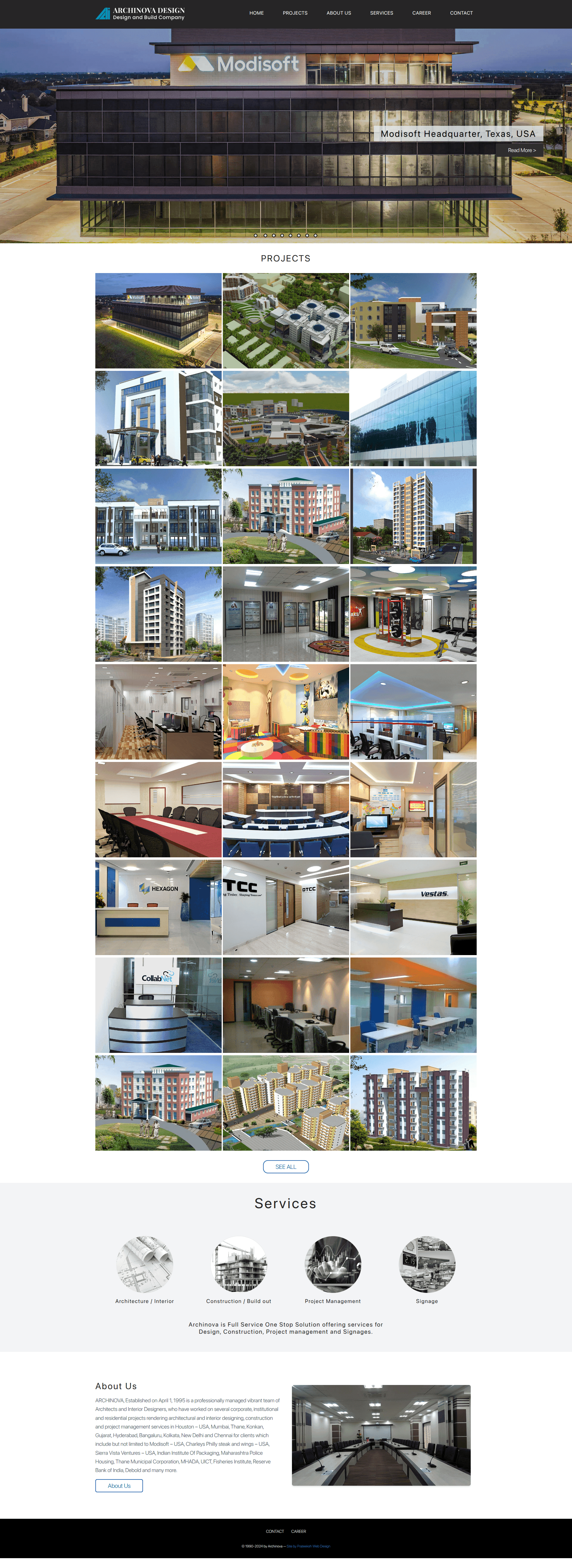
Portfolio and service website for an architecture practice, organising project work with clear consultation paths.
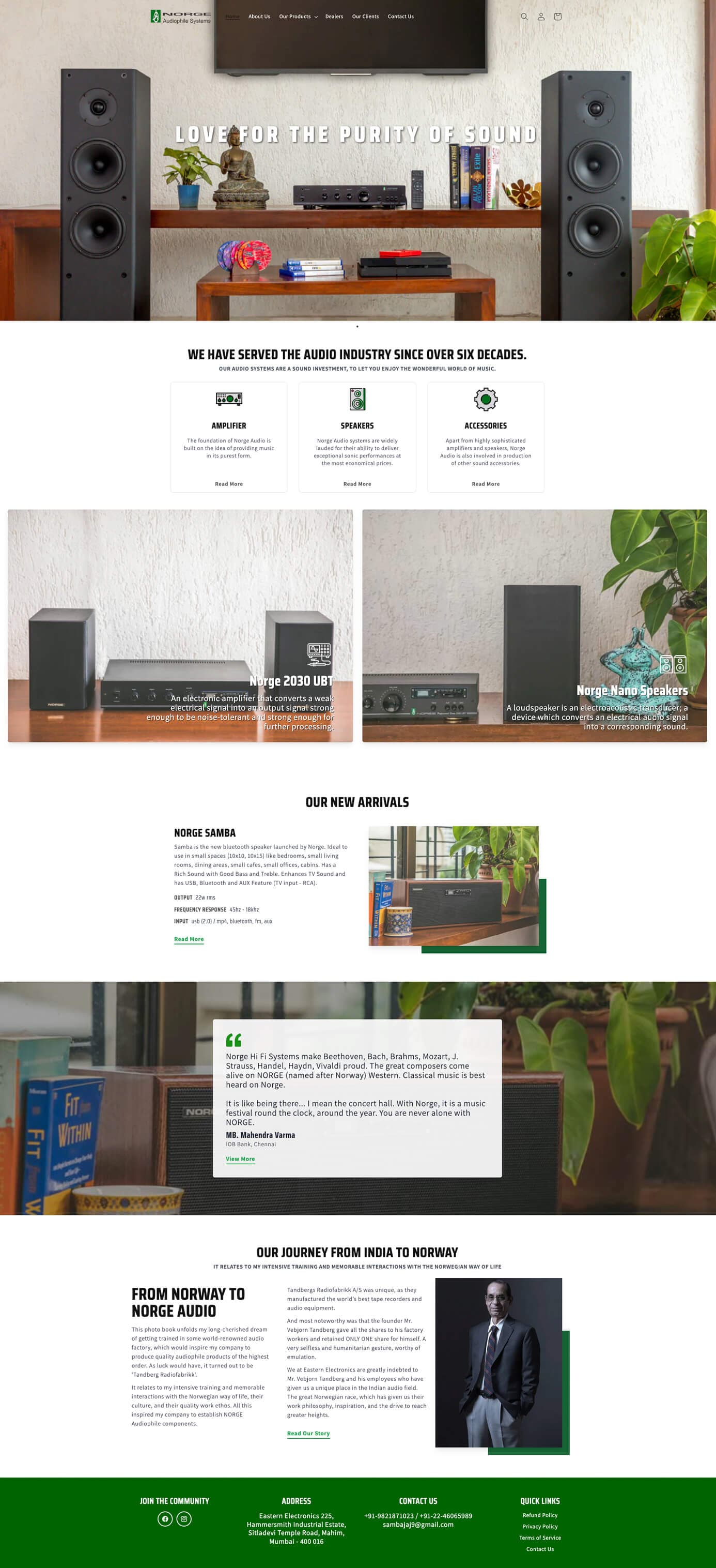
Product-led storefront organising audio equipment categories and customer enquiry flows in a responsive layout.
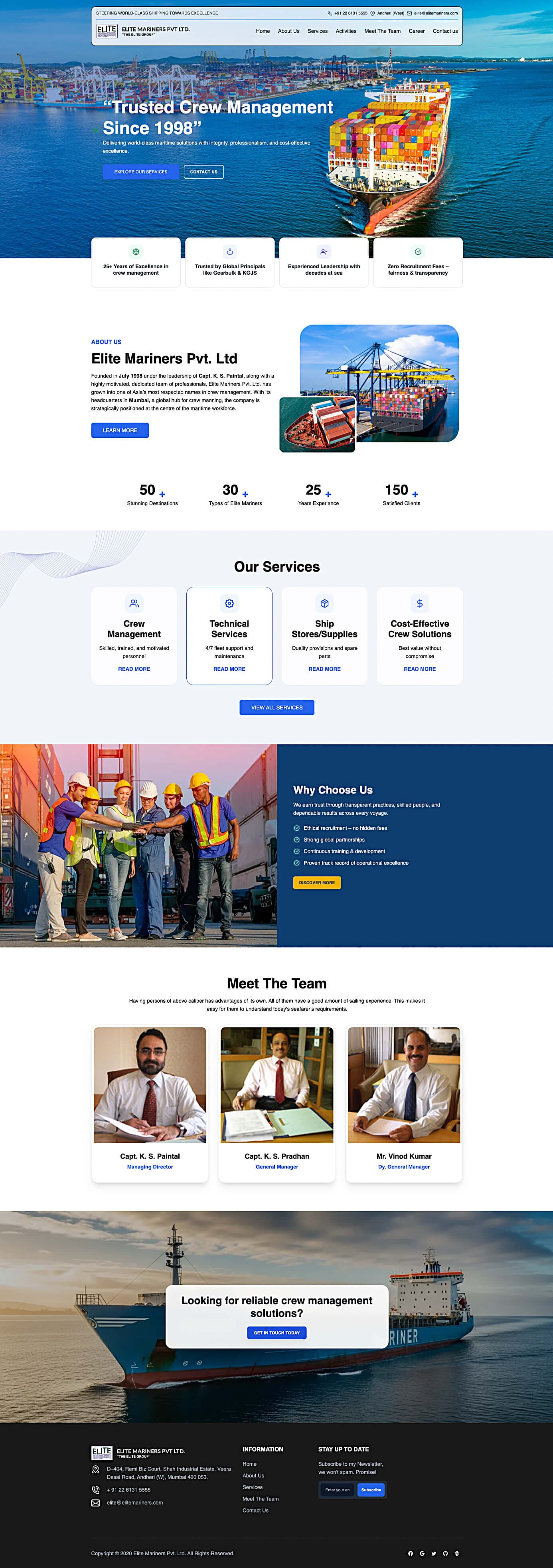
Corporate website presenting maritime services and crew information with clear navigation and direct enquiry channels.
FAQ
It covers the visual and reader-experience layer: homepage and section-front layouts, editorial hierarchy, article page templates, navigation and search design, typography, responsive layouts, media presentation and ad-slot placement. It does not include building the CMS or hosting. For that, see our <a href="/news-portal-design-and-development">news portal development</a> page.
Design decides how the publication looks and reads: layouts, hierarchy, type and components. Development builds the working platform behind it: CMS, editorial workflow, integrations, hosting, live feeds and paywalls. We can hand finished designs to your developers or pair them with our <a href="/news-portal-design-and-development">publishing-platform build</a>.
Yes. We start by reviewing how readers use your current site and where the layout confuses them, then redesign the templates that matter most, usually the homepage, article page and navigation. Redesign scope depends on your platform, so we confirm it before quoting through our <a href="/request-a-quote">quote form</a>.
Yes. Templates are designed mobile-first and tested on common phone, tablet and desktop widths, including tap targets, sticky elements and image sizes. We treat speed as a design priority but promise no specific load time, since hosting, images and ads affect it. See our <a href="/speed-optimization">speed optimization</a> service.
We design the layouts, language switcher and navigation, and check that headlines, menus and body text hold up in the scripts you publish in. Translation workflow and multilingual CMS setup are platform work, which we scope separately. Tell us your languages at the start so type and spacing are planned from day one.
Yes. The same article, category and homepage principles scale down to a single-author publication, with a lighter component set and a layout your own team can maintain. For personal and editorial blogs, our <a href="/custom-blog-design">custom blog design</a> page explains the approach.
We map ad slots for desktop and mobile, design clear sponsored-content labels, and balance placements against reading comfort. We promise no ad income, because that depends on your sales, network and audience. Network integration and tracking are separate scope, and reporting is covered under <a href="/analytics-and-reporting">analytics and reporting</a>.
We build clean headings, crawlable navigation and sensible page structure into the layout, which supports search engines in understanding your pages. Inclusion in Google News, Discover or any ranking is decided by Google, and no design can assure it. Wider search work sits under our <a href="/search-engine-optimization">SEO services</a>.
It depends on how many templates, languages and components you need and whether we redesign an existing site. We do not publish a generic price or timeline. Share your publication and we will send a scoped quote and schedule through our <a href="/request-a-quote">quote form</a> or a <a href="/growth-consultation">growth consultation</a>.
Locations
We proudly serve clients in major cities worldwide, delivering exceptional web design, development, and digital marketing services.