News Website Design: Homepage, Article & Category Page Layouts That Work
The homepage, article, and category page layouts that keep news readers scrolling — plus mobile design rules for speed and readability.
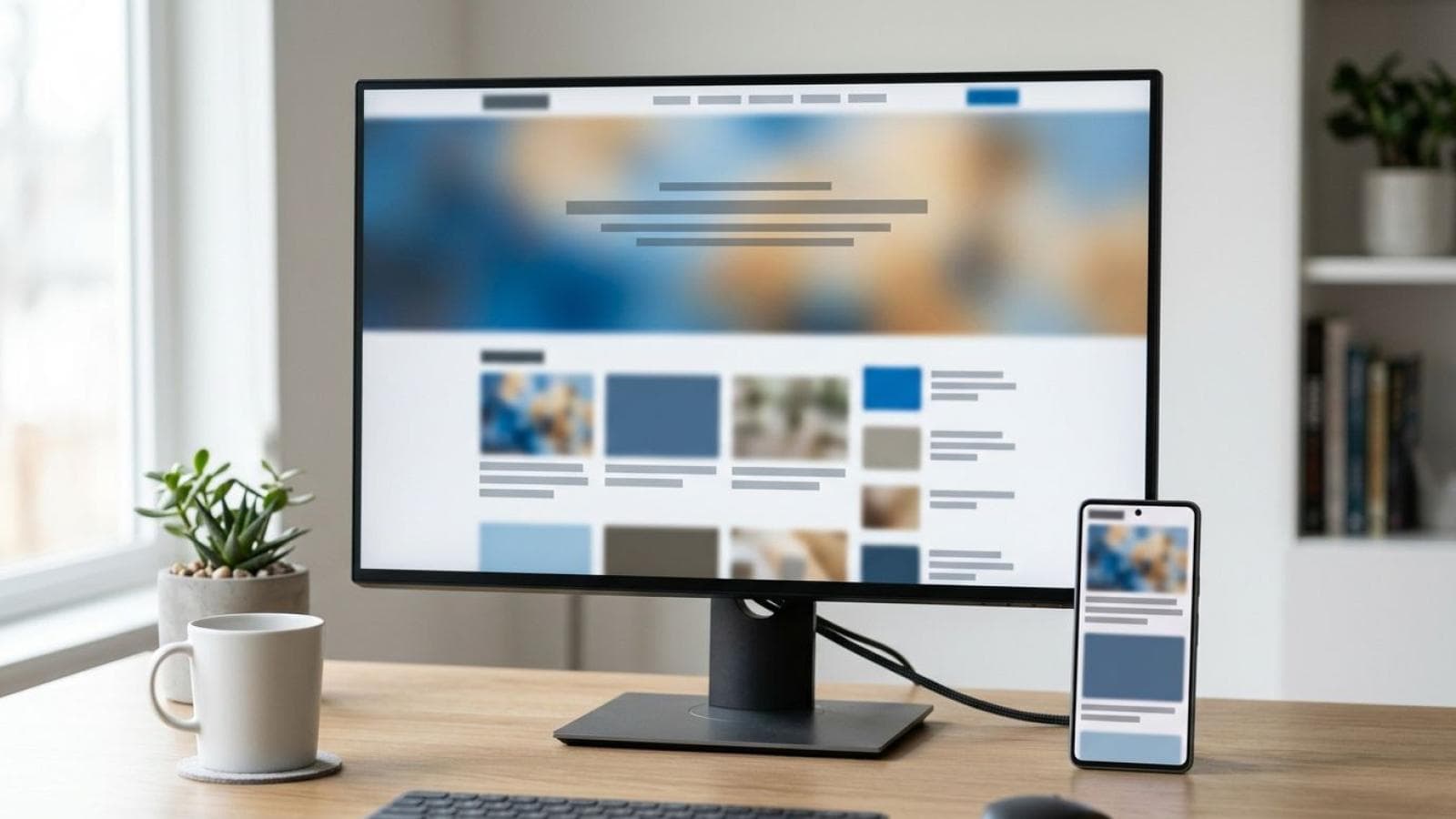
A news website has about three seconds to prove it belongs to a reader who just clicked in from Google, Twitter, or a WhatsApp forward. News website design is the discipline of arranging headlines, images, and navigation so that reader finds the right story instantly, trusts what they're looking at, and keeps reading. Get the layout wrong and even the best reporting sits unread below a cluttered fold.
This guide covers the actual layout decisions: what goes where on the homepage, how an article page should be structured from headline to related-stories module, how category pages should organize a flood of content without becoming a wall of links, and what changes on mobile. If you're planning the full build — CMS, hosting, monetization, SEO setup — for the full step-by-step build process, see our complete guide. This article is about what the reader actually sees and clicks.
Homepage Anatomy: What Belongs Above and Below the Fold
A news homepage is not a single hierarchy — it's several hierarchies stacked on top of each other, each one answering a different reader intent. Someone landing on your homepage is either checking "what's happening right now," browsing by section, or searching for something specific. Good news website design serves all three without making any of them compete for the same pixels.
The lead story block
The lead story is the single biggest visual element on the page — typically a large image (16:9 or wider), a bold headline in a larger type size than anything else on the page, and a one- or two-line deck (a short summary sentence under the headline). This is editorial judgment made visible: whatever your team decides is the day's most important story gets the most space, full stop. Don't let this slot auto-rotate through five stories on a timer — readers can't process a carousel in the two seconds they spend deciding whether to stay.
The latest news module
Directly beside or below the lead story, a compact list of the 5–8 most recent headlines gives readers a quick scan of "what's new" without competing visually with the lead story's imagery. This module works as plain text links with timestamps — no large images needed, since its job is speed, not persuasion.
Trending or top stories
A horizontal strip of 4–6 stories, usually ranked by reader engagement rather than publish time. This section rewards genuinely popular content and gives your homepage a second axis beyond "newest first" — useful when a three-day-old investigative piece is still outperforming today's routine updates.
Category navigation and breaking-news banner
Category navigation — Business, Sports, Technology, Politics, Entertainment, or whatever sections your outlet covers — belongs in the primary header, always visible, never buried in a hamburger menu on desktop. A breaking-news banner, when you have one, sits directly under the header, above the lead story, in a distinct color (commonly red or a high-contrast accent) so it interrupts the normal reading flow only when there's genuinely something urgent. Don't leave a stale "breaking" banner up for days — it trains readers to ignore the word entirely.
Anatomy of a news website homepage
Here's how these pieces typically stack, top to bottom, on a desktop layout:
┌─────────────────────────────────────┐
│ LOGO      CATEGORIES      SEARCH    │
├─────────────────────────────────────┤
│            BREAKING NEWS            │
├──────────────────────┬──────────────┤
│                      │ Latest News  │
│    LEAD STORY        │ Story        │
│    (large image      │ Story        │
│     + headline)      │ Story        │
│                      │ Story        │
├──────────────────────┴──────────────┤
│ TRENDING / TOP STORIES              │
├───────────┬───────────┬─────────────┤
│ BUSINESS  │ SPORTS    │ TECHNOLOGY  │
├───────────┴───────────┴─────────────┤
│ MORE STORIES / EDITORIAL SECTIONS   │
└─────────────────────────────────────┘
Below the fold, category blocks (Business, Sports, Technology, and so on) each show 3–5 headlines with a thumbnail and a "See all" link into the full category page. This gives every major section homepage visibility without forcing readers to hunt through a nav menu for what they care about. We build this exact structure as part of our news portal design and development service, adapted to each publication's section count and content volume.
Article Page Anatomy: From Headline to Related Coverage
The article page is where a news site earns or loses trust in the first two seconds. Article page layout needs a clear reading order: headline, then who wrote it and when, then the story itself, with supporting elements placed so they help rather than interrupt.
Headline hierarchy
The headline is the only H1 on the page, set at the largest type size in the article template — typically 28–36px on desktop. Below it, an optional deck (a one-sentence subhead) can add context the headline itself couldn't fit. Never stack two competing large headlines; readers scan the first thing that looks like a headline and skip the rest.
Byline, timestamps, and hero media
Directly under the headline: the author's name (linked to their author page), the publish date, and — critically for news — an "updated" timestamp when the story has been revised after publishing. This single detail does more for reader trust than almost anything else on the page, because news readers specifically want to know if what they're reading is current. The hero image or video sits below this byline block, at full article width, with a visible caption and credit line directly beneath it.
Body content structure
Article body copy should run 65–75 characters per line at the body font size — narrower and readers feel like they're reading a phone book; wider and the eye loses its place jumping to the next line. Break long articles with subheadings every 300–400 words, use pull quotes sparingly, and keep paragraphs to 2–4 sentences. A sticky table of contents suits long-form investigative pieces but adds clutter to a routine 400-word update — reserve it for pieces over roughly 1,200 words.
Related coverage and author bio
A "related coverage" module — 3–4 other stories on the same topic — belongs either inline partway through a long article or immediately after the body, never buried past a wall of ads. This is one of the highest-value layout decisions on the page: it's the difference between a reader leaving after one article and a reader who reads three. An author bio block (photo, short bio, link to other stories) closes out the article, reinforcing the byline trust signal from the top of the page.
Category and Section Page Anatomy
A category page — Business, Sports, whatever section — is a mini-homepage for one topic. It needs its own hierarchy, distinct from the site homepage, because a reader who clicked into "Technology" wants technology news, not a repeat of the site's top story.
Featured-story treatment within a category
The top story in a category page usually gets one enlarged treatment — a bigger image and headline than the list below it — mirroring the homepage's lead-story pattern, scoped to that section. Below that, a reverse-chronological list of headlines with small thumbnails, timestamps, and a one-line excerpt covers the rest.
Latest-in-category listing and pagination
For the listing itself, you have three real choices: classic numbered pagination, a "Load more" button, or true infinite scroll. Pagination is the most SEO-friendly of the three — each page gets its own crawlable URL, which matters for a category with years of archived content. A "Load more" button is a reasonable middle ground: single URL, no silent strand in an endless scroll. True infinite scroll reads well on mobile but makes it hard to find a way back to a specific story, and can hurt crawlability without careful URL updates. For category and archive pages, pagination or "Load more" beats infinite scroll more often than not.
Section hierarchy in navigation
If a category has subcategories (Technology → Gadgets, Technology → AI, Technology → Startups), show that hierarchy as a secondary tab strip directly under the category page's own header, not buried in a dropdown a reader has to hover to discover. Keep the parent category's own "All Technology" feed as the default view.
Mobile-Specific Design for News Sites
Mobile news site design isn't a scaled-down desktop layout — it's a different reading pattern entirely. Most news publishers now see the majority of their traffic arrive on mobile, often from a social share or a push notification rather than the homepage, which changes what "the first screen" even means.
Navigation patterns on mobile
A hamburger menu for full category navigation is standard and expected on mobile, but pair it with a horizontally scrollable category strip pinned just under the header — this lets a reader jump between Business, Sports, and Technology with a thumb swipe instead of opening a menu every time. Search should be a single visible icon, never buried two menu levels deep.
Readability and typography on small screens
Body text on mobile needs a minimum 16px base size to avoid the browser's automatic zoom-on-focus behavior in form fields, and headline sizes should scale down proportionally rather than staying desktop-sized and wrapping awkwardly across four lines. Line length on mobile naturally narrows to the screen width, which is good for readability — don't fight it by forcing a fixed desktop-style max-width that leaves huge side margins.
Image behavior: aspect ratio and lazy loading
Every image slot needs a fixed aspect ratio reserved in the layout before the image loads, so the page doesn't jump around as images arrive — this single fix eliminates most of the layout-shift complaints readers have about news sites. Below-the-fold images should lazy-load, meaning the browser doesn't fetch them until the reader scrolls near them, which keeps the initial page weight low on a mobile data connection. Hero images and anything visible on first load should NOT be lazy-loaded, since delaying the very first thing a reader sees defeats the purpose.
Key statistics
- A majority of news consumers now get news primarily through smartphones rather than desktop computers, per Pew Research Center's Digital News Fact Sheet , making mobile-first layout a baseline requirement, not an afterthought.
- Google's Core Web Vitals guidance sets the Cumulative Layout Shift (CLS) target at under 0.1, per web.dev's CLS documentation — a score directly affected by whether image aspect ratios are reserved in advance.
- Eye-tracking research from the Nielsen Norman Group found readers scan web pages in an F-shaped pattern, concentrating attention on the top and left of a page, per NN/g's F-Shaped Pattern research — directly informing why lead stories and primary navigation sit top-left on most news homepages.
Ad-Slot Positioning on Mobile
Most news sites carry advertising, and mobile ad placement is where design and revenue collide most visibly. Reserve fixed-height containers for every ad slot before it loads — the same layout-shift discipline as images — and never place an ad directly above a headline where a reader might tap it by mistake. A single anchor ad at the bottom of the viewport is common and tolerated; a full-screen interstitial that blocks the article on first load drives readers straight back to search results. If your site also cares about conversions from newsletter signups or subscription prompts, the discipline is the same one that improves any conversion-focused page: fewer competing calls to action, not more. Our conversion rate optimization audit covers this kind of page-friction analysis if you're seeing high traffic but low signup rates.
Planning a news site and want a layout that actually converts readers into repeat visitors?
Request a quoteDesign Choices That Also Protect Site Speed
Every layout decision above has a performance cost attached. A homepage with 40 thumbnail images, three ad slots, and an auto-playing video hero will load slowly no matter how good the visual hierarchy is — and slow news pages lose readers before the design even gets evaluated. The same lazy-loading discipline that keeps mobile layouts clean also keeps load times down; our website speed optimization guide walks through the fixes that matter most for a content-heavy homepage. And if you're weighing layout patterns more broadly — trust signals, above-the-fold hierarchy, mobile-first structure — our landing page design best practices guide covers the same principles from a conversion-page angle.
Frequently Asked Questions
What is the ideal homepage layout for a news website?
The ideal news website homepage layout leads with one large story block, places a compact latest-news list beside or below it, follows with a trending or top-stories strip, and then organizes remaining content into category blocks. This structure serves readers browsing "what's new," "what's popular," and "what's in my section" without any of the three competing for the same space.
Should a news article page use pagination or infinite scroll?
Category and archive pages benefit more from classic pagination or a "Load more" button than true infinite scroll, mainly because pagination keeps each page crawlable and bookmarkable. Individual long-form articles rarely need pagination at all — they should read as one continuous page with a related-coverage module at the end.
How many images should a news homepage load above the fold?
Typically one large hero image for the lead story, plus small thumbnails for the latest-news list — usually 3–6 images total above the fold. Loading dozens of full-size images before the fold slows the page and adds no reading value, since most of those thumbnails are competing for attention the reader hasn't asked to give yet.
What's the difference between a news portal and a news website in terms of design?
In practice the terms are used interchangeably for layout purposes — both need the same homepage, article, and category page anatomy covered in this guide. "Portal" sometimes implies a larger site with more sections, user accounts, or multi-language content, which can mean a more complex navigation system, but the core visual hierarchy principles stay the same.
Does mobile news site design need a different layout than desktop?
Yes — mobile news design isn't just a narrower version of the desktop layout. It needs a collapsed navigation pattern (hamburger menu plus a scrollable category strip), larger touch-friendly tap targets, reserved image aspect ratios to prevent layout shift, and careful lazy-loading since most mobile readers are on a cellular connection rather than fast broadband.
Reference reading
- Nielsen Norman Group's guide to visual hierarchy in UX design
- How users read on the web, from Nielsen Norman Group's usability research
- Google's guidance on Article structured data for news and blog pages
- MDN's technical guide to lazy loading images and iframes
Need a news website built with a layout that actually holds readers past the first click?
Talk to our news portal design and development team