What I Prioritise in Ecommerce Web Design That Helps Customers Buy
Ecommerce web design isn't about making a store look pretty — it's about removing every reason a visitor has to leave without buying. Here's the order I actually work in.
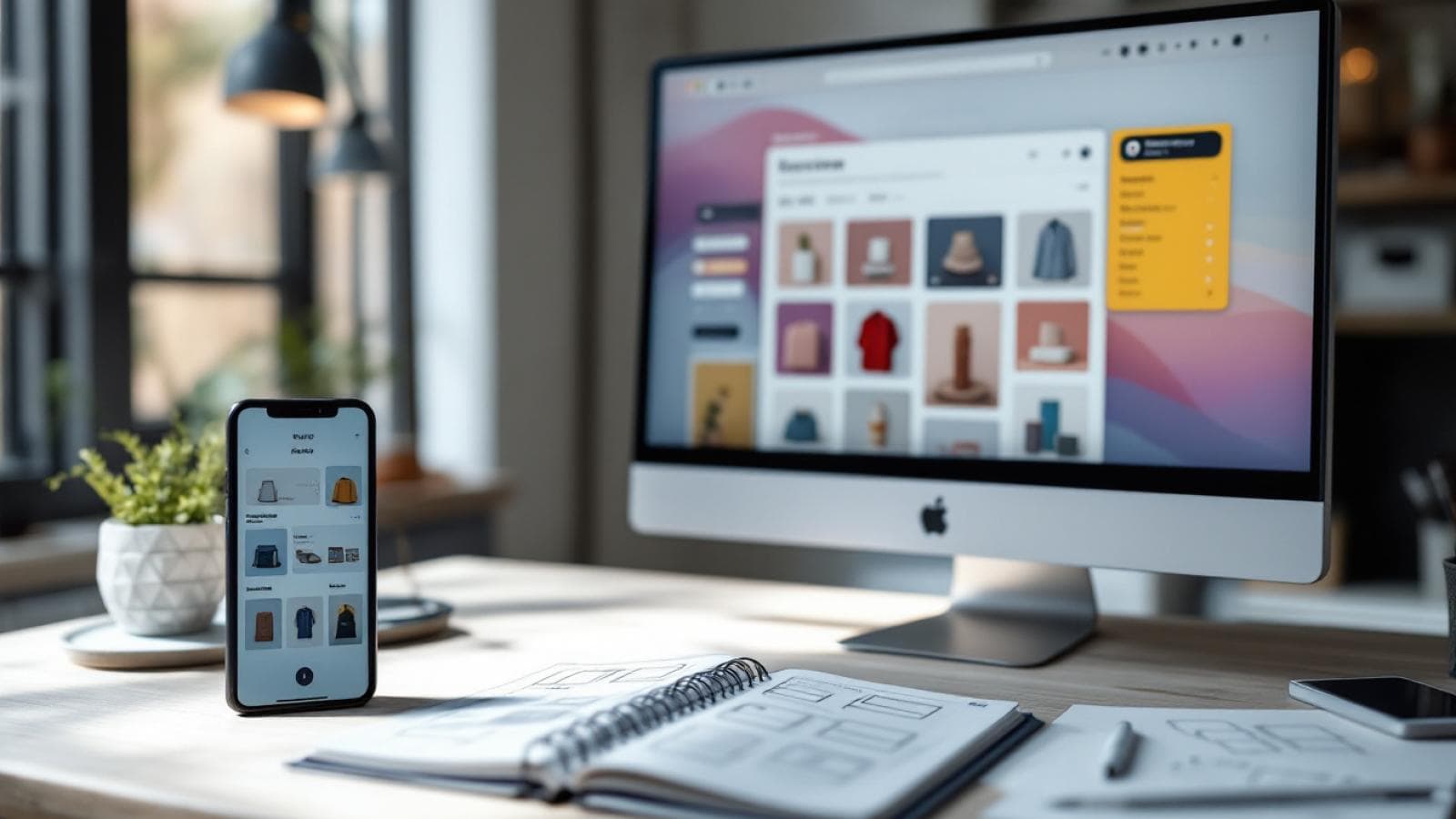
Good ecommerce web design comes down to one question I ask on every project: at each step of this store, what's making the customer hesitate? Colour schemes and hero banners get all the attention in client meetings, but the stores that actually convert are the ones where someone sat down and fixed the friction — slow product pages, confusing navigation, a checkout that asks for too much too soon. That's where I put my time, and it's the order I'd recommend any business owner insist on too.
Start With Speed, Not Style
I know this isn't the glamorous answer, but a store that takes four seconds to load has already lost a chunk of its visitors before they've seen a single product. Every image, every app you bolt onto a Shopify theme, every third-party script adds weight. My rule on new builds is simple: design decisions don't get final sign-off until we've checked what they cost in load time. A beautiful product gallery that tanks your Core Web Vitals isn't actually beautiful — it's a leak in your funnel.
This matters even more once you're running paid traffic. You're paying for every click that lands on a slow page, so speed optimization isn't a nice-to-have add-on, it's part of the return on your ad spend.
Product Pages Do the Actual Selling
The homepage gets the visit, but the product page gets the sale. I spend a disproportionate amount of design time here: image order (context and scale shots, not just five angles of the same thing), where reviews sit relative to the buy button, and whether size or variant selection is obvious without scrolling. If a shopper has to hunt for the "add to cart" button on mobile, that's a design failure, not a minor detail.
I also push clients to write real product descriptions instead of manufacturer copy-paste. Search engines and shoppers both reward it — descriptions that answer the actual questions a buyer has (does this fit, how long does it last, what's it made of) outperform generic spec lists every time.
Navigation That Matches How People Actually Shop
Category structure sounds like a boring back-end decision, but it's one of the biggest conversion levers in ecommerce design. If someone lands on your site looking for "running shoes under ₹3,000" and your navigation only lets them browse by brand, you've made them do work you should have done for you. Filters by price, size, and use case aren't a luxury feature for large stores — they're table stakes even for a catalogue of 50 products.
Trust Signals Belong Near the Decision Point
Return policy, delivery timelines, secure payment badges — these need to be visible right where someone is deciding whether to buy, not buried on a separate policy page three clicks away. I build these into the product page template itself: a short delivery estimate near the price, a one-line return policy note near the buy button. Small, but it removes the exact hesitation that makes someone abandon a cart to "think about it."
A few numbers worth knowing:
- Google's research through Think with Google has repeatedly found that as mobile page load time increases from one to five seconds, the probability of a visitor bouncing rises sharply — a strong reason speed sits at the top of my priority list.
- Baymard Institute's long-running checkout usability research consistently finds that unexpected costs and overly long checkout forms are among the top reasons shoppers abandon carts.
- According to widely cited ecommerce benchmarks, the majority of online shopping traffic in India now comes from mobile devices, which is why every design decision here starts with the phone screen, not the desktop one.
Checkout: Fewer Fields, Fewer Excuses to Leave
Every field you add to a checkout form is a chance for someone to give up. I audit checkout flows to strip anything that isn't strictly necessary to complete the order, and I make sure guest checkout is available — forcing account creation before a first purchase is still one of the most common self-inflicted wounds I see on stores I'm asked to review.
Mobile Isn't a Secondary Version
I design ecommerce stores mobile-first, not "desktop first, then shrink it." That changes decisions early — how many products show per row, how filters collapse into a drawer, how the sticky add-to-cart bar behaves as someone scrolls. Getting this right on day one avoids the awkward compromises that come from retrofitting a desktop layout onto a phone screen later.
Search and Filtering Are Part of the Design, Not an Afterthought
A store's internal search bar gets almost no design attention on most builds I review, and it shows. If someone types a product name with a small spelling mistake and gets zero results, that's a lost sale that had nothing to do with pricing or product quality. I treat search as core UX — typo tolerance, sensible result ranking, and visible filters on the results page itself, not just the category pages.
The same thinking applies to sorting. Shoppers browsing by price low to high or newest arrivals are usually closer to a purchase decision than someone landing cold on the homepage, so I make sure those sort options are prominent and actually reflect the underlying catalogue data correctly, not just cosmetically present.
Photography and Video Carry More Weight Than Most Businesses Budget For
You can have the fastest, best-structured store on the internet, and it still won't sell a product photographed badly. I push clients to budget properly for product photography — multiple angles, honest colour representation, and where it makes sense, a short video showing scale or use. This isn't strictly a design decision in the traditional sense, but it directly determines how much the design work around it can actually achieve, and I'd rather flag this early than let a client discover it after launch.
Post-Purchase Design Matters More Than People Expect
The order confirmation page and follow-up emails are still part of the store experience, and I design them with the same care as the homepage. A clear confirmation screen with delivery expectations reduces support queries, and a well-designed order-tracking experience is often what turns a first-time buyer into a repeat one. Businesses tend to stop designing the moment the payment clears — I think that's exactly the wrong place to stop.
Frequently Asked Questions
What's the single biggest ecommerce web design mistake you see?
Slow product and category pages. Businesses invest in beautiful photography and then load it in a way that makes the page take five or six seconds to become usable. Speed and design have to be solved together, not treated as separate priorities.
Does ecommerce web design affect SEO?
Yes, directly. Site structure, page speed, and clean product URLs all feed into how well your store ranks. A store built with search in mind from the start tends to need far less retrofitting later.
Should I build on Shopify or a custom platform?
For most businesses, Shopify gets you a secure, fast-to-launch store without reinventing checkout and payments. Custom builds make sense once you need functionality Shopify's ecosystem genuinely can't support well, which is a smaller list than most people assume.
How many products should be on a category page before I add filters?
I add filtering as soon as a category has more than roughly 15–20 items, or whenever there's an obvious way customers narrow their search, like size, price, or use case, regardless of catalogue size.
How long does a proper ecommerce redesign take?
Depending on catalogue size and how much custom functionality is needed, most ecommerce rebuilds I run take six to ten weeks from strategy through launch and testing.
I've written before about how a single, focused page can outperform a cluttered one — the same thinking applies to product pages; see one-page websites that make money for the underlying principle.Further Reading
- Baymard Institute: Cart Abandonment Rate Statistics
- web.dev: Fast Load Times
- Shopify Developer Docs: Theme Best Practices
If your store is getting visitors but not enough sales, it's worth walking through it page by page with someone outside your own team. Have a look at our case studies for how we approach these projects, or reach out through our contact page and we'll take a look at what's actually happening on your product and checkout pages.