30 Restaurant Websites for Design Inspiration
Thirty restaurant, hotel and cafe homepages with 1920x1380 screenshots and critiques of layout, typography, imagery and booking UX.
Why restaurant website design matters
A restaurant website is usually the first taste of the place. Before anyone smells the kitchen or sees the room, they judge the photography, the type and the tone of the page, and from that they decide whether this is somewhere for a quick lunch, a birthday dinner or a once-a-year splurge. A weak first screen can make a good kitchen feel ordinary; a confident one can set expectations before the first reservation is made.
The page also has a hard commercial job. Visitors arrive with a narrow set of questions: where is it, when is it open, what does it cost, can I book, can I order. Restaurants that answer these within seconds, with a clear reservation or order button, lose fewer people to a competitor's listing. Those that hide the answers behind artful but ambiguous navigation rely on reputation to carry the visitor through.
Finally, restaurant sites sit between brand and utility. A tasting-menu restaurant, a fried-chicken counter and a pub with rooms need very different personalities, yet all three need legible menus, tappable booking links and imagery that makes the food look as good as it tastes. The thirty examples below show how widely those priorities can be balanced, and where each choice costs something.
What to look for
As you scroll through the examples, use these lenses to compare them:
- First-screen hierarchy. What is the one thing the page wants you to notice, and is the next step obvious?
- Booking and ordering clarity. Is the reservation or order action visible, labelled plainly and visually distinct?
- Photography and art direction. Does the imagery show food, room or story, and does it feel like the brand’s own?
- Typography. Does the type give the restaurant a voice, and is small copy still readable over images?
- Color and contrast. Do palette and overlays help text and buttons stand out?
- Practical information. Are location, hours, menus and contact details easy to reach?
- Overlays and interruptions. Do banners, pop-ups and cookie bars help or block the brand?
1. Hotel Aurelia: A Full-Screen Poolside Video With Handwritten Script and a Summer/Winter Switch

Hotel Aurelia homepage, captured at 1920×1380.
Hotel Aurelia opens on a full-bleed image of two palm trees mirrored in an infinity pool at dusk, with parasols and a still sea behind. A white copperplate-style script reading La dolce vita sits over the water, and three small gold birds hover above it. The header is symmetrical: Turkish-language links to rooms, gastronomy, experiences and journal on the left, weddings and reservations on the right, with a crest-style logo in the middle and a TR / EN switch. Directly below the headline a pill toggle lets visitors choose the summer or winter season, a rare piece of interface that adapts the whole story to the time of year. The mood is confident and the palette of teal, amber and cream is cohesive. The cost is legibility: the thin, widely spaced nav text and the thin script both sit over a bright, detailed photograph, and a tiny sound button and side tab are easy to miss. The Reservation link is plain text, not a button.
2. Club Charlestown: A Rounded Dining-Room Hero Under a Utility Bar and a Green Book-a-Table Button

Club Charlestown homepage, captured at 1920×1380.
Club Charlestown is a community venue, and the page is organised accordingly. A dark green utility strip carries a link to a sister venue and member-oriented links such as Become A Member, Online Raffles and Function Enquiry. Beneath it, a white header holds the logo, a five-item nav and a solid lime Book A Table button, which is the clearest action on the screen. The hero is a large, rounded photograph of a bright covered dining area with wooden tables, black chairs and string lights, darkened so the white condensed headline, Beyond a Club, It's a Community, stays readable. Two buttons below the intro line, Explore Our Bistro & Bars and Book A Table, repeat the booking route. The structure is practical and welcoming. The weaknesses are that the photograph is an empty room, so it communicates space rather than atmosphere, the thin white intro text is fairly small over the table pattern, and the cream badge at bottom right competes with the headline.
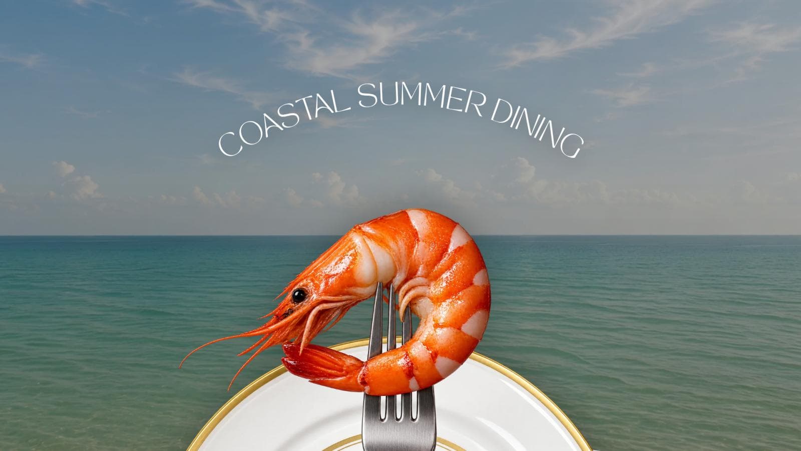
3. Pier 88 Coast: A Cut-Out Prawn on a Fork Rising Out of the Sea Under Curved Headline Type

Pier 88 Coast homepage, captured at 1920×1380.
Pier 88 Coast uses a surreal but disciplined composition: a glossy prawn skewered on a fork, cut out and placed in front of a calm turquoise sea and sky, with a gold-rimmed plate at the bottom. The words Coastal Summer Dining follow a gentle arc across the sky, and a wavy white shape at the bottom edge begins the next section. Navigation is almost absent, only Find Us and Menu on the left, a small serif logo in the centre and a menu icon on the right. The idea explains the concept in a single glance, and the orange of the prawn pops against the cool blues. The restraint also has a cost. Thin white type over wispy clouds has low contrast, the curved headline is harder to read than a straight line, and there is no visible reservation or contact action on the first screen. The wave transition is a smooth, brand-appropriate detail.
4. Coquelicots: A Rounded Photograph of an Ivy-Covered House With a Small Dutch Welcome Note

Coquelicots homepage, captured at 1920×1380.
Coquelicots is a holiday house in the Dordogne, and its page behaves more like a boutique stay than a restaurant. A cream background carries a small logo, a short Dutch welcome paragraph, a dark navy Boeken (book) button with an arrow and a pale blue Menu button with a hamburger icon. Below sits one large, rounded-corner photograph of a stone house covered in climbing ivy, with a balcony, garden furniture and a red-leaved shrub. The photograph is warm and believable and the navy and pale blue palette is calm. The booking action is easy to find and has strong contrast. The page does not tell a first-time visitor how many guests the house sleeps or what a stay costs, and the small welcome text is quite light in weight. A Webflow award badge on the right edge slightly distracts. A tiny blue dot in the middle of the image looks like a cursor or loader and is unexplained. As a template for a single-property rental it is clean and direct.
5. Le Saint Georges: A Dimmed Panoramic Dining Room With Mountain Views and Two Reservation Routes

Le Saint Georges homepage, captured at 1920×1380.
Le Saint Georges fills the screen with a darkened video still of a glass-roofed dining room, tables laid with dried flowers and copper lamps, and tall windows looking out on a green and gold hillside. A thin line drawing of a crest sits top left, a light serif logo sits in the centre, and a boxed Réserver button and a language link sit top right. A seven-item nav underneath lists rooms and suites, restaurant, weddings, meetings, activities, gallery and offers. At lower left a second outlined button, Réserver une chambre, sits above a phone number and email address, so contact details are visible without scrolling. The image does a lot to sell the view, and the mix of hotel and restaurant links is clear. Both buttons are thin outlines on a busy dark photo, so they are less prominent than they should be, and the small nav text has modest contrast. A chat bubble sits at bottom right.
6. Vita Travels: One Giant Word Over a Mountain Valley, With a Single White Pill Button

Vita Travels homepage, captured at 1920×1380.
Vita Travels is a Webflow template for a retreat and tour business, and it puts a single oversized sans-serif word, Travel, in the middle of a wide landscape of snow peaks, golden hills, yurts and a grazing horse. A short subline promises retreats, active tours and boutique stays in one place, and one white pill button reads Explore Retreats. The header is clean: an orange logo at left and Retreats, Coaches, Contacts and Explore at right. The hierarchy is exemplary: one word, one sentence, one button, and the warm photograph supports the idea of getting away. The orange logo against the blue sky is low in contrast, and the subline's white text over a mid-tone hillside is only moderately readable. The darker section underneath starts a headline about vetted retreats that is cut off by the fold, which is a reasonable invitation to scroll. It is a useful pattern for any business whose promise is a destination.
7. Warpigs: An Overhead Table of Barbecue Trays Under a Hand-Cut Gothic Wordmark

Warpigs homepage, captured at 1920×1380.
Warpigs shows a Copenhagen barbecue and brewpub through an overhead photograph of a green picnic table covered with metal trays on brown paper: brisket, ribs, pulled pork, wings, nachos, mac and cheese, and glasses of beer. The wordmark is set in a rough white blackletter style across the centre, followed by a line about Texas barbecue and house-brewed craft beers. The header has small uppercase links to food, drinks, events and groups, plus two boxed buttons, Order Food and Get a Table, at top right, so both actions are findable at once. The abundance of food is appetising and makes the offer obvious. The weakness is that the wordmark and tagline sit on top of the busiest part of the photograph, so the tagline is partly lost against the trays and the bright green. The nav text is very small, and a gift-card button at the bottom left and a mascot icon at the bottom right add clutter. It is a strong example of letting food photography lead.
8. Bresca: A Macro Cocktail Image Under a Warm Yellow Header With the Address Built In

Bresca homepage, captured at 1920×1380.
Bresca puts a close-up of a deep magenta drink with a ball of ice and a crisp, sugar-dusted garnish across the entire first screen, with a slideshow arrow on each side and a pause control at the bottom. Above it, a navy line states the street address and phone number, and a bright amber header holds a spaced-out BRESCA wordmark, nav links to the story, menus, events, contact, gift cards and newsletter, and a navy Reservations button. The photograph is dramatic and tactile, the amber and navy header is distinctive, and the address and phone in the top strip answer practical questions immediately. The Reservations button is the only dark block in the header, which gives it good contrast. A drink close-up does not show the room, the food or the feeling of dining there, and the macro image is so tight that the garnish is the only recognisable detail. The header link text is small and tightly packed. The pause control is a good accessibility touch.
9. Arts District Kitchen: A Black-and-Gold Saloon Palette With Address, Hours and Phone Beside the Burger

Arts District Kitchen homepage, captured at 1920×1380.
Arts District Kitchen uses a near-black page with an overlapping collage: a warm burger photograph on the left, a distressed gold headline reading Good Times with Great Friends, and below it the street address, the note that it sits inside a brewery, a phone number and opening hours. A second photograph of banh-mi style sandwiches in metal trays overlaps the lower right. Navigation across the top is bold condensed type, with social icons and a boxed phone number at the far right. The colour scheme of black, tan and gold is cohesive and the display font gives the place a vintage-Western character. Practical information is unusually prominent for a first screen. However, the capture looks dimmed by an overlay, the nav's Home item and the logo at top left almost vanish into the black, and the Serving Tasty Bites Since 2019 text is small. The tan text on black has acceptable contrast but long uppercase lines are tiring to read.
10. Lox in a Box: A Sepia Family Shopfront Photograph Layered With Collage and a Deep-Green Heritage Band

Lox in a Box homepage, captured at 1920×1380.
Lox in a Box leads with history rather than food. A black-and-white photograph of a 1900s grocer's shopfront with staff in white coats fills the hero, overlaid with a torn paper bag printed with the grocery's name and a snapshot of two smiling people in green uniforms at lower left. The wordmark is large and white at the top, followed by a centred nav in a condensed typeface and an outlined Order Now pill. The headline, Family Recipes Baked in Tradition, and a white About Us button sit over the photograph, and a solid green band below reads Family-run deli merchants since 1904. The storytelling is authentic and unusually specific, and the collage gives it a handmade feel. The weakness is legibility: the white headline sits directly over the detailed shopfront and is partly lost, and the first screen has no menu or food image. Order Now is a thin outline against a mid-tone photograph, so the main commercial action is understated.
11. Madre Taberna Moderna: Red and Cream Diagonal Tiles Framing a Single Plate and a Shouted Spanish Slogan

Madre Taberna Moderna homepage, captured at 1920×1380.
Madre's page is built around the tiles in the room: a red-and-cream diagonal pattern fills the framed photograph, and a hand holds out one plate of prawns with orange roe in front of it. The surrounding page is a solid brick red, with a centred, bold condensed wordmark between two groups of white nav items in Spanish, covering gastronomy, history, space, menu, contact, booking and gift. A giant white headline, Nunca engordarás por una tapa más, runs across the bottom of the image and out of the first screen. The palette is limited to red, cream and white and is very strong. The tattooed arm and single plate add human warmth. The headline is huge and fun but is cropped by the fold and overlaps the busy tile pattern, and the small tracked nav text is fairly tight. The Reserva link is not visually distinct from the other links. The language switch to English sits at the far right.
12. Sliders: A Black Farewell Letter Set in Plain Centred Type Under a Gold Signature Logo

Sliders homepage, captured at 1920×1380.
The Sliders page, at the time of capture, is a closing announcement. A gold brush-script logo sits at the top of a near-black textured background, followed by a heading thanking customers for twelve years and a long, centred message in white, divided into short paragraphs with bold sub-headings addressed to guests and to staff. A strip of burger photography begins at the very bottom of the screen. The design is simple and respectful: strong contrast, generous line spacing, a narrow reading column and a consistent tone. It shows how a closing or transition notice can be handled with dignity. The drawbacks are plain to see: the message is long and entirely in Danish on a page labelled English, there are no navigation links or next steps on the screen, and the food imagery that would sell the brand is pushed below the fold. As a text-only layout it is easy to read, but it offers little visual inspiration.
13. Malai: A Festival Campaign Built From Two Saturated Product Photographs on a Quiet Cream Page

Malai homepage, captured at 1920×1380.
Malai's page is a clean cream canvas with a seven-item header of find us, catering, our story, order, cookbook and flavors around a coral wordmark, with an account icon at right. The campaign headline, Make Diwali a Little Sweeter, is set in a refined serif, followed by a bold sentence about Indian-inspired desserts for sharing and gifting and a salmon Shop Diwali Desserts button. Two large photographs sit below: pints of gulab jamun ice cream beside a layered cake on gold fabric, and an ice cream sandwich stack against a deep pink backdrop. The saturated yellows, pinks and reds make the products look celebratory while the neutral page lets them stand out. Hierarchy is clear: headline, one button, two images. The salmon button with white text has low contrast, and the bold subline is wider than the headline above it, which feels slightly unbalanced. A blue accessibility button is added at the bottom right, and there is a large amount of empty cream beneath the images.
14. Barra: A Hand-Illustrated Mexico City Collage on Sage and Sand Bands

Barra homepage, captured at 1920×1380.
Barra's page begins with a thin announcement line about private events, a white header with Home, Menu and EarlyBites on the left, a hand-drawn logo in the centre, Instagram and Spotify icons, and an outlined Reservations pill. Below sits a sage band with a line drawing of corn plants growing from old buildings with a carved head wearing headphones, and teal text describing Mexico City food and vibes, mezcal, sotol and cocktails, natural wines and delivery. A drag brunch date appears in white, and a sand-coloured band begins with giant teal Check Menu lettering and an illustrated cocktail and corn. The illustration is distinctive and entirely owned by the brand. The weaknesses are that the white drag brunch text on light sage has low contrast, the long pipe-separated line is dense, and the Reservations button is an outline rather than a filled button. The page makes personality, not photographs, the main selling point.
15. Canlis: Oversized Ghosted Lettering Running Behind a Framed Architecture Photograph

Canlis homepage, captured at 1920×1380.
Canlis sets its name in huge, pale grey serif capitals across a light stone background and lets a single dusk photograph of the building's angled roof and windows overlap the middle letters. The effect is confident and sculptural, and it makes the first screen feel like a poster. Navigation is minimal: Reserve on the left, Explore and Private Events on the right, and an orange circular badge announcing Mad Manor tickets hanging from the top centre. Phone number, address and Instagram handle sit in the footer line, so essential facts are visible without scrolling. The overlap does cost legibility, since the letters L and I almost vanish into the sky, and the orange badge is the only strong colour and competes with the logotype. It is a good example of a seasonal promotion handled as one object rather than a banner.
16. Sweetgreen: One Close Crop of a Wrap With Editorial Headline Type

Sweetgreen homepage, captured at 1920×1380.
Sweetgreen's page opens with an extremely close photograph of a hand holding a wrap in printed paper against a cream knit sleeve. A cream header carries the lowercase green wordmark, Our Menu, Our Mission and Fundraising on the left, Outpost, Catering and Locations on the right, and a dark green Order pill. Over the lower photograph, a light sans-serif headline reads Molly's Big Dill Caesar Wrap, with a small kicker above and a lime Order Now button below. A partner mention at the right edge is cropped by the viewport. The photograph is stylish and food is the hero. The lime button against a brown photograph has strong contrast, and the order action is repeated top and bottom. The white headline is thin and sits over a mid-tone background, so legibility is moderate. The cropped partner mark at the right edge looks accidental. An Enable Accessibility button sits top right.
17. Rosebud Bar & Kitchen: A Full-Width Diner Photograph With Its Own Neon Signage and a Boxed Reservations Link

Rosebud Bar & Kitchen homepage, captured at 1920×1380.
Rosebud's hero is a full-width photograph of the restaurant's own silver railcar-style diner building, with a red neon-style Rosebud sign, a Since 1941 Bar & Kitchen panel, hand-painted lettering, a passer-by on the pavement and a fire hydrant. The surrounding frame and header are solid coral red, and a row of nav links ends with a white-outlined Reservations box. The photograph is the best part: the building itself is a logo, so the site can show the real place and let its signage do the branding. As captured, the first seven nav links appear in the browser's default blue underlined style rather than the white used for Happenings, which looks inconsistent and has poor contrast on red. The footer strip carries social icons, a Powered by credit and Jobs and Contact links in a small serif. There is no headline, address or hours on the first screen, but the picture explains the concept immediately.
18. Noma: A Full-Bleed Garden Photograph With One Boxed Booking Button

Noma homepage, captured at 1920×1380.
The first screen is almost entirely a single photograph of low timber-and-brick buildings set in wildflowers, dimmed slightly so the white serif type can sit on top. The wordmark is top left, a centred "Reservations" link sits in the header, and EN / DA and a menu icon sit on the right, so the main commercial action is repeated twice: in the header and in the outlined "Book a table" button beside the "Copenhagen 2026-2027" label. The palette is deliberately restrained, greens and brick against off-white type, and the thin outline button reads as calm rather than pushy. The weakness is contrast: white text over busy foliage and the pale path is only comfortable where the overlay darkens it, and the thin button border is easy to miss. The pale strip below, with email and name fields for reservation updates, is useful but arrives before any food imagery. A short line about the dining format would help first-time visitors.
19. The Clove Club: A Cyanotype Botanical Image as the Whole Interface

The Clove Club homepage, captured at 1920×1380.
The page is an entire field of cobalt blue with a white botanical print, a cyanotype-style plant, centred and almost life-size. The restaurant name is set in small spaced serif capitals over the stems, a boxed Reservations link sits top left, and a thin plus icon opens the menu at top right. There is no other copy, navigation or button on the first screen. This is the boldest use of colour in the set and it is immediately memorable; the blue and white also give very strong contrast for the little text that exists. The risk is discoverability. A first-time visitor must guess that the plus opens the rest of the site, and the centre title overlaps fine white stems, which slightly reduces its crispness. Because the Reservations link is the only visible action, the page does at least make booking unambiguous.
20. Atelier Crenn: A Macro Plate Photograph With Almost No Interface

Atelier Crenn homepage, captured at 1920×1380.
Atelier Crenn gives the whole first screen to one macro photograph: a white sculpted flower with a ring of tiny blue blossoms on a dark mossy surface. The only interface is a gold line-art logo top left, small tracked serif links for Information and Reservations top right, and a row of carousel dots with a pause control at the bottom. An accessibility button sits bottom right. The image makes a strong argument about craft without a word of copy, and the dark gradient at the top gives the small navigation adequate contrast. The consequences are that visitors learn nothing practical from this screen, the nav text is tiny relative to the canvas, and a pause control for the slideshow, while thoughtful, is also very small. For a destination restaurant, this works as an invitation; it would be stronger with one short line saying where the restaurant is and what the format is.
21. Cutler & Co.: A Two-Column Layout Where Practical Details Sit Beside a Warm Dining-Room Photograph

Cutler & Co. homepage, captured at 1920×1380.
Cutler uses a cream background with a left column listing a Make a Reservation link, location, opening hours, phone and email, and a large photograph to its right showing a white-clothed table, a shelf of glassware and a fiddle-leaf fig against painted brick. Below, a short Welcome to Cutler passage is split into two text columns. This is among the most useful first screens in the set: a visitor sees the address, the days and hours, and a booking link without clicking anything. The sans-serif tracked capitals in the header and the bold serif wordmark are consistent and legible. The weaker points are that the reservation link is only underlined text, not a button, and the serif body text on cream is quite small. The photograph is excellent at suggesting the room, though, and the layout shows that practical details and atmosphere can share a screen.
22. Ma‘ono: Saturated Yellow, Condensed Type and One Unmissable Order Button

Ma‘ono homepage, captured at 1920×1380.
Ma‘ono is a fast-casual fried chicken site, and it looks like one. A solid yellow header holds a heavy condensed wordmark and plain links (Menu, Locations, About, Contact, FAQ), with a red Catering button. The hero places a very close photograph of a chicken sandwich on black, with a giant yellow headline reading Hawaiian Style Fried Chicken and a large red Order Online button. Below, four storefront photographs begin a locations strip. Hierarchy is very strong: headline first, photograph second, order button third. The red and yellow palette is loud but consistent, and the button is large with white text, although the white on red is only moderate contrast. The orange line of small Crispy, Juicy, Aloha text above the headline is thin and harder to read on black. The yellow gap beneath the hero feels a little empty, but overall this is a model of direct ordering design.
23. La Semilla: Terrazzo-Table Photography and Sideways Type on a Sand-and-Sage Palette

La Semilla homepage, captured at 1920×1380.
La Semilla's page is built around a warm cream hero with a vertical photograph of dishes on a terrazzo table, a hand-drawn logo and the tagline modern latin cuisine, plus a small gold Menu button. Vertical letters spelling Sólo Plantas run down both margins, and a sage-green band below introduces a palm-tree illustration. The navigation is split around the centred wordmark: About, Press and Order to the left, Reserve, Gift and Work to the right. The palette of cream, forest green and mustard is cohesive, and the photograph is vivid. The sideways lettering is a playful idea but it reduces readability, and the Menu button is small and low in the hierarchy given that ordering and reserving are both important. The empty space beside the photograph also feels unresolved. Still, the identity is clear within a second: plant-based and Latin-inspired.
24. Pizzeria Beddia: A Playful Interior Photograph, a Pill Booking Button and a Big Plain Statement

Pizzeria Beddia homepage, captured at 1920×1380.
Pizzeria Beddia stacks a thin announcement strip about Hoagie Room bookings, a black header with a hand-lettered logo and six plain links, and a full-width photograph of a curved wooden bar with a smiling cloud-shaped lamp. A black pill button, Make A Reservation, sits at the bottom of the photograph. Below that, a large sans-serif statement reads Pizza, Wine, and Everything Fine, beside a taped-looking blue Open Daily label and a short paragraph about the restaurant and walk-ins. The hierarchy is excellent: image, action, then explanation. The cloud lamp adds humour that matches the logo. The black button on a busy photograph holds up because of its size and colour. The announcement strip text is tiny, and the black bar at the bottom left of the next section looks like an unfinished image at this scroll position. It is a clear example of a restaurant being playful without losing the booking path.
25. Lune Croissanterie: A Black Stage, One Glazed Croissant and a Two-Word Command

Lune Croissanterie homepage, captured at 1920×1380.
Lune's page is near-black with a studio-lit, glossy close-up of a laminated croissant reflected on a dark surface at right. A large white condensed headline, Order Now, sits on the left, and a tiny square wordmark is at top left. Navigation is three small items, Order Online, Shop and Gift Cards, at top right, plus a vertical Menu control with a diamond icon at the left edge. The photograph is spectacular and the layout is as simple as a product page: one object, one instruction. The contrast between white type and black field is maximal. The cost is that the headline itself is not a link that is obviously clickable, and the small nav text is very light against the dark. The menu control at the left is unusual and easy to overlook. Nothing explains what Lune is, where it is, or when it is open, so the page depends on prior brand awareness.
26. The Bull & Last: A Pub Interior Photograph With a Centred Serif Headline and a Terracotta Booking Button

The Bull & Last homepage, captured at 1920×1380.
The Bull & Last fills the screen with a photograph of a timber-panelled bar, mounted bull heads, green pendant lamps, red stools and glass shelves, darkened a little. A white serif headline, A Pub With Guest Rooms in North London, sits over the middle, a stacked serif logo is centred at the top, and a terracotta Reservations button sits top right beside Outside Catering and Cart. Left navigation lists Home, Menus, Rooms, Shop, Events and Contact. The photograph does most of the explanatory work: it says traditional pub before any text does. The headline tells visitors exactly what the business is, which is rare and useful. The weaknesses are that the headline overlays the busiest part of the photograph, including the taps and bottles, and the small thin nav text is difficult to read against the wood. The terracotta button is the only filled element, which makes booking easy to find.
27. Fiorella: A Dark Dining-Room Photograph With Blocky Display Lettering and a Yellow Order Button

Fiorella homepage, captured at 1920×1380.
Fiorella uses a full-bleed photograph of a navy wall with brass sconces and three framed pieces of art, over a long wooden table set with wine glasses and plates. A small wordmark sits top left, six tracked uppercase links (Order Now, Menus, Reservations, Group Dining, Gift Cards, Bar Nonnina) at top right, and a chunky geometric headline, Neighborhood Italian, sits across the centre. A pale yellow Order Online pill sits at the bottom. The photograph sets a calm, grown-up tone while the blocky letterforms add a playful note. The yellow button is the strongest contrast on the page and is easy to find, though it is far from the headline and near the bottom of the screen. The headline overlaps the glasses and table edge, which makes it slightly harder to read. The dark photograph gives the thin nav good contrast. An accessibility button sits bottom right.
28. King: A Hand-Lettered Logo Over a Bright, Daylight Bar Photograph

King homepage, captured at 1920×1380.
King uses a cream page with a handwritten logo that includes the street address, a six-link serif nav beneath it (Menus, Reservations, Shop, Celebrations, Café King, Cookbook), a small cart icon, and a thin gold announcement strip about the King cookbook. A very large photograph of the bar, with glass shelving, bottles, a vase of yellow flowers and street-facing windows, fills the width below. The hand lettering gives the brand a distinct, friendly voice, and the bright natural photograph feels honest and welcoming rather than staged. The announcement strip is small, however, and its light gold background with tiny capital text has low contrast. The photograph is so large that the first screen contains no text about the menu or hours. The nav is clear and uses plain language, and the cookbook and shop links suggest the site doubles as a small retail space.
29. Disco Cheetah: A Rounded Photograph Carousel With Takeaway Boxes on a Beach Blanket

Disco Cheetah homepage, captured at 1920×1380.
Disco Cheetah uses a very simple header: a centred row with About Us, Menus, Hours & Locations, Catering, Gift Card, and an orange-filled Order Online button outlined in navy. Beneath it a rounded full-width photograph shows an overhead scene of bao, fries, a rice bowl, kimchi and an almond milk tea on a striped blanket with sunglasses and a straw bag. A small carousel control with arrows and pause sits at the bottom. The photograph is warm, appetising and light, and the filled order button is the only coloured element in the header, so the main action is clear. The photograph does, however, depict takeaway rather than the restaurant interior, and there is no headline or tagline, so the cuisine is only implied. The nav is compact, with no visible address or hours on this screen. The carousel controls are the sort of small detail that matters for accessibility.
30. Girl & the Goat: A 50/50 Split Screen That Sends Visitors to Los Angeles or Chicago

Girl & the Goat homepage, captured at 1920×1380.
The first screen is a split into two equal photographs of dining rooms. On the left is the Los Angeles room, with arched shutters, industrial pendant lamps and woven chairs, labelled by a white logo card. On the right is the Chicago room, with charred timber and a black circular logo over a dark window, labelled in white. A beige footer with accessibility and site map links sits below. There is no menu, no copy and no reservation link here, because the choice of location is the whole interface. That is a clear and efficient pattern for a two-city restaurant: each half is a large, obvious target and the contrast between the bright and dark rooms is memorable. The weaknesses are that the left logo card is a stark white box on a warm photograph, and the right black circle blends into the dark window behind it. It would also help to include the cities as plain text for assistive technology and quick scanning.
Reusable lessons from thirty restaurant homepages
Several patterns repeat across the strongest pages. The clearest sites give the main action a distinct treatment, such as a filled pill, a coloured button or a boxed link, so booking or ordering never depends on reading a menu bar. Cutler & Co., Le Saint Georges and Pizzeria Beddia show that practical details and atmosphere can share the same screen.
Image-led pages can be memorable, from The Clove Club’s single blue print to Pier 88 Coast’s cut-out prawn, but they work best when one line of copy or one visible action tells a new visitor what to do. Equally, bold identity, whether illustrated like Barra, loud like Ma‘ono, tiled like Madre or playful like Pizzeria Beddia, should be paired with strong text contrast and plain-language labels.
Overlays deserve restraint, and honest states matter: Sliders’ farewell letter and Girl & the Goat’s two-city split each make a single decision obvious. Use these examples as prompts, not templates, and test any layout against your own guests’ real questions.