30 Toy Shop Design Inspirations from Outstanding Shopify Stores
A screenshot-led review of 30 Shopify toy stores, covering visual hierarchy, colour, typography, product discovery and conversion design.
Toy shoppers decide fast. A parent buying a birthday gift or a collector hunting a limited run lands on a homepage and, within seconds, either understands where to go or leaves. These 30 Shopify storefronts show how very different toy brands answer that moment: with storybook illustration, dark fandom posters, calm boutique photography or loud party-game type.
Each entry below is based on a fresh homepage screenshot taken on 24 October 2026. Commentary describes only what is visible in that image.
Why Toy-Shop Design Matters
Toys are bought for someone else, often as a gift, and often under time pressure. That puts unusual weight on the first screen. Shoppers need to see quickly who a product is for, what age it suits, what it costs and whether delivery will arrive in time. Trust cues such as guarantees, reviews and shipping thresholds matter because the buyer is rarely the user.
Design also carries the brand's personality. A plush brand, a science subscription and a collector marketplace all sell fun, but they earn trust differently. Colour, type, photography and navigation tell a visitor, before reading a word, whether the shop is playful, educational, premium or irreverent.
What We Evaluated
For every store we looked at the same things, where visible: overall design quality, layout and visual hierarchy, colour palette and contrast, typography, product and lifestyle imagery, navigation and product discovery (by age, category, interest or franchise), the primary call to action, and visible trust, gifting, bundle, promotion, review or shipping cues. Each entry ends with a design lesson, and with one improvement where one was warranted.
How This List Was Chosen
This is a curated design-inspiration selection, not a sales ranking. The stores were picked for visual quality and variety across toys, games, plush, collectibles and learning products, not because they are the largest or best-selling. Seasonal promotions and any remaining popups described below are observations from the capture date, not permanent features. Screenshots were taken from a desktop viewport in India, which may affect regional banners and consent prompts. Four captures could not be accepted and are marked as unavailable rather than described.
01 Melissa & Doug
1. Warm Lifestyle Slider over Circular Category Shortcuts
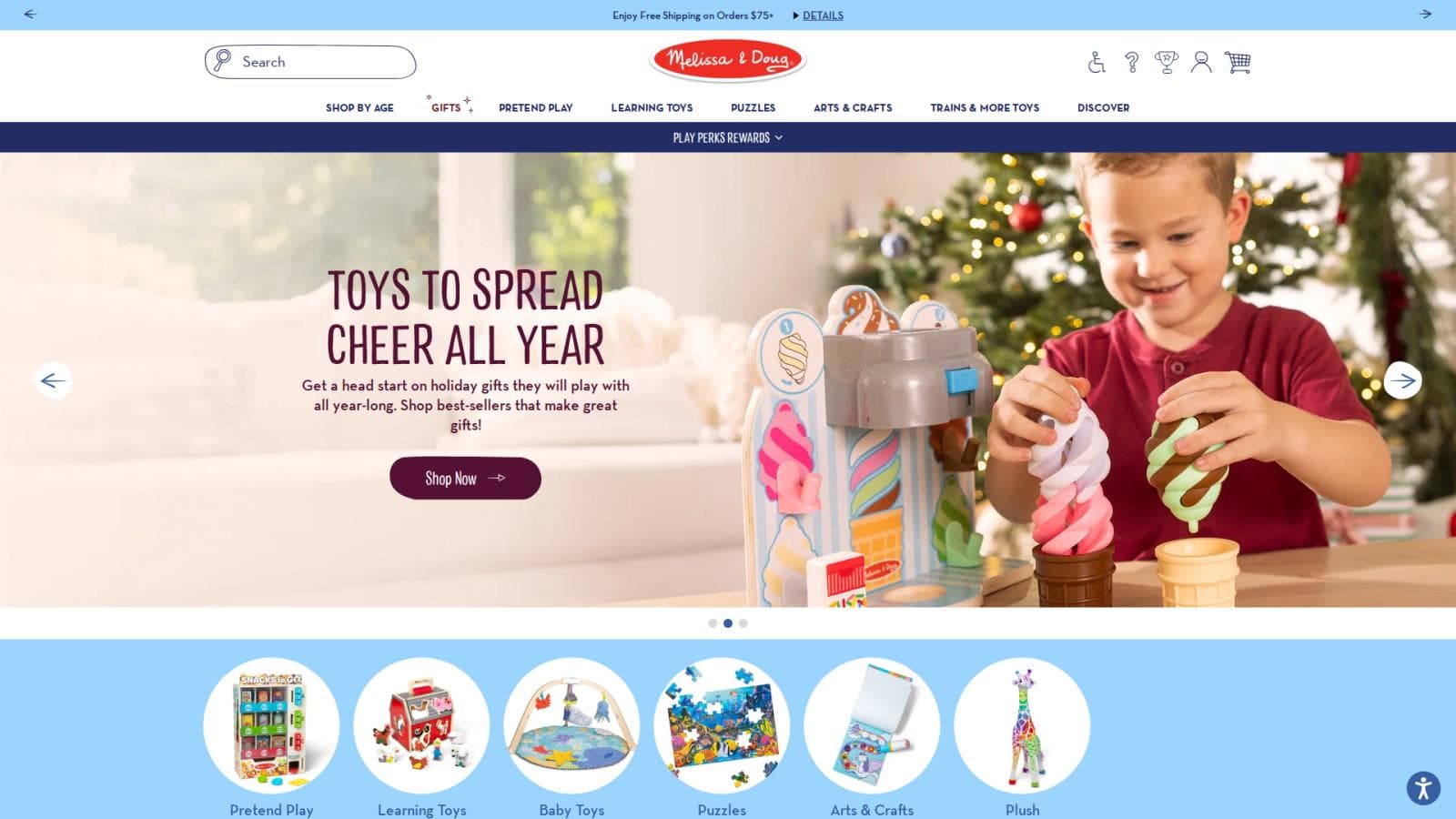
 Melissa & Doug homepage, desktop viewport (1920×1080), captured 24 October 2026 with cookie banners and popups accepted or closed where possible.
With the consent panel dismissed, the page reads as a calm, family-friendly storefront. A pale blue announcement bar, a hand-lettered red logo and a single-row menu (Shop by Age, Gifts, Pretend Play, Learning Toys, Puzzles, Arts & Crafts) frame a full-width slider. The slide pairs a plum condensed headline, 'Toys to Spread Cheer All Year', with a boy playing with an ice-cream set beside a Christmas tree; the plum on soft cream is legible and the rounded 'Shop Now' button is easy to find. Directly below the slider, round product thumbnails (Pretend Play, Learning Toys, Baby Toys, Puzzles, Arts & Crafts, Plush) give a second, visual way into the catalogue. The navy 'Play Perks Rewards' strip adds a loyalty hook but also adds a third horizontal band above the hero. The slider arrows are large and clear, though auto-rotating slides can hide a message before it is read.
Design lesson: Back a lifestyle hero with a row of round, image-led category shortcuts.
02 Exploding Kittens
2. Black Canvas, Yellow Slab Type and Two Stacked Hero Panels
 Exploding Kittens homepage, desktop viewport (1920×1080), captured 24 October 2026 with cookie banners and popups accepted or closed where possible.
The email popup is gone, and what remains is a bold, game-box-first page. A near-black header carries a compact logo, a maroon 'Games' dropdown button next to cream Puzzles, Collectibles and Instructions buttons, plus search, currency, account and cart icons. The first banner is a laughing player holding cards beside two game boxes, with a huge hand-drawn 'New Games Just Dropped!' on a yellow slash and a red 'Shop All New Games' button, which is the clearest call to action on the page. A second panel for the Rage Mode game uses large red-highlighted type that reads like a game rulebook. The nav buttons look more like pills than links, which is distinctive but heavier than needed. A small 'Get 15% Off' tab and a chat bubble remain at the bottom corners. The two big banners together push product grids below the fold.
Design lesson: Let one oversized, brand-voiced headline and one bright button carry the first screen.
03 Magna-Tiles
3. Rounded Brand-Colour Hero with a Rewards-First Menu
 Magna-Tiles homepage, desktop viewport (1920×1080), captured 24 October 2026 with cookie banners and popups accepted or closed where possible.
A purple announcement bar for a free blind bag over $85 sits above a white header that holds the logo, a six-item menu (Rewards in purple, Shop, Bundle & Save, Explore, Learning Hub, Magna-Tales) and four utility icons. The popup that covered the first view is closed, though a vertical 'Sign up & save' tab, a cookie button and a chat bubble remain at the edges. The rounded hero slide is deep navy with a lime-green tile, a pink triangle and a green shape, set beside a photograph of a child driving a magnetic police truck, and the 'Welcome to MAGNA-TILES' headline in large white type is highly legible. The product itself is shown as colour and shape, which suits a building toy. 'Explore Sets Today' is an outlined pill that is understated for the main action. The tagline beneath, with an orange 'About MAGNA-TILES' button, is a warm brand statement but pushes shopping lower.
Design lesson: Use your product's own colours and shapes as the hero's graphic language.
04 Piecework Puzzles
4. Two Stacked Campaigns in Burgundy, Lime and Candy Pink
 Piecework Puzzles homepage, desktop viewport (1920×1080), captured 24 October 2026 with cookie banners and popups accepted or closed where possible.
The page works like a magazine spread. A burgundy sale module places a scalloped photo of tennis balls and a boxed game on the left, a serif headline, 'The More You Stuff, The More You Save', in the middle and three flat blocks, lime, lime and pink, for 20%, 30% and 40% off on the right. At this width the offer logic is easier to take in than in a narrow view, and the pink pill 'Shop the Sale' button stands out against the dark burgundy. Below, a full-bleed photograph of ruffled pillows carries a white serif headline, 'Piecework's Soft Side', and a second pink button. The menu is tiny, set in a light serif with a dotted-outline sale link, which looks elegant but is small to read. The page sells home goods as much as puzzles, so a first-time visitor may not see the puzzle range at all. White text over a busy, mid-tone photograph is only moderately legible.
Design lesson: Stacked campaign bands can sell several ranges at once, but keep your core product in view.
05 Mattel Creations
5. Collector Franchise Tiles Behind a Consent Confirmation Dialog
 Mattel Creations homepage, desktop viewport (1920×1080), captured 24 October 2026 with cookie banners and popups accepted or closed where possible.
A Mattel cookie confirmation dialog ('You have successfully updated your Cookie settings') could not be closed automatically and still dims the page, so this entry is judged on what remains visible. A black utility bar carries an accessibility link and a rewards link, and the header holds a spaced-capitals logo with Sign In, search, wishlist and bag icons. A row of franchise logos (Hot Wheels Collectors, Matchbox) sits above a dark, cinematic Batman slide with a 'Pre-Order' button. Under it, tall, saturated tiles for Exclusives, New Arrivals, Vehicles, Dolls, Action Figures, Merch and Pop Culture each show a single product cut-out, a strong, scannable shelf for collectors. The pre-order button is a flat grey rectangle with low emphasis for a purchase action. Carousel dots and a pause control are small. The most useful lesson is the interest-based tiles, which let fans jump straight to their category.
Design lesson: For collector audiences, give each interest its own colour-coded tile with one hero product.
06 Tonies US
6. Rounded Coral Hero, Trust Row and Product-Type Shelf
 Tonies US homepage, desktop viewport (1920×1080), captured 24 October 2026 with cookie banners and popups accepted or closed where possible.
A white announcement bar, a clean header with a red logo and a red 'Bundle & Save' pill, and a large coral hero with a rounded lower edge set a warm, child-safe tone. The headline 'Our Birthday, Your Treat!' is large and white, though white on this light coral is only moderate in contrast, and the 20% off starburst next to a child listening on headphones makes the offer easy to read. A solid red 'Shop now' button and a white 'Bundle & save' button give a clear primary and secondary choice. Immediately under the slider, a three-item trust row (100 day happiness guarantee, free shipping over $45, pay later with Shop Pay) handles common doubts before any scrolling. The next section, 'Best Deals!', starts with a Birthday sale tile and green 'Extra savings' badges, so the sale is repeated in the announcement bar, hero and shelf. The nav uses chevrons for dropdowns and keeps product types distinct.
Design lesson: Put guarantee, shipping and payment-plan cues in one compact row right below the hero.
07 Crazy Aaron's
7. Full-Bleed Product Poster with Sticker-Style Brand Illustration
 Crazy Aaron's homepage, desktop viewport (1920×1080), captured 24 October 2026 with cookie banners and popups accepted or closed where possible.
Without the newsletter popup the hero finally gets to speak. A huge slide for 'Better Butter' putty combines a stretched yellow putty photograph, a cartoon cow and toast characters, a chunky purple 'Better Butter' wordmark and a pack shot, with a purple 'Shop Now' button below. It is loud, playful and clearly about a sensory toy. Above it, two announcement bars stack (welcome message, restocking alert) and are followed by a large header with a wide search bar, login and cart, then a yellow nav bar with Thinking Putty, Slime Charmers, Wonder Falls, Play, Learn and utility links such as Store Locator. The two announcement bars and the tall header take space before the poster begins, and the 'Shop Now' button sits near the bottom of the first screen. The low-contrast grey utility links on yellow are hard to read. A rewards button floats at bottom right.
Design lesson: A product-led poster hero can carry a sensory toy better than a lifestyle photo.
08 Big Potato Games
8. Oversized Condensed Headline over a Full-Bleed Play Video
 Big Potato Games homepage, desktop viewport (1920×1080), captured 24 October 2026 with cookie banners and popups accepted or closed where possible.
The hero is a full-width video-style scene of two people playing a catching game in a kitchen, with the headline 'Game Night Is So Back' set in huge white condensed capitals and two chunky yellow buttons, Shop All and Shop TV Games. It shows the games being played rather than boxed, which conveys the tone of the brand more quickly than product shots. A floating white navigation pill holds Shop Games and Learn dropdowns, the centred logo, Find Your Match, search and a pink basket tab. A pink strip above offers a free bag with a Noodle Flip purchase in tiny type. The hero photograph is busy and the white headline relies on weight and a darkened scene for legibility, so a subtle overlay would help. Beneath the curve, a yellow section starts a 'Board Games for' heading, hinting at audience-based browsing. The page makes the first click obvious.
Design lesson: Show people actually playing; it sells a party game faster than a pack shot.
09 Orchard Toys
9. Letter-Pattern Blue Hero with a Wide Shop-by-Range Carousel
 Orchard Toys homepage, desktop viewport (1920×1080), captured 24 October 2026 with cookie banners and popups accepted or closed where possible.
On a wide screen the header is richer: a navy circular logo, a text menu (Games, Jigsaw Puzzles, Colouring Books, Baby and Toddler, Shop by Age, Bluey, Peter Rabbit) and a rounded search box with wishlist, account and basket icons. Two top strips announce a misplaced pieces service and free activity sheets. The hero is a sky-blue field of faint lowercase letters, with the 'Learning made fun for over 50 Years' lockup, a bee mascot, and a circular torn-paper photo of a parent and child around a board game. The navy 'Shop now' and outlined 'About us' buttons are clear but small compared with the hero. The curved white edge leads to a 'Shop by range' carousel with a 'View all collections' button, which uses photographs of children playing. The empty blue space between the logo lockup and the photo wastes some width. Nav entries by age and by licence (Bluey, Peter Rabbit) help gift buyers.
Design lesson: Offer navigation by age and by licence so gift buyers can start from what they know.
10 Jaques of London
10. Illustrated Winter Shopfront with a Code-Led Discount
 Jaques of London homepage, desktop viewport (1920×1080), screenshot supplied by the site owner.
This screenshot was supplied by the site owner rather than captured by the script. A dark green announcement bar shows a sitewide offer and code, above a white header with a serif logo and a wide menu of dropdowns (Christmas, Black Friday, New & Trending, Toys, Games, Shop By Age, Gifts & Bundles, Our Story). The hero is a full-width illustration of a snow-covered toy shop, its sign reading 'J. Jaques & Son, Oldest Toys & Games Maker', with the large white line '20% Off Sitewide' and an outlined 'Use code: EARLY20' button. The artwork is charming, heritage-led and on a single colour palette of green, cream and gold, but the outlined 'Shop Now' button is understated for the main action. A scrolling strip of free-gift thresholds (£40, £60, £80, £120) sits below, followed by an 'Early Black Friday Sale' heading and photographic tiles. A 'Flash Deals' tab clings to the right edge. The dense menu serves a large catalogue, but its many dropdowns are small to scan.
Design lesson: Heritage branding works best when the offer and code are as clear as the artwork.
11 Bigjigs Toys
11. Screenshot unavailable
Screenshot unavailable. A verified 1920×1080 homepage capture of this store could not be accepted, so no design commentary is given.
Source: https://www.bigjigstoys.co.uk/
Reason: the store's homepage did not finish loading during the capture attempts.
12 Plum Play
12. Trust Strip, Seasonal Banner and Outdoor-Play Photography
 Plum Play homepage, desktop viewport (1920×1080), captured 24 October 2026 with cookie banners and popups accepted or closed where possible.
With the signup popup closed, the structure of the page is clear. A white header holds a pink logo, a wide rounded search box and utility icons, with a grey menu strip below (Discovery Range, Trampolines, Swings & Slides, Climbing Frames, Outdoor Toys, Scooters & Ride-ons, Brands, Outlet) and a pink 'Deals' button. Right under it, a trust strip states '35+ Years of Ethically Made Play', a 4.7 star rating and '0% Finance Options', which suits high-ticket garden play equipment. The hero is a wide seasonal banner with a purple Halloween panel, hand-lettered 'Spooktacular Fun', and a photograph of children on swings; the orange headline reads well on purple, though the white subline is small. A 'Top picks for the seasons' carousel follows in maroon. A 'Want 5% Off?' tab, a chat prompt and a chat button remain at the bottom corners. The hero has no direct button, so the whole banner has to act as the link.
Design lesson: For expensive items, put rating and finance reassurance directly under the menu.
13 Ginger Fox
13. Orange Brand Header with a TV-Licence Hero and Priced Best Sellers
 Ginger Fox homepage, desktop viewport (1920×1080), captured 24 October 2026 with cookie banners and popups accepted or closed where possible.
A saturated orange header with a white logo, a wide search bar and a cart icon makes the brand instantly recognisable, with a darker orange menu below (Games, Coming Soon, Professor Puzzle, Blogs, Wholesale). The menu items are spread very wide on a large screen, which loosens the grouping, and white text on orange is only moderately legible. A navy band carries a family favourites link and a free-delivery progress message ('Spend another £15.00 to get free delivery'), a useful conversion cue. The hero banner for a Taskmaster board game uses a cream paper texture, a typewriter-style headline, rubber ducks, a gold-framed 'Shop Now' button and the show's two presenters, which is eye-catching and clear about the licence. The 'Best Sellers' row below shows boxed games with names, which supports quick comparison, though prices fall just below the fold in this view. A 'Message us' button floats at the bottom right.
Design lesson: A free-delivery progress message and a licence-led hero help shoppers act without clicking around.
14 Modiphius Entertainment
14. Warehouse-Sale Takeover with a Full Franchise Menu
 Modiphius Entertainment homepage, desktop viewport (1920×1080), captured 24 October 2026 with cookie banners and popups accepted or closed where possible.
At this width the header is more informative: a blue notice bar with social icons, a warehouse-delay message for EU customers and a UK | GBP selector, then a white bar with a small logo, a menu of Our Games, Fallout, Star Trek, Wargames and Other Games, and rounded search, saved-list, account and cart buttons. The menu is the useful part, since it names the franchises a fan would look for. The hero, however, is a darkened stock photograph of cardboard boxes with a huge white sans-serif 'Warehouse Clearance Sale' headline, a line promising massive discounts on over 300 products, and a rounded blue 'View Collection' button. The offer is unmistakable and the button has strong contrast, but the image says nothing about games and the plain system-style type does not match the brand's character. A rewards badge and a scroll-up button peek in at the bottom. Showing a few discounted products would make the sale more tempting.
Design lesson: Name your biggest franchises in the menu, and show discounted products in a sale hero rather than stock boxes.
15 Tiger Tribe
15. Calm Beige Header with an Inset Card on Baby-Toy Photography
 Tiger Tribe homepage, desktop viewport (1920×1080), captured 24 October 2026 with cookie banners and popups accepted or closed where possible.
A bright orange free-shipping bar sits over a warm beige header with a boxed tiger logo, three wide-tracked menu items (Shop with a dropdown, Sale, New) and search, account and cart icons. The hero is a soft photograph of pastel bear and mouse toys on faux fur, with a white rounded card at the left carrying 'Discover our New Arrivals', a short line of copy and an underlined 'View now' link. At this width the photograph is large and the products are easy to see, which is the strength of the page. The weak point is the call to action: it is a small underlined link inside a big card, where a filled button would have more weight. The three-item menu keeps discovery simple but gives little guidance by age or product type. Below, a 'New Arrivals' heading with a 'View all' link starts a product row, partly visible at the fold. The cream and beige palette is calm and cohesive.
Design lesson: A single inset card on a calm photo keeps copy readable, but give the call to action a real button shape.
16 Make Me Iconic
16. Story-Led Nostalgia Hero with an Orange Promise Band
 Make Me Iconic homepage, desktop viewport (1920×1080), captured 24 October 2026 with cookie banners and popups accepted or closed where possible.
The header is a transparent overlay on the hero photograph: spaced white capitals for the logo, a centred menu (Shop By, Toys, Homewares, Gifts, Best Sellers, Bundle & Save, Outlet, Explore) and a flag, currency and icon cluster on the right. White text over a busy, mid-tone photograph is not always easy to read. The photograph itself is distinctive, a worn sneaker beside a wooden orange ute and painted figures, and the lines 'Aussie icons, beautifully made to last' and 'Where play meets nostalgia' set a clear emotional tone. A small orange 'Shop Now' button is easy to find. Immediately below, an orange band lists free shipping over $120, weekday customer service and a money-back guarantee in three evenly spaced columns, followed by a centred statement, 'Celebrating Aussie icons with style & a little bit of fun'. A black announcement bar and a chat button complete the frame. The hero is story-led rather than product-led.
Design lesson: Anchor a story-led hero with a full-width band of service promises directly below it.
17 Alimrose
17. Boutique Serif Header over a Five-Bear Product Line-Up
 Alimrose homepage, desktop viewport (1920×1080), captured 24 October 2026 with cookie banners and popups accepted or closed where possible.
A dusty-pink announcement bar offers a free gift over $150, and a centred serif logo with the line 'Give. Inspire. Play.' sits between a search icon on the left and a country selector, account and cart on the right. A single-row menu (New Arrivals, Baby Gift Sets, Dolls, Soft Toys & Rattles, Clothing, Nursery, Accessories, Gift Cards) uses small capitals and chevrons. The hero is a full-width product line-up of five curly bears in caramel, brown, oatmeal, ivory and pink on a pale pink background, with 'Meet Charlie Baby Bear' in large brown serif type. It communicates the product range and its colour choices at a glance and the palette is gentle and cohesive. There is no visible button or link text on the banner, so the next step is not stated. 'Customer Favourites' follows in brown capitals, with product images cut off at the fold. A rewards badge and an accessibility icon sit at the edges.
Design lesson: A line-up hero shows colour choices at a glance; add a button so the banner also tells people what to do.
18 MierEdu
18. Purple Brand Crest above a Product-in-Use Hero
 MierEdu homepage, desktop viewport (1920×1080), captured 24 October 2026 with cookie banners and popups accepted or closed where possible.
A tall purple crest logo hangs at the centre of the header, with a quiet 'Search our store' field on the left and account and cart icons on the right. The menu beneath is wide and generous (Home, Products, Learning, Puzzles, Games, Arts & Crafts, About Us, Blog, Contact) with dropdown chevrons and an underline on the active page. The hero is a large rounded photograph of a child placing dinosaur pieces on a magnetic scene, with the purple headline 'Learn interesting facts about dinosaurs!' and an 'Order Now' pill. It shows the product being used, which tells a parent what the toy does. The small 'Develop · Improve Cognitive Skills' text over the photograph is too small and low in contrast to read, and the 'Order Now' pill sits near the lower right where the picture is busiest. The crest, header and nav use much of the first screen before the hero starts. The purple is used consistently for text, nav and buttons.
Design lesson: Show the toy in use and state what it teaches, but keep supporting text large enough to read.
19 O.B. Designs
19. Sage-Green Frame around a Coastal Lifestyle Photograph
 O.B. Designs homepage, desktop viewport (1920×1080), captured 24 October 2026 with cookie banners and popups accepted or closed where possible.
With the discount popup closed, the page shows its structure. A sage-green announcement bar mentions free shipping over $120 and Afterpay, above a white header with the koala logo on the left, a centred menu (New In, Best Sellers, Gifts, Crochet Baby Blankets, Soft Plush toys, Bag Charms, Baby Essentials, Nursery, Tableware, Sale, Reviews) and a currency selector, account, search and cart icons. The menu is clear and gives a sense of the range, including a Reviews link as a trust cue. The hero photograph of two children with soft toys on a beach log is warm and on-brand, with an 'Australian designed since 2008' ribbon, a white serif headline, 'Soft companions inspired by our unique wildlife and wide open spaces.' and a peach 'Shop Aussie Soft Toys' button. The white text sits on a mid-tone sandy area, so its contrast is moderate. Slider dots at the lower right are tiny. The sage panel beginning below keeps the colour story.
Design lesson: Use one brand colour across the bar, logo and call to action so the page feels unified.
20 Playgro
20. Bright Bath-Time Photo Hero under a Navy Header
 Playgro homepage, desktop viewport (1920×1080), captured 24 October 2026 with cookie banners and popups accepted or closed where possible.
A magenta announcement bar with a rotating message sits above a deep navy header with a glossy blue logo, a centred menu (Shop By Age, Toys, Feeding & Baby Care, Bundle & Save, Hot Deals) and mail, search, account and cart icons. The hero is a bright bath-time scene of a smiling baby with a parent and floating toys, with giant aqua type reading 'Ready for fun in the tub!?' and a line, 'Check Out Our Splashy Favourites', and a square blue 'Water Fun!' button. The imagery is warm and shows the products in use, and the aqua letters pop against the white bathroom. The headline is so large that it competes with the photo, and the button is small and sits far from the text, in the lower left. White subtext over the bright photo is less legible. The slider indicators are thin lines. 'Shop By Age' leads the menu, which fits a baby-product audience.
Design lesson: Lead the menu with age stages when parents shop by development.
21 Nana Huchy
21. Textured Teal Header and Three Tall Lifestyle Portraits
 Nana Huchy homepage, desktop viewport (1920×1080), captured 24 October 2026 with cookie banners and popups accepted or closed where possible.
With the popup closed, the page is calm and distinctly crafted. A salmon bar announces free shipping on orders of $120+ in AUD, NZD and USD, with 'Trade customers' and a phone number at the edges, an unusual and reassuring detail. A watercolour-textured teal header holds a hand-drawn house logo with a script line, 'Making memories for 20+ years', and a currency selector, search, account and bag icons. A white menu below lists New Arrivals in pink, Best Sellers, Christmas, Personalised, Bundles, Children, Comforters, For the Home, Cards, Gift Guide and Sale, which covers gifting occasions well. Three tall photographs show people holding broccoli and banana soft toys, with a single dark label button, 'Shop Nana's Farmers Market', on the middle one. The rest of the page has no visible button, so the other two images are unlabelled. A large serif brand statement follows.
Design lesson: Show toys held by real people, and label every image with where it leads.
22 CrunchLabs
22. Rounded Video Hero with a Founder Quote and Colour-Block Stats
 CrunchLabs homepage, desktop viewport (1920×1080), captured 24 October 2026 with cookie banners and popups accepted or closed where possible.
A large rounded video hero fills the first screen, showing a man assembling a robot kit at a desk beside a laptop. Its nav floats inside the frame (Subscriptions, Shop More, Our Company, a centred logo, cart and a red Sign In pill) and the headline 'Think like an engineer.' is huge, white and highly legible. A short line, 'Build a toy. Hack a robot. Create your world.', and a red 'Get Started' pill with a navy arrow give a clear action, and an 'Unmute' control acknowledges the sound. Directly beneath, a founder quote from Mark Rober and three colour-block cards show 4.8 / 5.0 average rating, 98% parents see impact and 100% eco-friendly, which are the site's own claims and are not verified here. The proof row fits neatly in the first screen at this width. The chat bubble overlaps the quote at the lower left.
Design lesson: Use a person, a bold headline and colour-block proof tiles to turn a subscription box into a story.
23 The Woobles
23. Screenshot unavailable
Screenshot unavailable. A verified 1920×1080 homepage capture of this store could not be accepted, so no design commentary is given.
Source: https://thewoobles.com/
Reason: the store's homepage did not finish loading during the capture attempts.
24 Glitch Plays
24. Purple Blob Backgrounds with a Price-Pill Plush Shelf
 Glitch Plays homepage, desktop viewport (1920×1080), captured 24 October 2026 with cookie banners and popups accepted or closed where possible.
A saturated violet header, decorated with stars and moons, holds a bubble-font logo, a 'United States | USD $' selector, search, account and a yellow 'Cart' pill, with a darker nav strip (Home, Shop All, Plushies, Freebies, FAQ, About) below. The page goes straight into a 'Glitch Plushies!' shelf of five white rounded product cards with names and yellow price pills ($49.99, $27.99, $27.99, $29.99, $149.99 USD), so the catalogue and its prices are visible in the first screen. Yellow on purple gives strong contrast and the organic blob shapes feel like the creators' own world. The price pills sit at slightly different heights where product names wrap onto two lines, which looks a little uneven, and the cards have no 'add to cart' wording. A 'Meet Mochi & Tanuki!' heading begins a character story below the shelf. There is no sale banner, so the focus stays on products.
Design lesson: Align product-card prices to one baseline so a grid feels tidy.
25 Manhattan Toy
25. Four Tall Photo Cards That Sort by Brand and Age Stage
 Manhattan Toy homepage, desktop viewport (1920×1080), captured 24 October 2026 with cookie banners and popups accepted or closed where possible.
A brown utility bar carries social links, a US free-shipping message and country flags, above a header with search, a centred crown logo, account and cart icons. The menu has a pink Groovy Girls logo link, Shop Toys, Bundles of Wonder, Explore Our Brands and About. The strongest idea is the row of four tall rounded photo cards, Groovy Girls, Love Stella, Infant Toys and Bundles, each with a white heading, a one-line description and an arrow, which lets a visitor choose by brand or by stage in a single glance. The photography of children and parents with the toys is warm and consistent. White text over lighter parts of the photographs, especially on the Bundles card, is a contrast risk. A confetti-dot divider in blue, yellow and coral leads into 'Shop by Age' with 0-12 months, 1-3 years and 3-5 years tabs, a handy age filter. Two floating accessibility buttons sit at the lower right.
Design lesson: Use tall, photo-led category cards to let shoppers sort by brand or age in one glance.
26 Bella Luna Toys
26. Screenshot unavailable
Screenshot unavailable. A verified 1920×1080 homepage capture of this store could not be accepted, so no design commentary is given.
Source: https://www.bellalunatoys.com/
Reason: the store's homepage did not finish loading during the capture attempts.
27 Pusheen Shop
27. Blush-Pink Header and a Two-Panel Mascot Product Hero
 Pusheen Shop homepage, desktop viewport (1920×1080), captured 24 October 2026 with cookie banners and popups accepted or closed where possible.
With the signup popup closed, the page opens on a calm, pastel layout. A dark chocolate announcement bar promotes the new Fluffy Penguin Plush, and a blush-pink header holds the large hand-lettered logo with the grey cat mascot, search, account and cart icons, and a centred menu (New, Exclusives, Plush & Collectibles, Clothing, Accessories, Home & Office, Collections). The hero is a clean two-panel split: a photograph of the plush in a penguin costume beside a lavender panel with sparkles, an 'Exclusive' label, the italic title 'Fluffy Penguin Plush' and a solid brown 'Shop' button. The brown on lavender and the brown button on pale colours are readable, and the product is the clear focus. The page is spacious, though the large pink header and big panels push everything below, including the next product row, off the first screen. The same brown is used for type, bar and button, which keeps the identity tight.
Design lesson: A two-panel hero, with a photo on one side and a single clear button on the other, keeps a product launch simple.
28 Warmies USA
28. Screenshot unavailable
Screenshot unavailable. A verified 1920×1080 homepage capture of this store could not be accepted, so no design commentary is given.
Source: https://warmies.com/
Reason: the store's homepage did not finish loading during the capture attempts.
29 Youtooz Collectibles
29. Poster-Wall Layout Led by Franchise Artwork
 Youtooz Collectibles homepage, desktop viewport (1920×1080), captured 24 October 2026 with cookie banners and popups accepted or closed where possible.
The first screen is a dense wall of character panels, each with its own colour, title lettering and a rounded black 'Buy' button: Five Nights at Freddy's twice, Dead Rails, Max Design Pro, Verity, Laika: Wildwood and Jonah Scott: Klawed! The panels are slightly skewed, which adds a comic-poster energy. A pink 'Spooktooz' countdown banner sits under a minimal white header with Community, Gone Soon and Upcoming Drops, which uses scarcity as a theme for collectibles. The repeated 'Buy' buttons are consistent and high in contrast, so every card has a clear action. The risk is density: many bright images and titles compete for attention, and there is no overall headline telling a new visitor what the shop is. A further row of tall cards (Slime Rancher, Adventure Time, The Binding of Isaac, Spyro, Subnautica, Rick and Morty, Cult of the Lamb, Crash Bandicoot, Obsession, Saw) shows how many licences are available. Search is a single pink round button.
Design lesson: For fandom-driven catalogues, let franchise artwork lead and give every card one identical button.
30 Mastermind Toys
30. Retail-Style Header with Delivery Services and a Seasonal Hero
 Mastermind Toys homepage, desktop viewport (1920×1080), captured 24 October 2026 with cookie banners and popups accepted or closed where possible.
With the first-order popup closed, the page behaves like a store directory. A blue top bar offers a phone number, a free-shipping message for Canada and a 'Find a store' link, and a wide search bar sits beside a two-row menu (Gifts in red, Collectors Corner, Baby & Preschool, Arts & Crafts, Science & Education, Shop by Department, Deal Shop). A navy pick-up-in-store strip and a blue same-day-delivery announcement with gift-box and car illustrations stack above the hero, which shows how much service information the brand carries. The Halloween hero, a toddler in a clown costume among pumpkins, uses a '50% off' headline and a blue 'Shop Now' button that is partly low in contrast on the darker photograph. These three bands mean the hero starts roughly halfway down the first screen. Accessibility and chat buttons sit at the bottom corners. The 'Gifts' item in red adds a little emphasis in an otherwise uniform blue menu.
Design lesson: If you have strong delivery services, give them one clear band, not several, so the hero starts higher.