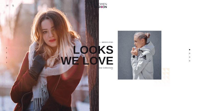
Women Clothings - Design Inspiration

1. Boden US | Women's, Men's, Boys', Girls' & Baby Clothing and Accessories
Boden US | Women's, Men's, Boys', Girls' & Baby Clothing and Accessories
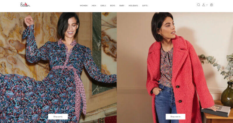
Bold colours and geometric shapes characterise the design of www.bodenusa.com, a website that aims to reflect the aesthetic of the present day. The most recent collections are shown prominently on the site, alongside vivid, attention-grabbing photography that entices shoppers to click through and check out more. You may rapidly narrow your results by category or collection using the menu bar on the left, while the search bar and main navigation bar are front and centre at the top of the page. Customers may quickly find what they're looking for without having to wade through infinite pages of product listings by browsing featured products that can be sorted through several categories such as apparel, shoes, accessories, etc.
2. Missguided US: Women's Clothes | Online Fashion Store
Missguided US: Women's Clothes | Online Fashion Store
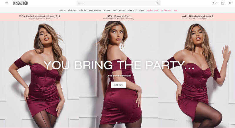
https://www.missguided.co.uk/ The layout of is new and exciting. The background of the website is black, but there are spots of pink, blue, and yellow on it. On the homepage, there is a navigation bar at the top, as well as an interesting carousel banner that shows off new products and specials. Below this is a list of categories, like "New In," "Clothing," and "Sale," that are meant to help customers find what they need quickly. There are also links to their social media pages. Customers who know exactly what they want can use the search box at the top right of every page. Missguided's style is perfect for finding design inspiration and getting help with website design. It also makes for a fun shopping experience that makes customers want to see what else the brand has to offer.
3. Express
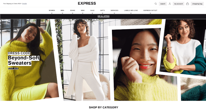
The style of the women's clothes on the website https://www.express.com/ is best described as warm and modern. The colour scheme is made up of white for the background, black or dark text, and bits of yellow and different shades of grey for buttons and other graphic parts. In addition to a big hero image that shows the fashion trends for this season, the Express homepage has many blocks that show off different collections or product categories. They also have links to their social media accounts and a rotating carousel that shows products that are new or on sale. With the simple menu bar in the top left corner, which has drop-down options for each category, it's easy to find what you're looking for. Overall, the result is an e-commerce platform that is simple, elegant, and easy to use. This was done by taking design ideas from the latest trends in Website Design Services.
4. Lulus
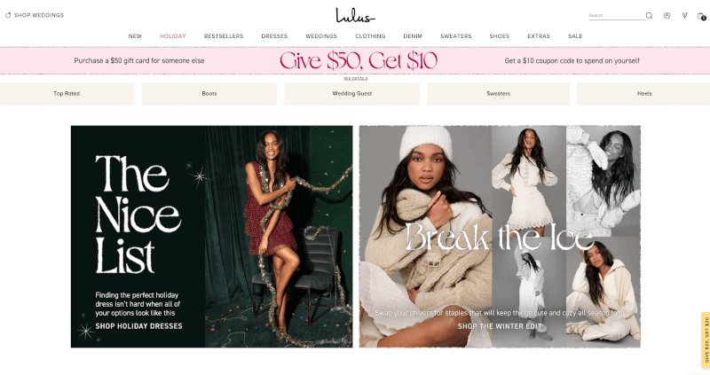
https://www.lulus.com/ is a website that features a sleek, fashion-forward style. It has a white background with pastel highlights, making it feel warm and welcoming. The text is large and legible, making it simple for visitors to peruse the site's wares. Categories like "Dresses," "Tops," "Shoes," and "Accessories" are prominently displayed in the primary navigation bar at the top of the page. Links to categories like "New Arrivals" and "Best Sellers" are conveniently located on the page's left side to help shoppers locate them fast. In addition, the website makes use of high-quality imagery, such as product photographs, to present Lulus's clothing lines in a way that is both engaging and conducive to making a purchase. In sum, this site is a fantastic illustration of how Design Inspiration and Website Design Services can be used together to produce an exciting e-commerce environment.
5. Oneill
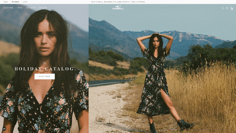
The style of the website https://us.oneill.com/pages/womens, which is simple but appealing, was clearly influenced by the laid-back yet trendy style of Southern California. On the home page, there is a large image of a woman wearing an O'Neill swimsuit, with the ocean in the background. This image draws the eye and helps the company connect right away with its target audience.
Under this is a horizontal menu that lets you get to the different parts of the site, like the company's blog and social media pages. Customers can look through featured products, new arrivals, bestsellers, sale items, and more in the following sections to find the exact item they want as quickly as possible.
6. Thereformation
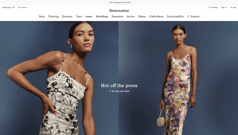
The clean, simple design of https://www.thereformation.com/ makes it a very inspiring website. The name of the website is written in white letters on a black box on the homepage's large banner image. This makes it easy to recognise and gives it a professional look. Scroll down to see a carousel of products, links to the store's blog and page with the newest products, and other parts of the website. For ease of use, the rest of the homepage is divided into many sections, such as Shop Women, Shop Men, Sale & Offers, and so on. Each section has its own subheadings and drop-down menus.
7. Fashiontiy
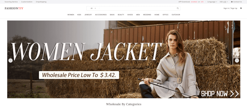
FashionTiy is a platform where you can find web design assistance and inspiration for your own projects. The site features a modern layout with sleek lines and neutral colors. The homepage prominently displays a banner image with the bold headline "Design Inspiration + Website Design Services." The main content of the homepage is divided into two key sections: "Design Inspirations" and "Website Design Services," making it easy for users to navigate and explore.
Overall, the design of Fashiontiy is nice to look at and easy to use. It gives people access to both design ideas and web development services that can be changed to fit their needs.
8. Eshakti
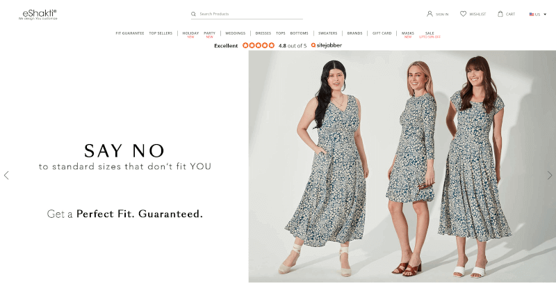
The clean and simple design of https://www.eshakti.com/ was meant to make shopping as easy as possible for the site's customers. On the homepage, the grey background is neutral, the writing is stark white, and there are dramatic black accents. The main menu has a search box, a logo for the brand, and drop-down menus for choosing different items of clothing. Just below this is a carousel of photos that shows different things in their shop every few seconds, as well as the most recently featured items. At the bottom of the page, you can find links to Design Inspiration sites. These sites show consumer feedback from social media sites like Instagram or Twitter and give tips on how to style certain pieces of clothing. Customers can also find out more about eShakti's Website Design Services, which can help them make clothes that fit them perfectly and match their style. Lastly, the Graphic Design Firms link lets eShakti and professional graphic designers work together to make beautiful prints for eShakti's clothing. This gives customers a chance to show their individuality through the clothes they wear.
9. Wforwoman
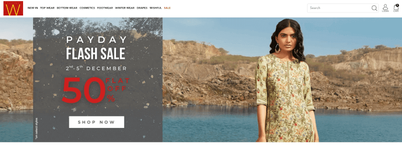
The design and layout of https://wforwoman.com/ are both modern and well-done. It uses a lot of different ways to decorate to make an inspiring and elegant atmosphere. The white space and few design elements on the site make the pictures stand out and give it a professional look. The site's top navigation is easy to use and has quick links to shopping, information about the company, and contact information. In conclusion, this website is a great place to get ideas and information about women's fashion because it is both stylish and full of useful information.
10. Columbia
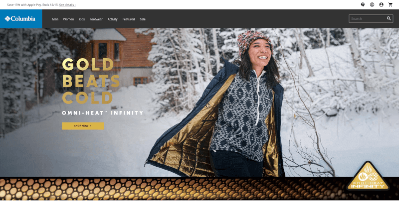
The website https://www.columbia.com/ was made with the idea that people like to explore and try new things. Full-width banner images on the website show how the seasons change to get people excited about what's to come. The website is divided into three main sections: clothing for men, clothing for women, and clothing for kids. In the navigation bar, all of the different kinds of clothes and accessories are laid out clearly, with direct links to where they can be found. With the product filters on each category page, customers can quickly and easily narrow down their search results by size, colour, or style.
11. Eloquii
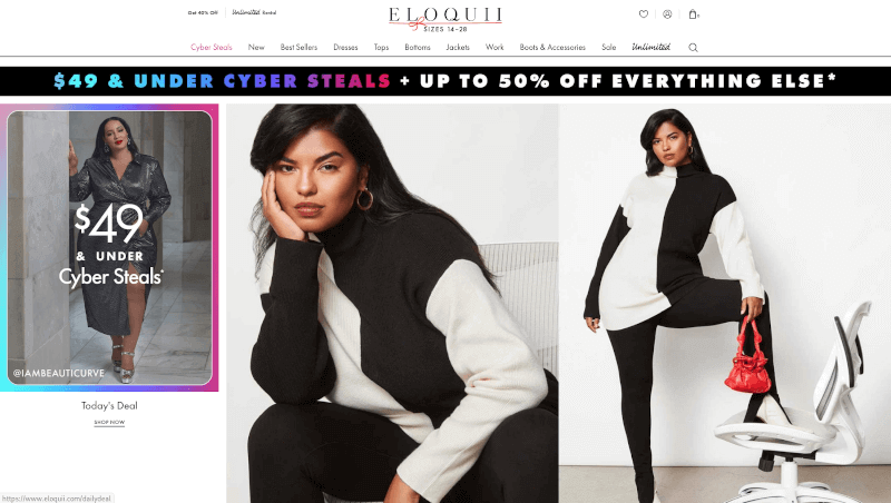
Eloquii.com is a place where web designers can find resources and get help. The site looks and feels modern and cutting-edge, with lots of bright colours and big, bold fonts. The homepage header shows a stylish outfit, and the images in the background show the different kinds of things for sale. On the left side of the page, there are links to dresses, tops, bottoms, and accessories, among other things. Below is a link to new items and items on sale, which will help customers find what they need quickly. Customers can also make it easier to find the right outfit by choosing the right size or event.
12. Talbots
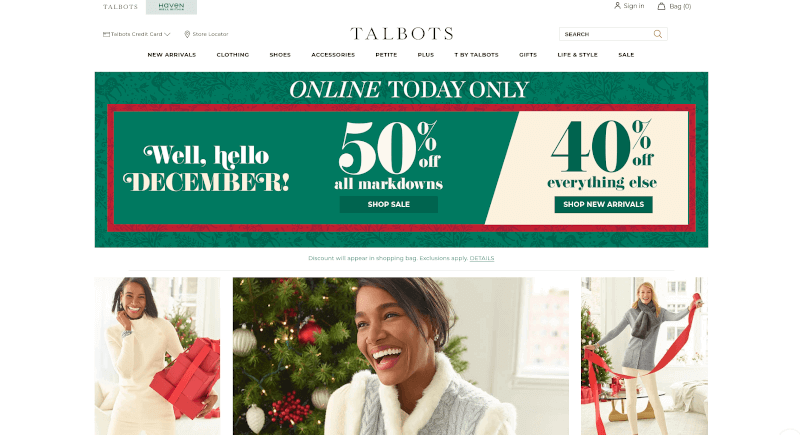
The layout of Talbots.com is based on a more traditional style. With its classic black-and-white colour scheme and gold accents, the homepage gives off an air of refined elegance. The newest fashion trends, sales, and seasonal collections are all put together in a way that is easy to understand. The top navigation bar makes it easy to get to categories like Women's Clothing, Accessories & Shoes, Petites Collection, Plus Size Collection, and More. The site's search bar also makes it easy for users to find what they need. In the "My Account" area, customers can look at their order history and change their account information.
13. Garageclothing
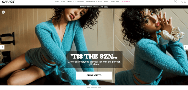
The designers of the clothing site https://www.garageclothing.com/us/home wanted to make a place that would inspire and please site visitors. The design of the site is modern and simple, with a light grey background and simple, easy-to-read fonts. The website design services offered by Garage Clothing are simple and minimalist, so visitors can quickly find the information they need without getting lost in a lot of extra information. Also, the design of the site uses things like bright colours and high-quality photos to draw attention to certain products without taking away from the look of the site as a whole. With the site's many helpful tools, like product filters, user reviews, and more, customers can find exactly what they need quickly and without spending too much time looking through the many products.
14. Kalkifashion
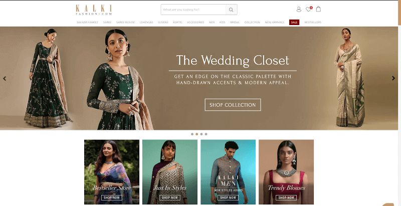
The style of https://www.kalkifashion.com/ is modern and stylish, with a touch of ethnicity. The homepage is full of high-quality photos of models wearing the brand's clothes, so visitors can get an idea of how the brand looks right away. The top menu bar puts items into logical groups, making it easy for customers to look through what's available. Everywhere you look, you'll see a monochromatic colour scheme with bright accent colours that are meant to draw attention to certain things, like special deals or promotions. Subtle animations draw attention to important parts without being too much or taking away from the main content.
15. Windsorstore
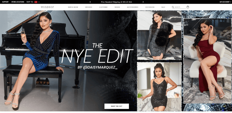
The layout of Windsor Store's website is based on the latest trends in design and fashion. On the homepage, their newest products are highlighted by a banner with bright colours and big letters. The navigation bar makes it easy to get to categories like Women's Clothes, Shoes, Accessories, and More. From here, you can also get to their social media pages and support centre.
With the help of website design services, shoppers can narrow their search results by a number of factors, such as the price range, brand, colour, and size of the product they want. They also have a tool called "Shop by Trend" that lets customers look through products based on the styles that are most popular right now.
16. Hobbs
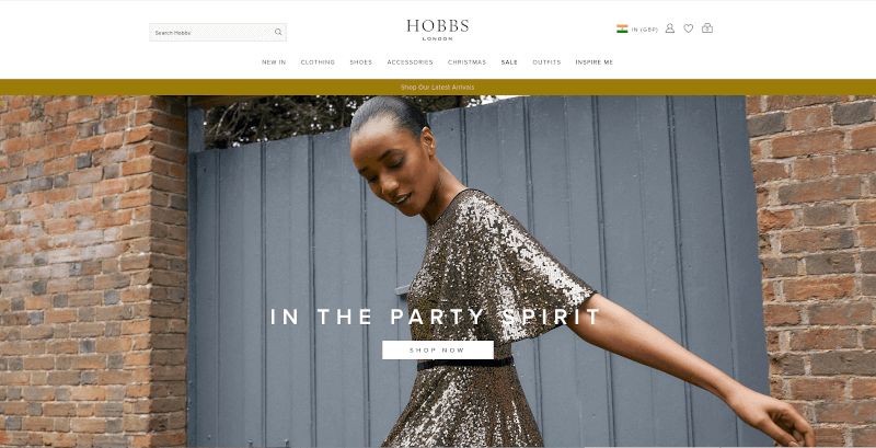
You can see how a modern website should be laid out by looking at this one (https://www.hobbs.com/row/). The design of the site is simple and modern, with a bold black background and bright white accents. You can get to all of the different kinds of products and categories by using the drop-down menus in the main navigation bar, which is in the upper left corner. The homepage has an interactive carousel that makes it easy to find featured products, new products, and best-sellers without having to look through pages. Hobbs' website design services have led to a modern shopping experience that is easy to use and looks good.
17. Missyempire
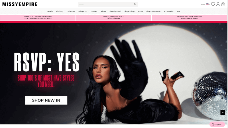
Missy Empire's website looks like a fast-fashion store because it uses bright colours and modern fonts. The homepage has an easy-to-use menu bar at the top and a carousel that automatically changes the most popular content. There are more sections below that talk about new items, top picks, and featured styles.
The site is easy to get to from any phone or tablet. The bright colours and clear pictures on the site show that it is mostly about fashion. The drop-down menus are easy to use and take you right to the pages where you can read detailed descriptions of each product and make an informed buying decision.
In general, the Missy Empire website is well-made and easy to use, so customers can enjoy shopping there on any device.
18. Softsurroundings
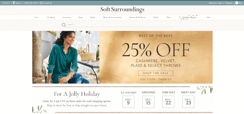
The website for Soft Surroundings looks modern, warm, and elegant. The website's homepage is mostly made up of soft, earthy colours like brown, blue, green, and neutral grey. The design of the site, which was clearly influenced by nature, gives it a homey, welcoming feel. The top navigation bar makes it easy for people to move around the site. Shop for clothes for women, household items, gifts, and more in categories that are easy to understand. Also, a drop-down menu makes it easy to find products or sets that fit into a certain category.
19. frenchconnection
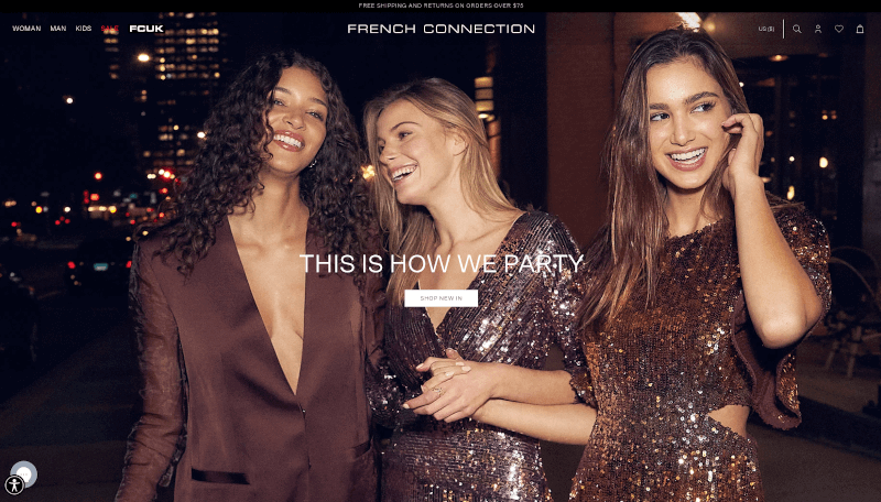
The website, https://usa.frenchconnection.com/collections/woman, is made in a modern, minimalist style and has a simple, easy-to-use interface. Some of the categories that make up the site's page structure are Dresses, Tops & Blouses, Sweaters & Cardigans, Jackets & Coats, and Accessories. At the top of each page is a header bar that you can use to get to the main parts of the site, such as the Homepage, About Us, and Contact Us. The main content of the page is a list of products with pictures, descriptions, and user reviews to help people decide what to buy. In the footer, you can find links to your social media pages, shipping rates, and information about how to get help with your website.
20. Itswomenfashion
If you are a woman looking for fashion inspiration and tips, https://www.itswomenfashion.com/ is the place to go. The design of the website is simple and modern, and it has a minimalist look. Its mostly white background lets the accent colours and important parts of the design stand out. A big navigation bar with drop-down menus is at the top of each page to make the site easy to use.
Overall, this site looks great and works great. The designers paid close attention to both how it looks and how it works, so shoppers can easily find what they're looking for at this online boutique.
