Design Inspirations - Create a Stunning Kitchenware Website
Table of Contents
- Williams Sonoma
- Sur La Table
- Le Creuset
- Crate & Barrel
- Pottery Barn
- Food52 Shop
- CB2
- Anthropologie Kitchen
- Bed Bath & Beyond
- West Elm
- Made In Cookware
- Our Place
- Staub USA
- Fellow Products
- Mepra Store
- OXO
- GreenPan
- Material Kitchen
- Caraway Home
- Tovolo
- All-Clad
- Viking Culinary
- Lodge Cast Iron
- Zwilling
- KitchenAid
- Simplehuman
- Bodum
- Rosenthal
- IKEA Kitchen
- Tupperware
1. Williams Sonoma
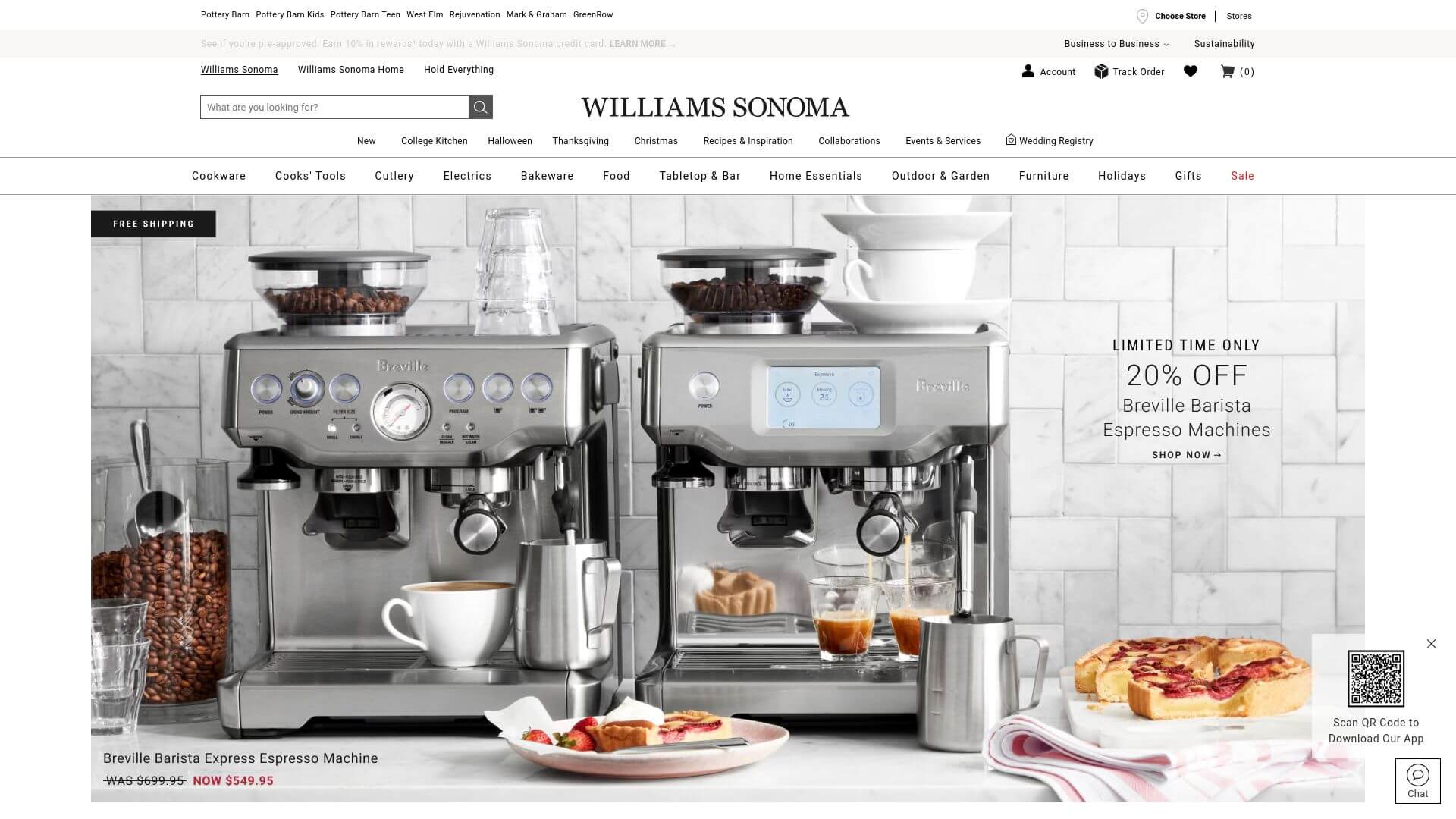
The Williams Sonoma website exudes an elegant, luxurious design that speaks directly to upscale consumers. Color strategy plays a pivotal role here, with a muted, minimalistic palette of whites, soft grays, and gold accents that effortlessly highlight high-quality product images. The layout is clean and spacious, creating a premium experience that encourages users to explore without feeling overwhelmed. By utilizing ample whitespace, the design ensures each item gets its moment to shine, avoiding clutter.
Navigation is streamlined, with clear categories and dropdown menus, ensuring users can easily find what they're looking for. The homepage often features large hero images of beautiful kitchen settings, setting the tone of sophistication right from the start. Call-to-action buttons are subtle but effective, using shades of gold or neutral tones that blend into the overall design without being too intrusive.
Typography is modern and refined, reinforcing the brand's identity as a leader in kitchenware. This website perfectly balances aesthetics and functionality, making it a go-to destination for stylish kitchen products.
2. Sur La Table
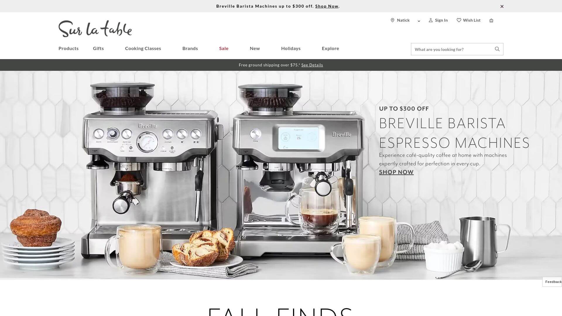
Sur La Table’s website offers a modern, sleek design with a strong focus on functionality and accessibility. The color strategy is built around earthy tones—rich browns, soft beige, and deep blues—evoking a sense of warmth and culinary tradition. The layout is simple but highly effective, with bold, high-quality imagery of kitchenware taking center stage. The homepage features large banners and rotating carousels that showcase top products and promotions, making it easy for users to navigate between different categories.
The navigation bar is fixed, so it follows you as you scroll, which is an excellent usability feature. The website leverages call-to-action buttons in a subtle green color that contrasts well with the background tones, drawing attention without being overpowering. Typography is clean and legible, using a classic serif font for product headings, which adds an elegant touch. Overall, Sur La Table’s website is an excellent example of how thoughtful web design services can combine aesthetics and usability to create a seamless user experience.
3. Le Creuset
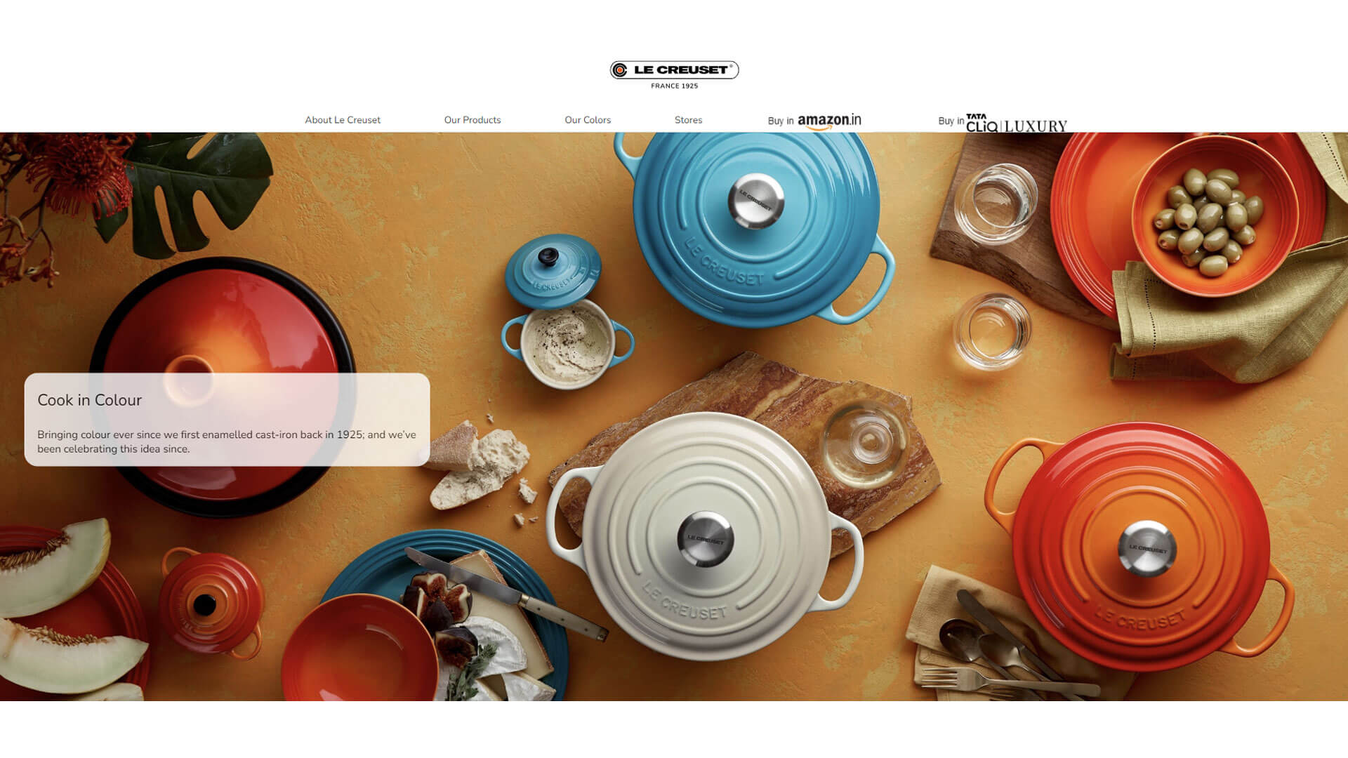
The Le Creuset website embodies the brand’s identity with its vibrant and colorful design that reflects the hues of its iconic cookware. The color strategy here is a standout feature: bold and bright colors like flame orange, deep red, and sunny yellow are heavily utilized, creating an engaging and energetic vibe. Each product page is clean, allowing the colors of the cookware to pop against a predominantly white or light-gray background.
The layout is minimalistic but impactful, with the homepage focusing on large hero images that highlight their products in home settings. The navigation is intuitive, with dropdown menus neatly categorized by product type, color, and collection, making it easy for users to find specific items. Call-to-action buttons are cleverly placed and use contrasting colors like black or white for maximum visibility.
Typography is simple, with sans-serif fonts that align with the brand's modern yet approachable image. Le Creuset’s website is a perfect example of kitchenware website design that balances vibrant visuals with functionality.
4. Crate & Barrel
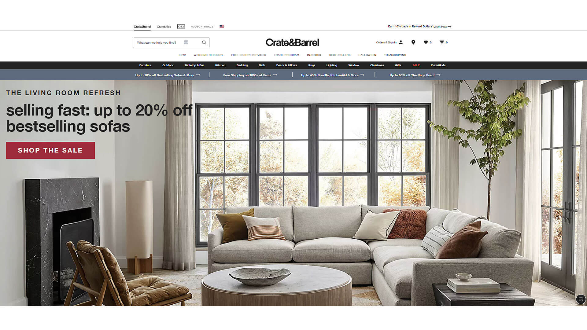
Crate & Barrel delivers a website design that blends modern minimalism with timeless elegance. The color strategy revolves around neutral tones—white, black, and light gray—which helps to highlight the vivid images of their kitchen products. The site uses a grid-based layout that allows for easy browsing through different categories like kitchenware, dining, and cookware. What sets this website apart is its use of high-quality lifestyle imagery, showing products in real home settings, which creates an emotional connection with the user.
The navigation is smooth, with mega-menus that present a wide range of products in an organized fashion. Call-to-action buttons are understated yet effective, usually in black or a muted tone that matches the overall color palette. Typography is crisp, using a combination of serif and sans-serif fonts that make reading easy without sacrificing style. Crate & Barrel's design perfectly exemplifies how web design services can enhance the user experience by focusing on clean design, intuitive navigation, and stunning visuals.
5. Pottery Barn
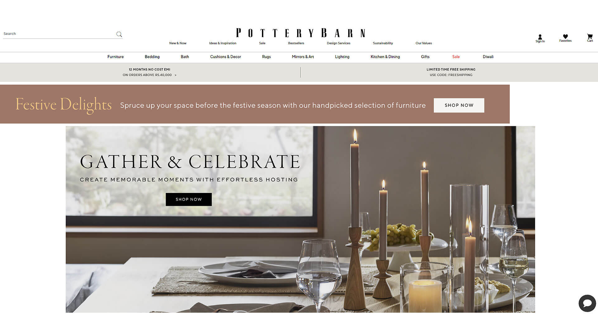
The Pottery Barn website stands out for its classic, rustic design that mirrors the brand’s focus on timeless home goods. The color strategy is warm and inviting, with beige, cream, and dark wood tones dominating the palette. These colors evoke a cozy, homely feeling, making users feel like they’re shopping for items that will enhance their living space. The layout is clean and structured, with product categories clearly segmented, allowing users to easily navigate through the kitchenware section.
Large hero images on the homepage display seasonal collections or promotions, and scrolling down reveals a grid layout of featured products. Call-to-action buttons are minimal but effective, usually in neutral tones that align with the rest of the site’s design. The typography is classic, using serif fonts that reinforce the brand’s elegant yet approachable aesthetic.
Pottery Barn’s website offers an excellent example of how kitchenware website design can create a comfortable shopping environment while still being functional and user-friendly.
6. Food52 Shop
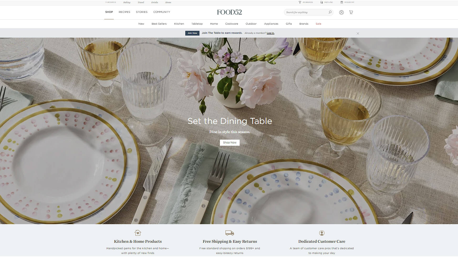
The Food52 Shop website offers a beautifully modern and approachable design that captures the spirit of its culinary community. The color strategy is light and fresh, with whites, soft greens, and pastel accents that create a welcoming and clean aesthetic. The layout is minimalist, with the focus placed on high-quality product photography and user-generated content, such as recipes and reviews.
What’s unique about this site is how it blends a shopping experience with editorial content, giving users a seamless transition from reading a recipe to buying the kitchenware used to make it. Navigation is intuitive, with dropdown menus that make it easy to explore different categories of products. The call-to-action buttons are subtle but effective, using a light gray or green that contrasts just enough with the background.
Typography is modern and clean, using a sans-serif font that complements the overall minimalist aesthetic. Food52 Shop’s design is a brilliant example of how web design services can merge content and commerce to create an engaging, user-friendly experience.
7. CB2
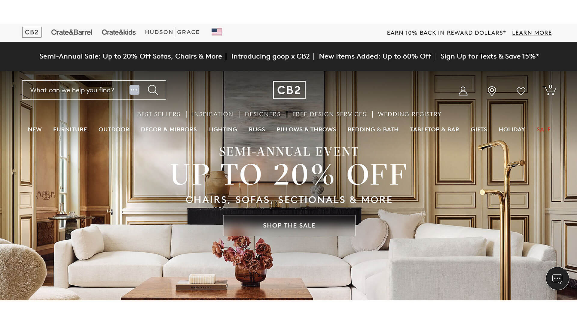
CB2’s website design is a perfect example of modern minimalism in action. The color strategy is dominated by monochromatic tones—black, white, and shades of gray—that allow the product images, especially their vibrant kitchenware, to stand out. The layout is sleek and organized, using ample whitespace to prevent the site from feeling cluttered. Large, full-width images are used throughout, giving the site a clean and bold aesthetic.
The navigation is straightforward, with clear dropdown menus that make it easy to browse their extensive kitchenware collection. The call-to-action buttons are small but noticeable, using black or white to contrast effectively with the background. Typography is modern and elegant, primarily using sans-serif fonts that align with CB2’s sleek, contemporary brand image.
Overall, CB2’s website is a fantastic example of kitchenware website design that prioritizes simplicity and ease of use while still maintaining a bold and modern aesthetic.
8. Anthropologie Kitchen
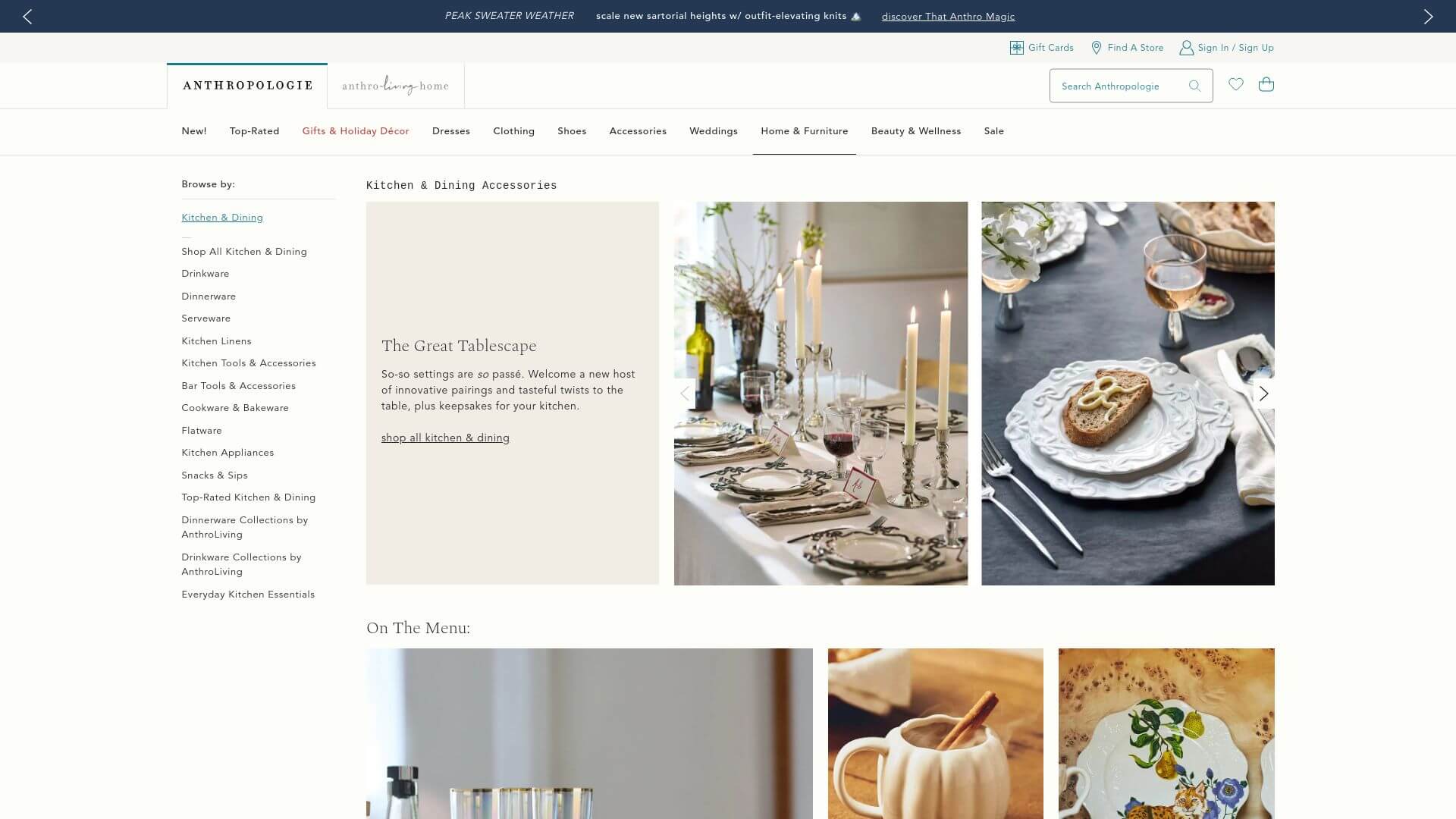
Anthropologie Kitchen has a website design that perfectly matches the brand’s bohemian-chic aesthetic. The color strategy is vibrant and playful, featuring a mix of pastels, earthy tones, and bold pops of color that reflect the artistic flair of their kitchen products. The layout is visually engaging, with large product images and unique design elements like hand-drawn icons and borders.
The homepage often features rotating banners that showcase seasonal collections or special offers, keeping the site dynamic. The navigation is user-friendly, with a simple menu bar that allows users to browse by category or collection. Call-to-action buttons are often in pastel tones, blending seamlessly with the rest of the design but still standing out enough to encourage clicks.
Typography is whimsical, using a mix of serif and sans-serif fonts that add character to the site while still being easy to read. Anthropologie Kitchen’s website is a great example of how web design services can create a unique, memorable shopping experience by focusing on creativity and personality in the design.
9. Bed Bath & Beyond
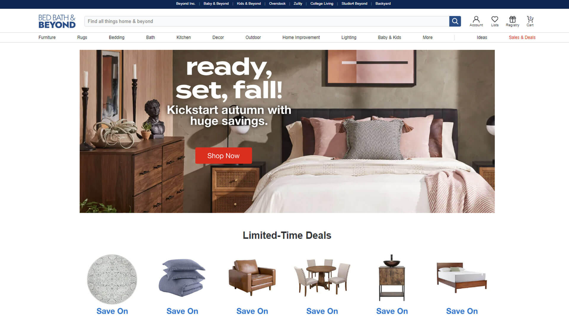
Bed Bath & Beyond’s website design emphasizes convenience and user-friendliness, blending modern eCommerce principles with traditional retail. The color strategy is simple, with a lot of whites, soft blues, and grays that create a fresh, clean look, allowing their diverse range of products to take center stage. The homepage features multiple sections of organized product categories, with large banners that highlight promotions or seasonal sales.
The layout is grid-based, making it easy for users to navigate through the site’s vast array of kitchenware items without feeling overwhelmed. Call-to-action buttons are typically in blue, matching the brand's overall color scheme and standing out against the neutral background. The navigation is intuitive, with easy access to different categories via a top bar and a sidebar on product pages.
Typography is clear and straightforward, focusing on legibility rather than flair, which aligns with the site’s goal of providing a functional, seamless shopping experience. Bed Bath & Beyond’s site showcases how effective web design services can prioritize functionality while still maintaining a clean, approachable design.
10. West Elm
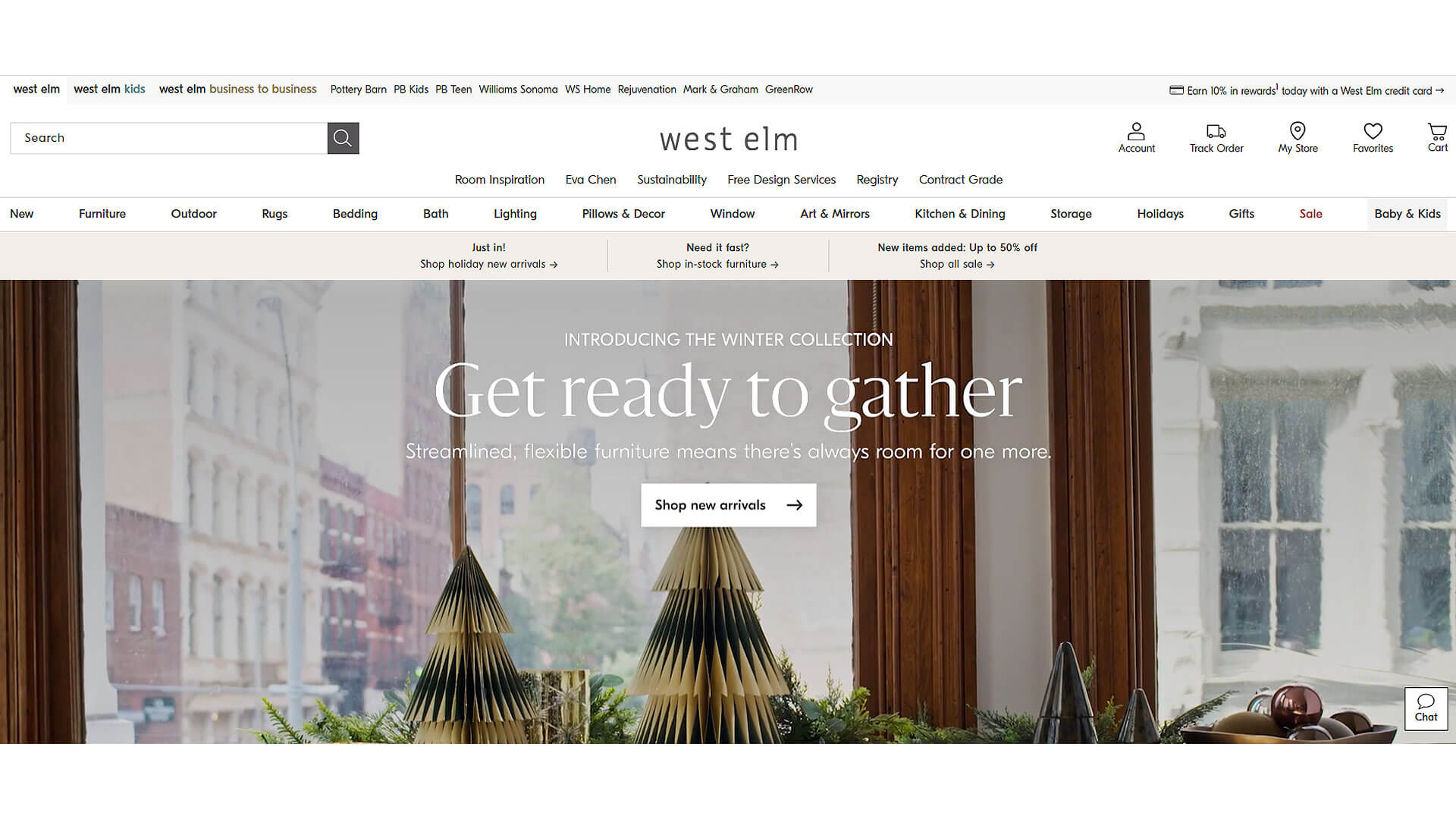
The West Elm website design is a beautiful example of modern minimalism infused with a mid-century aesthetic. The color strategy uses a lot of earthy tones—wood browns, soft grays, and muted greens—that complement the brand’s focus on organic and sustainable products. The layout is clean and highly visual, with large, stunning images of kitchen products and dining setups that immediately catch the eye.
The homepage is divided into clear sections, often featuring lifestyle photography that showcases their products in real home environments, adding an emotional connection. The navigation is simple and easy to use, with dropdown menus that organize products by category and style. Call-to-action buttons are understated, using neutral colors like white or gray to blend seamlessly into the design while still guiding users effectively.
The typography is clean and modern, often using thin, sans-serif fonts that give the site a sleek, contemporary look. West Elm’s site demonstrates how kitchenware website design can feel both modern and warm, blending style with user-friendly functionality.
11. Made In Cookware
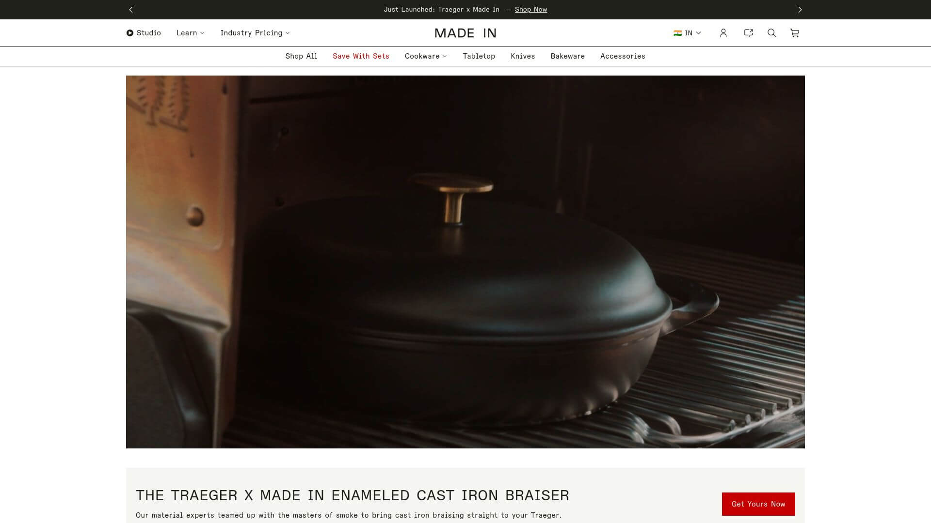
Made In Cookware's website is a minimalist’s dream, focusing on clean lines and simplicity. The color strategy is centered around whites and grays with blue accents, giving the site a modern, clean feel. The layout is straightforward, with large, high-resolution product images placed against neutral backgrounds that make the kitchenware pop. The homepage features rotating banners that highlight the brand’s top-selling products or limited-time offers.
Navigation is simplified, with easy-to-access links to cookware, knives, and accessories in the top bar. One standout feature is the educational content integrated into the site, offering buyers insights into the quality and craftsmanship of the products. Call-to-action buttons are blue, standing out clearly against the neutral background.
The typography is clean and modern, using sans-serif fonts that enhance the minimalistic feel of the site. Overall, Made In Cookware has mastered the art of keeping things simple while still offering a rich user experience, making it a prime example of effective kitchenware website design.
12. Our Place
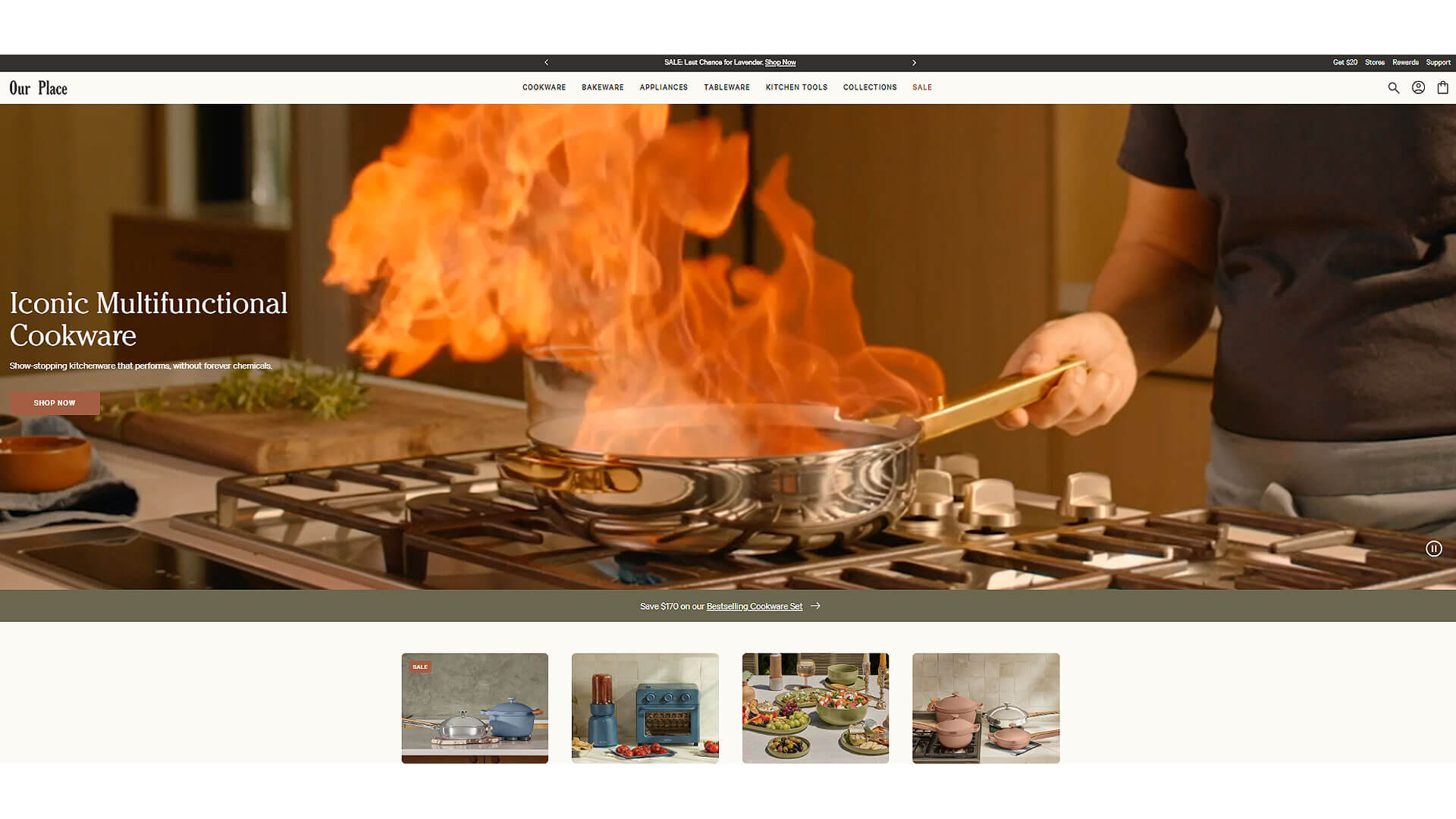
Our Place's website design is the epitome of modern warmth, combining clean aesthetics with a welcoming vibe. The color strategy uses soft, natural tones like cream, light pink, and sage green, which create a calming atmosphere. The homepage is full of large images that highlight their kitchen products, particularly their signature "Always Pan."
The layout is highly visual, with ample whitespace ensuring that product images take center stage. Navigation is easy and intuitive, with clear links to their core products like cookware, tableware, and bundles. Call-to-action buttons are subtle yet effective, usually in shades of green or gray that match the overall color palette.
The typography is simple but elegant, with rounded sans-serif fonts that add a friendly, approachable feel to the site. Our Place successfully creates a seamless shopping experience by using thoughtful design elements, proving how web design services can transform a website into an inviting, user-friendly space.
13. Staub USA
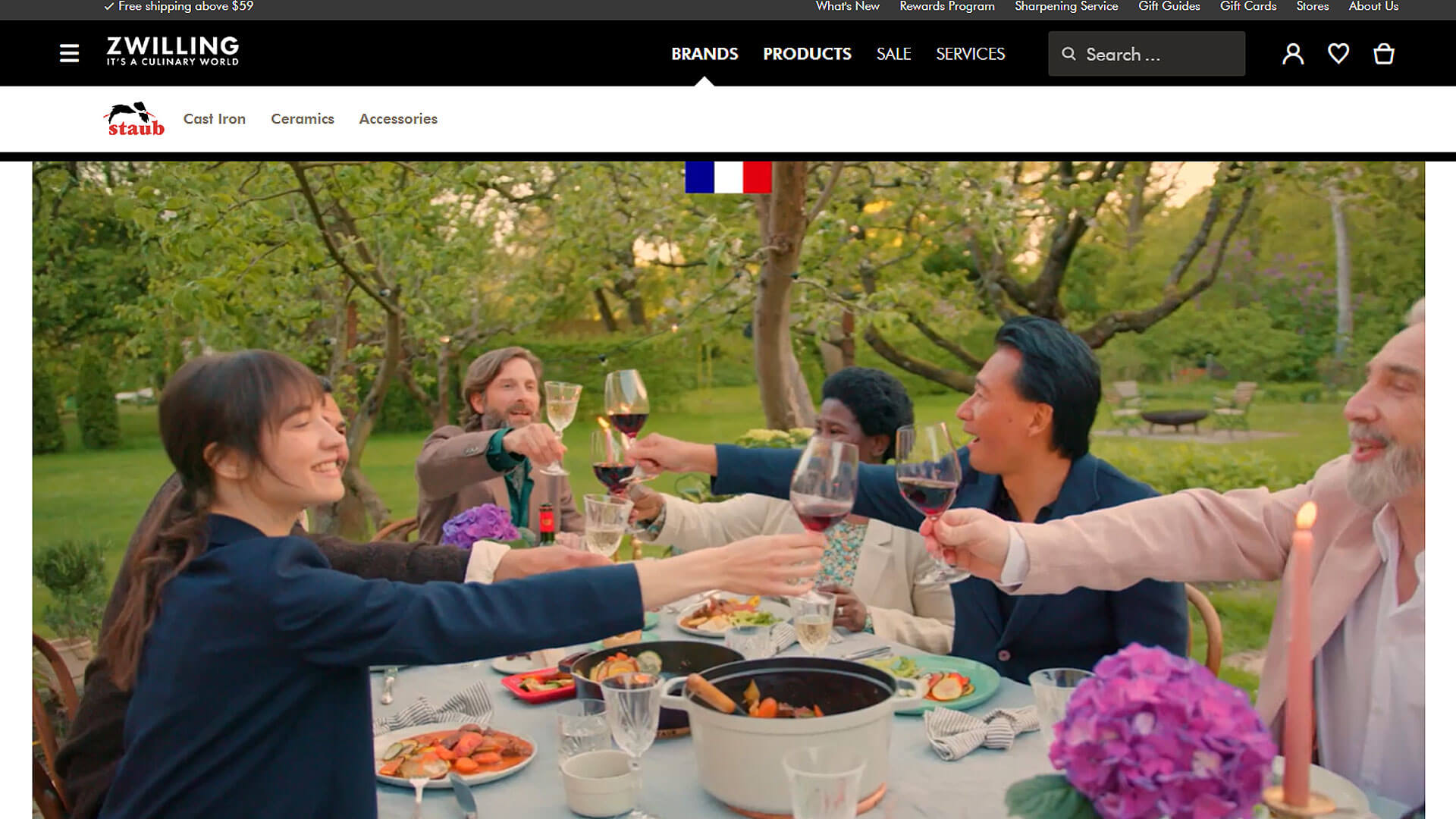
Staub USA features a website that perfectly mirrors its brand’s commitment to craftsmanship and quality. The color strategy is dark and rich, with deep blacks, blues, and grays serving as the backdrop for their iconic enameled cast iron cookware. The layout is clean but visually engaging, with large product images that showcase the craftsmanship of Staub’s kitchenware.
The homepage is elegant, featuring rotating banners that highlight their cookware collections, special offers, and recipes. The navigation is straightforward, with easy access to cookware categories and the brand’s blog. Call-to-action buttons use white and black tones, ensuring they stand out against the rich, dark background without clashing.
The typography is refined, using a mixture of serif and sans-serif fonts that add a touch of elegance while maintaining readability. Staub USA’s website demonstrates how premium brands can use high-quality visuals and a sophisticated design to elevate the online shopping experience, making it an excellent example of kitchenware website design.
14. Fellow Products
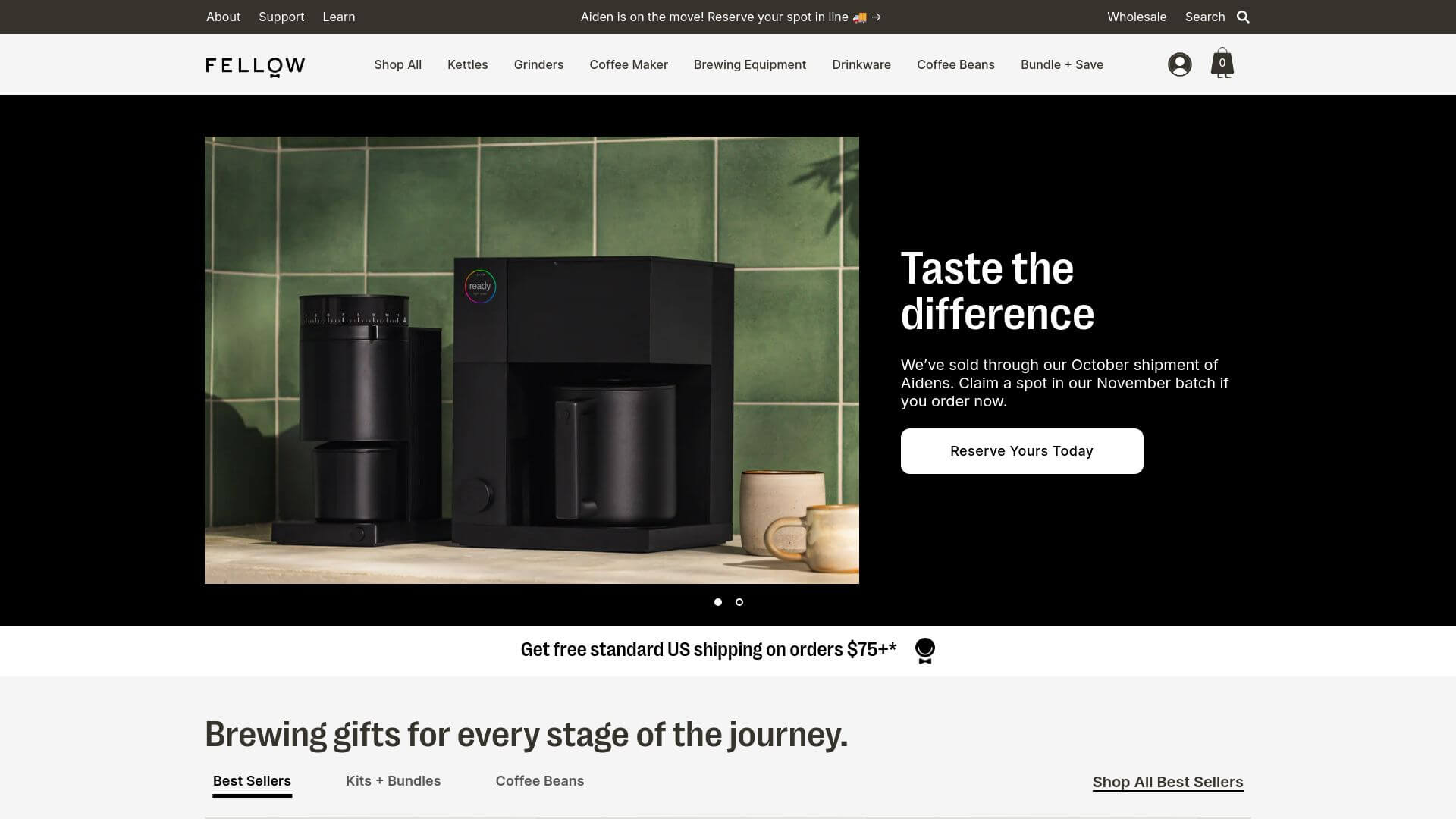
The Fellow Products website offers a sleek, modern design that perfectly matches its lineup of high-end coffee and kitchen products. The color strategy revolves around blacks, grays, and muted whites, which give the site a sharp, professional look. The layout is clean and highly functional, with large product images and minimal text that let the products speak for themselves.
On the homepage, users are greeted with rotating banners that showcase their most popular products, while the rest of the page is divided into sections for different product categories. Navigation is intuitive, with a top bar that provides easy access to product categories, accessories, and bundles. The call-to-action buttons are small but effective, using black or white depending on the background for clear visibility.
Typography is modern, using a combination of bold and regular sans-serif fonts that enhance the clean, minimalist feel of the site. Fellow Products does a great job of balancing aesthetics with usability, creating a visually stunning yet functional kitchenware website design.
15. Mepra Store
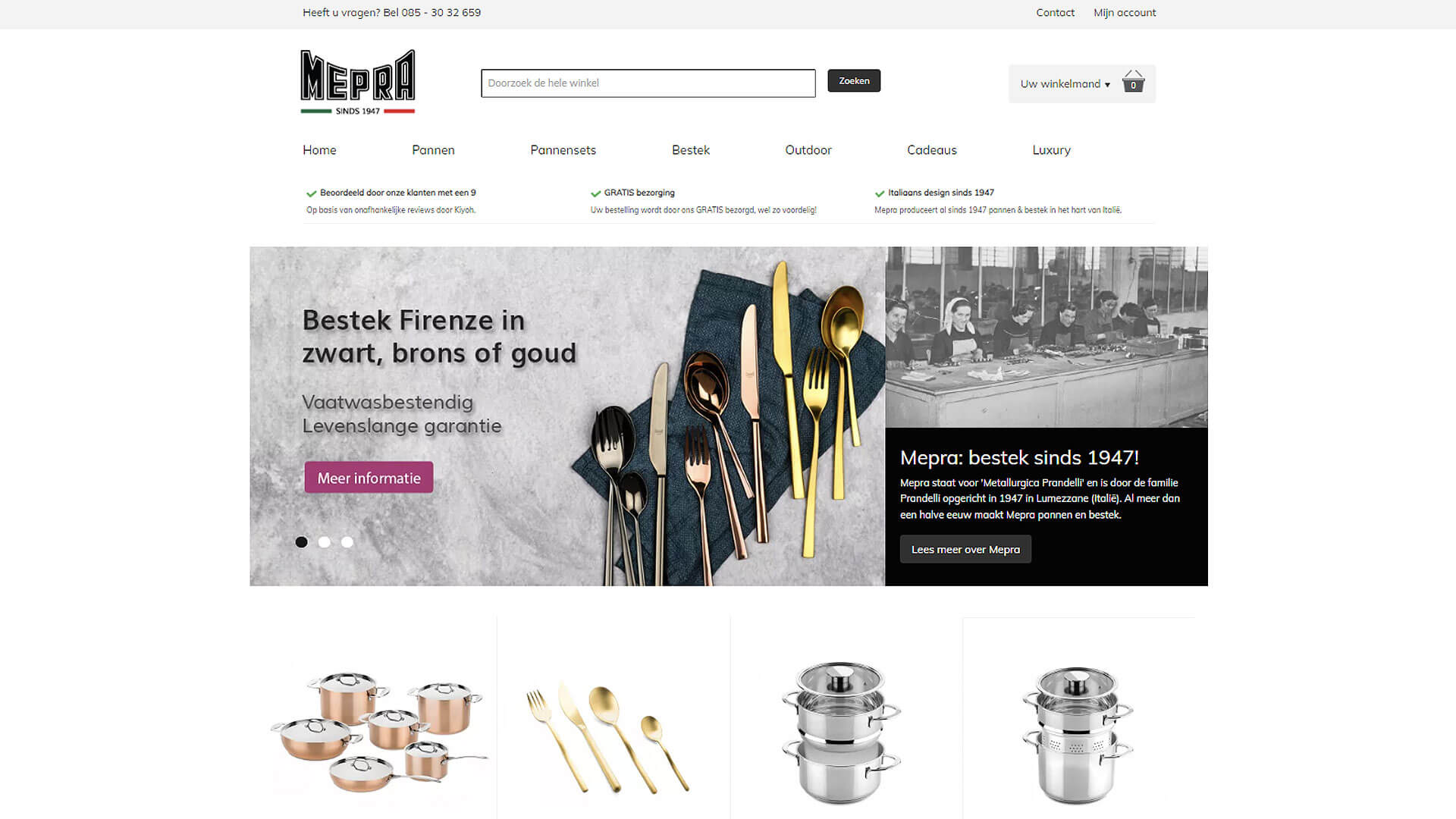
The Mepra Store website is a stunning example of luxury kitchenware website design. The color strategy uses deep blacks, golds, and whites, evoking a sense of elegance and exclusivity. The homepage features large, high-resolution images of their premium kitchen products, including cutlery and cookware, showcased against minimalistic backdrops. The layout is clean and easy to navigate, with a focus on product images rather than text-heavy descriptions.
Navigation is intuitive, with clear links to different product categories like flatware, cookware, and accessories. The call-to-action buttons are often in gold or white, standing out against the darker background and encouraging users to explore the products further. The typography is elegant, with serif fonts used for headings and sans-serif fonts for body text, creating a contrast that adds to the luxurious feel of the site.
Mepra Store perfectly captures how web design services can create a high-end shopping experience through the use of sophisticated design elements and user-friendly features.
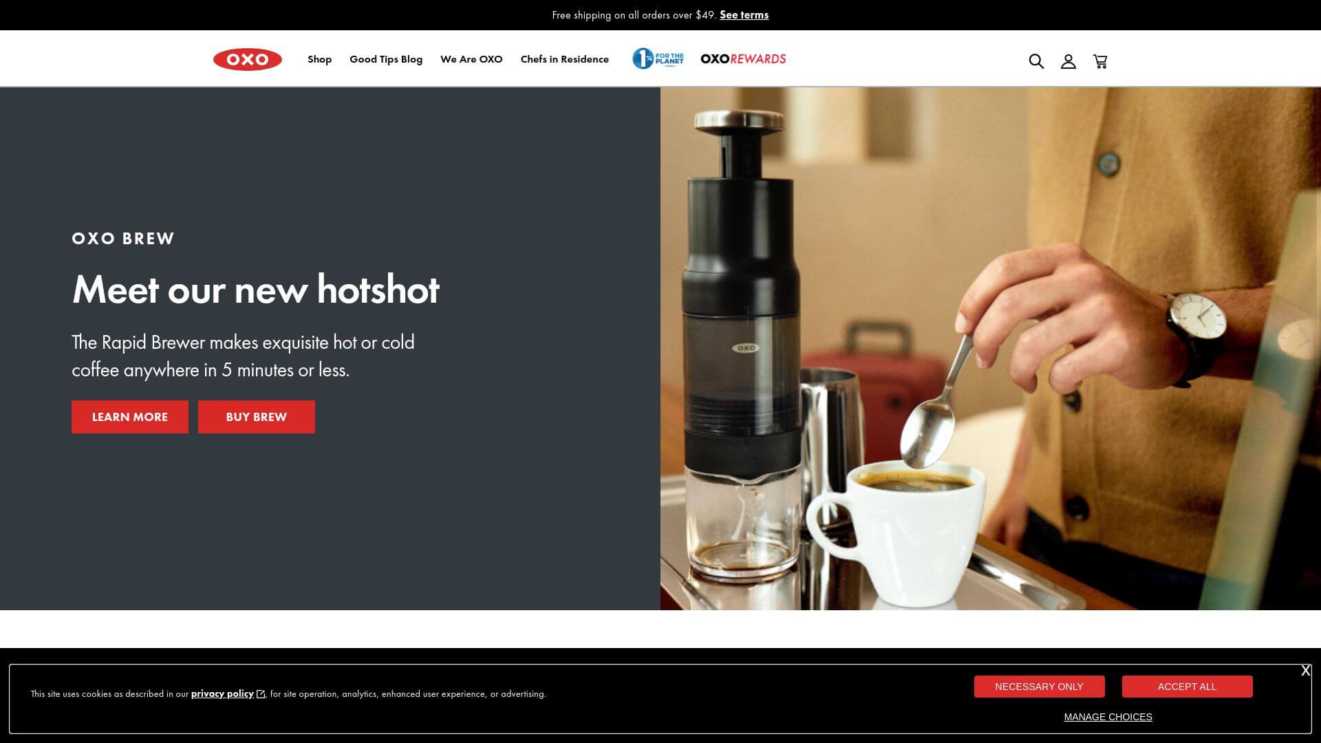
16. OXO
OXO’s website design is a perfect blend of functionality and modern minimalism, reflecting the brand's focus on making everyday kitchen tools that are both simple and effective. The color strategy is clean and light, using a combination of white, soft gray, and pops of red (which matches their logo) to create a fresh and inviting interface.
The layout is highly organized, with a grid-based system that allows users to easily browse categories such as cooking, cleaning, and storage. Each product is presented with high-quality imagery and concise descriptions, allowing users to quickly understand the benefits of each item.
The navigation is intuitive, with a sticky top bar that remains visible as users scroll down the page, providing quick access to different product sections. Call-to-action buttons are in bold red, standing out clearly and encouraging users to add items to their cart.
Typography is clean and modern, using sans-serif fonts that are easy to read and align with the brand’s no-nonsense approach to kitchenware. OXO’s website showcases how kitchenware website design can balance clean aesthetics with user-friendly functionality, creating a smooth shopping experience for visitors.
17. GreenPan
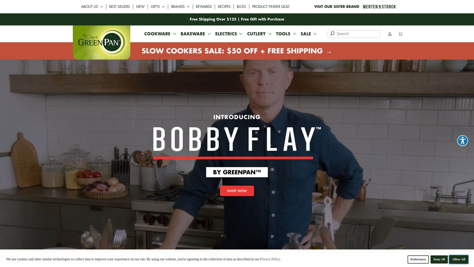
GreenPan’s website design emphasizes eco-friendliness and modern elegance, aligning perfectly with its brand’s mission of offering sustainable, non-toxic cookware. The color strategy revolves around earthy tones—forest green, cream, and soft beige—that immediately convey a connection to nature and environmental consciousness. The layout is simple and structured, with large images of their eco-friendly cookware placed against soft backgrounds, allowing the products to shine without overwhelming the user.
The homepage highlights bestsellers and special offers with well-placed banners that guide the user to explore more. Navigation is intuitive, with categories for cookware, kitchen tools, and accessories clearly displayed in a sticky top bar. The call-to-action buttons are often in green, matching the brand’s color scheme and standing out just enough to catch the eye.
The typography is clean and modern, using sans-serif fonts that complement the overall minimalistic feel of the site. GreenPan’s website serves as a great example of how web design services can create a design that reflects a brand’s core values while still offering a seamless and enjoyable user experience.
18. Material Kitchen
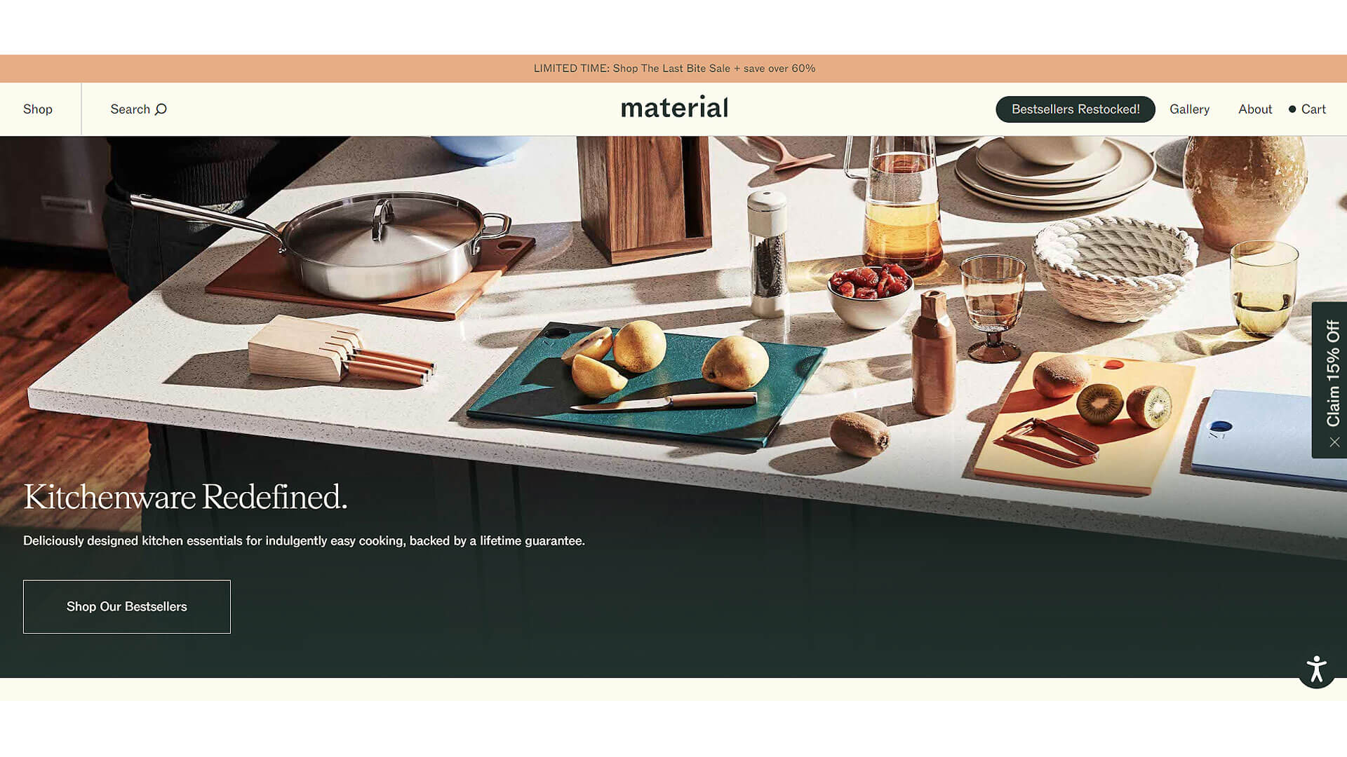
Material Kitchen’s website is the definition of minimalist design with a modern twist. The color strategy is understated, with whites, soft grays, and muted pastels that allow the vibrancy of their kitchen tools to shine through. The layout is clean and spacious, featuring large, high-resolution images of their products arranged in a grid format. The homepage features rotating banners that highlight popular products and limited-edition collections, offering a dynamic user experience.
Navigation is simplified, with only the most essential links to cookware, knives, and bundles, ensuring users can find what they’re looking for quickly. Call-to-action buttons are often in a neutral tone, such as light gray or soft blue, which blends harmoniously with the rest of the site’s aesthetic. The typography is modern and sleek, using sans-serif fonts that align with the brand’s focus on simplicity and elegance.
Material Kitchen’s website is a beautiful example of how thoughtful kitchenware website design can enhance the user experience by focusing on clean lines, muted colors, and a user-friendly interface.
19. Caraway Home
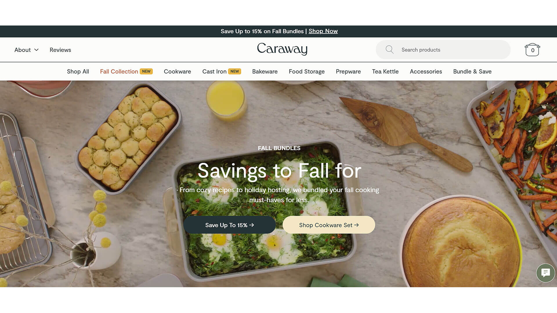
Caraway Home's website showcases modern, eco-friendly design that reflects their commitment to non-toxic, sustainable kitchen products. The color strategy focuses on light, airy tones like cream, soft blue, and sage green, creating a calming and welcoming atmosphere. The homepage features large, full-width banners that showcase the brand’s bestsellers and seasonal collections, while the layout is structured in a clean grid format that makes navigation a breeze.
Call-to-action buttons are strategically placed in contrasting colors like dark blue or green, standing out clearly against the lighter background. The navigation is streamlined, with a top bar providing easy access to categories such as cookware, bakeware, and kitchen accessories. Typography is modern and clean, using sans-serif fonts that maintain the minimalistic feel of the site while being easy to read.
Caraway Home’s website is an excellent example of how kitchenware website design can marry aesthetics with eco-conscious messaging, creating a user-friendly shopping experience that aligns with modern consumer values.
20. Tovolo
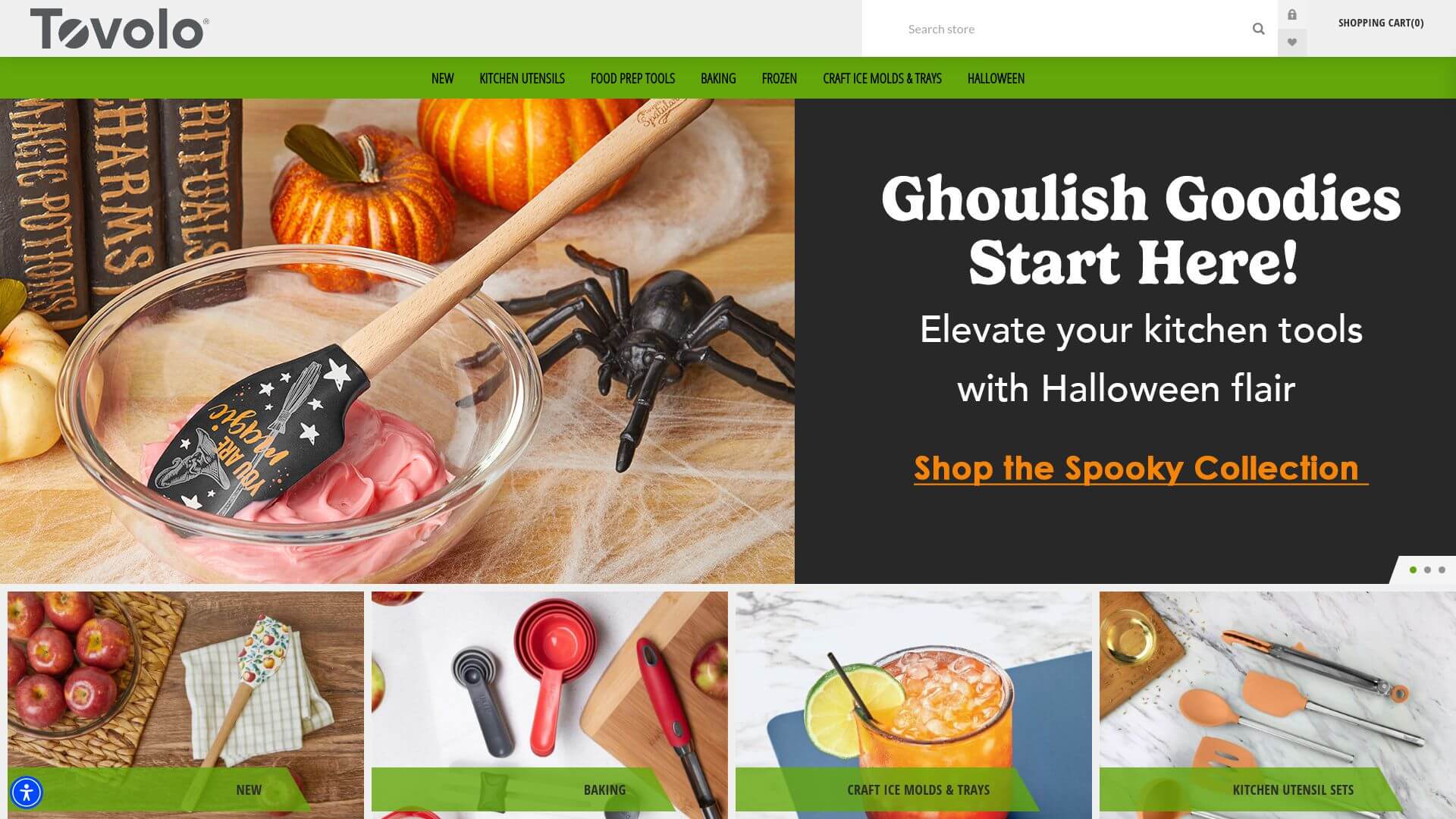
Tovolo’s website stands out for its playful, vibrant design that mirrors the brand’s colorful kitchen gadgets and tools. The color strategy revolves around bright, cheerful tones like lime green, red, and orange, which instantly grab the user’s attention. The layout is lively yet organized, with large, dynamic images of their kitchenware products arranged in a grid format.
The homepage features rotating banners that highlight seasonal promotions and new arrivals, making the site feel constantly fresh and engaging. Navigation is user-friendly, with a top bar that offers quick access to different product categories like tools, bakeware, and storage. The call-to-action buttons are bold, often in bright shades like red or green, ensuring they stand out against the colorful backgrounds.
Typography is playful yet legible, using a combination of serif and sans-serif fonts that add a touch of fun without compromising readability. Tovolo’s website is a fantastic example of how web design services can create a visually engaging, fun shopping experience that perfectly reflects the personality of the brand.
21. All-Clad
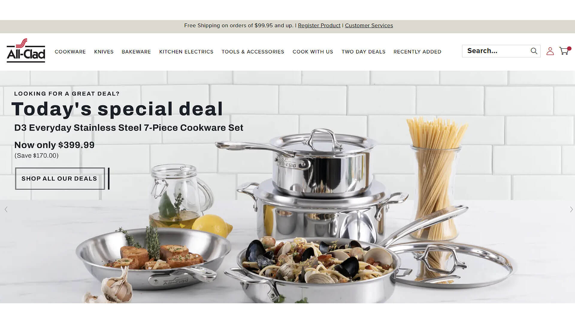
All-Clad’s website design exudes professionalism and premium quality, perfectly aligning with its reputation as a leader in high-end cookware. The color strategy is sleek and modern, with whites, blacks, and metallic grays dominating the palette, giving the site a sophisticated and refined look. The layout is clean and highly visual, with large product images of their stainless steel cookware featured against neutral backgrounds.
The homepage is divided into clear sections that showcase bestsellers, new arrivals, and product categories, making it easy for users to explore the full range of products. Navigation is smooth, with a sticky top bar that offers access to cookware, bakeware, and kitchen accessories. Call-to-action buttons are subtle yet effective, often in black or dark gray, blending seamlessly with the overall design while still guiding the user towards making a purchase.
The typography is bold and clean, using sans-serif fonts that enhance the modern, high-end feel of the site. All-Clad’s website is a masterclass in how kitchenware website design can communicate quality, durability, and professionalism through elegant visuals and intuitive design.
22. Viking Culinary Products
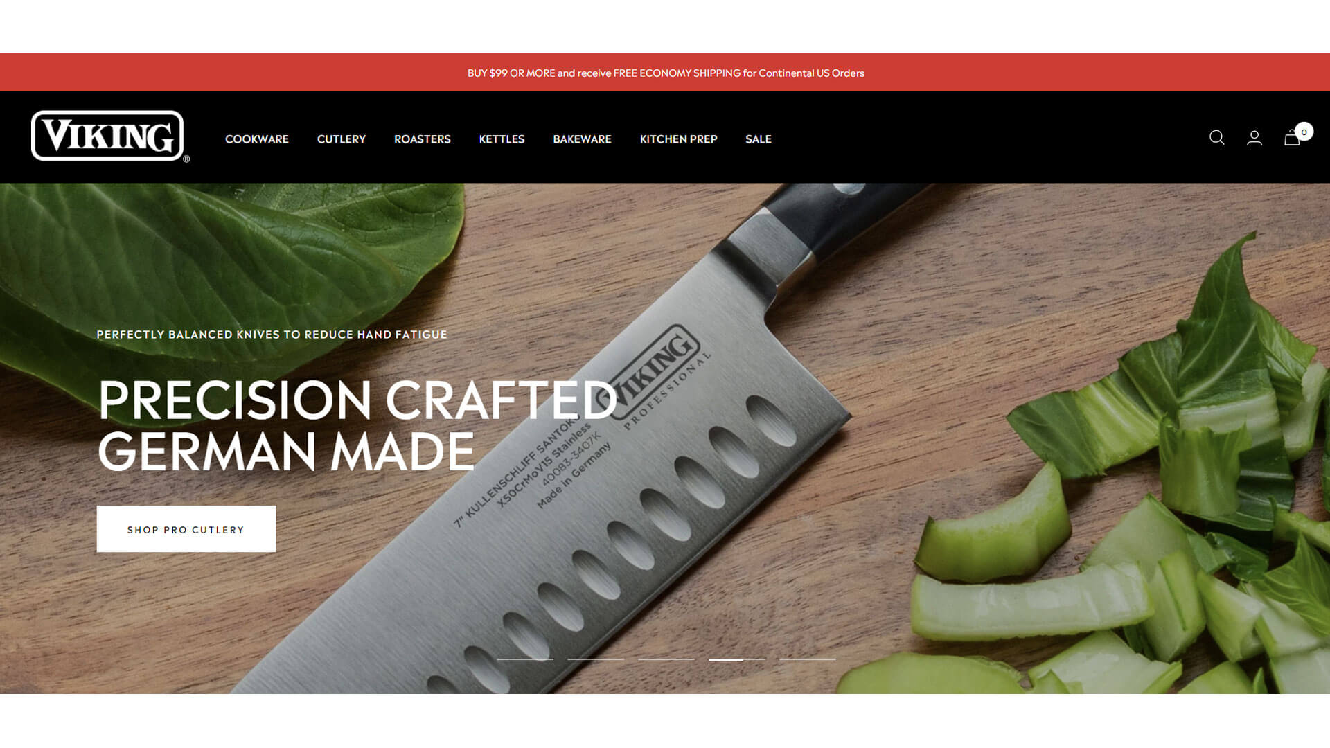
The Viking Culinary website mirrors its brand identity with a bold and professional design that exudes strength and durability. The color strategy is dark and rich, with blacks, deep grays, and metallic accents creating a powerful visual impact. The layout is structured and organized, with large, high-quality images of their cookware and kitchen appliances displayed prominently on the homepage.
Navigation is intuitive, with a top bar that offers easy access to cookware, cutlery, and kitchen appliances, ensuring users can quickly find what they’re looking for. Call-to-action buttons are in black or metallic tones, aligning with the brand’s premium aesthetic while still guiding users effectively.
The typography is modern and sleek, using bold sans-serif fonts that emphasize the brand’s focus on strength and performance. Viking Culinary’s website is a great example of how web design services can create a powerful online presence by focusing on bold visuals and a clean, professional layout.
Visit vikingculinaryproducts.com
23. Lodge Cast Iron
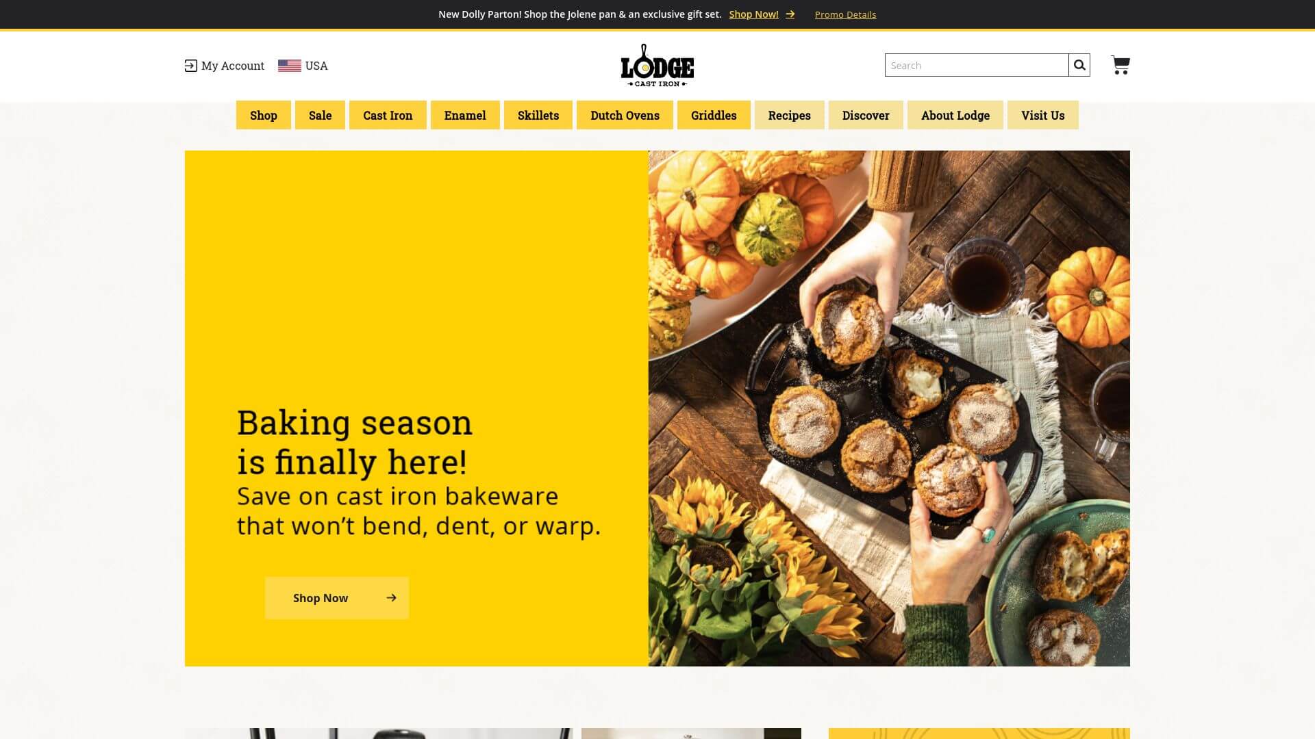
Lodge Cast Iron’s website design is simple, rustic, and functional, much like its iconic cast iron cookware. The color strategy relies on warm, earthy tones like brown, beige, and dark green, which create a cozy, homey vibe. The layout is straightforward, with a grid format that allows users to easily browse through different categories of cookware.
The homepage features large, high-quality images of their cast iron skillets and Dutch ovens, with rotating banners that highlight special offers or new products. Navigation is easy to use, with a top bar that offers quick access to cookware, accessories, and recipes. Call-to-action buttons are typically in dark green or brown, standing out against the neutral backgrounds but still blending harmoniously with the site’s rustic aesthetic.
The typography is simple and functional, using sans-serif fonts that align with the brand’s down-to-earth image. Lodge Cast Iron’s website is a great example of how kitchenware website design can reflect a brand’s heritage and values while offering a user-friendly shopping experience.
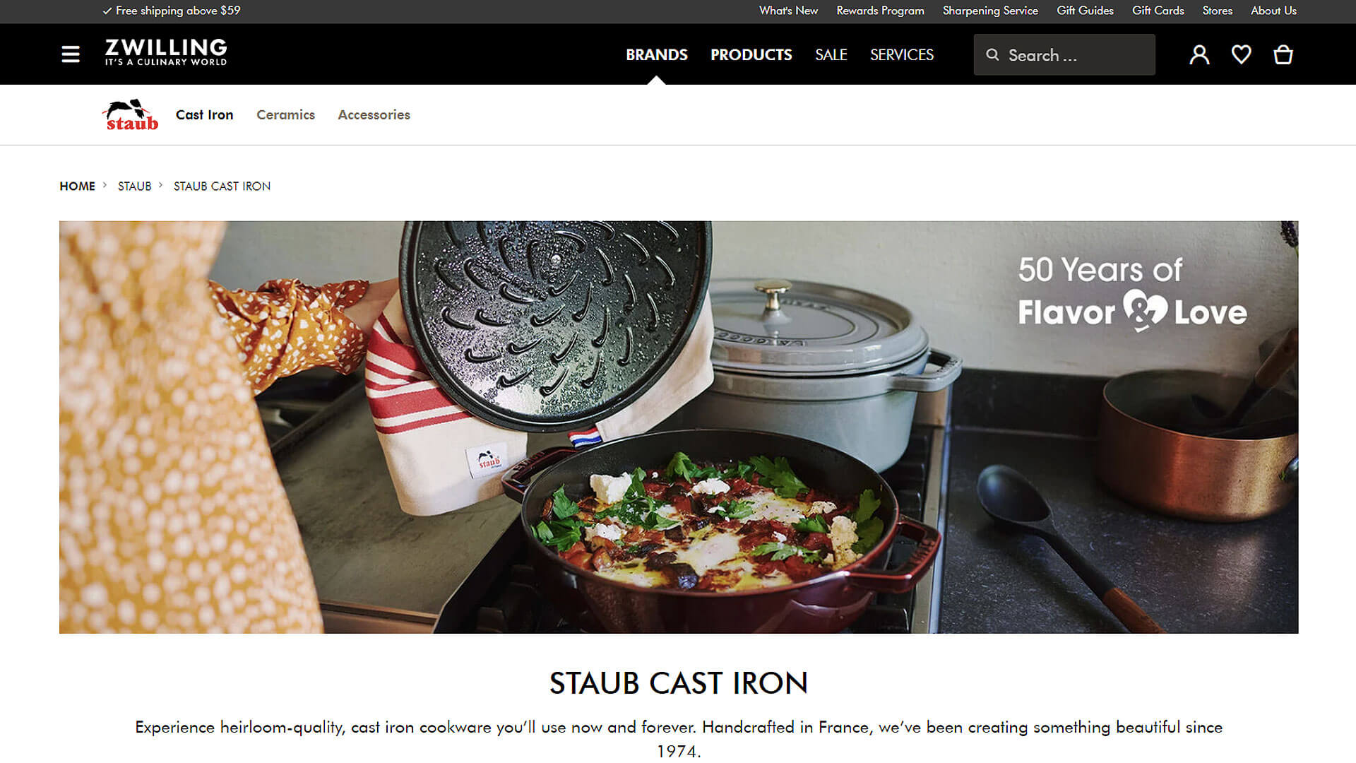
24. Zwilling
The Zwilling website is a stunning example of luxury meets functionality. The color strategy is sharp and clean, using a combination of white, black, and red accents that reflect the brand’s precision-focused kitchen tools and knives. The layout is sleek and minimalistic, with large, high-resolution product images displayed against clean, white backgrounds. The
homepage features rotating banners that highlight best-selling products and special offers, immediately grabbing the user’s attention. Navigation is easy to use, with a top bar providing access to categories like knives, cookware, and accessories. The call-to-action buttons are in red, matching the brand’s iconic color and standing out clearly against the neutral backdrop.
The typography is bold and modern, using sans-serif fonts that give the site a professional and polished look. Zwilling’s website is a perfect example of how kitchenware website design can convey a sense of precision and quality through sharp visuals and a clean, minimalist interface.
25. KitchenAid
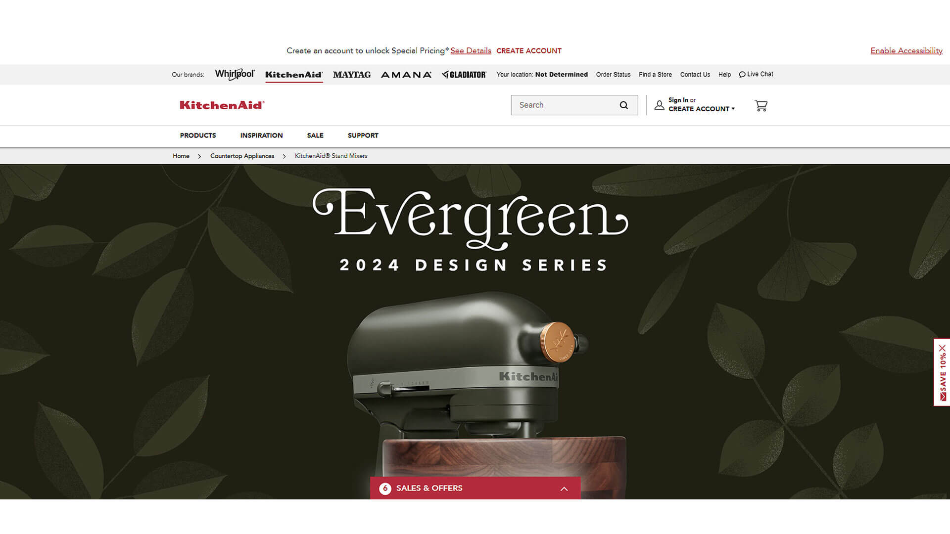
KitchenAid's website is a vibrant blend of modern design and brand heritage, showcasing the company's iconic appliances. The color strategy leans heavily into bold reds, whites, and blacks, matching the brand's well-known product color schemes. The homepage features large, high-quality images of their mixers and kitchen appliances, arranged in a clean, grid-based layout that highlights new products, bestsellers, and special offers.
The navigation is straightforward, with a sticky top bar offering easy access to categories like mixers, ovens, and kitchen tools. Call-to-action buttons are in striking red, standing out against the white and gray backgrounds, encouraging users to explore further or add items to their cart. Typography is modern and sleek, with sans-serif fonts that complement the website's professional yet approachable feel.
KitchenAid’s website effectively balances functionality and aesthetics, providing a user-friendly experience that also showcases the brand's long-standing reputation for quality kitchen appliances. It's a prime example of how web design services can blend brand identity with cutting-edge design.
26. Simplehuman
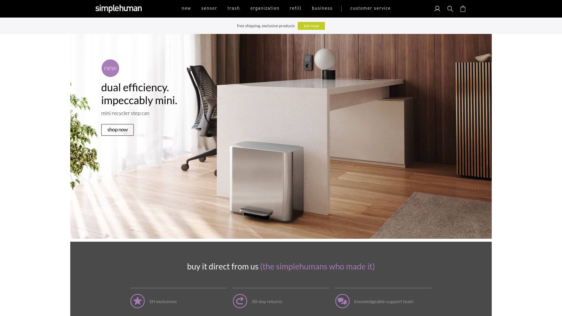
Simplehuman’s website design reflects the brand’s focus on minimalism and innovation, much like its product line of sleek, functional kitchen and household items. The color strategy revolves around whites, grays, and blacks, creating a clean, uncluttered aesthetic that aligns with their product design. The layout is simple but highly functional, featuring large product images and a clear, easy-to-navigate grid system.
The homepage focuses on product categories like trash cans, kitchen tools, and soap dispensers, with rotating banners that highlight their innovative features. Navigation is smooth, with a sticky top bar providing quick access to different sections of the website. Call-to-action buttons are subtle yet effective, using black or gray to blend with the minimalist design while still standing out enough to guide users.
Typography is clean and modern, using sans-serif fonts that maintain the site’s sleek, futuristic feel. Simplehuman’s website exemplifies how kitchenware website design can create a seamless, enjoyable user experience by focusing on simplicity and innovation.
27. Bodum
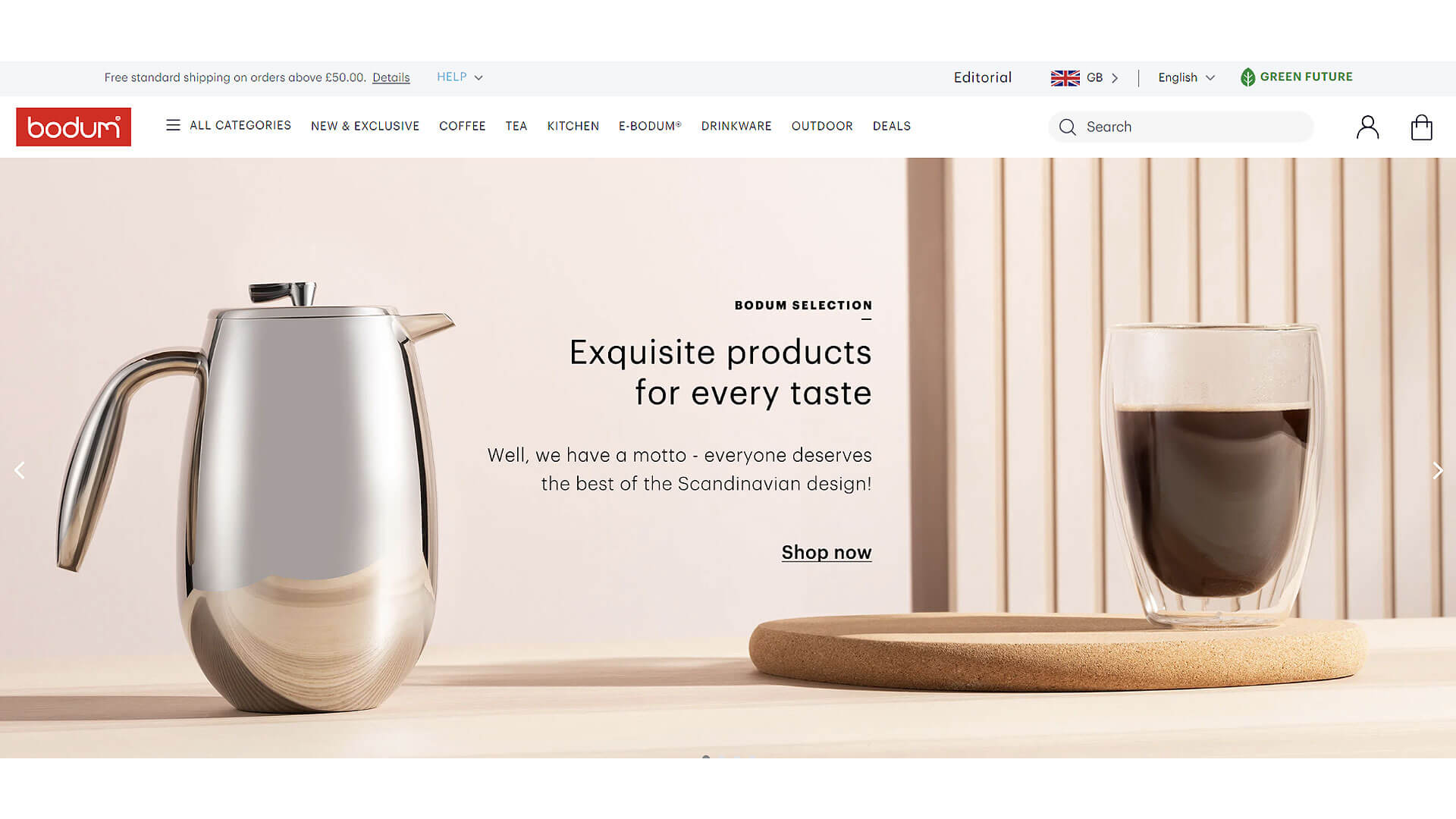
Bodum’s website is a great example of modern elegance, with a focus on coffee and tea accessories. The color strategy uses a combination of black, white, and red, reflecting the brand’s logo and product aesthetic. The layout is clean and minimalist, with large images of their products displayed against neutral backgrounds, creating a highly visual and engaging experience.
The homepage is organized into sections that feature bestsellers, new arrivals, and product categories, making it easy for users to navigate. Call-to-action buttons are in bold red, standing out against the black and white color scheme, guiding users to explore more or make a purchase. Navigation is simple and intuitive, with a top bar offering access to categories like coffee makers, kettles, and tableware.
The typography is modern and clean, using sans-serif fonts that align with the brand’s sleek, modern image. Bodum’s website is an excellent example of how web design services can create a visually engaging shopping experience while maintaining a clean and user-friendly interface.
28. Rosenthal
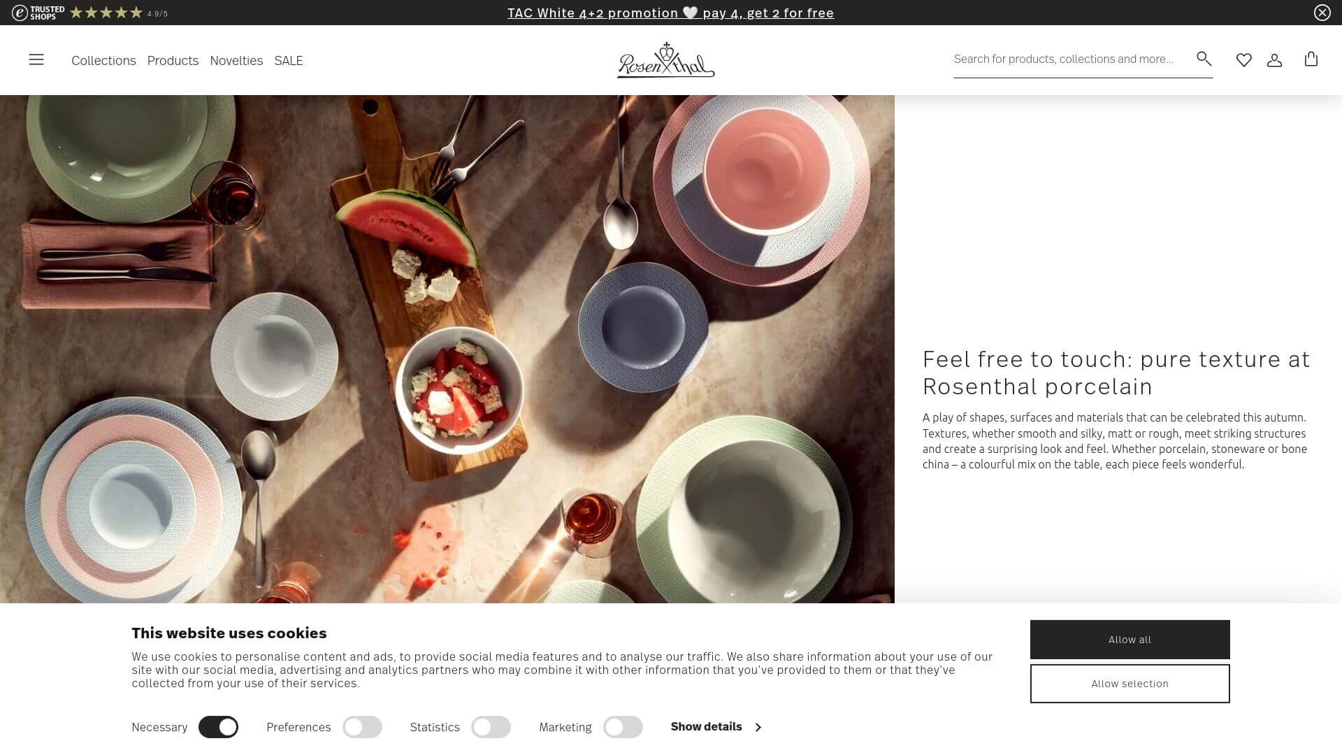
Rosenthal’s website design reflects the brand’s dedication to luxury and artistry in fine china and glassware. The color strategy is clean and sophisticated, with whites, grays, and black dominating the design, allowing their premium products to take center stage. The layout is elegant and spacious, with high-resolution product images displayed in a grid format, giving each item its own space to shine.
The homepage features rotating banners that showcase new collections, collaborations, and special editions, creating a dynamic user experience. Navigation is simple and intuitive, with a top bar that offers easy access to different product categories like porcelain, glass, and cutlery. Call-to-action buttons are subtle yet effective, using neutral tones that blend seamlessly into the overall design while guiding users towards product pages.
The typography is modern and elegant, using serif fonts that add a touch of sophistication to the website. Rosenthal’s website perfectly captures how kitchenware website design can elevate the user experience by focusing on luxurious, high-quality visuals and a refined layout.
29. IKEA Kitchen
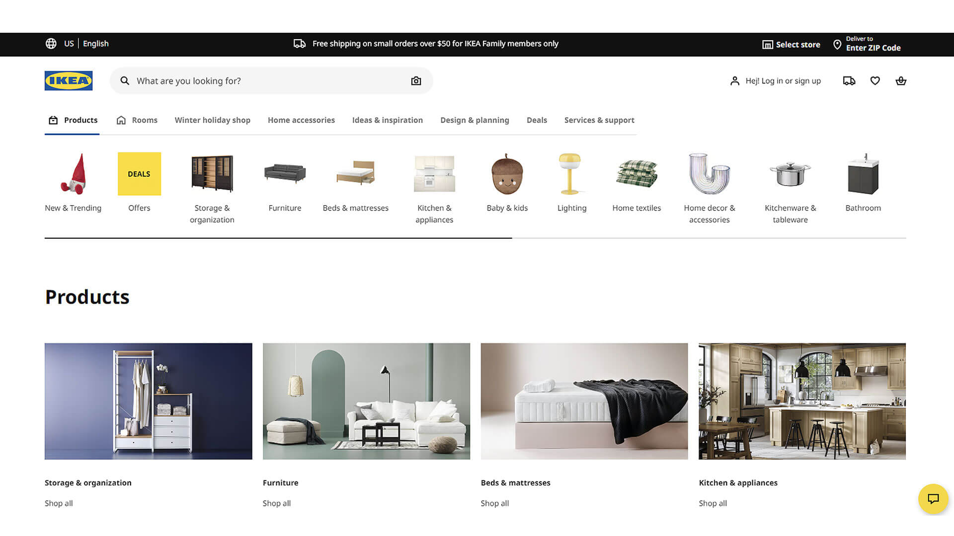
IKEA Kitchen’s website is the embodiment of functionality and accessibility, much like its furniture and home products. The color strategy revolves around the classic IKEA colors—blue and yellow—with plenty of white space to ensure a clean, easy-to-navigate design. The layout is highly visual, with large, high-quality images of kitchen setups and products arranged in a well-organized grid.
The homepage focuses on showcasing different kitchen room ideas and configurations, making it easy for users to visualize products in their own homes. Call-to-action buttons are bold and clear, using IKEA’s signature blue and yellow to stand out against the clean white backgrounds. Navigation is intuitive, with a mega-menu that offers quick access to kitchenware, appliances, and room ideas.
Typography is simple and functional, using sans-serif fonts that enhance the readability and accessibility of the website. IKEA’s website is a prime example of how web design services can create a highly functional and user-friendly experience without sacrificing aesthetic appeal.
30. Tupperware
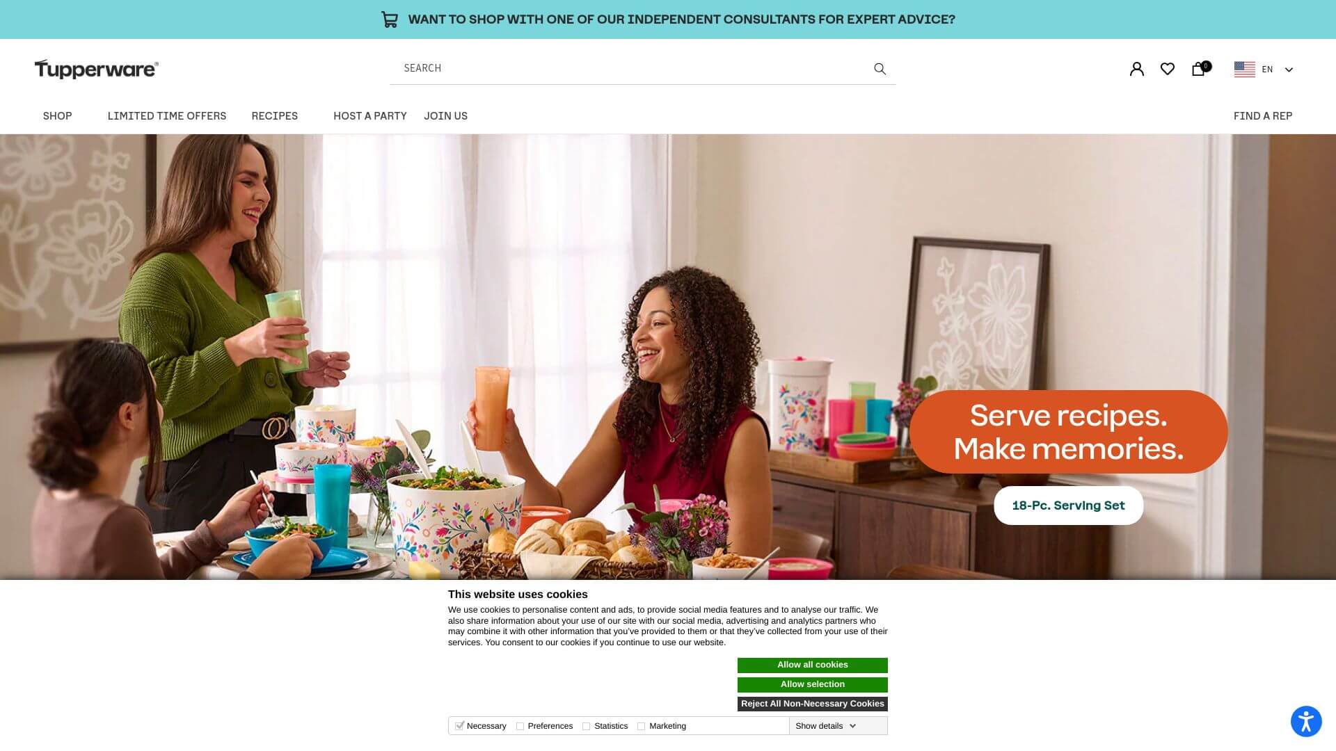
Tupperware's website design reflects the brand’s focus on innovation and convenience. The color strategy is bright and cheerful, with bold oranges, blues, and greens dominating the design, evoking a sense of freshness and modernity. The layout is clean and organized, with large images of their products displayed prominently on the homepage, along with banners that highlight special offers and seasonal collections.
Navigation is simple and intuitive, with a top bar providing easy access to categories like kitchen tools, storage, and cookware. Call-to-action buttons are bright and bold, often in orange or blue, making them stand out against the white and neutral backgrounds. The typography is modern and clean, using sans-serif fonts that align with the brand’s innovative and user-friendly image.
Tupperware’s website is an excellent example of how kitchenware website design can balance vibrant visuals with an intuitive, easy-to-use interface, creating a seamless shopping experience for users.
About Prateeksha Web Design
Prateeksha Web Design is a renowned company that specializes in creating visually appealing and user-friendly websites. Their services extend to designing stunning kitchenware websites, incorporating unique design inspirations that capture the essence of the brand. They blend creativity with functionality, ensuring an engaging online presence for kitchenware businesses.
Interested in learning more? Contact us today.
