Design inspiration - Companies selling Laminates
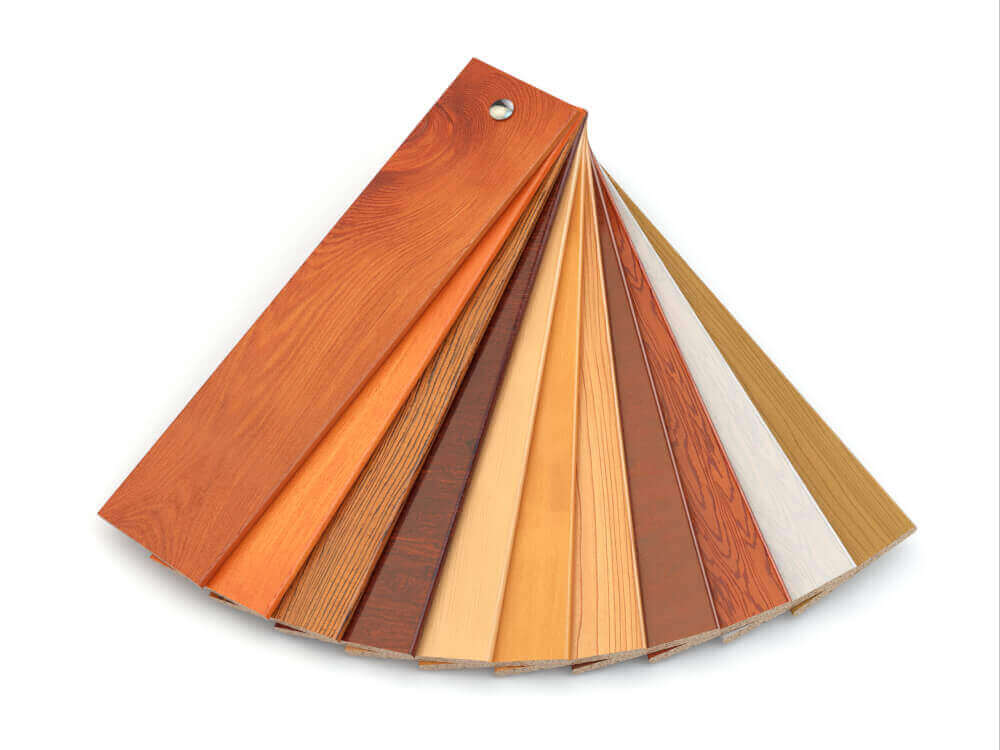
Businesses that sell laminates can get design ideas from the websites of major laminate makers like Formica, Greenlam Industries, Merino Laminates, Century Laminates, and Eurotex Laminates. These sites are made with the customer in mind, with clean and modern designs, high-quality photos of the products, clear categories for the products, and simple layouts. Bold typography and bright colours are used well to show that the brands care about sustainability and making high-quality products.
1. Asisindia.com
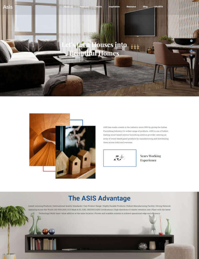
The website https://www.asisindia.com/ has a modern design which is inspiring and engaging for its users. The website uses bright colors and a clean layout to create an inviting atmosphere for visitors, with plenty of white space in the background. The homepage features an attractive banner with a slideshow of images that showcase the company's services, as well as links to other pages on the site. The navigation bar at the top allows users to quickly locate information they are looking for, while also displaying key features such as "Design Inspirations" and "Web Design & Creative". Along the bottom of the page are social media icons so customers can stay connected with ASIS India's latest updates. Overall, this website design provides an easy-to-navigate experience that is both aesthetically pleasing and informative for its visitors.
2. Deltalaminates.in
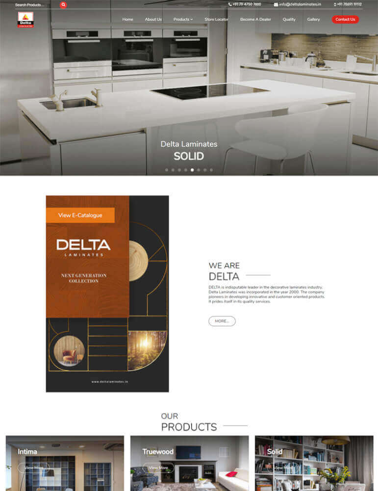
Delta Laminates is a website that focuses on providing design inspiration and website design services. The overall design of the site has an organized structure with a modern, professional feel. It features clean, crisp lines and a bold color palette of blues, whites, and greys.
The homepage is divided into two main sections: “Inspiration” and “Services”. The Inspiration section showcases the company's portfolio of work featuring various designs from different industries and sectors including retail, hospitality, corporate interiors etc., while the Services section provides information about their web design services such as custom websites built on WordPress or Shopify platforms and other specialized services like SEO Optimization & digital marketing strategy development.
 Design inspiration Companies selling Laminates Deltalaminates" />
3. Wilsonart.com
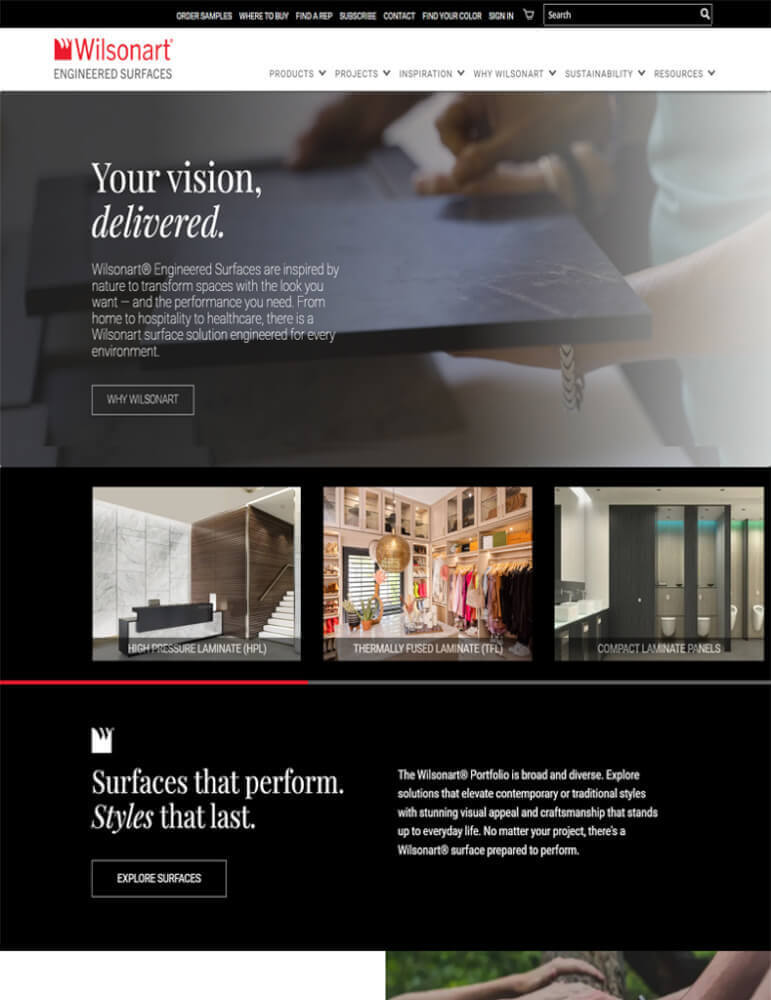
The website design of Wilsonart is clean, modern and user-friendly. They offer design inspiration and website design services to help customers create the perfect look for their home or office. The homepage features a large banner with images of their products, making it easy for customers to get an idea of what they offer.
The navigation bar at the top provides easy access to pages such as Design Inspiration, which showcases images from Wilsonart's collections along with ideas on how to create the perfect look using their products. There are also pages that provide information on Website Design Services, where customers can get personalized advice and help with designing their space.
Overall, Wilsonart's website design is inspiring and inviting while providing clear access to helpful resources like Design Inspiration and Website Design Services.
 Design inspiration Companies selling Laminates Wilsonart" />
4. Amulyamica.com
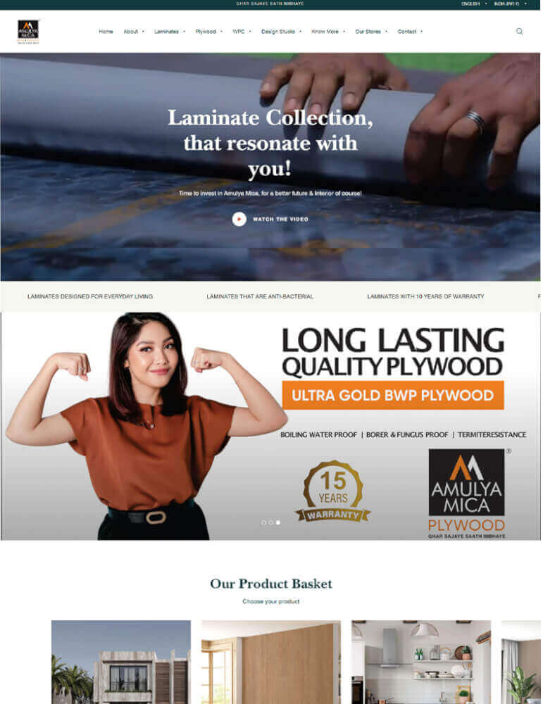
Amulyamica's website design is a great source of inspiration for anyone looking for ideas and services related to web design. The site has a modern, sleek look with an overall minimalist aesthetic. Website Design Services and Website Design Ideas are two of the sections on the homepage that show off the company's services.
Each section shows pictures and talks about the different ways Amulyamica can help you design a website. In addition, there are various testimonials from clients who have used their services that serve as further proof of the quality of their workmanship.
The navigation menu is simple and easy to use, allowing visitors to quickly find what they’re looking for without having to search through multiple pages or menus. Overall, the design of Amulyamica's website is a great way for people to get ideas or find professional web design services.
5. Arborite.com
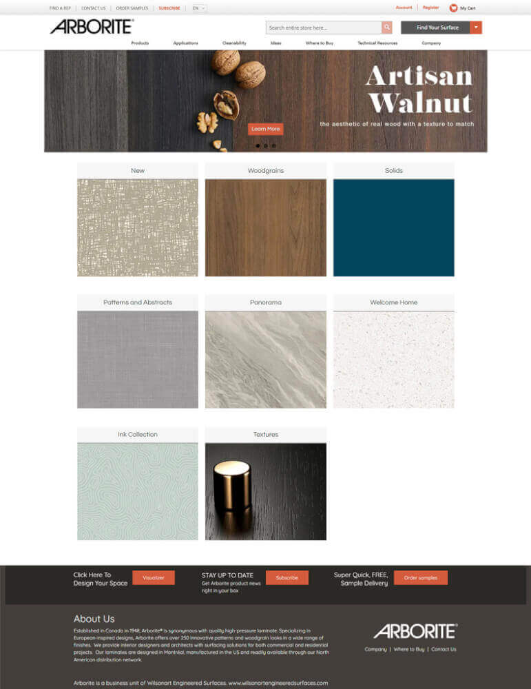
The design of arborite.com is modern and simple, with a focus on clean lines and simple shapes. On the homepage, there is a large hero image that shows off the company's services in an eye-catching way. The colour scheme is soft and earthy, with shades of green and brown that make the room feel calm. With drop-down menus for each part of the site, the navigation menu is easy to use.
The design of the site as a whole gives visitors a pleasant visual experience and gives them lots of ideas for their own projects. It also has information about their Website Design Services, such as Custom web development and digital marketing solutions. Visitors can also find a page called "Portfolio," which shows examples of projects that Arborite's professionals have done in the past and includes client testimonials to show how good they are at web design.
6. Arpaindustriale.com
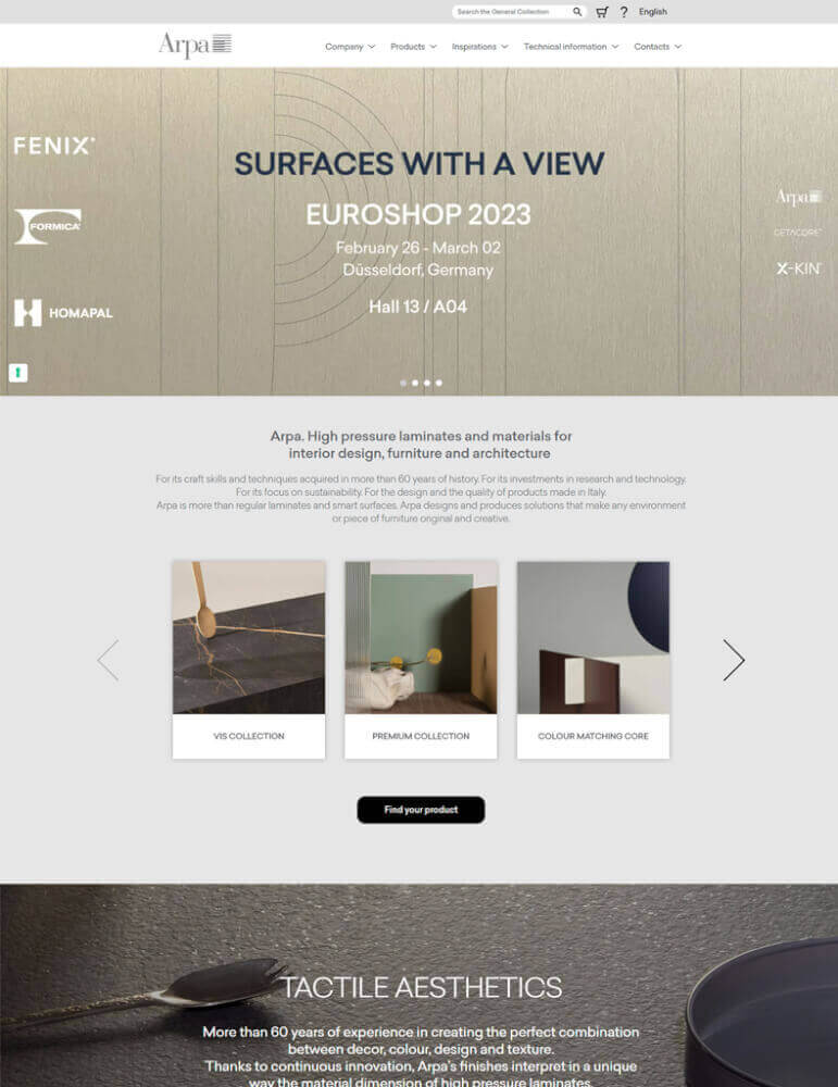
The style of http://arpaindustriale.com/en is based on modern, minimalist design. The top navigation bar has only four links: "Products," "Projects," "Company," and "Contacts." The homepage has a full-width banner image with white text on top.
The main colours of the site are different shades of grey, white, and blue. A few accent colours were chosen to draw attention to important parts of the site. All of the fonts are simple sans-serif styles, so they can be read on any size screen.
The website for Arpa Industriale is very simple because the company wants to draw attention to its products and projects. On each page, there are a few large photos or videos of their work to catch people's attention and make them want to learn more about what they have to offer.
The website for Arpa Industriale is easy to use and full of useful information. It shows off the company's products with eye-catching pictures and moving stories.
7. Atilaminates.com
The clean design of http://atilaminates.com/ is meant to inspire visitors to think of new ideas. The background of the website is a striking dark colour that makes the bright colours of the company's products stand out. The main colour is white, but accents and writing are done in different shades of grey.
The top menu bar has links to the pages for each product and a section called "Design Inspirations" where people can get ideas for their own projects. Under the "Services" tab, Website Design Services, Branding Design, and Digital Solutions are each shown in their own tab.
All over their website, Atilaminates makes it easy for site visitors to get in touch with the company and learn more about the products and services they offer. The layout is simple and clear, which makes it easier for customers to find what they are looking for. This makes it fun to shop online.
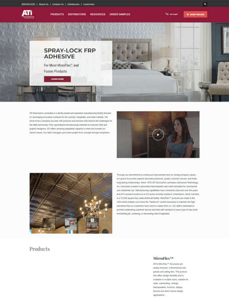
8. formica.com
Homeowners looking for design ideas can get ideas from https://www.formica.com/, which has a modern look and is easy to navigate. On the homepage, you can see pictures of countertops, cabinets, floors, and other places where Formica is used. The website has a clean white background with bright splashes of colour that are placed in just the right places to show off Formica's products.
Visitors can get to different parts of the site by clicking on tabs along the top navigation bar. These tabs lead to sections like Goods, Design Inspiration, Project Gallery, Samples & Brochures, Technical Information & Support, and Website Design Services.
Under each tab, customers can find more information, such as product specifications, how to install the device, and case studies that show how their products have been used. In the top right corner of the site, there is also a search bar where people can look for information about specific Formica products or explore related topics.
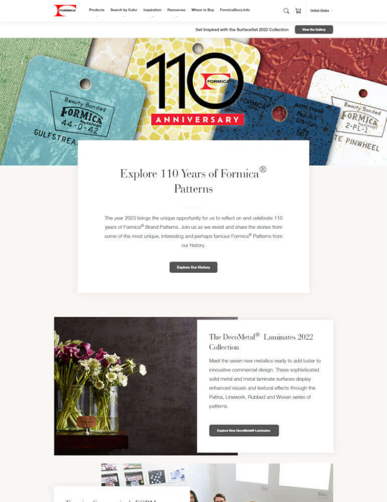
9. Howdens.com
The style of http://howdens.com/ is clean and friendly. The peaceful colour scheme is made up of grayscale, blues, and greens. On the homepage, you can see pictures of newly remodelled kitchens, bathrooms, and other rooms in people's homes that look nice. The menu is simple and makes it easy to find useful information about the company's services, such as website design. With helpful tools like a room planner and product selection guide, customers can find everything they need in one place.
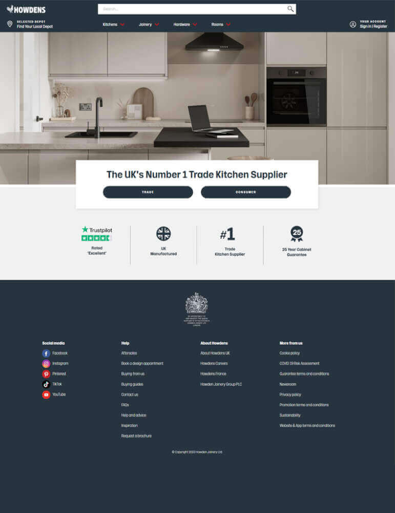
10. Ialaminates.com
The style of IALaminates.com is modern and simple, which shows off the company's products. Visitors to the homepage are greeted by a slider of eye-catching photos of products. This is followed by information about the company and the products and services it offers. At the top of the page is a menu bar that lets you get to the different parts of the site, such as the product catalogue, galleries of design ideas, and even how to build a website.
A lot of greens and blues are used in the site's colour scheme to make it look modern and professional. The text is easy to read because the fonts are the right size for both computers and phones.
IALaminates makes it easy for visitors to connect with them on their favourite social media platforms by putting links to their profiles in the upper right corner of every page. Users of the site can easily find the information they need to get in touch with a local or global IALaminates rep because this information is shown in both text and interactive maps.
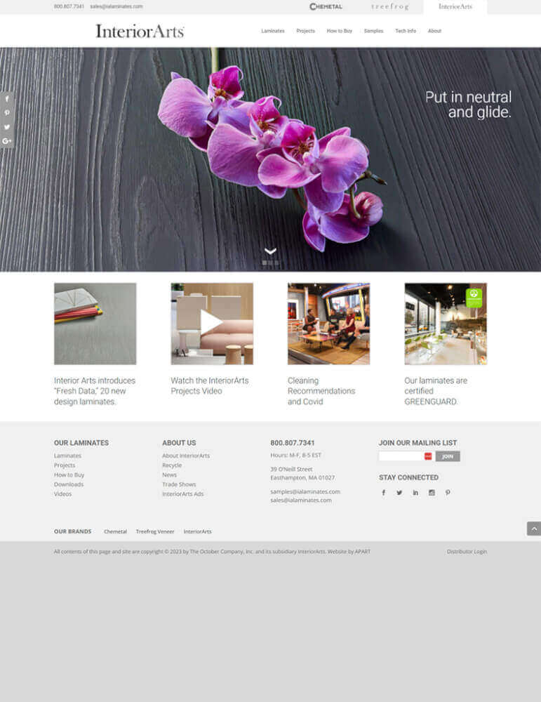
11. Laminex.com.au
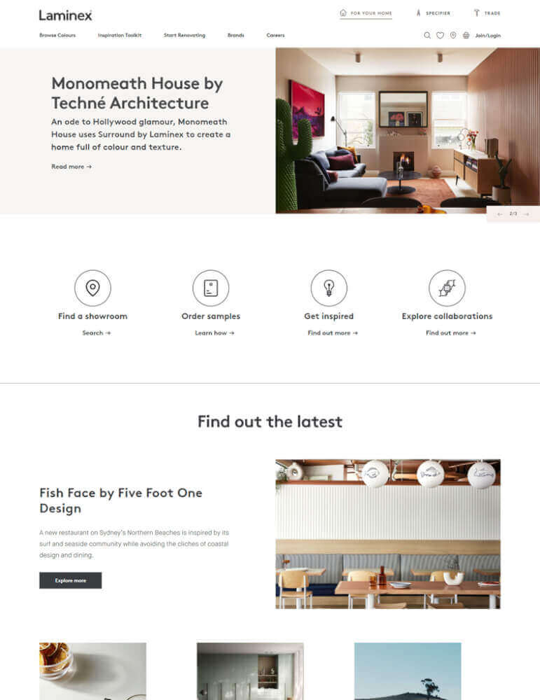
Laminex.com.au has a new look that is both simple and full of pictures that will catch your eye. The company logo, tagline, and a strong call to action are all in a large header at the top of the homepage. The following large photos show what they sell and give customers ideas for how to arrange their own rooms. Further down the page, you can learn about services like website design, colour schemes, and more.
The white background helps to show off the photos of their products in a way that looks clean and appealing. Also, the way the site is set up makes it easy to find specific information about the company's products, like how to choose colours or how to place an order, by using the tabs at the top of the page.
Overall, Laminex's site design gives visitors a warm and friendly feeling by using eye-catching images and simple navigation that makes it easy for them to find the information they need.
12. Mohawkind.com
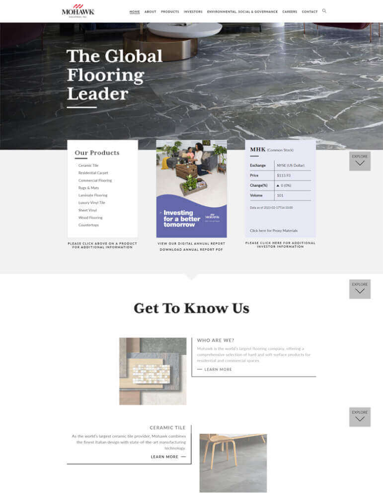
Mohawkind.com is a great example of how a modern website should look. The designers chose a chic and simple colour palette for the site, which is why it looks professional and has a clean layout. On the homepage, a slideshow of full-screen photos shows off Mohawkind's web design services and gives potential clients ideas for their own projects.
The site's top navigation bar makes it easy for users to look at Mohawkind's many services, such as Website Design Services, Graphic Design Services, and Branding & Identity Design Services. At the end of each page, there are links to other parts of Mohawkind's website, such as the portfolio, where you can see examples of their past work in more detail.
13. Quick-step.co
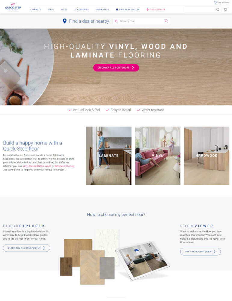
Quick-website Step's looks good and is full of new ideas. The full-width banner on the landing page shows an eye-catching picture of elegantly made wooden flooring. A navigation bar at the top of the site has tabs for Collections, Inspiration, About Us, and Contact Us. Visitors can use the carousel under the banner to look at the different flooring styles and collections.
The drop-down menus at the bottom of the homepage let you look through the products and services that Quick-Step has to offer. These include Design Inspiration, which tells you how to decorate with Quick-Step products, Website Design Services, which tells you how to choose the right colours and textures for your home, and other products like underlays, accessories, and installation tools. In each of these sections, you'll be drawn in right away by the pictures that stand out.
In conclusion, Quick-Step has made a state-of-the-art website that is both beautiful and easy to use.
14. Styleideasdirect.co.uk
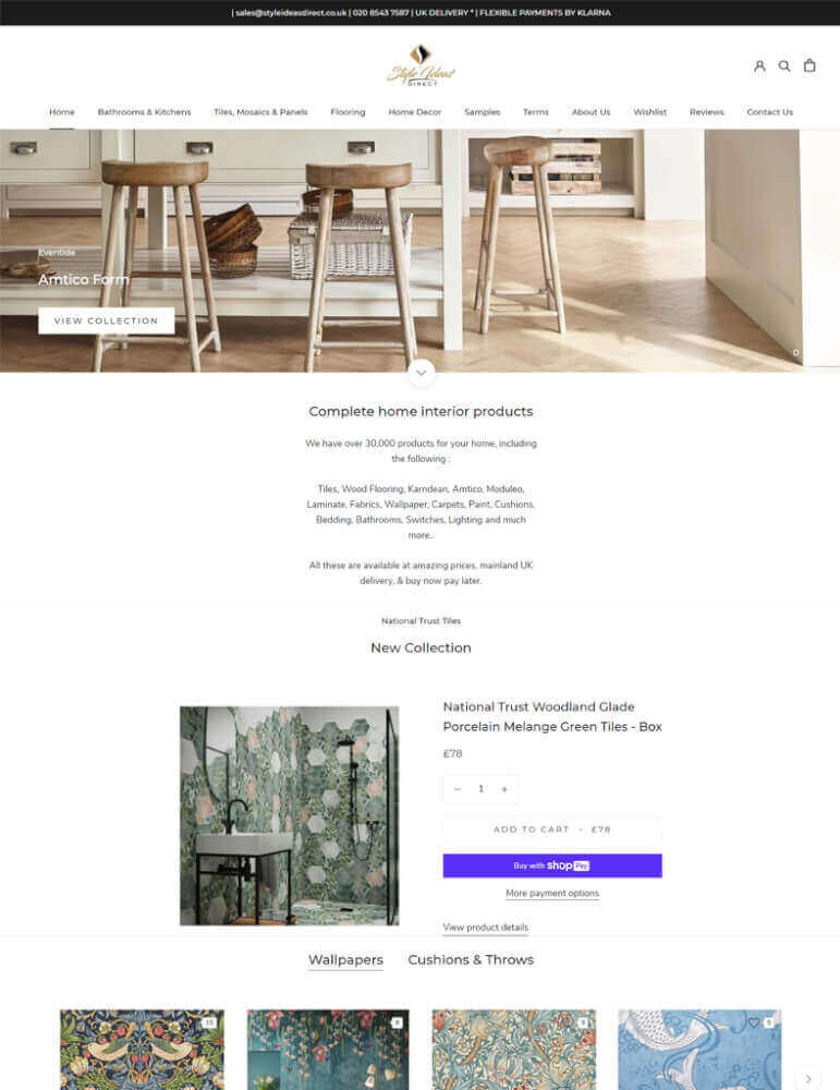
At https://www.styleideasdirect.co.uk/, you can find a stylish online store that sells furniture and decorations for the home. Check out these important parts of the design:
White and grey are the main colours of the site, and pink and gold are the secondary colours. The pink and gold details stand out against the clean and fresh-looking white background.
The typography on the site is modern and clean. Headers and body text are set in a sans-serif typeface that is easy to read. The categories in the top-level navigation menu make it easy for users to find what they need. The pull-down menus give you more ways to move around the site.
15. Sundekindia.com
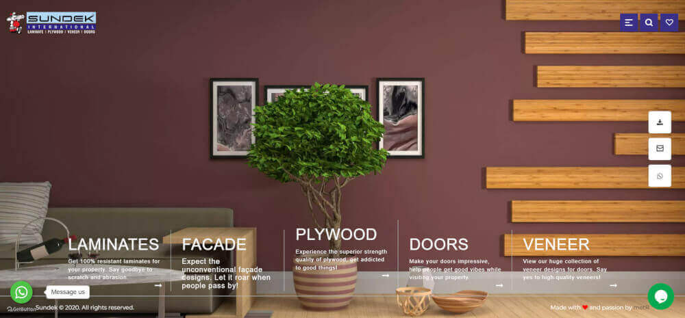
The site, which can be found at http://sundekindia.com/, is a business website for a company that makes decorative concrete solutions. It has a clean, modern look. Check out these important parts of the design:
The main colours of the site are white, grey, and blue, and orange is used as an accent. The white background is clean and modern, and the blue and orange accents make things more interesting. The typography on the site is modern and clean. Headers and body text are set in a sans-serif typeface that is easy to read. The categories in the top-level navigation menu make it easy for users to find what they need. The pull-down menus give you more ways to move around the site.
