Design Inspirations for a More Engaging Pharmacy Website
Table of Contents
- Rx Outreach - Website
- North Fulton Compounding Pharmacy - Website
- Boots Pharmacy - Website
- Medx Pharmacy & Supply - Website
- Prairieville Pharmacy - Website
- HealthWarehouse - Website
- Southstar Drug - Website
- My Dr’s Pharmacy - Website
- Carehart Pharmacy - Website
- Central Drugs Compounding Pharmacy - Website
- VeganMed - Website
- Advantages Pharmacy - Website
- Dyer Drugstore - Website
- DrugMart - Website
- AndroGenX - Website
- Coastal Biotech Pharmacy - Website
- United Pharmacy Berkeley - Website
- My Medicap Pharmacy - Website
- Gulf Drug Company - Website
- MEDS Pharmacy - Website
- Myeloma Australia Pharmacy - Website
- Rebecca Newton, LMFT - Website
- BEHAP Clinic - Website
- Mt Annan Eyecare - Website
- Melbourne Mothers Pharmacy - Website
- RxPharmacyNow - Website
- PrimeRx Pharmacy - Website
- Mayo Clinic - Website
- HealthDirect Pharmacy - Website
- Medika Health Clinic - Website
1. Rx Outreach
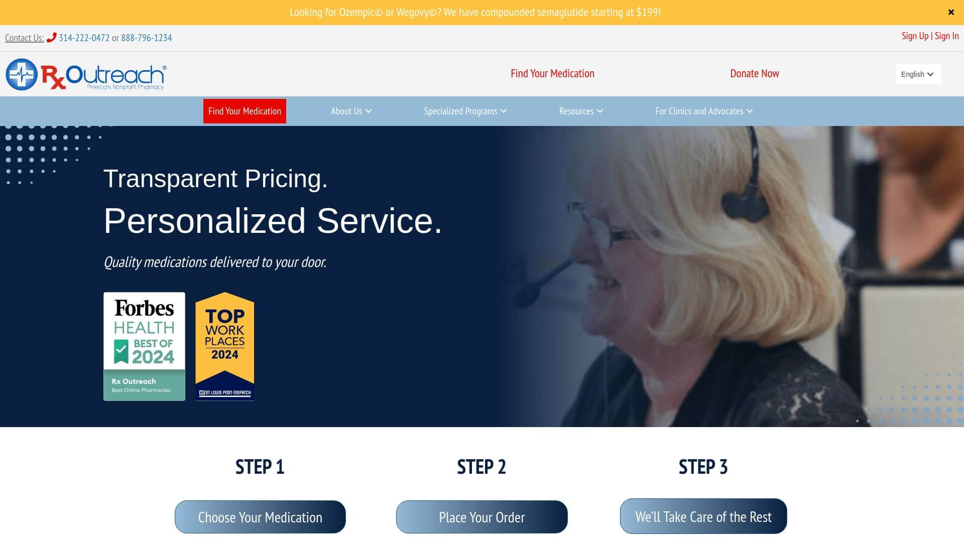
This award-winning pharmacy website excels in delivering a calming user experience through its blue and gray hues, which establish trust and relaxation. The clever use of red for call-to-action buttons and menu items draws the user's attention exactly where it needs to go. The homepage's background imagery—a couple on the beach—subliminally conveys a stress-free experience with the pharmacy. The site effectively showcases its multiple awards and testimonials, establishing social proof.
2. North Fulton Pharmacy
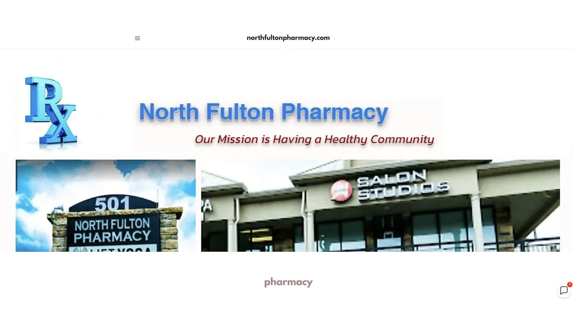
North Fulton Pharmacy is a full-service pharmacy in Alpharetta, GA. We are a local, family-owned, independent pharmacy focused on standard prescriptions, personalized compounding of medications, wellness and health management, hospital transition of care, excellent customer service, and a full line of healthcare and over-the-counter products! North Fulton Pharmacy is located in Alpharetta at the corner of 501 S Main St, Alpharetta, GA 30009.
3. Boots Pharmacy
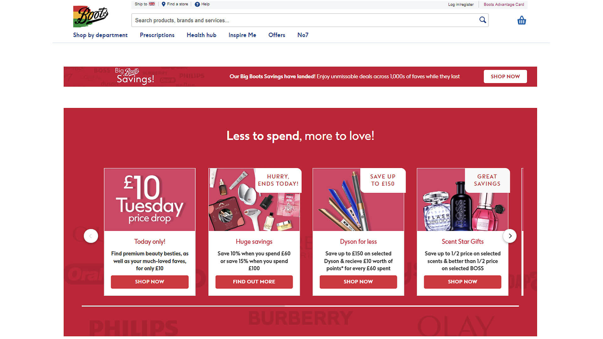
The design of Boots Pharmacy is akin to a digital magazine, where product categories are organized efficiently for seamless navigation. The color scheme is bright, with clean whites and pastels, enhancing the readability of the text. The website is responsive and loads quickly, making it easy for users to find what they need, whether it’s prescriptions or health tips.
4. Medx Pharmacy
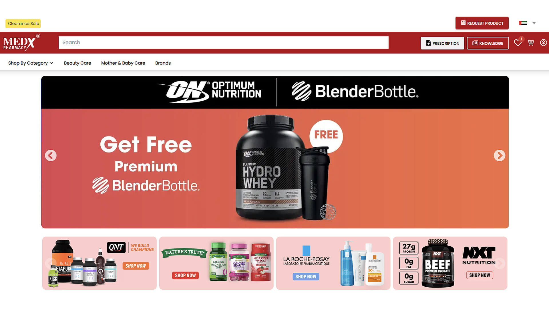
At MedX Pharmacy, we aim to help everyone who wants to stay fit & embark upon their fitness journey. We are equally passionate about the idea of fitness and want to help people transform their lives. Keeping this vision in mind, we started in 2015 to support the health and wellbeing of the community. Over time, we have cultivated a strong relationship with top brands.
5. Prairieville Pharmacy
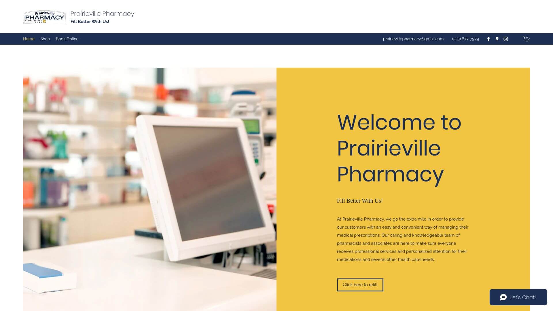
This site stands out with its mobile-first approach, offering a clean, motion-enhanced design that’s easy to navigate on both desktop and mobile. Split-page designs guide visitors to key information like store hours, services, and prescription refills. The color scheme is soft and professional, balancing white space with touches of blue for clarity and focus.
Visit prairievillepharmacy.com
6. HealthWarehouse
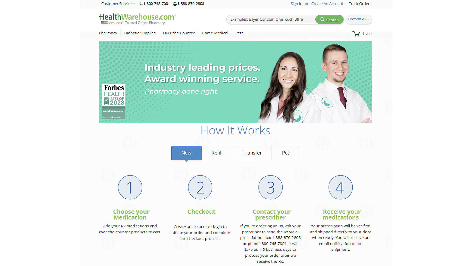
Simplicity reigns supreme at HealthWarehouse, with a minimalist design emphasizing white spaces. The layout offers easy access to products through a prominent search bar and a neatly categorized product catalogue. The simple color scheme and spacious design make it an inviting site for users looking to quickly locate their medications.
7. Southstar Drug
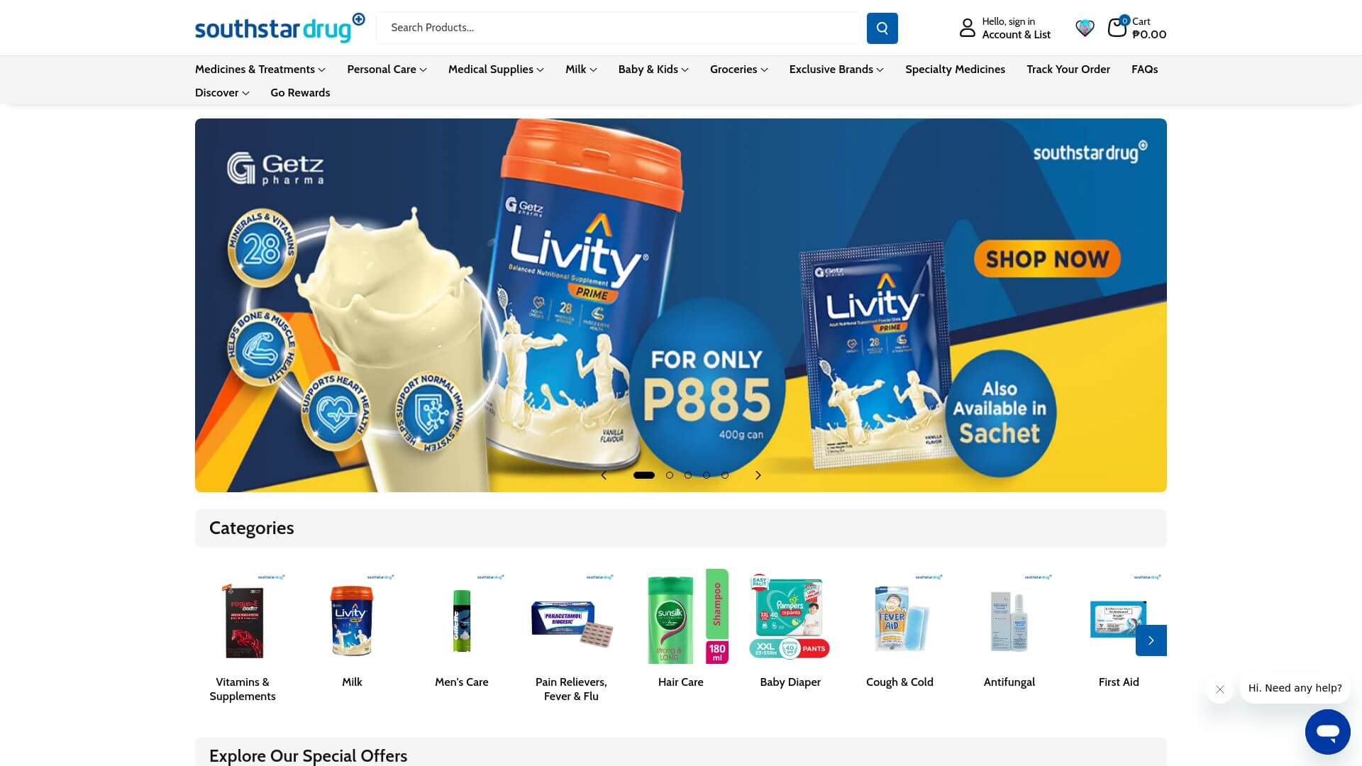
Southstar Drug’s design emphasizes urgency and promotion through bold banner ads that greet visitors. The website doubles as an e-commerce store, offering a dynamic user experience where visitors can quickly find promotions, products, and services. The bright and engaging visuals draw users in, while the responsive design ensures usability across all devices.
8. My Dr’s Pharmacy
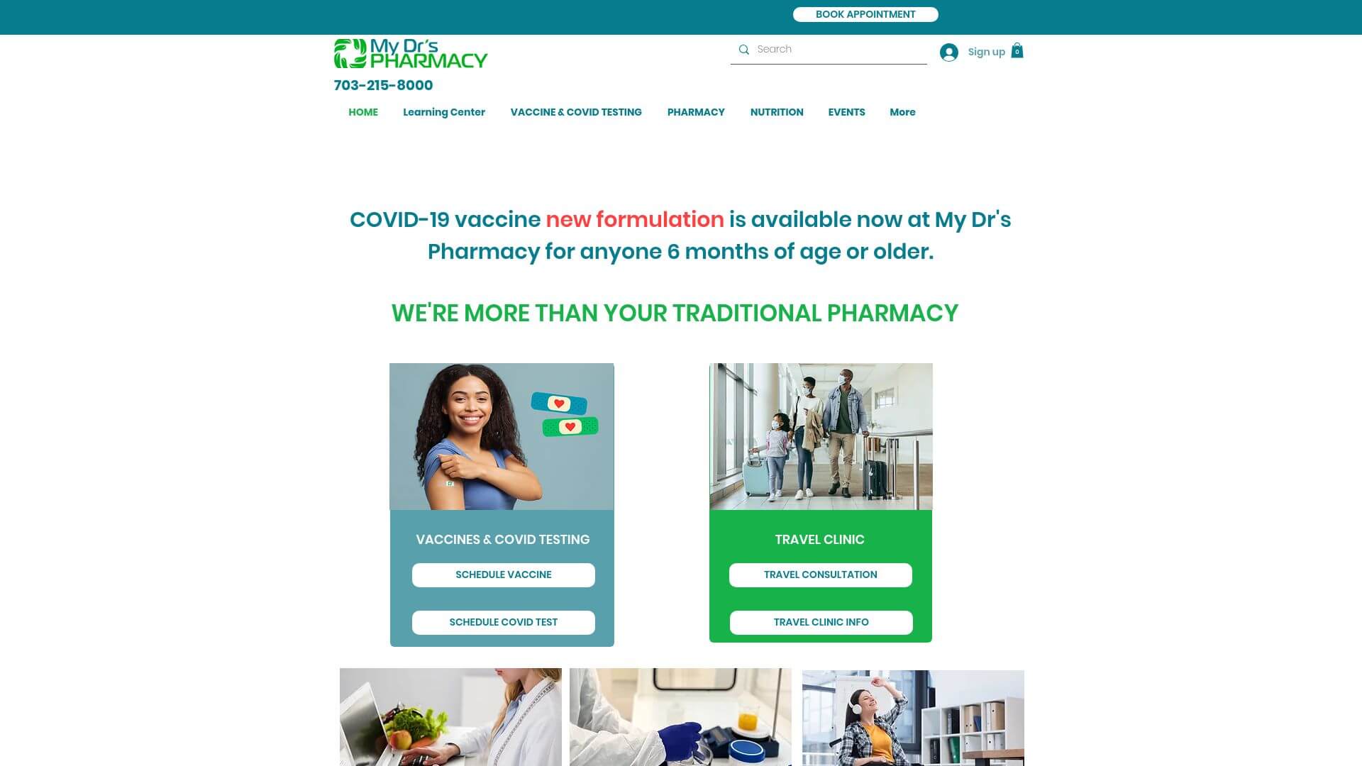
Featuring a Wix-built template, this website leverages a blocky, sectioned layout that separates services clearly. The design features plenty of white space, making the navigation intuitive. It also includes excellent SEO Optimization, which ensures that users can easily find it on search engines. The clean layout enhances the user experience, especially on mobile devices.
9. Carehart Pharmacy
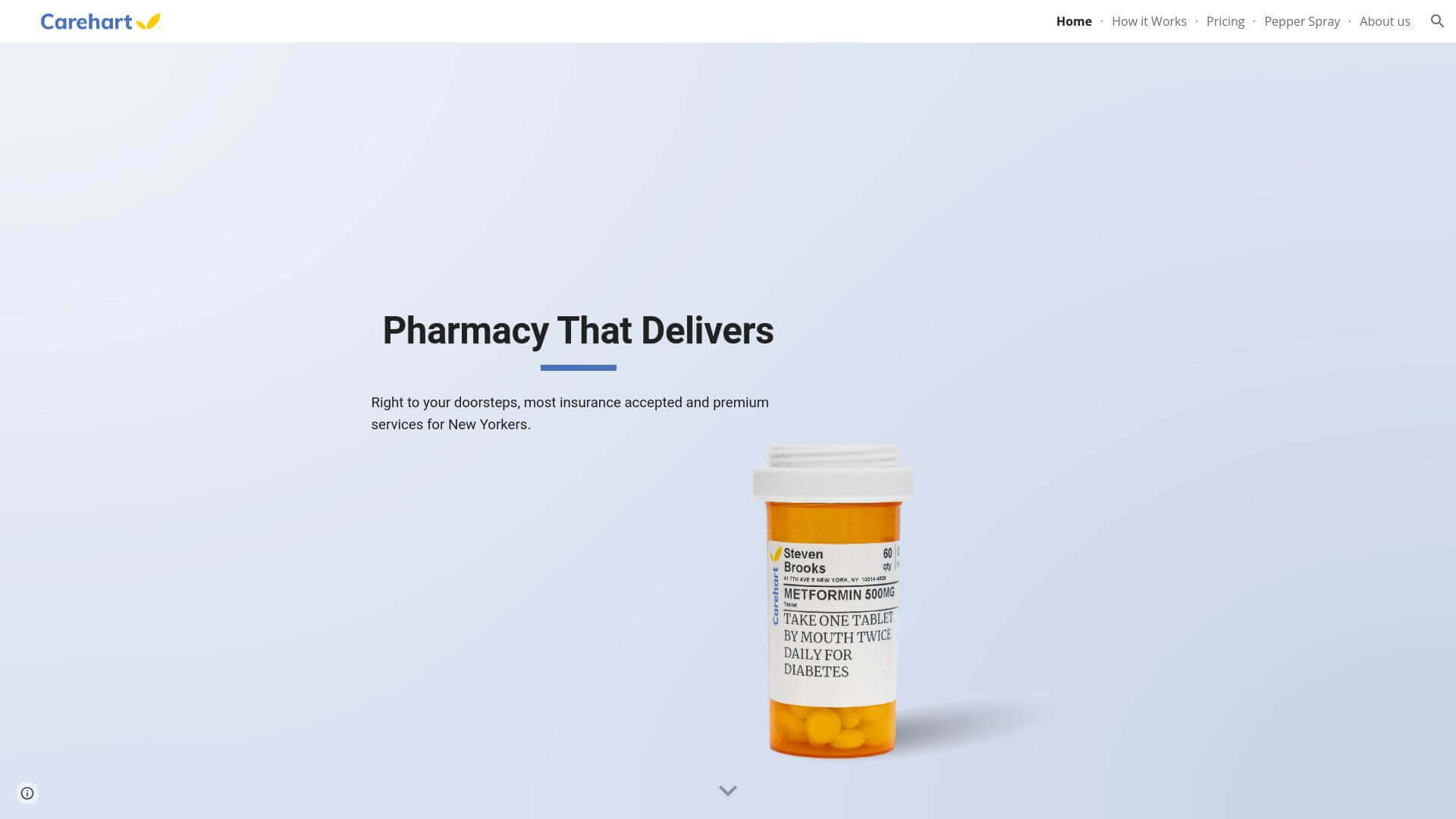
The design here is minimalist but impactful. By removing any unnecessary decorative elements, Carehart focuses attention on the content and services. This simplicity enhances usability and ensures that visitors can navigate and find what they need with ease.
10. Central Drugs Compounding Pharmacy
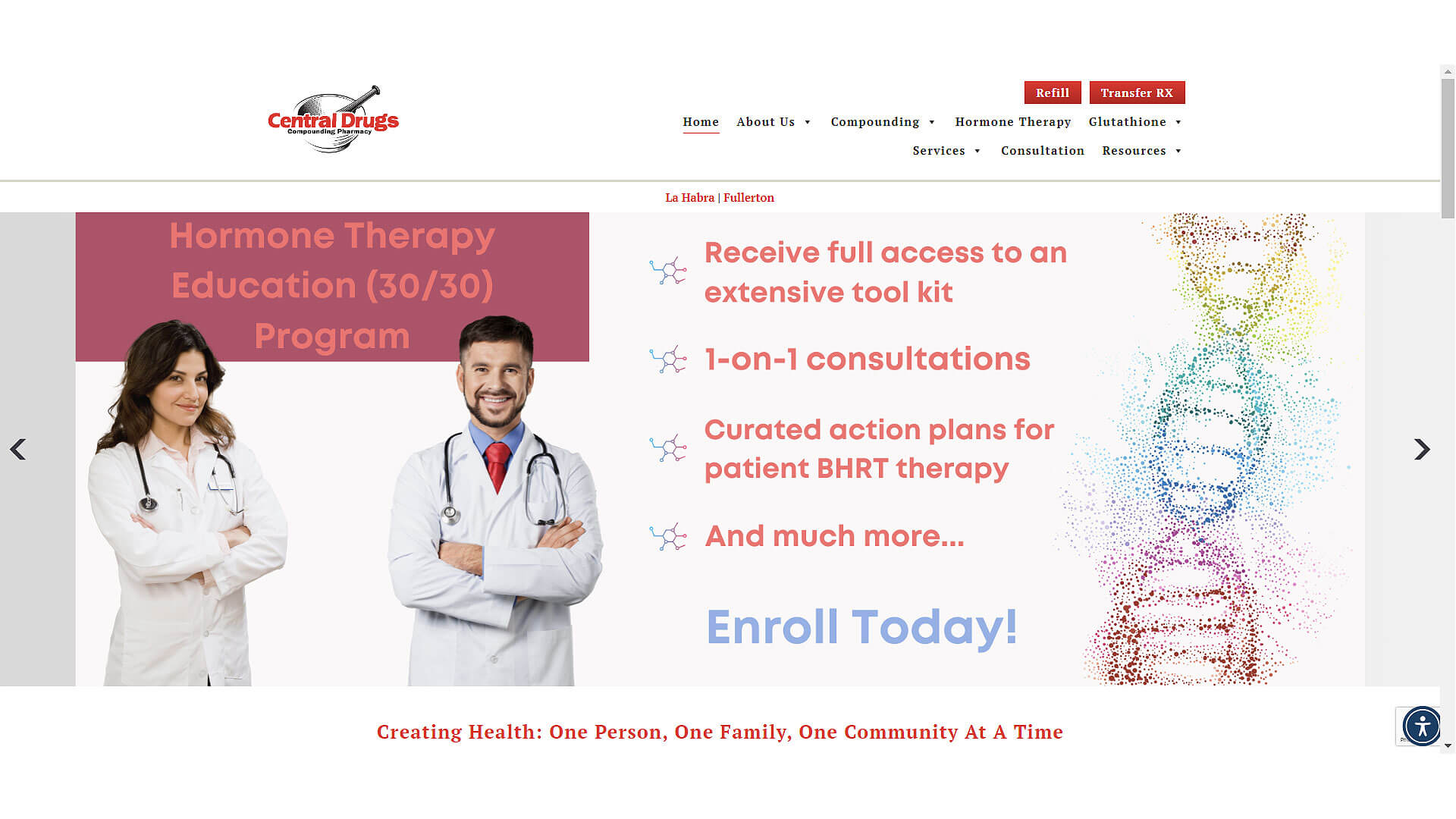
Central Drugs uses a red and white color scheme, reflecting urgency and reliability. The minimalist layout makes the site highly functional with online refills and prescription transfer services readily available. The use of red in call-to-action buttons encourages engagement, while the clean design ensures the site is easy to navigate.
11. VeganMed
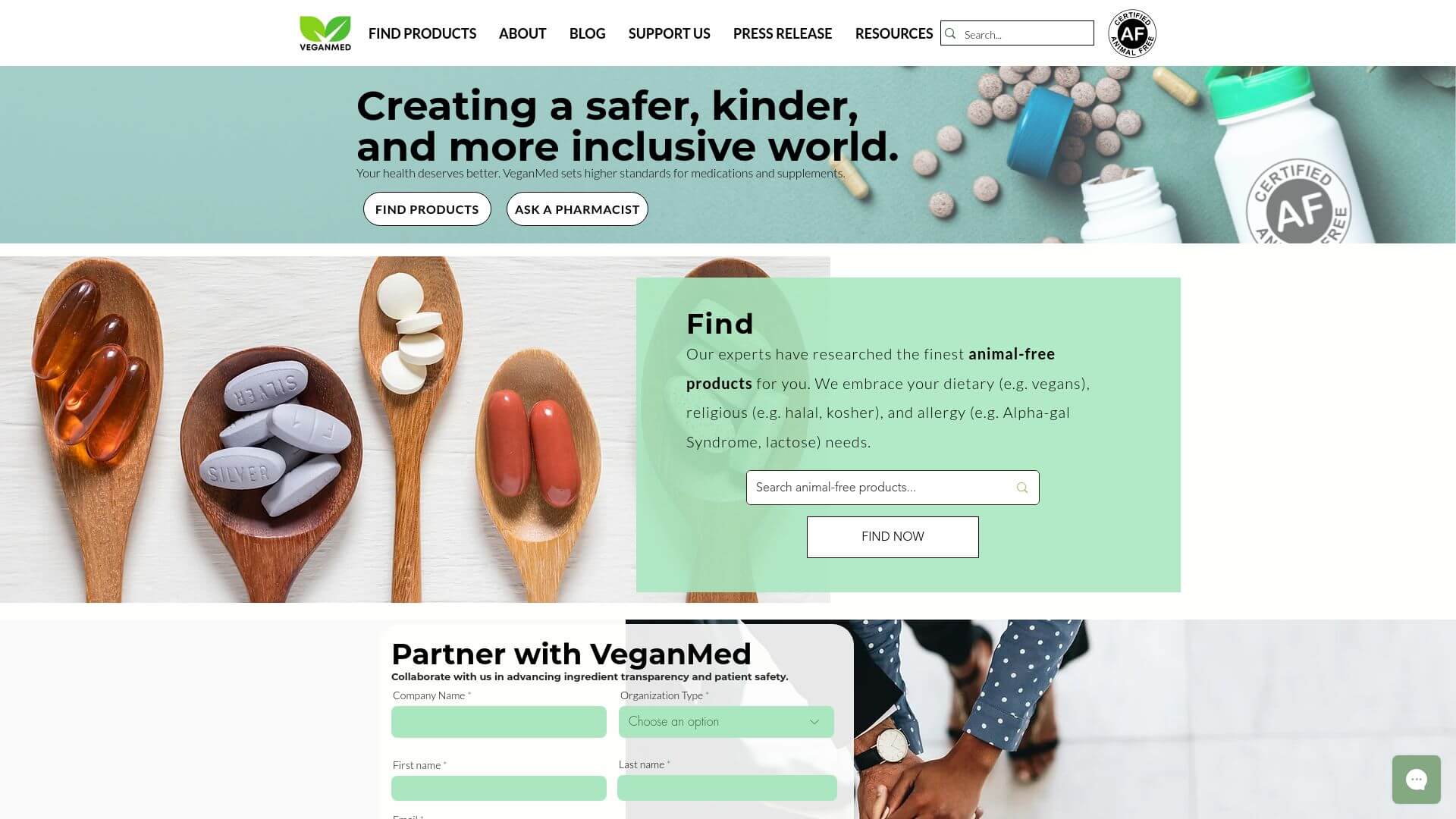
VeganMed’s website is an excellent example of modern minimalism with a focus on clear communication of its plant-based pharmaceutical mission. The use of coated and uncoated pill images as a central theme immediately distinguishes the site, allowing users to understand its offerings at first glance. The layout is straightforward, with a strong focus on customer testimonials and certifications, which add credibility to the brand. The chatbot is an important interactive feature, guiding customers through refills and queries. The site’s green tones, combined with simple text overlays, enhance its environmental and health-friendly vibe, making it both professional and welcoming.
12. Advantages Pharmacy
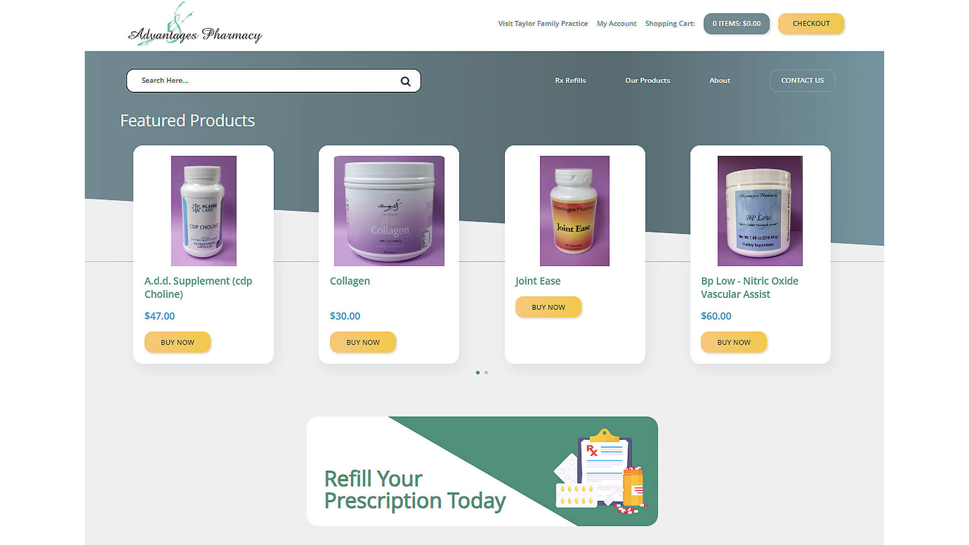
Advantages Pharmacy’s website is clean, simple, and designed to quickly meet customer needs. The lightweight design features a balanced mix of white space and key call-to-action buttons, ensuring that users can navigate smoothly. This site’s emphasis on its online store, where users can purchase pharmaceutical products, stands out. Its light green and white color scheme offers a professional, no-nonsense appeal that reflects the pharmacy’s dedication to customer convenience and transparency. The online store's layout is intuitive, guiding visitors directly to the products or services they need.
13. Dyer Drugstore
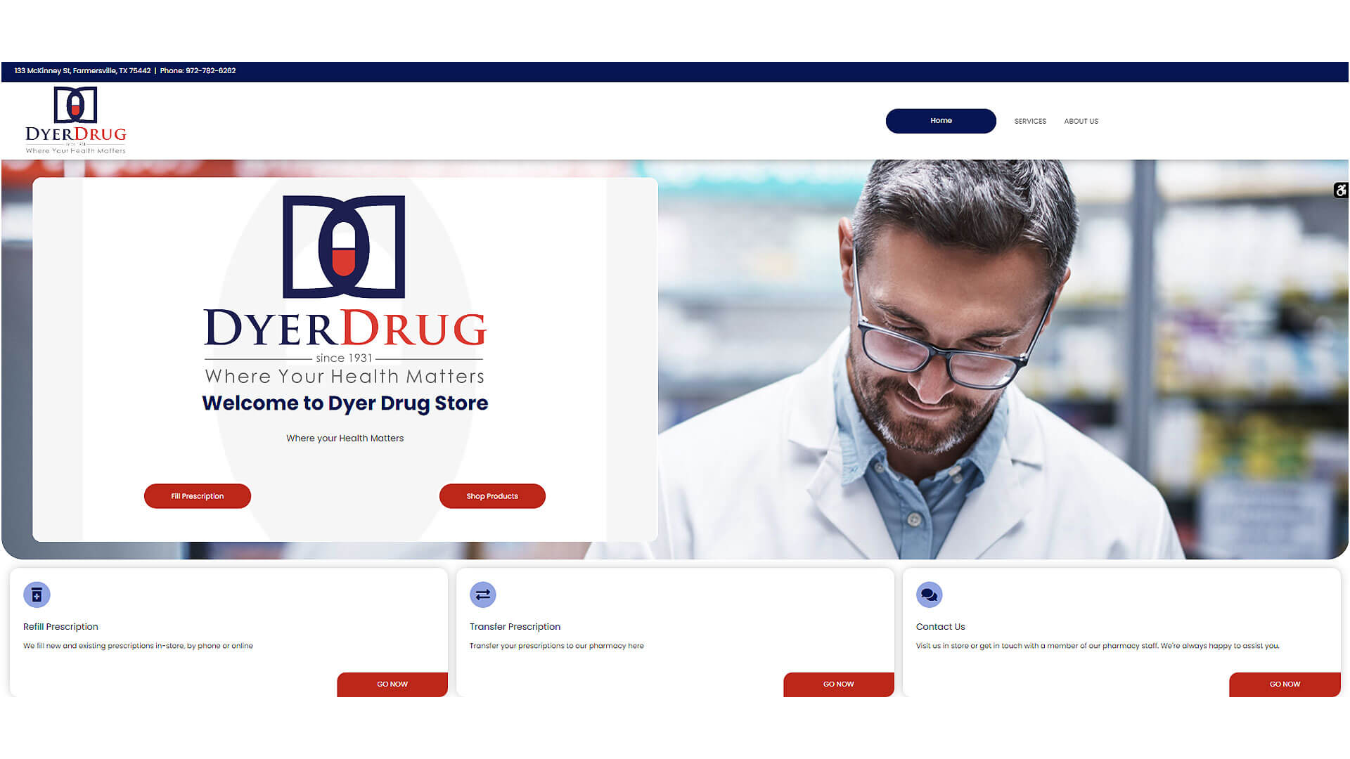
Dyer Drugstore taps into a nostalgic feel with a website that reminds users of a traditional pharmacy. The use of warm tones and vintage-inspired elements helps foster trust and reliability. Despite the retro look, the website is packed with modern functionality, including online prescription management and fast-loading pages that adapt to mobile devices. The overall structure is straightforward, ensuring that users of all technical abilities can navigate the site efficiently.
14. DrugMart
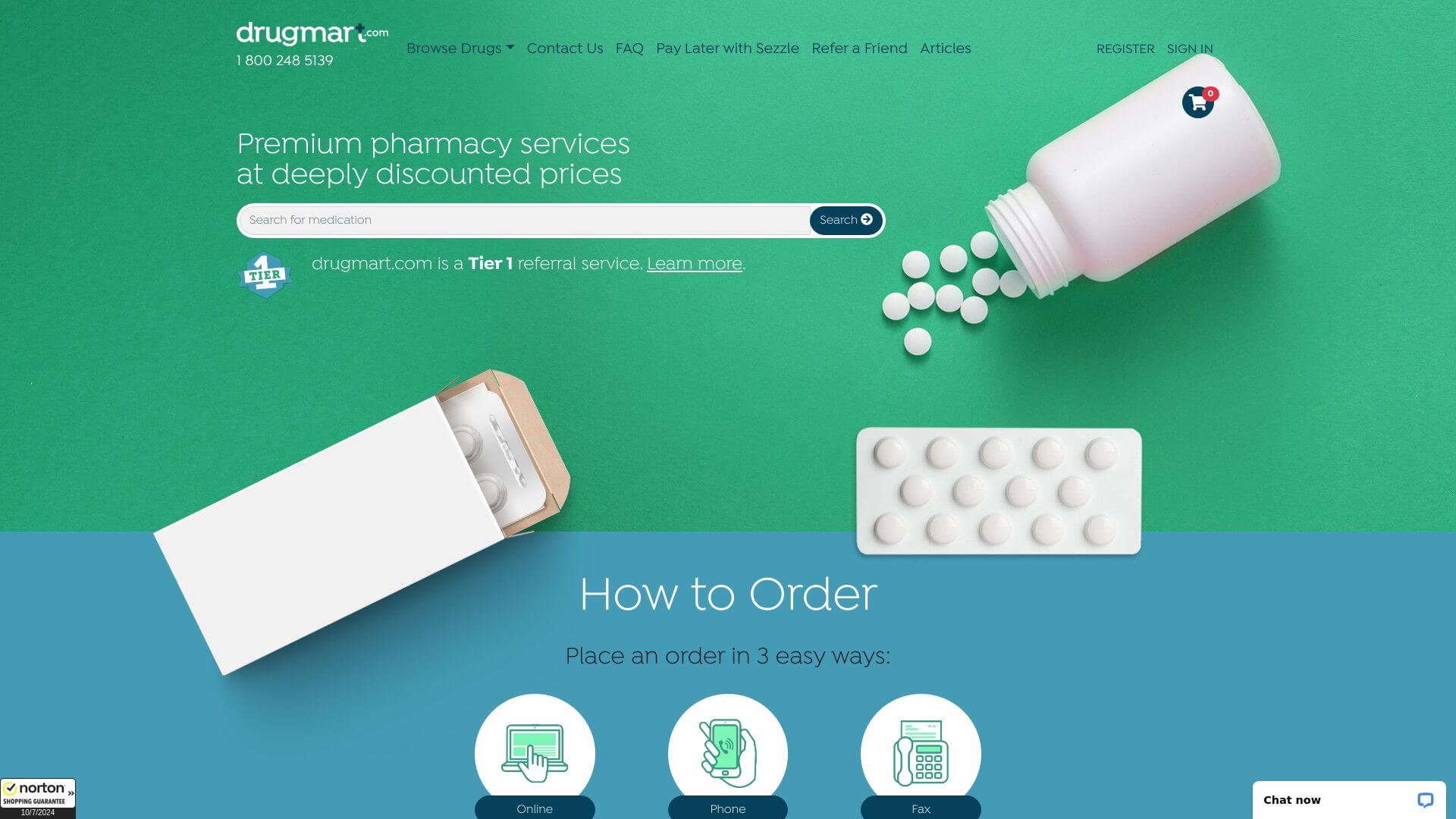
DrugMart’s website focuses on clarity and ease of use. The white and light green palette reflects the health-conscious nature of the brand, while the no-frills layout allows users to quickly find the products and services they need. A standout feature is the auto-refill program, which is clearly highlighted on the homepage. The clean design supports an optimal user experience, making it a great fit for both tech-savvy customers and those who prefer a more straightforward approach.
15. AndroGenX
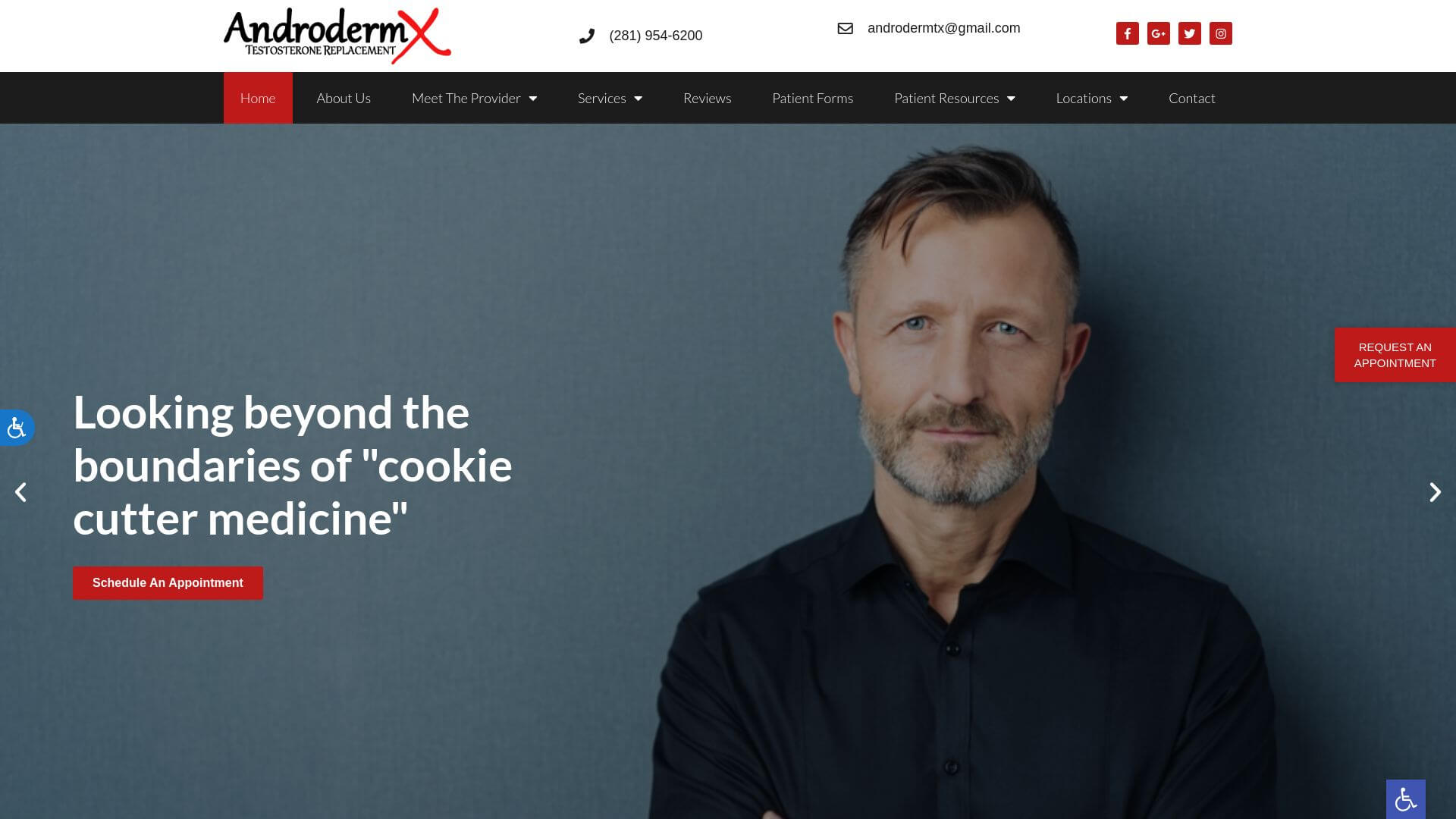
Designed for a specialized clientele, the AndroGenX website provides a sleek, user-friendly platform focusing on men's health. The website is visually striking, using dark tones and bold typography to appeal to its target demographic. The navigation is simple, with dedicated sections for patient resources and online scheduling, providing a discreet and convenient experience for users. Overall, the site blends modern aesthetics with functional usability, enhancing the customer journey while addressing specialized healthcare needs.
16. Coastal Biotech Pharmacy
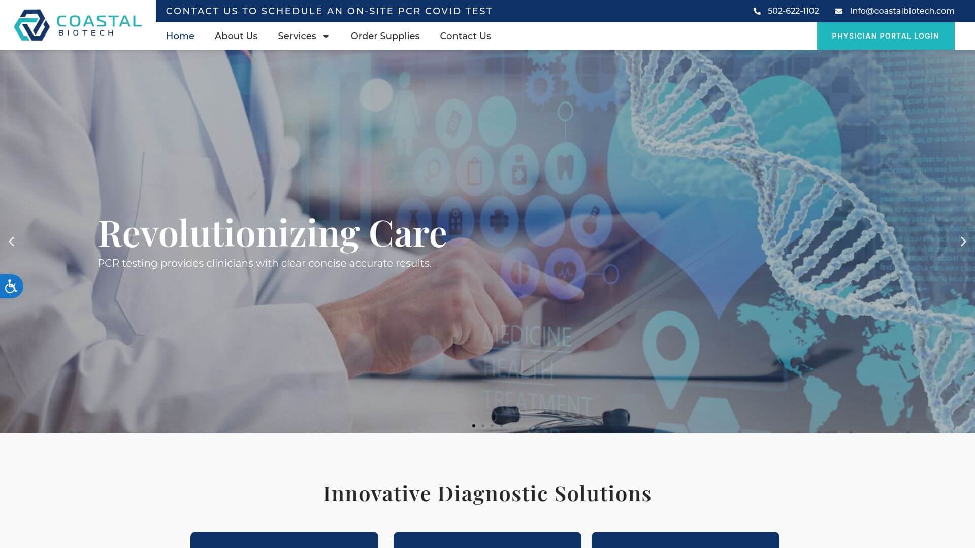
The cool blues and whites of Coastal Biotech's website immediately communicate professionalism and cleanliness. The layout is minimal, with high-quality images that accurately reflect the pharmacy’s biotech services. The about page and service sections are clearly delineated, ensuring that users can quickly find the information they need. The overall tone is scientific yet approachable, perfect for a pharmacy that caters to both patients and healthcare providers.
17. United Pharmacy Berkeley
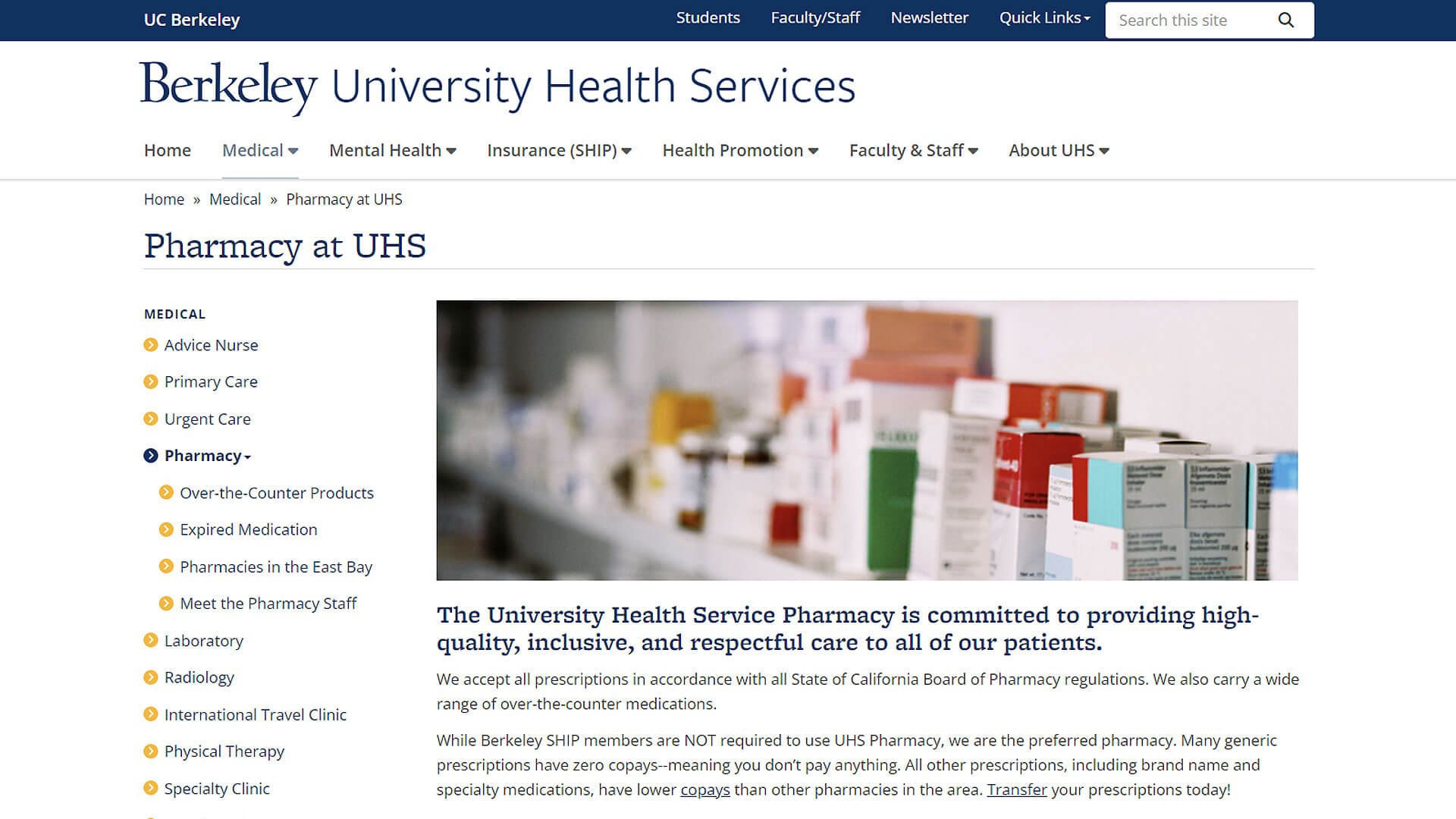
This website uses bold call-to-action buttons and testimonials to enhance user trust. Its clean and professional design ensures visitors can easily navigate through the services, maps, and contact information. The blue and white color scheme fosters an atmosphere of trust and transparency, which is crucial for healthcare providers. A helpful map widget ensures customers can find the pharmacy’s physical location without difficulty.
18. My Medicap Pharmacy
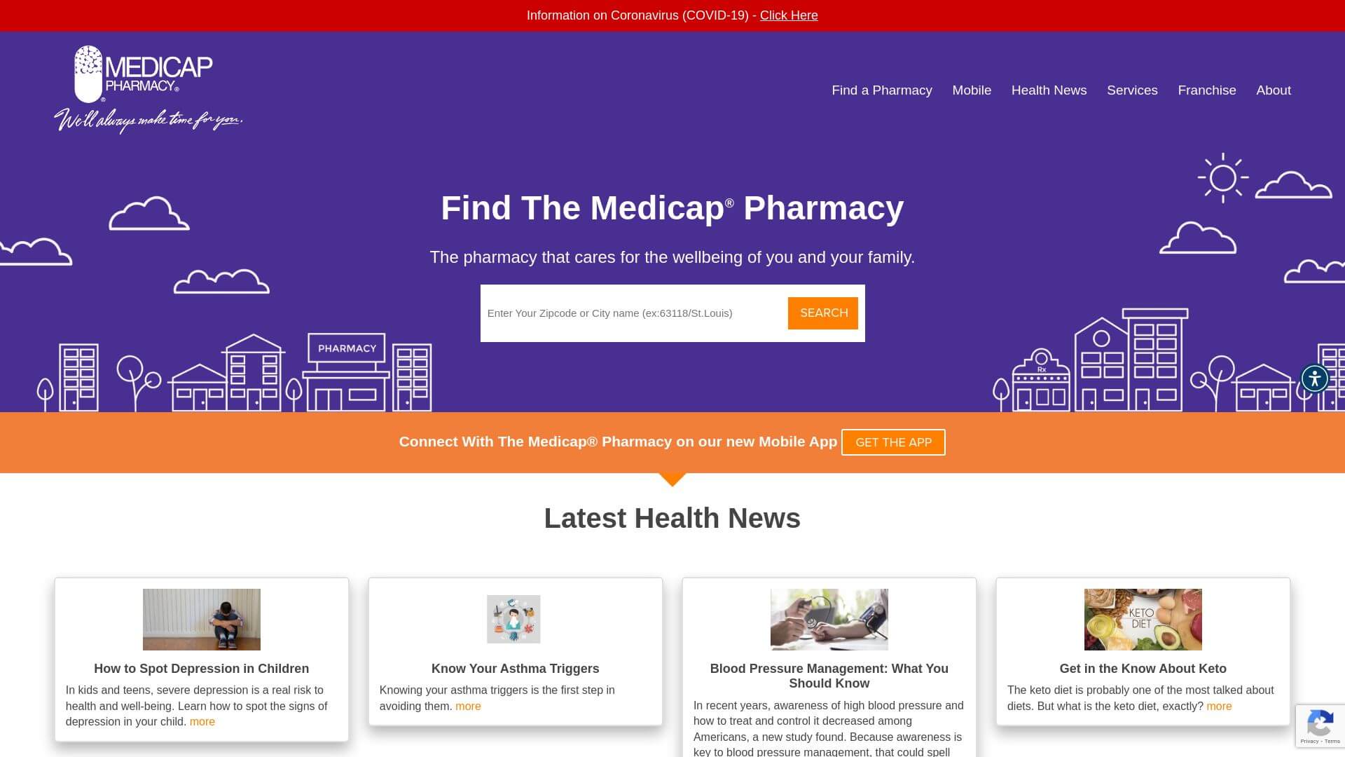
My Medicap Pharmacy’s website stands out with its four-section layout that includes a professional yet inviting purple-haze background. The design keeps things simple but functional, with horizontal menus guiding visitors to telehealth services, blog articles, and an online shop. The minimalist approach to content placement means users can quickly scan for what they need, and the overall structure emphasizes accessibility and ease of use.
19. Gulf Drug Company
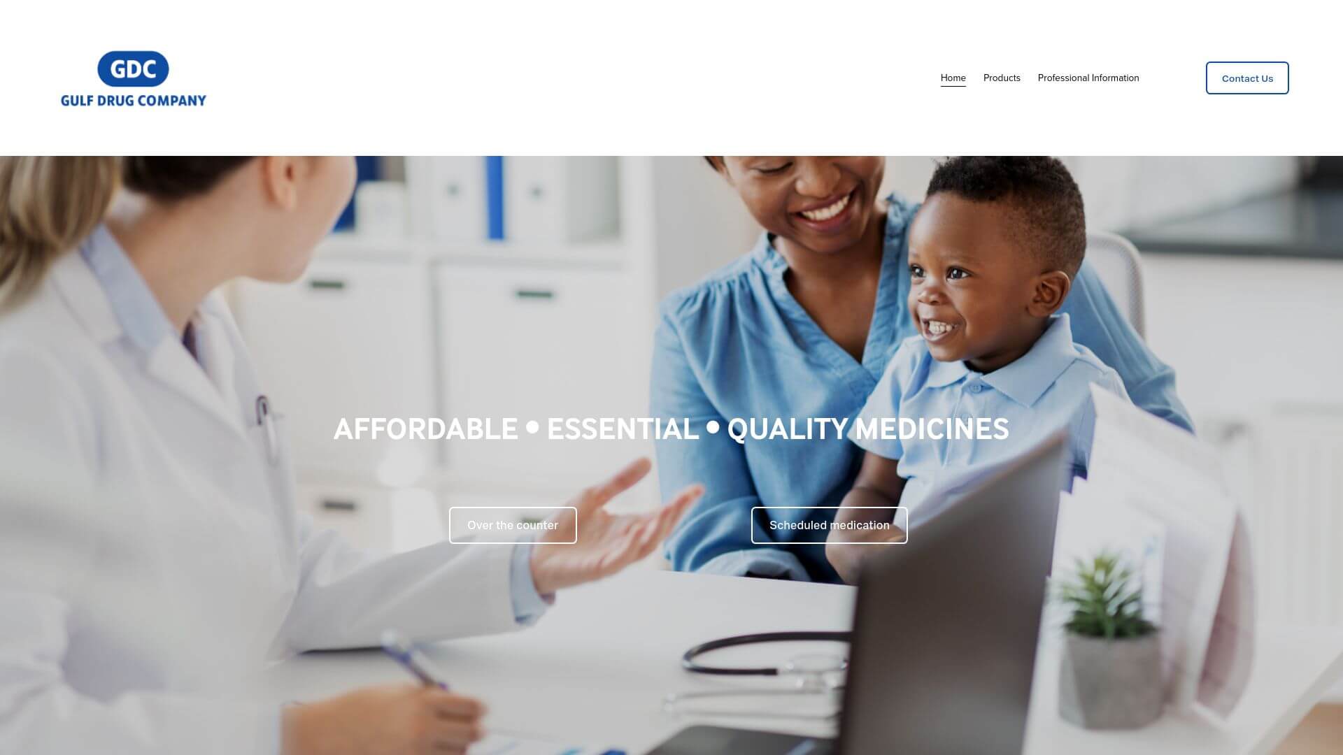
A modern and polished design defines the Gulf Drug Company’s online presence. The website uses celestial blue overlays to highlight its key services and locations, combined with parallax scrolling to keep users engaged as they move down the page. The layout is both visual and functional, with multiple CTA buttons guiding users to different sections of the site. It’s a well-executed example of how branding can integrate smoothly with usability.
20. MEDS Pharmacy
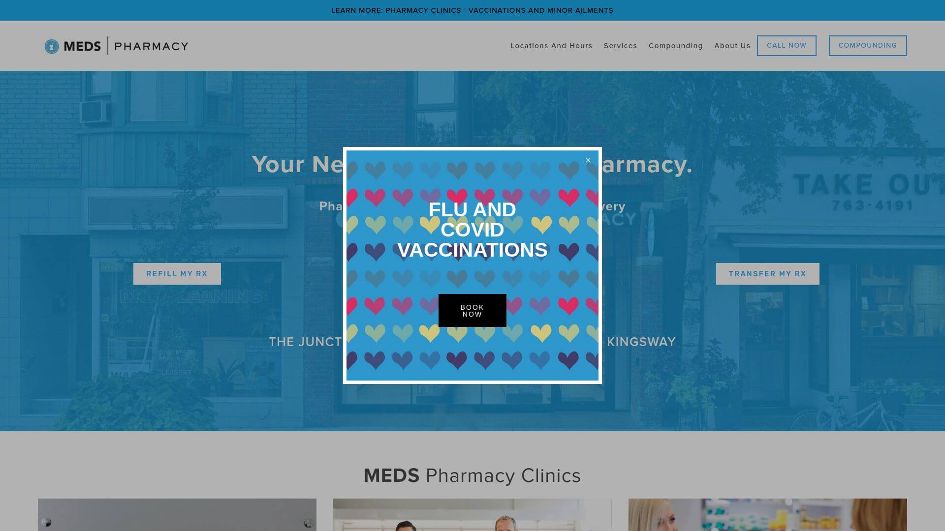
This Canadian pharmacy emphasizes its compounding services with a calm and professional aesthetic. The website features a clean, user-friendly design, with sections that neatly separate the pharmacy’s various services, such as hormone replacement therapy and pain management. The soft blue and white color palette reflects trust and reliability, while the parallax scrolling adds a modern touch without overwhelming the visitor. The website is responsive, adapting well to both desktop and mobile devices.
21. Myeloma Australia Pharmacy
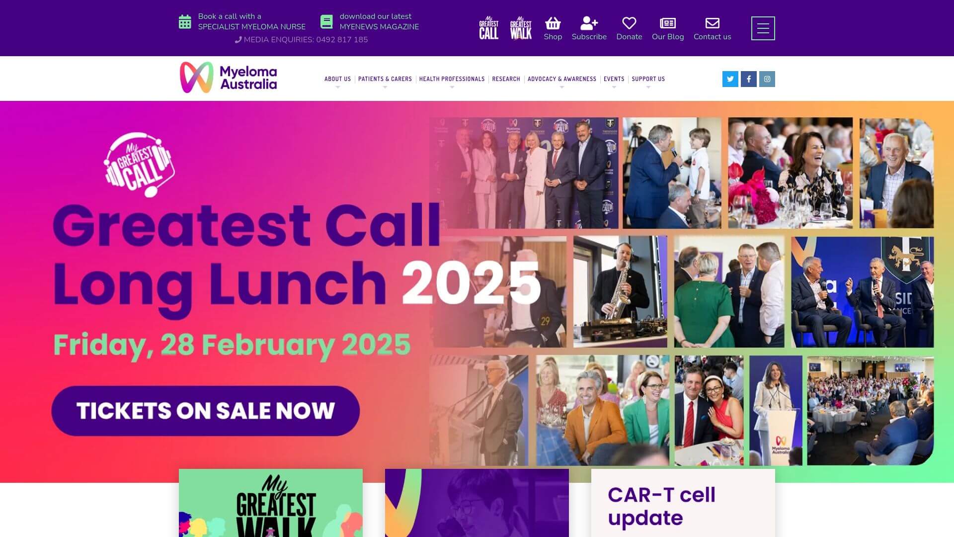
Myeloma Australia’s website is a prime example of a well-organized, informative platform tailored for its users. The emphasis on call-to-action buttons ensures visitors are always guided towards helpful actions, like contacting support or learning more about myeloma treatment. The carousel services menu gives users a quick overview of the pharmacy’s key offerings, while the use of bold headings ensures that visitors can navigate the site easily. The informative homepage, combined with an accessible design, makes this website highly effective in delivering critical health information. Its light color scheme, predominantly white and light blue, adds to the site’s professional and calming appearance.
22. Rebecca Newton, LMFT
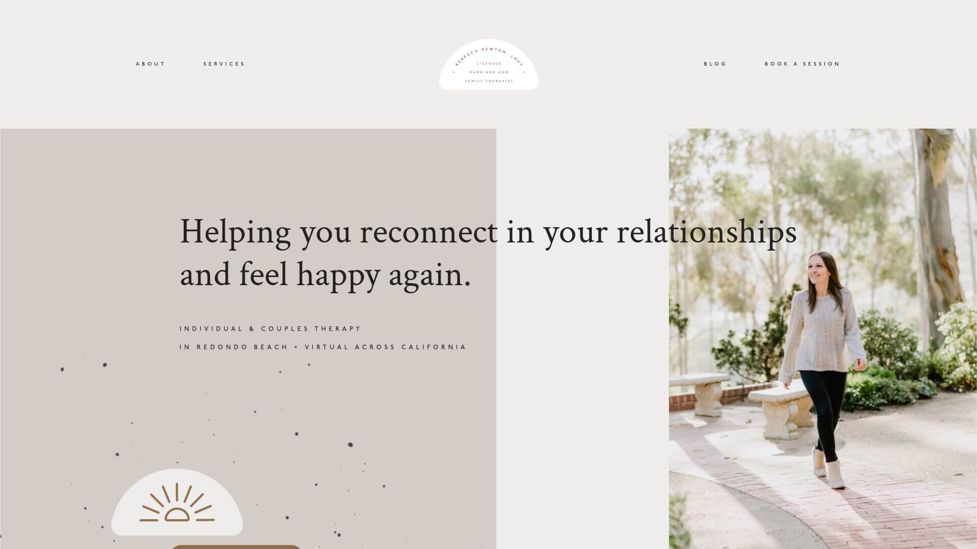
The website for Rebecca Newton, LMFT, employs a minimalist aesthetic, combining soothing pastel colors with a modern design layout. The site's elegant design with increased letter spacing makes the text easy to read and ensures a professional appearance. The color palette, consisting mostly of light pinks, grays, and whites, creates a welcoming and serene atmosphere. The use of portrait photography adds a personal touch, while the simple layout ensures that users can quickly find relevant information about services and contact details. This site shows that simplicity in web design can enhance both readability and user engagement.
Visit rebeccanewtontherapy.com
23. BEHAP Clinic
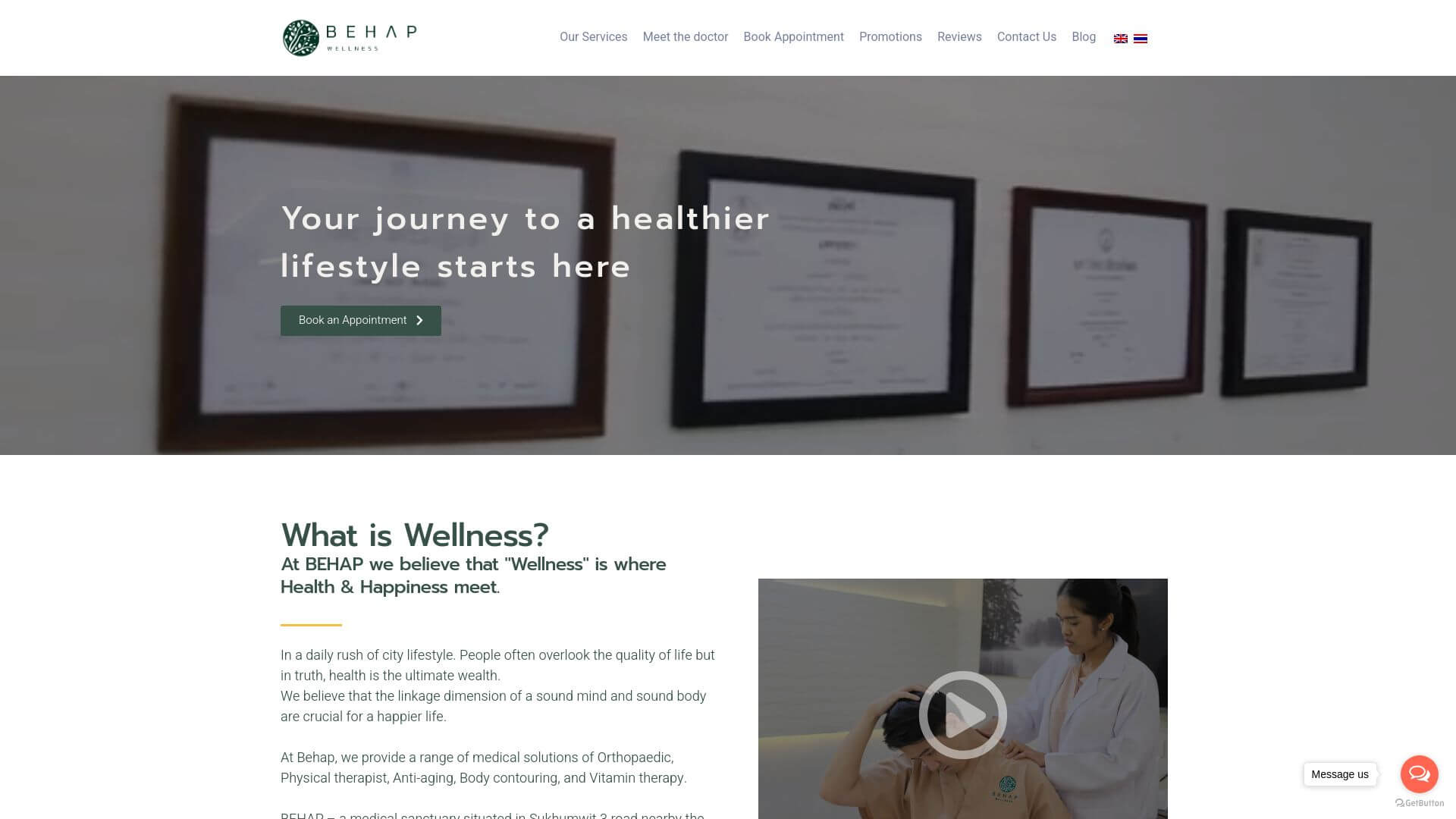
BEHAP Clinic’s website is an engaging and visually appealing platform. It makes excellent use of in-action photographs and real-life imagery, which helps to build trust with visitors. The site is sectioned into clear, accessible parts, making it easy to navigate through the various services offered. The bold imagery and clear typography immediately capture the user’s attention, ensuring that the important information is conveyed quickly. The blue and white color palette creates a sense of cleanliness and professionalism, while the images add warmth, making the website approachable for patients.
24. Mt Annan Eyecare
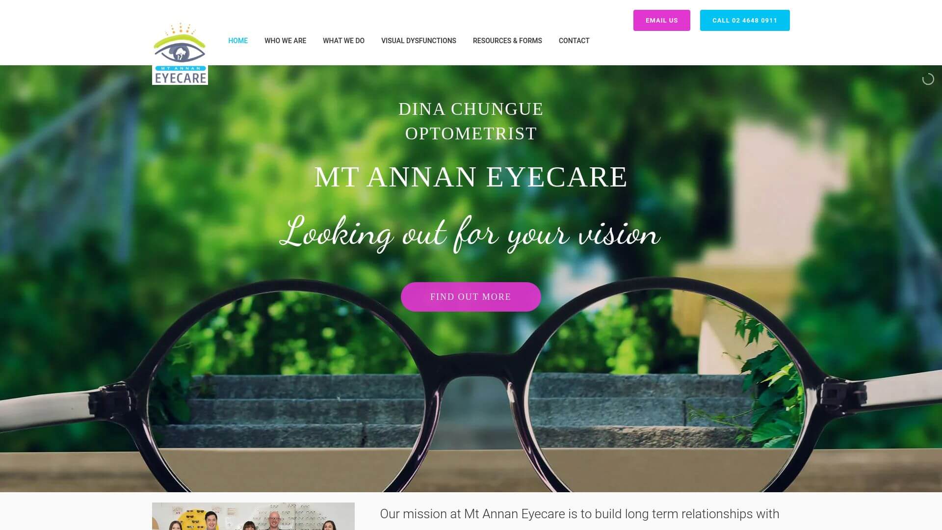
The design of Mt Annan Eyecare’s website features intuitive navigation and engaging call-to-action buttons. The visuals—including captivating images of eye care and patient care—help create an emotional connection with visitors. The color palette is predominantly blue and white, conveying a sense of trust and expertise. Additionally, the responsive design ensures that users on both desktop and mobile devices have a seamless experience. The layout emphasizes clear navigation with easy access to appointment booking and service details, making it both visually appealing and highly functional.
25. Melbourne Mothers Pharmacy
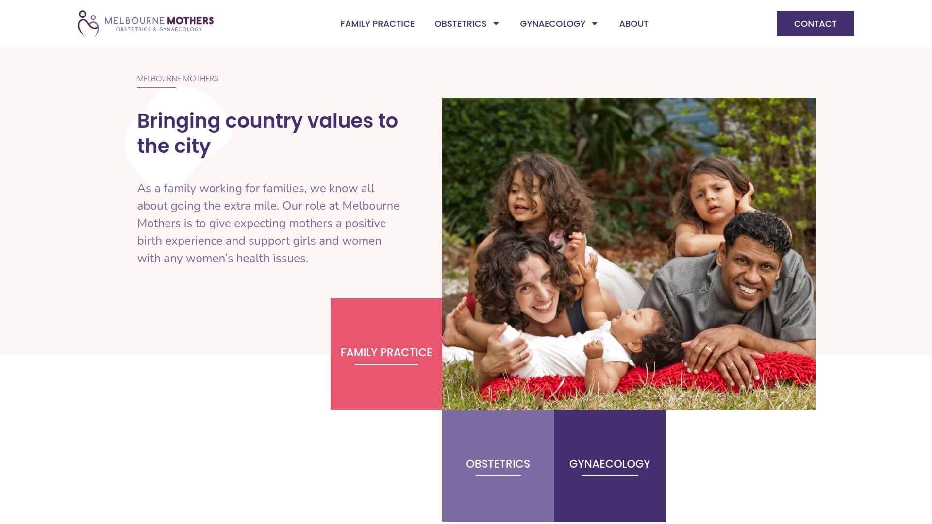
Melbourne Mothers Pharmacy is a stunning example of subtlety in design. The use of light colors, such as whites and soft pastels, combined with moving graphics, provides a modern and fresh feel. The layout is informative, ensuring users can access relevant sections like pregnancy resources or pharmaceutical services with ease. The dynamic elements, including motion graphics and parallax scrolling, add a level of engagement while maintaining the website's elegant and clean aesthetic. The overall design successfully communicates professionalism while remaining approachable, especially for mothers seeking specialized services.
26. RxNow Pharmacy
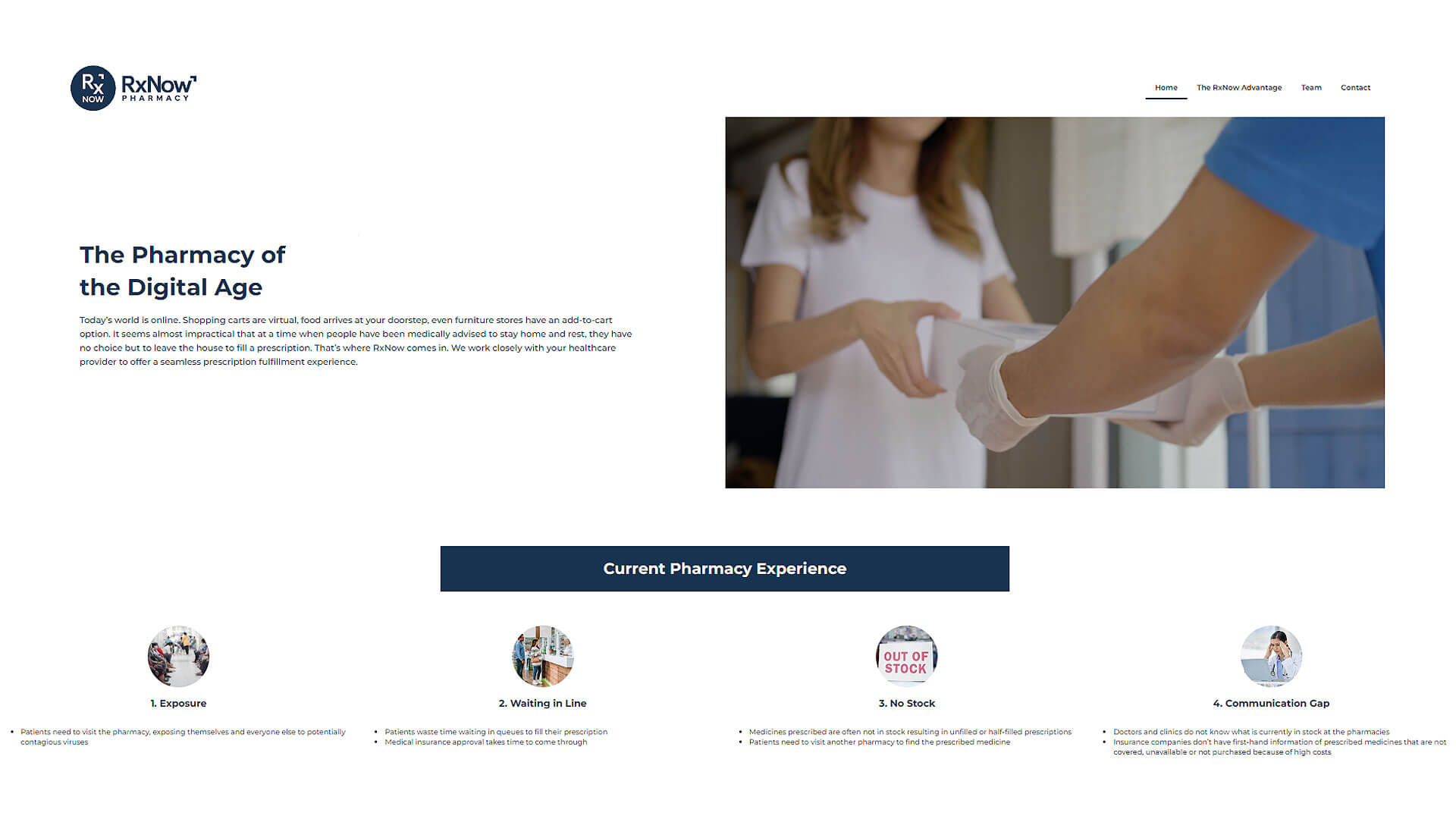
The Pharmacy of the Digital AgeToday’s world is online. Shopping carts are virtual, food arrives at your doorstep, even furniture stores have an add-to-cart option. It seems almost impractical that at a time when people have been medically advised to stay home and rest, they have no choice but to leave the house to fill a prescription. That’s where RxNow comes in. We work closely with your healthcare provider to offer a seamless prescription fulfillment experience
27. PrimeRx Pharmacy
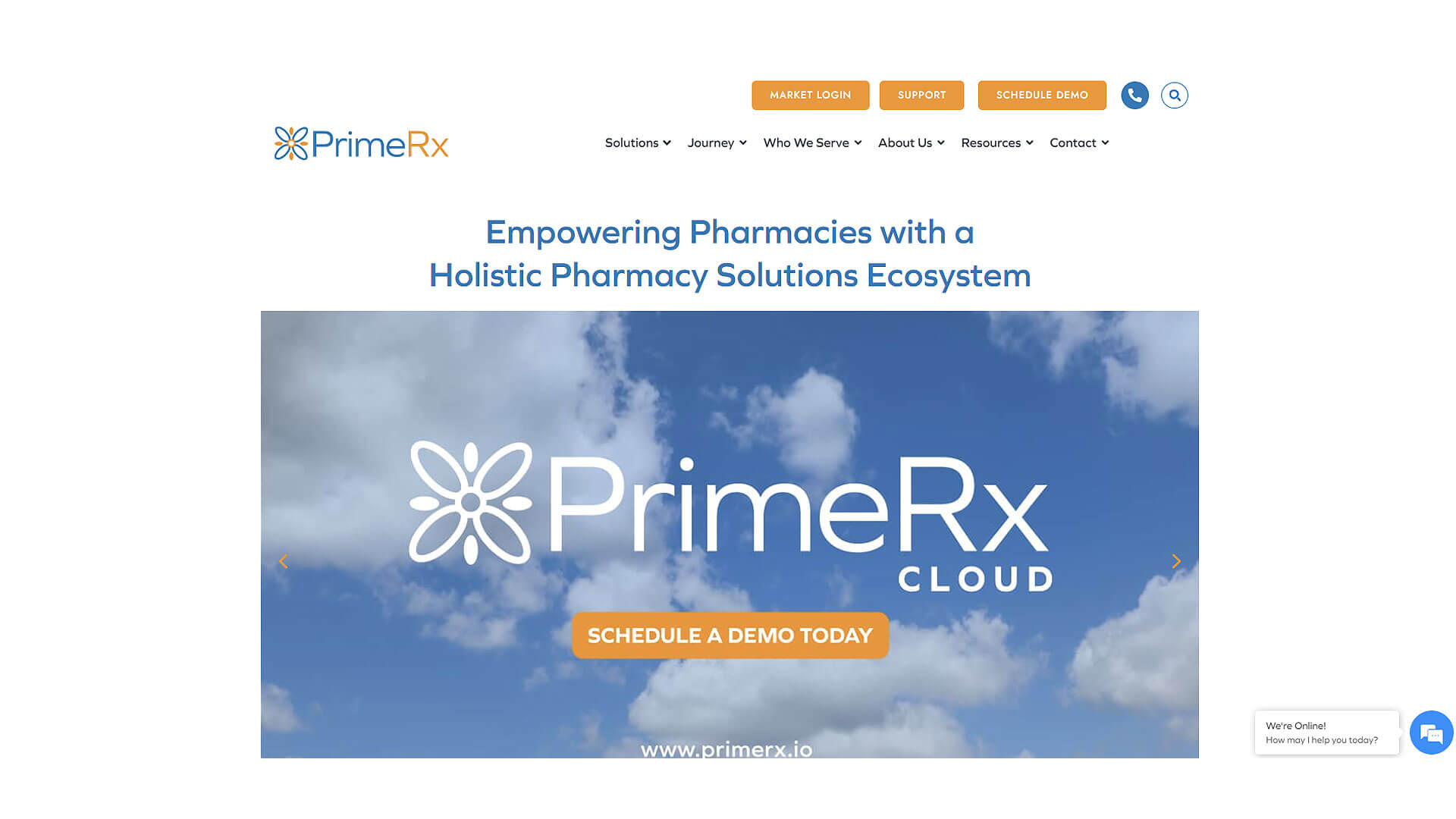
PrimeRx Pharmacy's website is sleek and modern, with a design that prioritizes functionality and ease of navigation. The website uses a dark background with vibrant accents, drawing attention to important features like the online store and prescription refill options. The clean design, combined with a responsive interface, ensures that users can access the site from any device without any usability issues. The sectioned layout makes it simple for users to locate the information they need, while the prominent call-to-action buttons encourage engagement.
28. Mayo Clinic
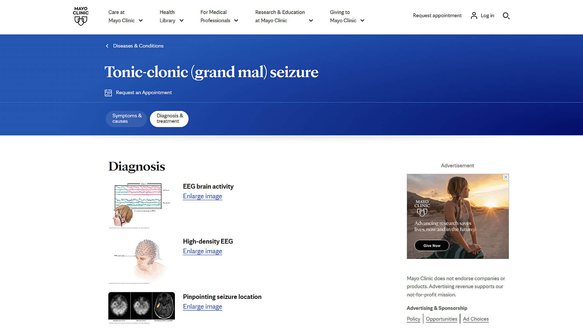
After a seizure, see a healthcare professional to thoroughly review your symptoms and medical history. You may need several tests to determine the cause of your seizure. The tests can evaluate how likely it is that you'll have another one.
29. HealthDirect Pharmacy
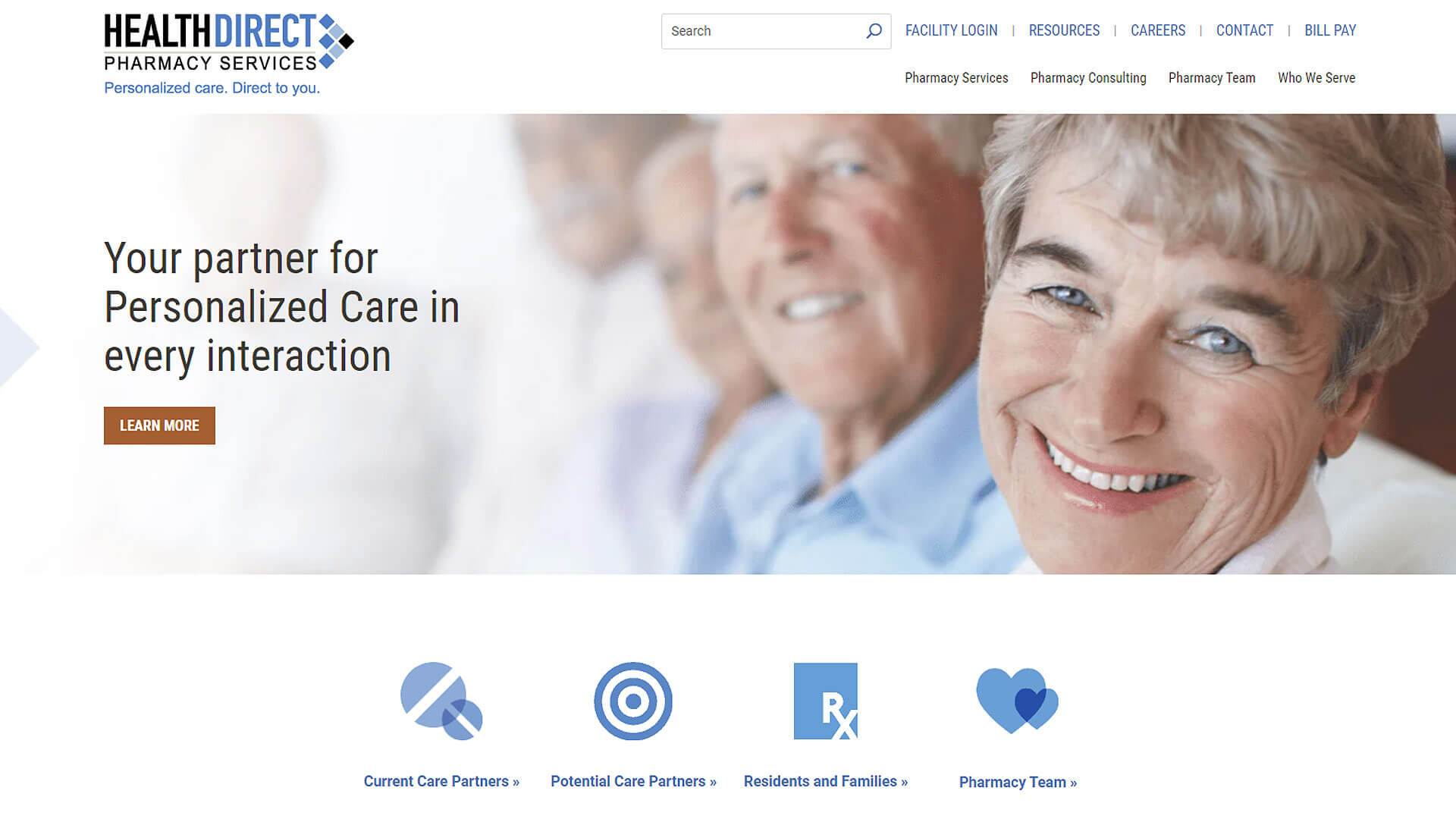
HealthDirect Pharmacy’s website is designed with a focus on clean aesthetics and accessibility. The website uses a minimalistic design with ample white space, making it easy for visitors to focus on essential elements like the search function and service listings. The color scheme is mostly white and blue, providing a sense of professionalism and trust. The layout is user-friendly, with prominent buttons for refill requests and a clear menu structure that ensures a seamless user experience.
30. Medika Health Clinic
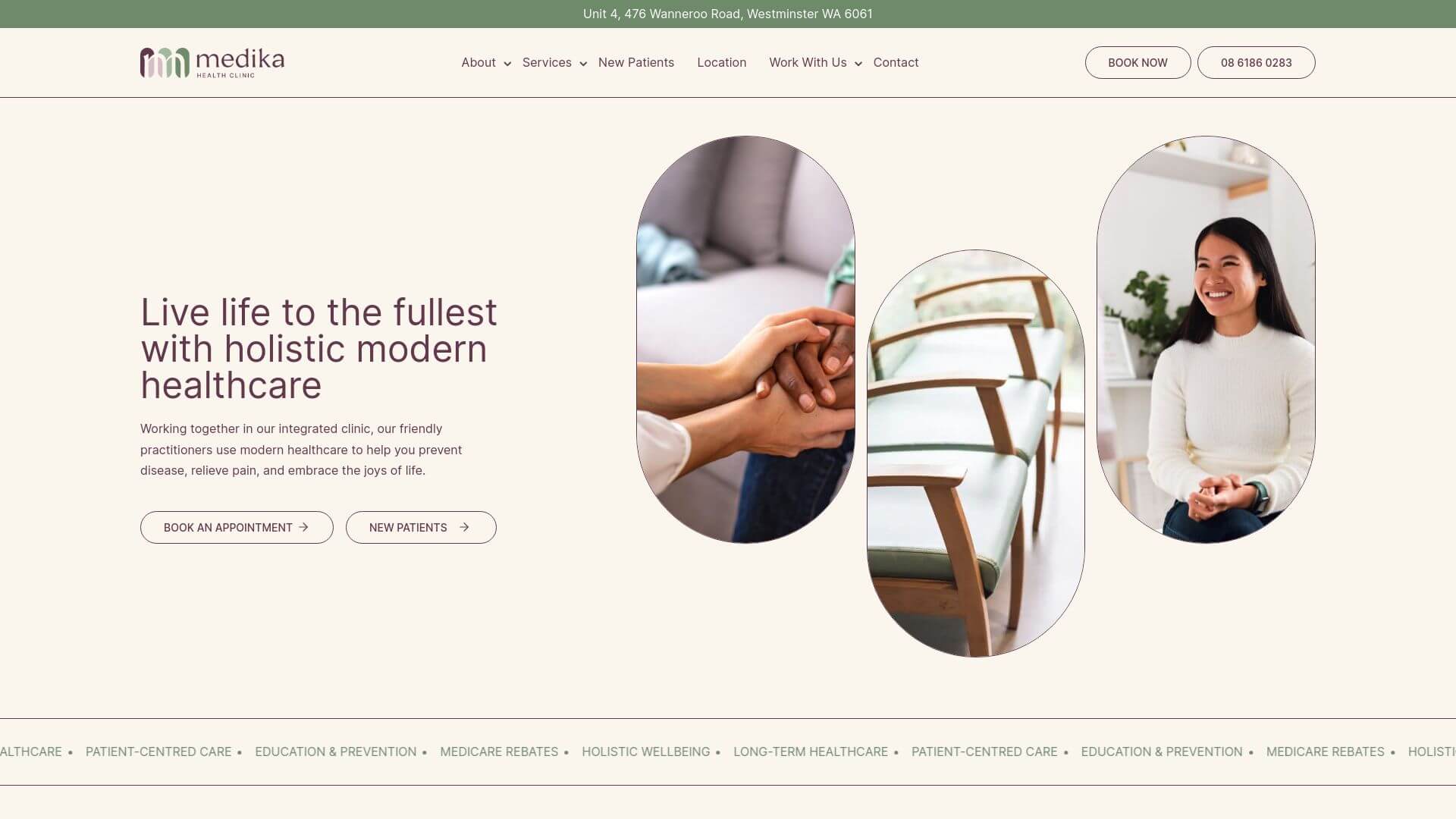
Medika Health Clinic’s website is a beautifully crafted platform featuring cream-white backgrounds and user-friendly forms. The design combines aesthetics with functionality, using welcoming imagery and subtle animations to create an inviting experience. The website is easy to navigate, with services and contact information placed strategically on the homepage. The color palette, consisting mostly of soft tones, adds to the calming and professional feel of the site. Overall, it’s an excellent example of how pharmacy website design can be both aesthetically pleasing and highly functional.
About Prateeksha Web Design
Prateeksha Web Design is a professional web design company that offers specialized design services for pharmacy websites. The company focuses on creating engaging, intuitive, and user-friendly interfaces that highlight the pharmacy's products and services. Their design process draws inspiration from the latest trends and technologies, ensuring that each website they create is modern, aesthetically pleasing, and effective at drawing and retaining user interest.
Interested in learning more? Contact us today.
