Buy Car Selling Car Design Inspiration

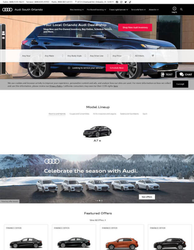
1. Audi South orlando
The design of Audisouthorlando.com is modern and simple, which makes it easy to use and easy on the eyes. On the home page, a huge, full-width hero image with text that stands out grabs the user's attention. The search bar on the site makes it easy for people to find the car they want quickly.
At the bottom of the page, you'll find useful navigation buttons that let you get to sections like "New Audi Inventory" and "Used Audi Inventory," which has pictures of some of their cars that are sure to catch your eye. You can also look at a showcase of interesting cars that will catch your eye. In the page's Footer, there are links to "Financing Options" and "Service & Parts Center" that make it easier for people to find their way around.
2. AutoNation
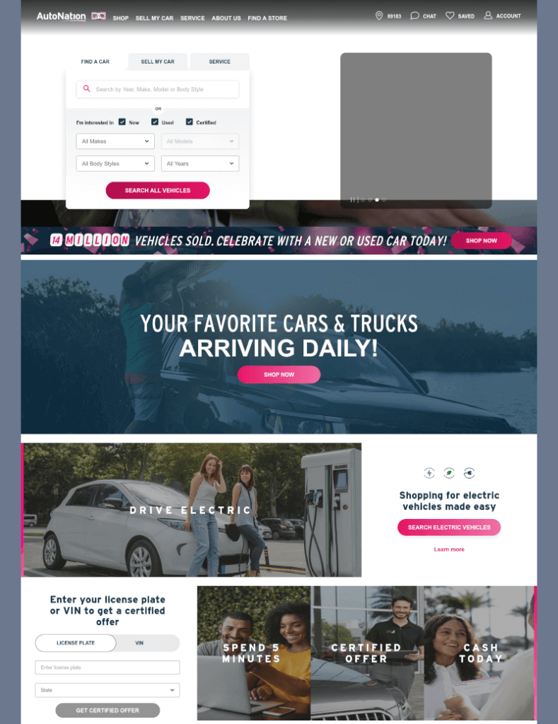
The design of https://www.autonation.com/ is based on current trends in the car business. It is sleek and simple. Its main colours are black and white, and blue accents are used to draw attention to certain parts. The website is set up like a grid, and it has big, easy-to-use buttons to help people find what they need quickly. Large banners advertise sales, new products, or featured articles, and users can use the search bars on the homepage to find a dealership near them or a vehicle they are interested in.
At the bottom of each page, users will find a set of quick links that will take them directly to the information they want. Autonation's website design services have given people looking for a new car an online experience that is both beautiful and very helpful.
3. Carvana
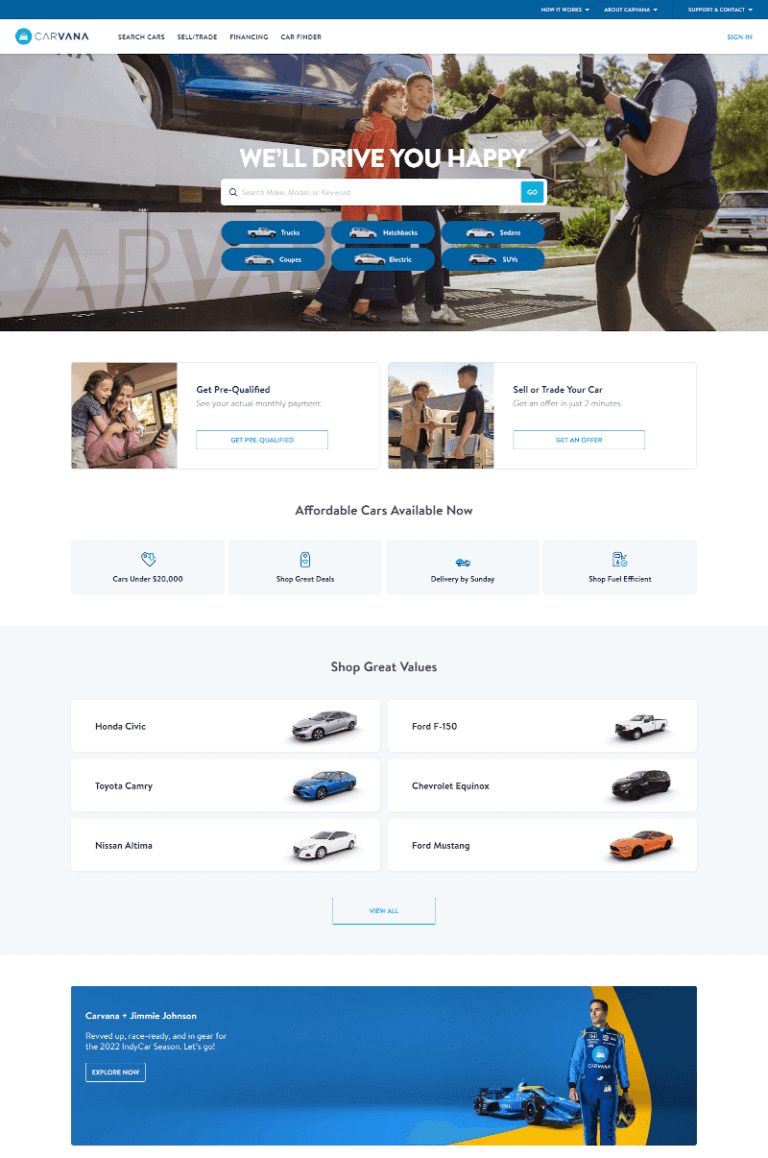
The design of https://www.carvana.com/ is very simple and up-to-date. The look of the site is energising, and even though it has a huge selection of cars, it is designed to make it easy to look around. Carvana's website has a full-width background image that gives off an air of luxury and draws attention to the cars for sale. The top-left navigation bar stands out from the rest of the design because it has big, white text on a dark grey background. This makes it easy to find your way around the site.
Carvana's website also uses buttons and icons and other design elements to point visitors in the right direction as they look through the company's inventory and find their perfect car. The use of mostly black, white, grey, and blue in a muted colour scheme gives the whole thing a stylish, modern look.
4. Carmax
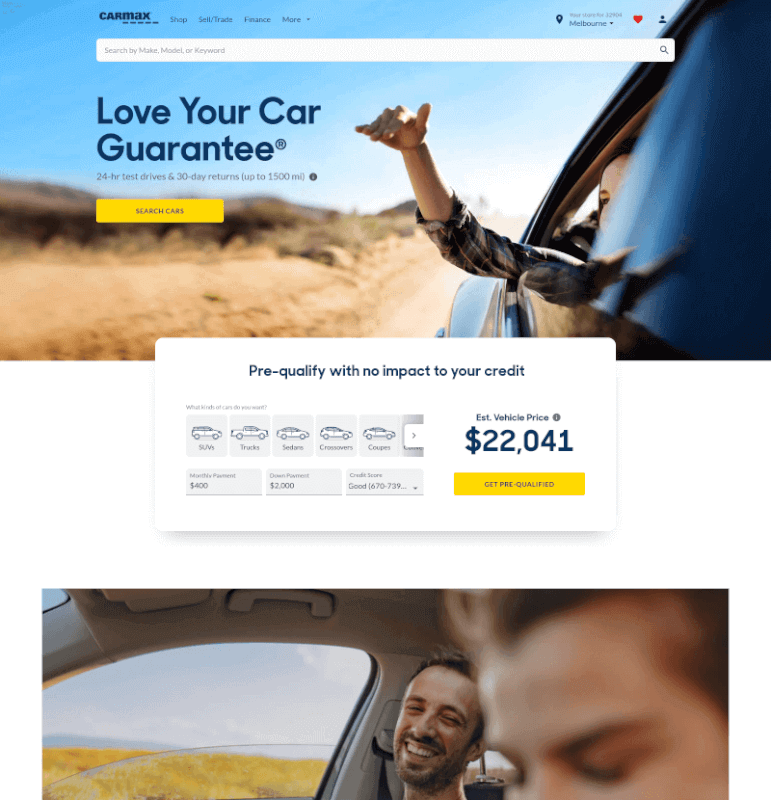
The CarMax website is sleek and easy to use. When a user goes to the homepage, the huge hero image will be the first thing they see. It has a catchy title, an easy-to-use navigation bar, and more than one CTA. The main colours are dark blues and greys, with some bright yellow accents to draw attention to important parts like the search bar and links to sales.
The font used throughout the website makes it look more modern. In conclusion, Design Inspiration or Website Design Services could learn a lot from CarMax's website design about how to make their users' experience more enjoyable.
5. Concept Car
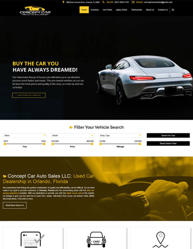
Concept Car Orlando is a website with a clean, modern look. On a black background of a hero image, it has a white overlay with the company logo, tagline, and main navigation bar. In the menu bar, you can click on "Home," "About," "Services," "Contact," and "Blog."
This website is a great place to get design ideas because it looks nice and is easy to use. This makes it more likely that people will learn about the services Concept Car Orlando offers. This website is also a good example of how Website Design Services can be used to make a site that looks good and fits your company's style.
6. Classic Mazda
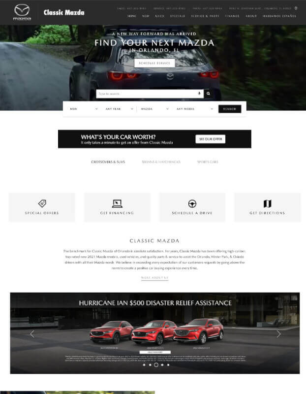
The website for Vintage Mazda looks clean and easy to use. The background of the website is white, and it has big, brightly coloured photos that are meant to show what the brand stands for through how their cars look. From the menu bar at the top of the page, you can quickly get to New Inventory, Used Inventory, Service & Parts, and Financing.
The homepage has an easy-to-use carousel that makes it quick to look at all the options. The payment estimate calculator and featured vehicle specials are in different places to make them easier to find.
7. Morgan auto group
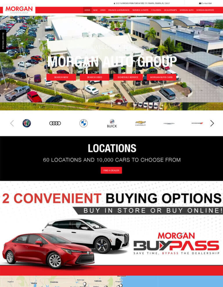
The Morgan Auto Group website is a great example of how a company that does web design should look, thanks to its clean and professional layout. The homepage of the website is modern and simple. It looks professional and trustworthy because it uses large, easy-to-read fonts and a clean, well-designed logo. The navigation bar doesn't get in the way and is easy to use, so visitors can quickly get to the content they want.
Overall, this website is a great resource for people who want to build their own site from scratch or change the look of the one they already have. It shows how effective minimalism can be when combined with attention to detail and careful use of colour, making it easy for users to find the information they need while also looking nice.
8. Worlda Utosinc
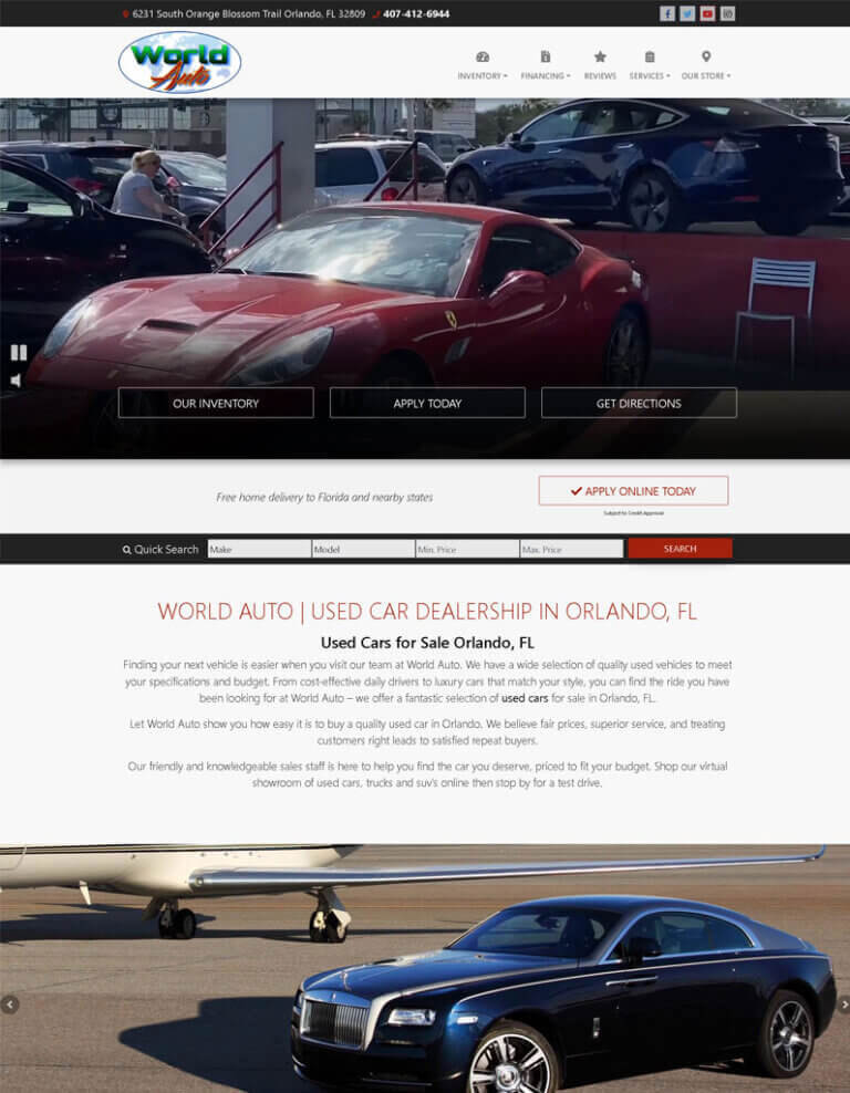
This website has a sleek, modern look that was inspired by the car industry. The interface is modern and easy to use, and the colours are all the same. On the homepage of World Autos Inc., there is a picture of a car with writing on it, as well as links to their many services. From the top menu bar, users can quickly get to any part of the site.
Here are links to the social media pages of World Autos Inc. for anyone who wants to keep up with the latest deals. The design of this site was inspired by car dealerships and car magazines to make it look appealing to people who visit the site. The layout of World Autos Inc's website is both professional and friendly, making it easy for visitors to find the information they need.
9.Coggin Honda Orlando
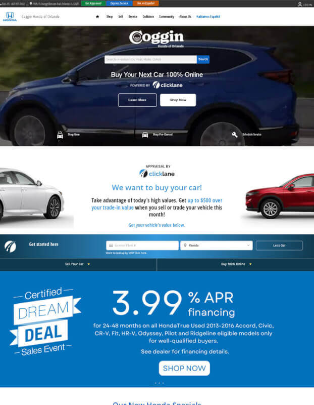
The website, which can be found at https://www.cogginhondaorlando.com/, looks clean and professional because it follows current trends in web design. The Coggin Honda logo is big and in the upper left corner of the homepage, next to a big picture of a hero. This picture is a hook to get people to look at the rest of the website. The site's information is set up in two columns, and navigation links are easy to find in the header.
Visitors can quickly find the information they need by clicking on the right button in the menu bar. This gives them access to sections about inventory, service, parts, and financing, among other things. There isn't much doubt that a professional web design company worked on this site to make it as easy as possible for people who want to buy to use.
10. Mazda
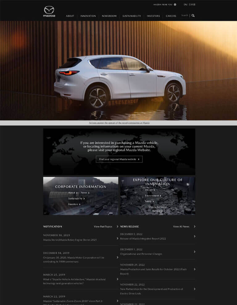
A lot of the design of Mazda's website comes from the car business. The site has a strong presence and an air of sophistication thanks to its simple design, which uses bright colours and modern fonts. Their newest models are shown in a slider at the top of the homepage, along with information about each one.
Here are the specials, used cars, lease deals, new cars, and maintenance and repair services. A different colour scheme makes each part of the page look different from the others. Aside from these categories, there are also featured articles that cover a wide range of topics about Mazda cars and driving.
The Mazda website is easy to use and appealing to car fans because it was made with both of these groups in mind. Custom graphics and animations, along with other web design services, helped create an environment that visitors would remember and enjoy.
11. Sonic Auto Motive
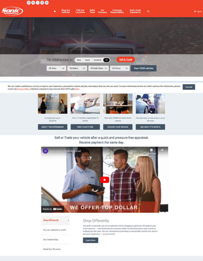
The design of Sonic Automotive's website was made with modern car styles in mind. The homepage has an interesting hero image of moving cars, and a simple navigation bar at the top makes it easy to get to the different parts of the site quickly. The layout and colour scheme are meant to make the audience feel like things are happening quickly and with a lot of energy.
On the homepage, there are two columns. One has photos and text that show off the company's inventory of cars, and the other has a search bar to help people find exactly what they need. Down the page, there are links to different things that Sonic Automotive has to offer, such as service specials, parts and accessories, used cars, and ways to pay for them.
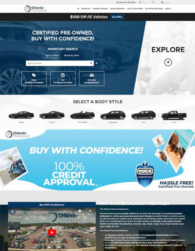
12. Orlando Preowned
The look of https://www.orlandopreowned.com/ is modern, clean, and inviting. The main colours are black and white, with a few accent colours like blue to make it stand out. The homepage has a slideshow of used cars for sale in the Orlando area. It's simple and effective, and there's a big "Call to Action" button that tells people to find out more.
The main menu is easy to use, and the tabs are clearly labelled so that users can quickly find the information they need. All pages have helpful search filters that let users narrow their results by things like car make, model, and year, among other things. In terms of design, the site uses a classic font that is both professional and up-to-date without being too busy.
In addition to the site's overall simplicity, the design puts a lot of focus on high-quality pictures to attract users and show off products. Last but not least, if you go to Orlando Preowned's website from your home or business and click on "Services" in the menu bar, you'll be taken to pages that explain the different services the company offers, such as website design.
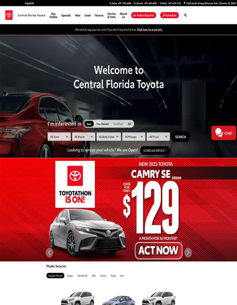
13. Centra Florida Toyota
Central Florida Toyota's website was made with the present in mind in terms of how it is laid out. The design of the homepage is simple, with a bright blue header that helps you find your way around. The cars for sale at the dealership are right in the middle, with big pictures and clear links to find out more about each one. From the main menu, you can also quickly get to other parts of the site, like the Financing and Specials tabs.
With the site's search bar at the top, visitors can quickly find what they need, and the site's social media buttons let it stay in touch with both old and new customers. Central Florida Toyota is a dealership that sells Toyotas. Their website is a great example of modern web design that combines a pleasant user experience with the business of selling cars.
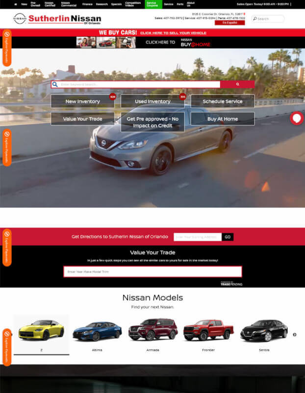
14. Sutherlin Nissan
The sleek and modern design of Orlandonissan.com makes it a great place to use. The site looks professional and friendly at the same time because it is mostly blue and white. On the homepage, there are big pictures of what the dealership sells and simple tabs for getting around.
The site has an easy-to-use menu bar at the top, so users can find what they need right away. Underneath, a big slider with pictures of Orlando Nissan's inventory and current deals draws even more attention to the company's products. Under it, there is a map that users can click on to find their exact location before doing a search for nearby cars or services.
15. Edmunds
The way https://www.edmunds.com/ is laid out is modern and easy to use. The background of the site is white, and at the top of the page is a navy blue bar with links to other parts (Home, New Vehicles & Trucks, Used Cars & Trucks, Car Buying Tools, Research & Advice, and so on). The logo stands out in the top left corner of the page.
In the main content area, carousels with pictures related to each page category entice users to look deeper into the different categories that Edmunds has to offer. Below, you'll find a number of helpful calculators and tools for buying a car, like ones that help you figure out how much your monthly payment will be and how much your old car is worth.
