Creative Design Ideas to Transform Your Heavy-Machinery Website
Table of Contents
- Caterpillar - https://www.cat.com
- Volvo Construction Equipment - https://www.volvoce.com
- Komatsu - https://www.komatsu.com
- John Deere Construction - https://www.deere.com/en/construction/
- Hitachi Construction Machinery - https://www.hitachicm.com
- Casece - https://www.casece.com
- jcb - https://www.jcb.com
- terex - https://www.terex.com
- liebherr - https://www.liebherr.com
- Doosan Infracore - https://www.doosaninfracore.com
- SANY - https://www.sanyglobal.com
- Bobcat Company - https://www.bobcat.com
- Hyundai Construction Equipment - https://www.hceamericas.com
- Atlas Copco - https://www.atlascopco.com
- Manitowoc Cranes - https://www.manitowoc.com
- Kubota Construction Machinery - https://www.kubota.com
- Bell Equipment - https://www.bellequipment.com
- Wirtgen Group - https://www.wirtgen-group.com
- Yanmar Construction - https://www.yanmar.com
- Tadano Global - https://www.tadano.com
- Fendt Construction - https://www.fendt.com
- Kobelco Construction Machinery - https://www.kobelco-usa.com
- Takeuchi - https://www.takeuchi-us.com
- CNH Industrial - https://www.cnhindustrial.com
- LiuGong Machinery - https://www.liugong.com
- Palfinger - https://www.palfinger.com
- Volvo Penta - https://www.volvopenta.com
- Sennebogen - https://www.sennebogen.com
- Genie - https://www.genielift.com
- Skyjack - https://www.skyjack.com
1. Caterpillar - https://www.cat.com
Caterpillar’s website exemplifies modern design in the heavy machinery sector. The use of bold colors like yellow and black aligns with the brand's signature look, creating a powerful visual impact. The homepage features a well-structured layout with clear calls-to-action (CTAs) like "Find Your Dealer" and "Buy Equipment." High-resolution images of machinery in action dominate the screen, emphasizing power and innovation. The user-friendly navigation at the top makes it easy to explore different machinery types and services. Overall, the site blends a sleek, professional design with user-centric features that make heavy machinery exploration intuitive and visually compelling.
2. Volvo Construction Equipment - https://www.volvoce.com
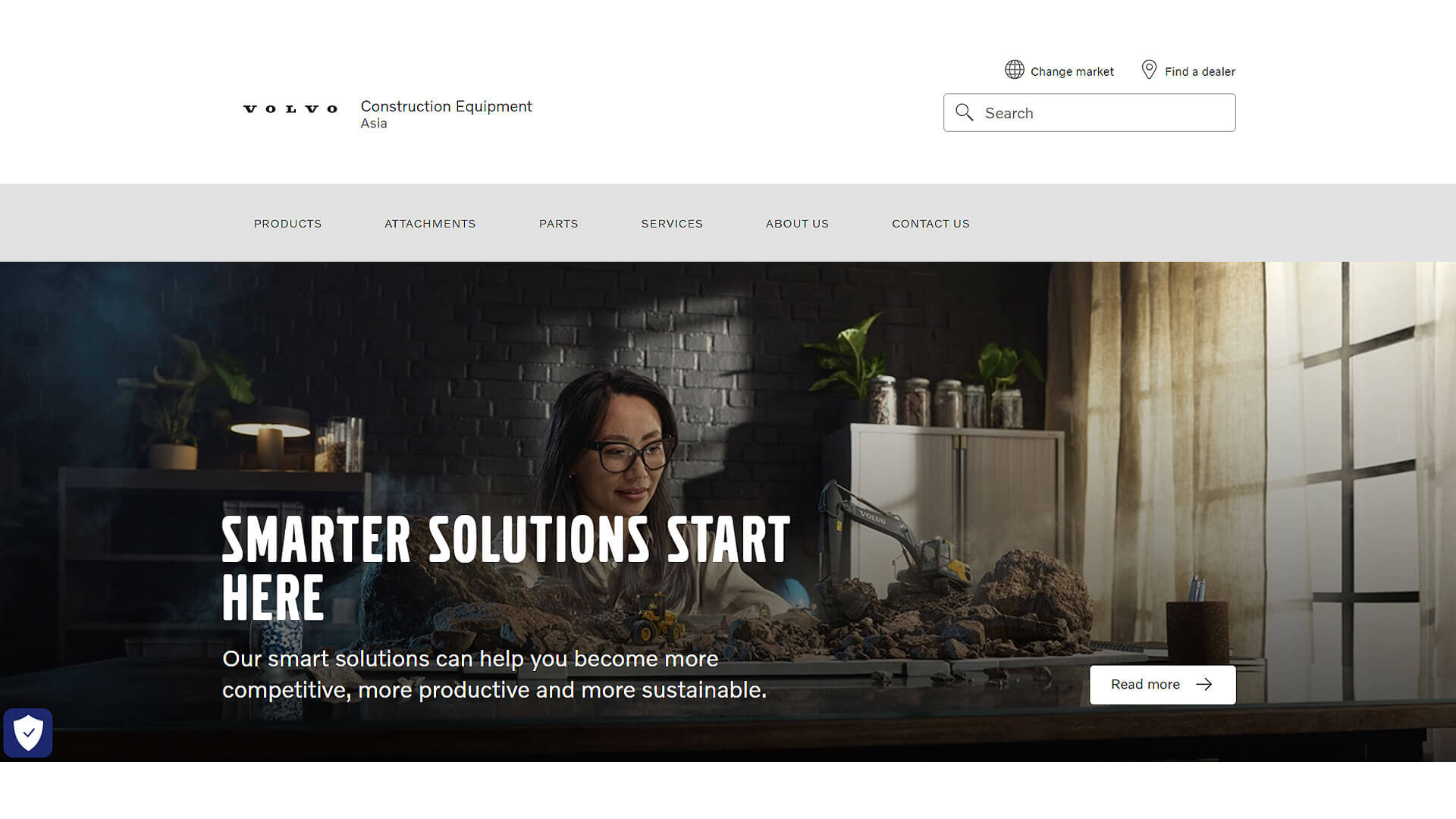
Volvo Construction Equipment's website is a masterpiece of clean, minimalist design, embodying the company’s ethos of efficiency and quality. The color palette relies on shades of blue and white, which evoke a sense of trust and reliability, paired with subtle grey tones to highlight the industrial context. The homepage focuses on large, immersive images showcasing the machinery in real-world conditions, giving a sense of scale and robustness. Navigation is straightforward, with dropdown menus that offer a deep dive into product categories, services, and dealer locations. The site balances aesthetics and functionality to create a seamless user experience for both consumers and professionals.
3. Komatsu - https://www.komatsu.com
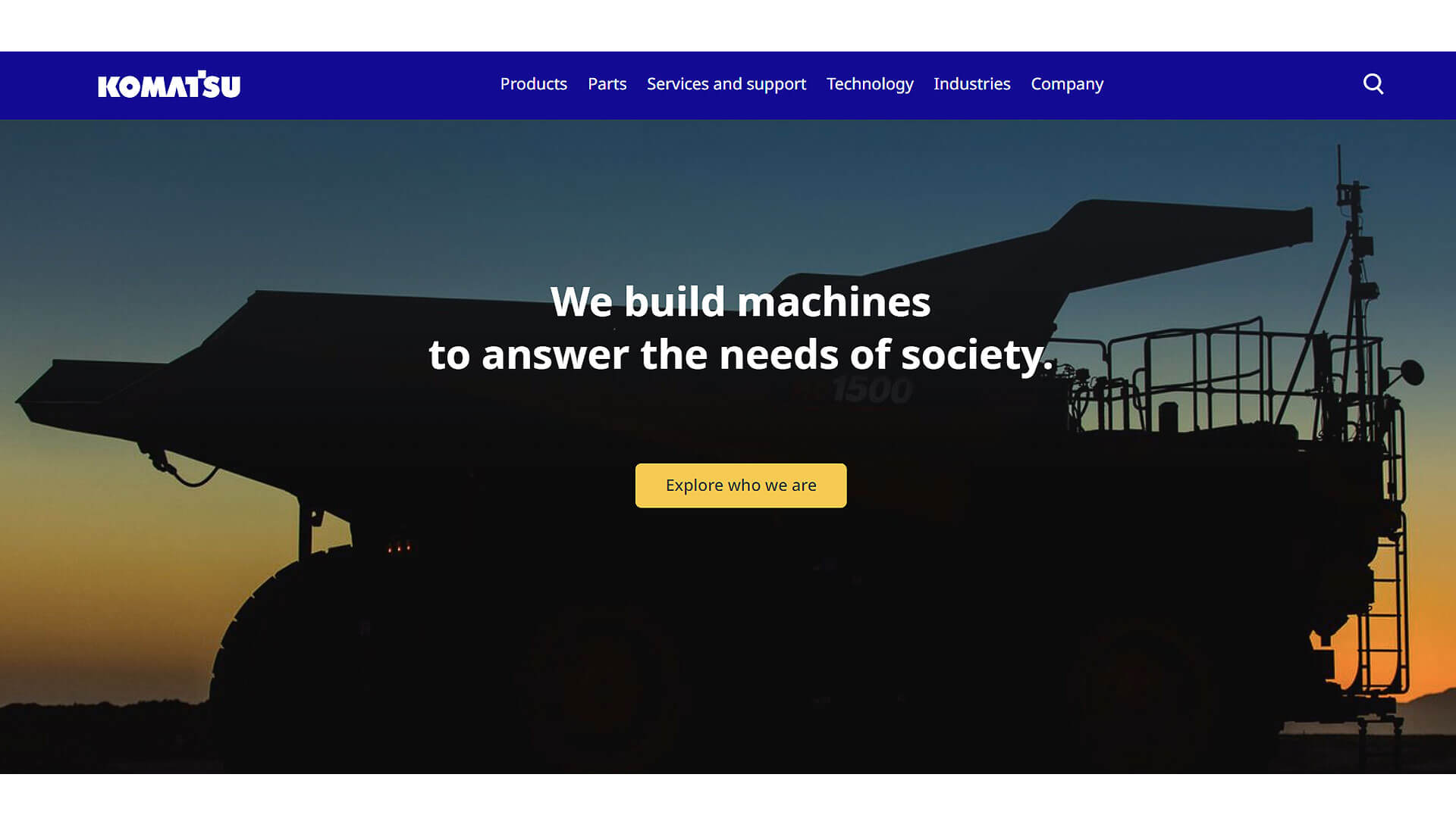
Komatsu's website design is bold and functional, featuring a modern, dark-toned layout with vivid accents of Komatsu's signature blue. The homepage immediately presents dynamic video content of machinery in action, giving users a sense of the brand’s cutting-edge technology. A well-organized top menu guides visitors through product lines, services, and support. The responsive design ensures that the website works equally well on mobile devices. The typography is clean and easy to read, while the imagery is high-quality and immersive, showing the machinery in challenging terrains. The website effectively communicates Komatsu’s commitment to innovation and durability in the heavy machinery space.
4. John Deere Construction - https://www.deere.com/en/construction/
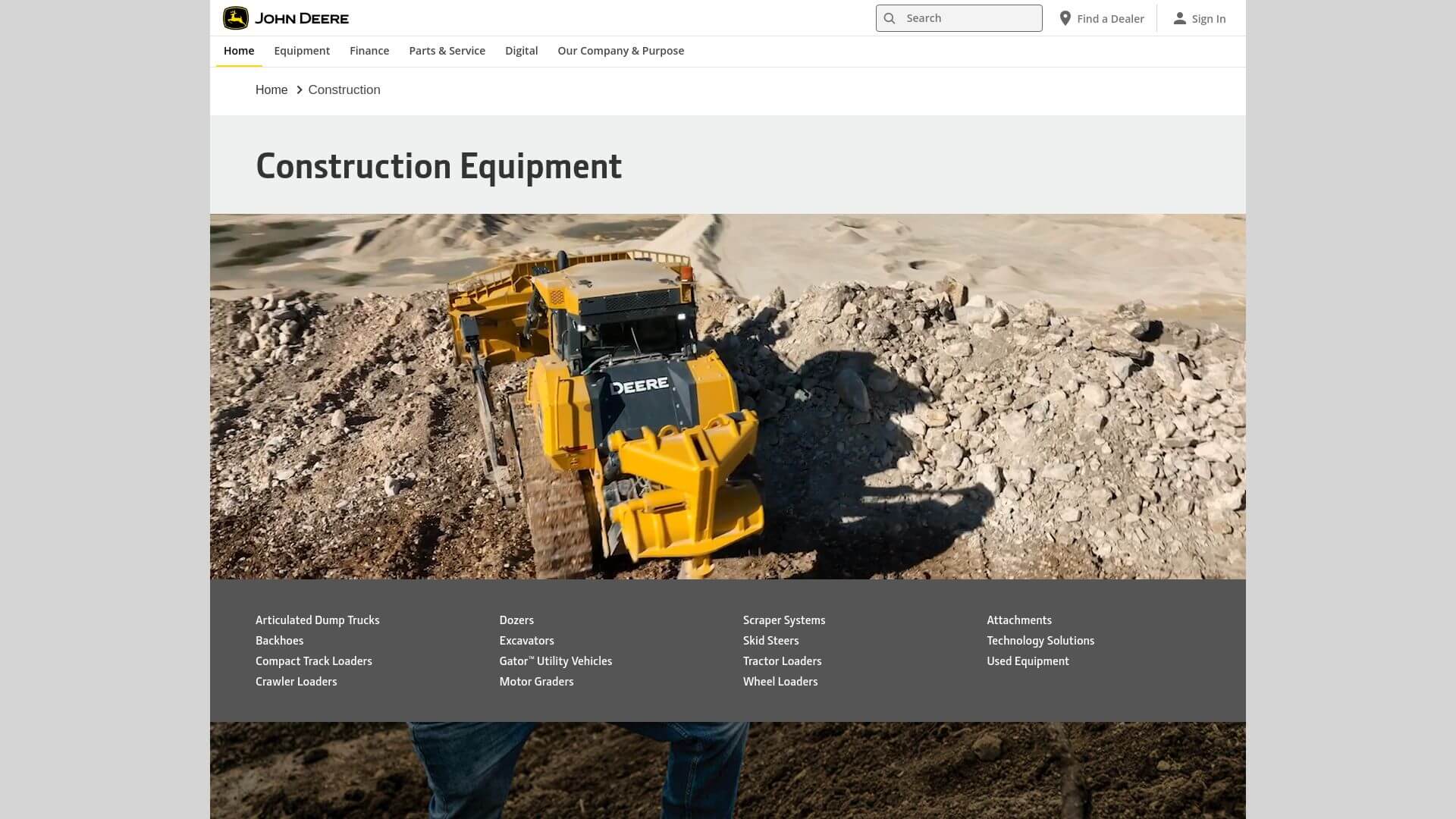
John Deere's construction website is a blend of tradition and modern design. The iconic green and yellow color scheme is present throughout the site, which instantly resonates with the brand’s identity. The homepage is designed to be visually impactful with full-width images of construction machinery at work, making an immediate connection with the target audience. The site features simple yet effective navigation, with tabs guiding users to different categories like compact construction, excavators, and financing options. The use of whitespace makes the content easy to digest, and the well-placed CTAs drive users toward exploring product lines and dealers.
5. Hitachi Construction Machinery - https://www.hitachicm.com
The design of Hitachi’s website strikes a perfect balance between technical excellence and user-friendliness. The homepage features a dark, sleek design, with pops of vibrant orange to match the company’s brand color. The layout is grid-based, allowing for easy exploration of various machinery categories and services. High-resolution images and videos bring the machinery to life, showcasing the engineering and durability of each product. The site’s responsive design ensures optimal performance across devices. The typography is bold, yet legible, making the information easily accessible while maintaining a professional and authoritative tone. Hitachi’s site is designed to cater to both engineers and decision-makers, with a focus on functionality and brand strength.

6. Case Construction Equipment - https://www.casece.com
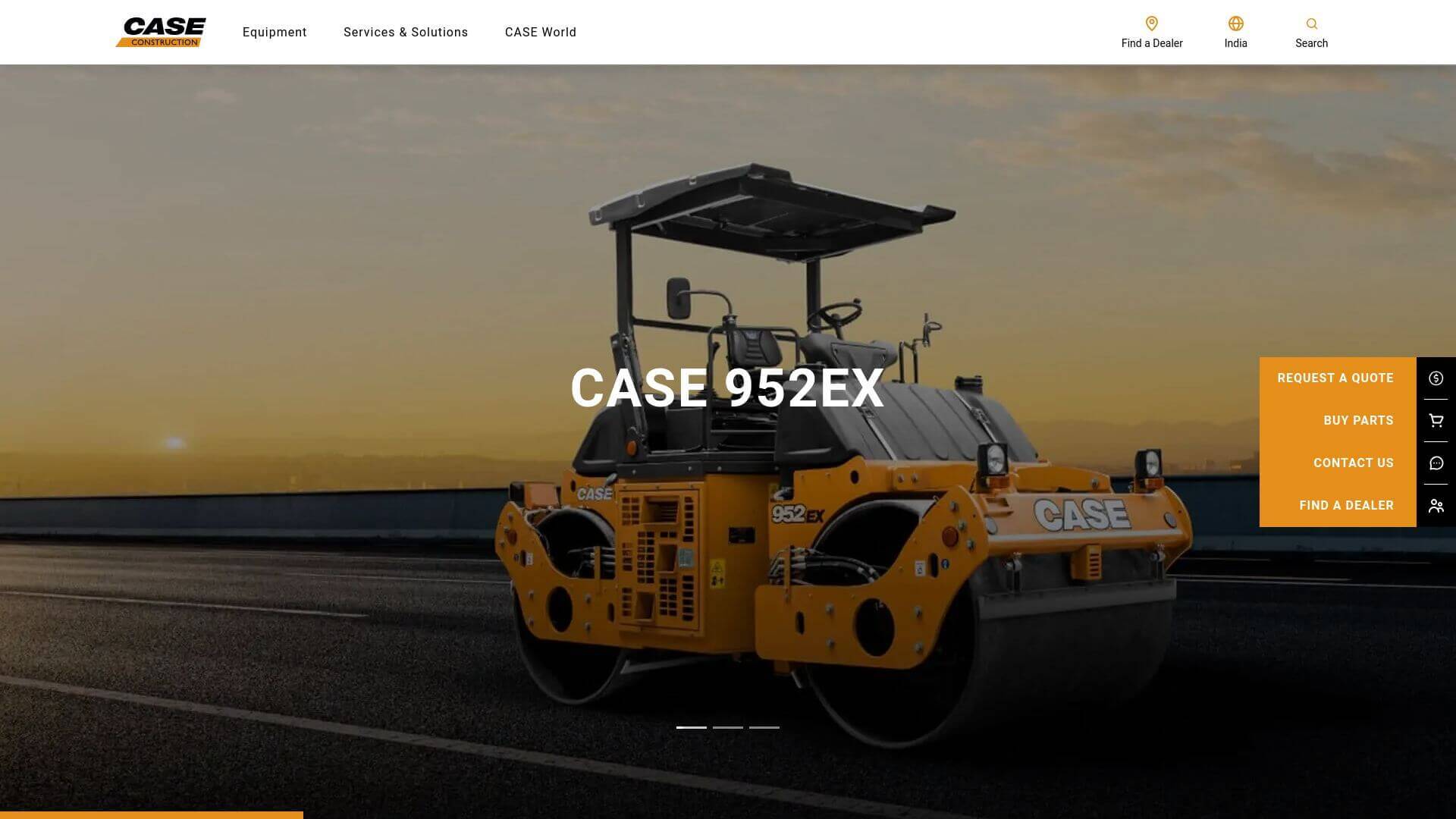
Case Construction Equipment’s website features a dynamic and engaging design that reflects the strength of its machinery. The color scheme primarily utilizes orange and black, which enhances visibility and brand recognition. The homepage is visually striking, featuring large banners that highlight current promotions and new products. A clean layout with intuitive navigation allows users to quickly find machinery, attachments, and services. Each product page is enriched with high-quality images and detailed specifications, ensuring users have all the necessary information at their fingertips. The site also emphasizes user engagement through interactive elements, such as machinery comparisons and financing calculators, making the online experience informative and enjoyable.
7. JCB - https://www.jcb.com
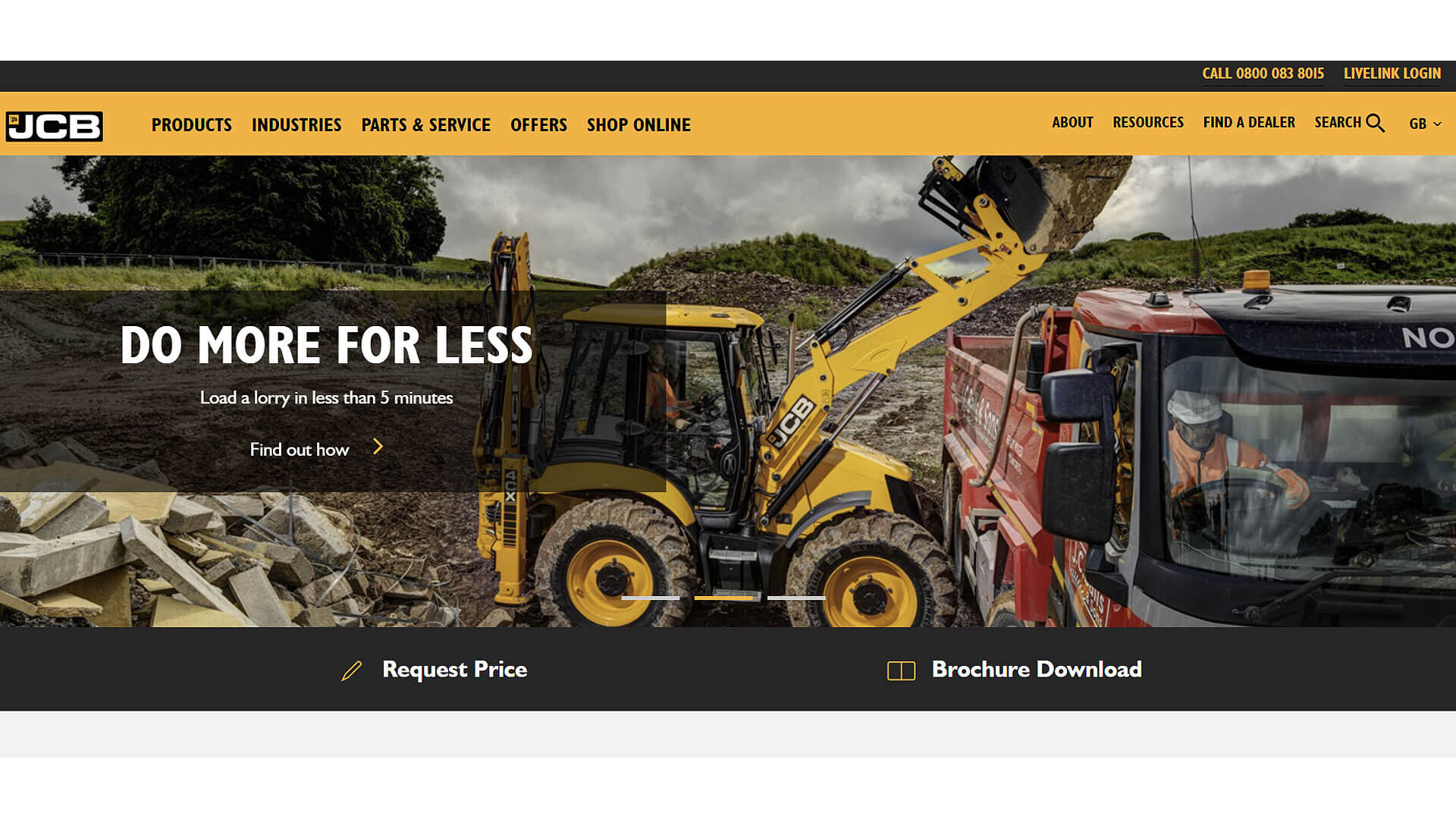
JCB’s website design is characterized by a bold, energetic style that mirrors the company’s vibrant brand. The primary use of yellow alongside black creates a high-contrast aesthetic that catches the eye immediately. The homepage employs large, captivating images of machinery in action, accompanied by strong call-to-action buttons directing users to various sections like product catalogs and dealer locators. The navigation is straightforward, with clear categories for different machinery types. The website also features a responsive design, ensuring optimal viewing on mobile devices. Overall, JCB successfully combines functionality and visual appeal, catering to a broad audience from contractors to casual visitors.
8. Terex - https://www.terex.com
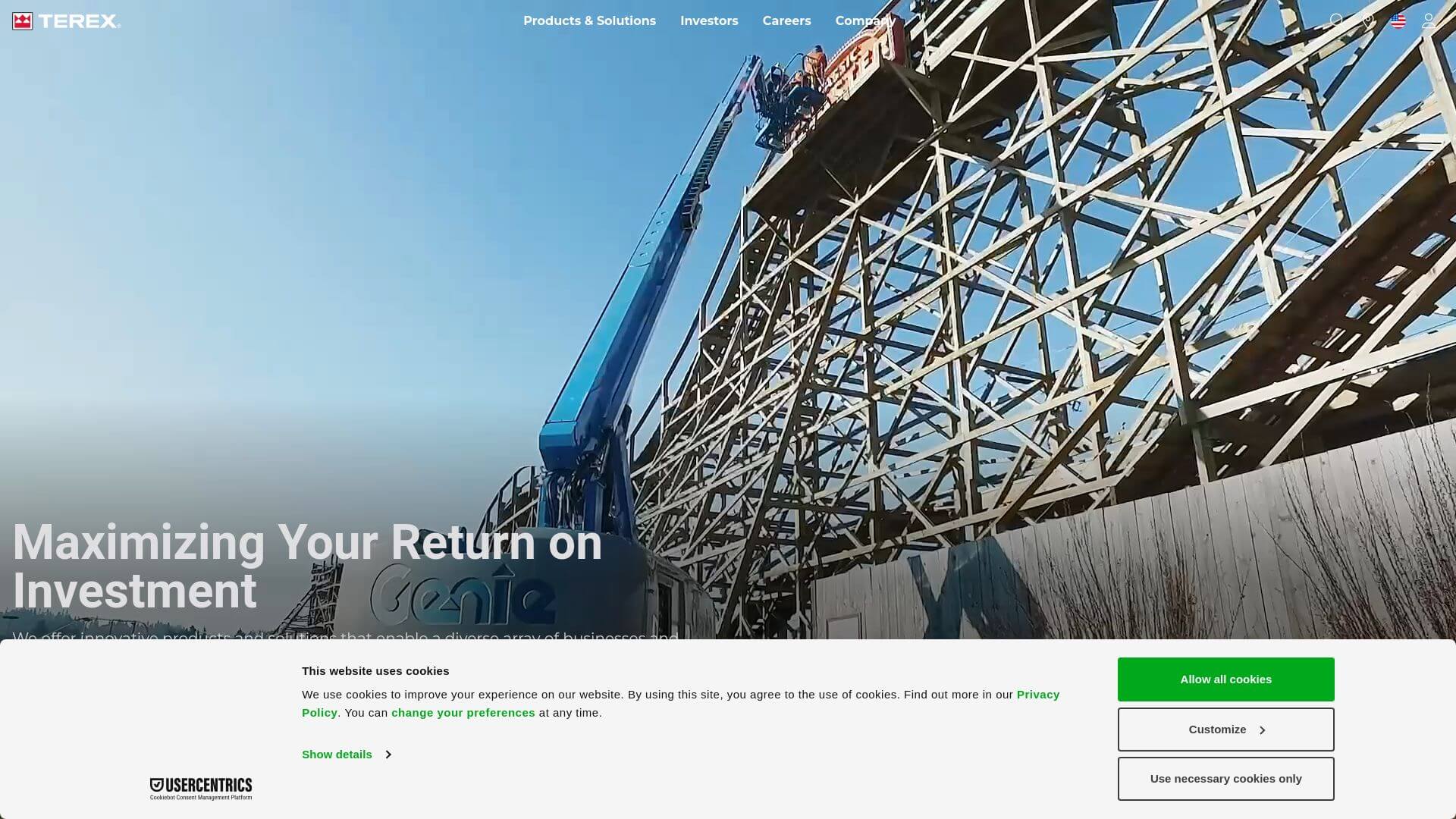
Terex's website exemplifies industrial elegance, using a minimalistic design approach that focuses on content. The color palette is predominantly blue and white, which conveys professionalism and trust. The homepage offers a clean layout with prominent images and sections dedicated to the latest news and product highlights. Navigation is easy, with dropdown menus that guide users to various machinery categories and support services. Each product page includes comprehensive specifications, images, and videos to provide a thorough understanding of the offerings. Terex’s site stands out for its user-centric design, prioritizing easy access to vital information for customers in the heavy machinery sector.
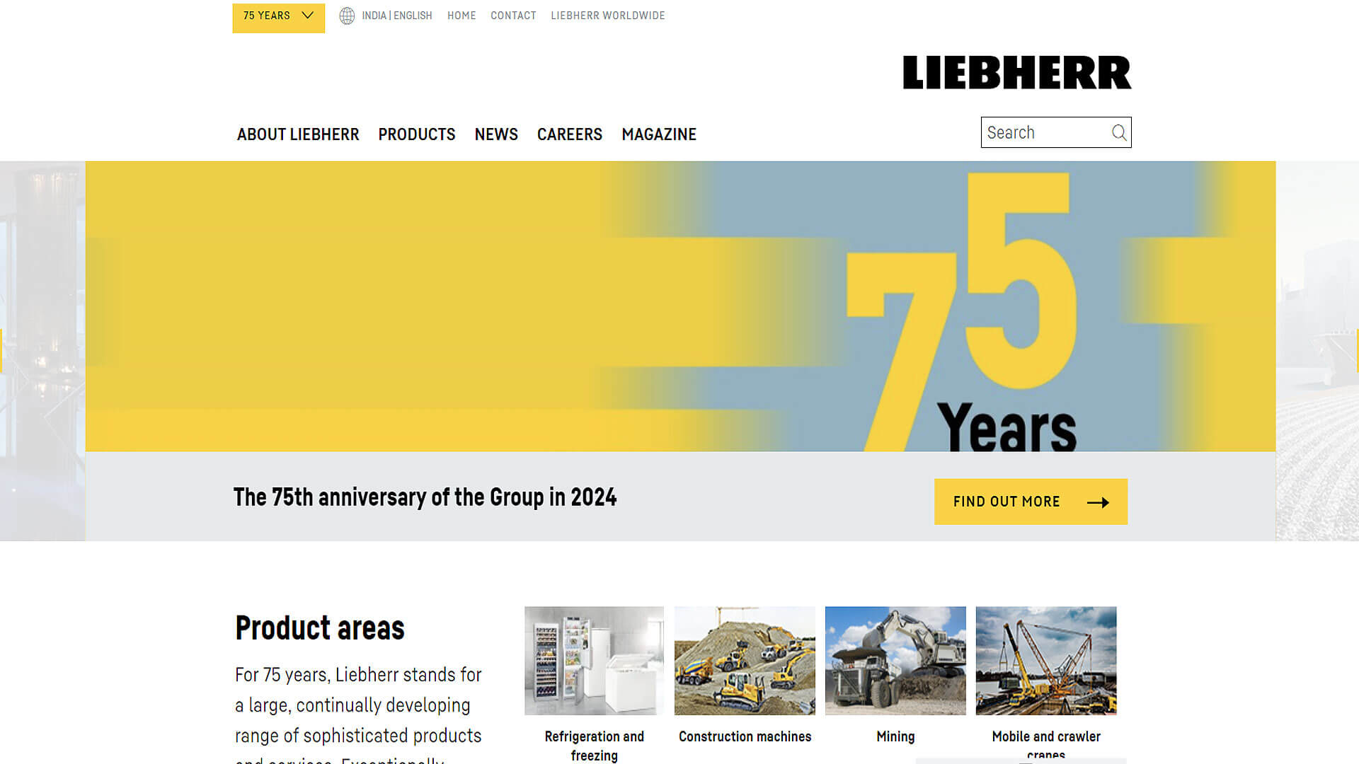
9. Liebherr - https://www.liebherr.com
Liebherr's website stands out with its sophisticated and modern design, characterized by a calm color scheme that includes shades of grey and blue, symbolizing reliability and quality. The homepage is visually appealing, featuring large visuals of their equipment in diverse working conditions. An intuitive layout ensures users can easily navigate through different machinery categories, spare parts, and services. The website is designed to be responsive, offering a seamless experience across devices. The use of interactive features, such as 3D models of equipment, allows users to explore products in depth. Liebherr effectively communicates its commitment to innovation and precision through its online presence.
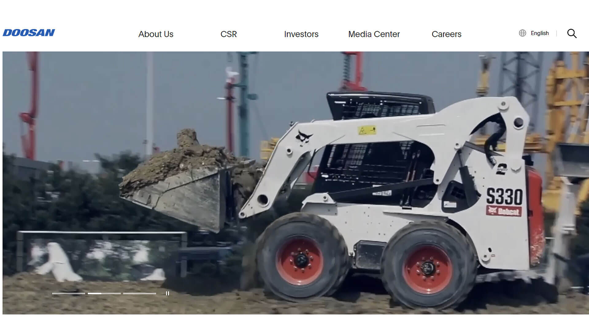
10. Doosan - https://www.doosan.com/en/
Doosan website showcases a sleek and modern aesthetic, using a blue and white color scheme that its brand identity. The homepage is organized with dynamic images that highlight the versatility of their machinery. The layout is clean, allowing for easy navigation to various products and services. Each section is designed with user experience in mind, providing detailed specifications and interactive features. The site also incorporates customer testimonials and case studies, enhancing credibility and user engagement. Doosan’s approach to design emphasizes clarity and functionality, making it easy for potential buyers to explore and understand their offerings.
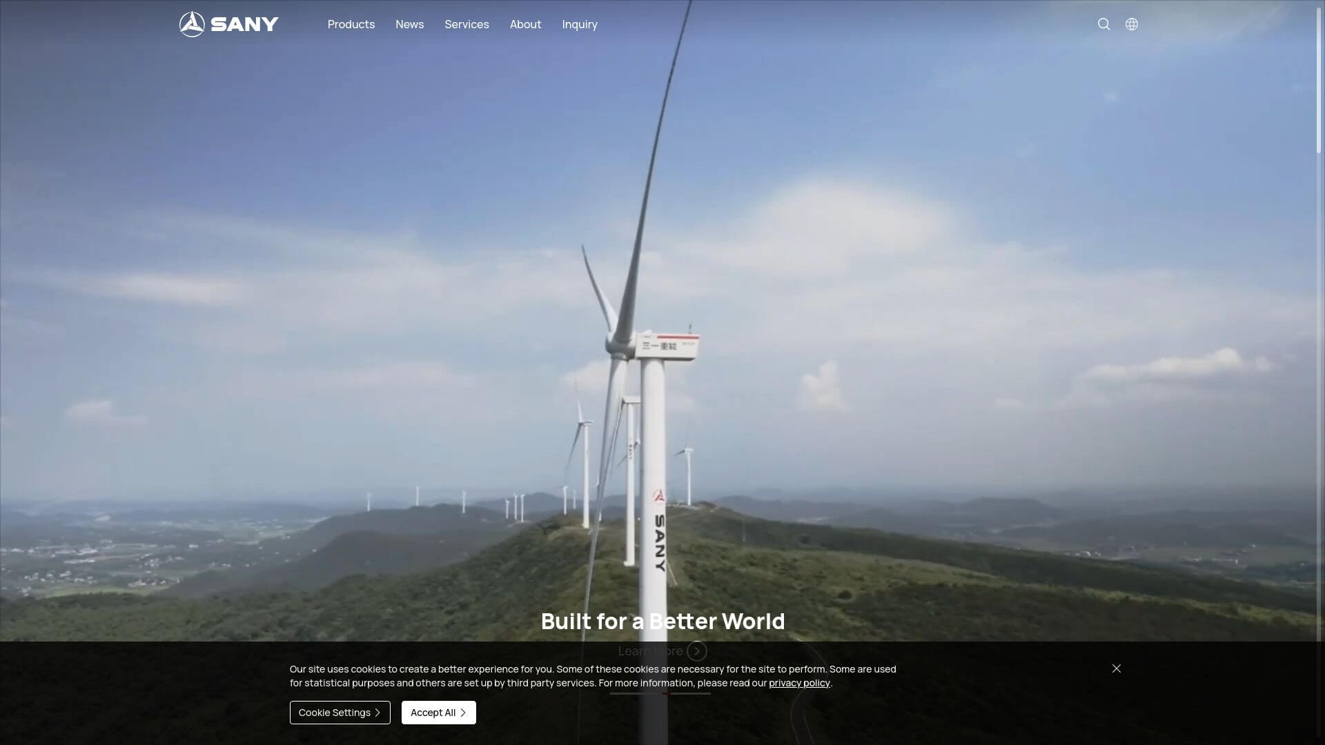
11. SANY - https://www.sanyglobal.com
SANY’s website design is both robust and visually striking, characterized by a bold red and black color palette that reflects the brand's energetic identity. The homepage features large banners with high-quality images of machinery, capturing the essence of power and durability. Navigation is user-friendly, with distinct categories for various equipment types and support services. Each product page includes detailed descriptions, specifications, and user manuals, making information accessible. The site also emphasizes interactive elements, such as product comparison tools, enhancing the overall user experience. SANY effectively blends visual appeal and functionality, catering to both consumers and industry professionals.
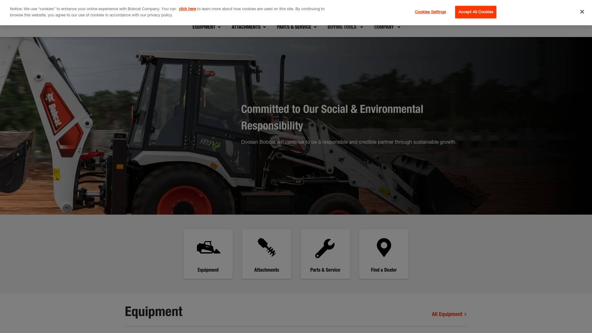
12. Bobcat Company - https://www.bobcat.com
Bobcat's website is a perfect example of contemporary design, utilizing a clean layout and a color scheme that features blue and white with accents of black. The homepage prominently displays large visuals of their machinery in action, creating an immediate connection with users. An intuitive navigation menu guides visitors through various equipment categories, financing options, and service information. The website is optimized for mobile devices, ensuring a seamless experience regardless of platform. Each product page is equipped with detailed specifications, videos, and customer reviews, fostering trust and transparency. Bobcat effectively balances style and substance, making it easy for users to find what they need.
13. Hyundai Construction Equipment - https://www.hceamericas.com
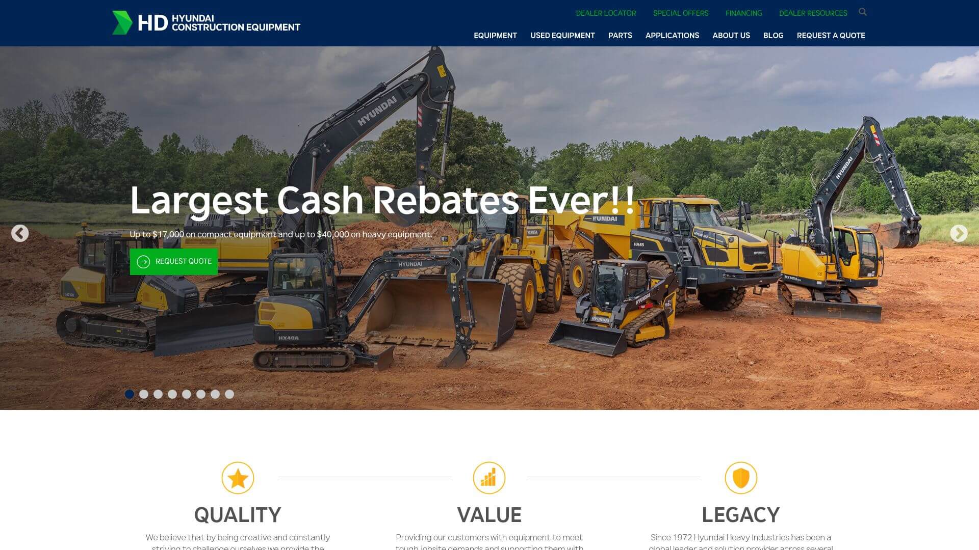
Hyundai’s website design is marked by a modern, clean aesthetic that reflects the brand’s commitment to innovation. The color palette features vibrant blue and white tones, which convey a sense of trustworthiness. The homepage includes large, captivating images that showcase their machinery in real-world applications. A streamlined navigation menu allows for easy exploration of products and services. The site’s responsive design ensures it performs well on both desktops and mobile devices. Each product page provides comprehensive details, including technical specifications and multimedia content, ensuring users have all the information they need to make informed decisions. Hyundai’s website successfully combines visual appeal and functional design.
14. Atlas Copco - https://www.atlascopco.com
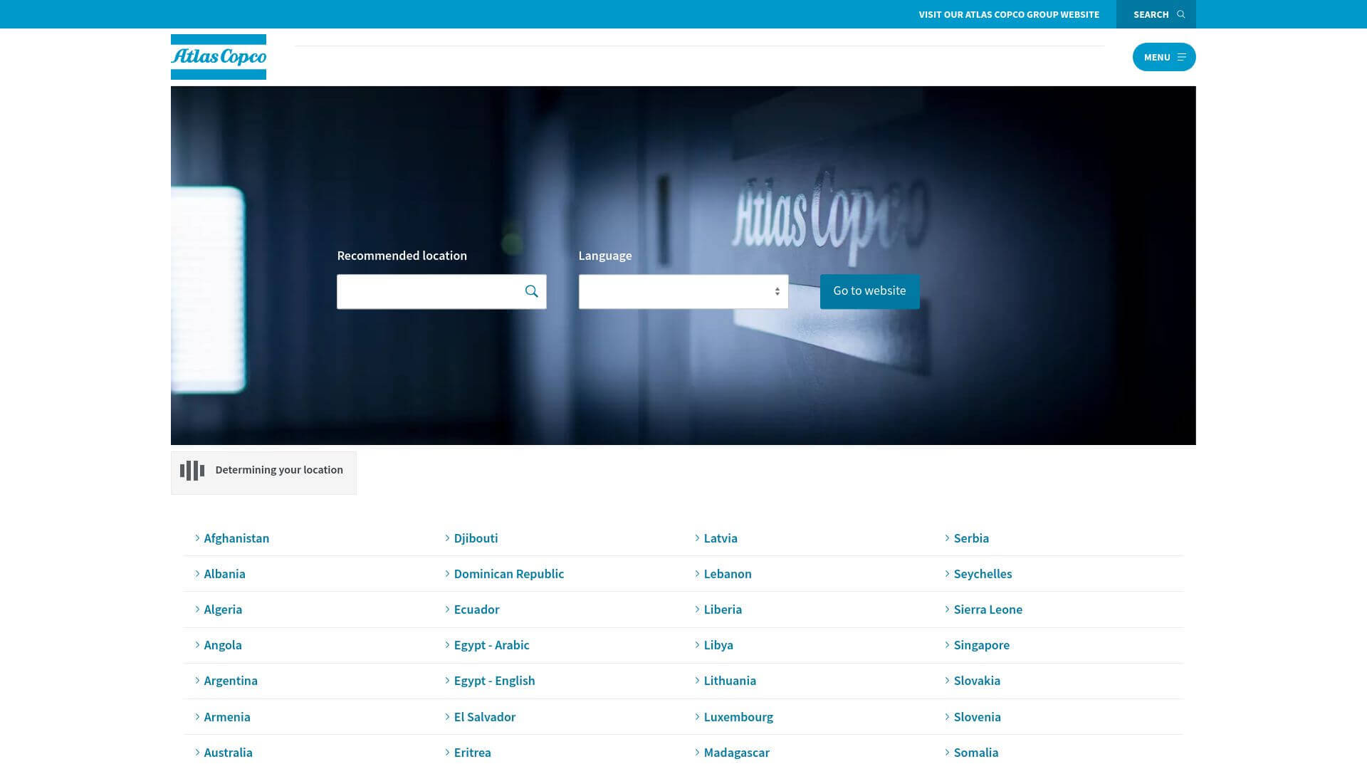
Atlas Copco's website design is characterized by its professional and sleek appearance, employing a blue and grey color scheme that aligns with its brand identity. The homepage is well-organized, featuring high-quality images and sections dedicated to their various product lines. Users can easily navigate through categories such as construction equipment and industrial tools, thanks to a clear and straightforward menu. Each product page includes in-depth specifications, application examples, and user guides, providing a wealth of information at users' fingertips. The site is also optimized for mobile, ensuring a smooth user experience across devices. Atlas Copco effectively conveys its commitment to quality and innovation through its online presence.
15. Manitowoc Cranes - https://www.manitowoc.com
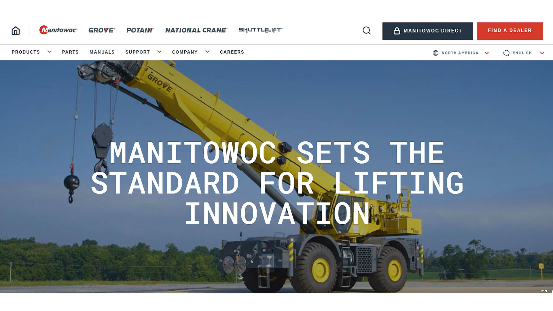
Manitowoc’s website showcases a bold and striking design, primarily featuring a red and black color scheme that commands attention. The homepage features dynamic images of their cranes in operation, emphasizing strength and reliability. The layout is organized, allowing for easy access to different product categories and support services. Each product page is equipped with detailed information, specifications, and a robust image gallery, ensuring users can thoroughly understand the offerings. The site’s design is responsive, providing an optimal experience on both desktop and mobile devices. Manitowoc effectively combines powerful visuals and comprehensive information, making it a standout in the heavy machinery sector.
16. Kubota Construction Machinery - https://www.kubota.com
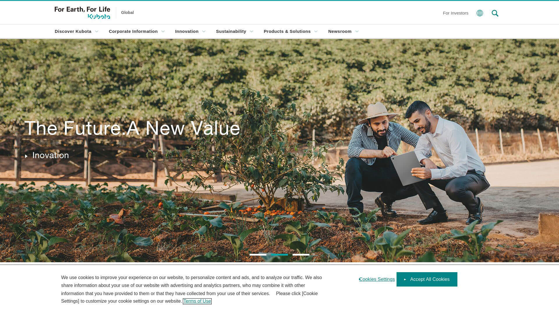
Kubota’s website exemplifies simplicity and functionality, with a bright and clean design that reflects its brand values of reliability and efficiency. The orange and white color palette is consistent with Kubota's machinery branding, creating a strong visual identity. The homepage features high-resolution images of machinery in various operational environments, showcasing the versatility of their equipment. The navigation is user-friendly, with easily accessible categories for machinery, services, and dealer locations. Each product page includes detailed technical specifications, videos, and customer testimonials, helping potential buyers make informed decisions. The site is designed to be responsive, ensuring a seamless experience on mobile devices, which enhances the overall user journey.
17. Bell Equipment - https://www.bellequipment.com
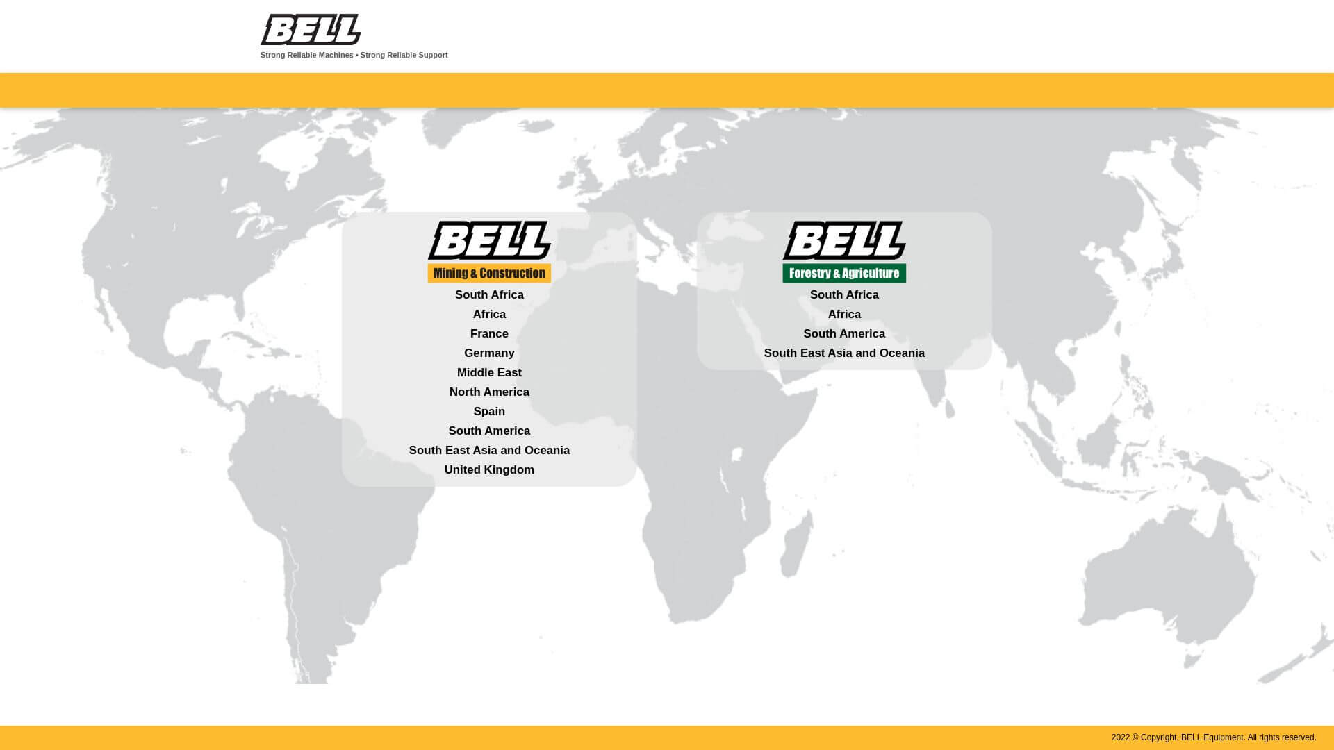
Bell Equipment’s website offers a dynamic and engaging design, with a focus on user experience and modern aesthetics. The color scheme predominantly features blue and grey, giving the site a professional and industrial feel. The homepage is highly visual, with large banners showcasing heavy machinery at work, accompanied by clear CTAs that guide users to explore products or services. The simple navigation menu allows users to quickly access equipment categories, parts, and services. Product pages include detailed specifications, 3D models, and customer reviews. Bell Equipment’s responsive design ensures that the site performs equally well across all devices, making it a great resource for potential buyers.
18. Wirtgen Group - https://www.wirtgen-group.com
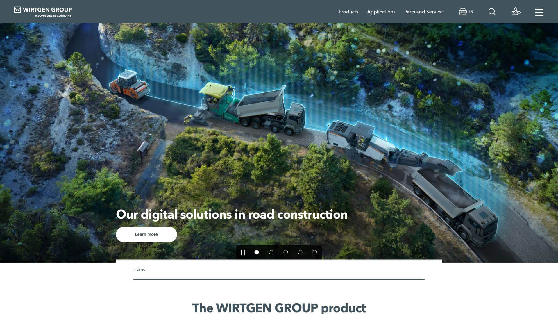
Wirtgen Group’s website has a sleek and professional design, utilizing a blue, grey, and white color palette that reinforces its industrial identity. The homepage features a clean layout, with well-organized sections that highlight different machinery categories and services. Large, high-quality images of machinery at work dominate the Visual Design, making the site feel impactful and engaging. The navigation is intuitive, with dropdown menus that provide easy access to product specifications, company news, and dealer locations. Each product page offers in-depth descriptions, technical details, and multimedia content like videos and 3D product views. Wirtgen Group's website is designed to be functional and visually appealing, creating a smooth user experience.
19. Yanmar Construction - https://www.yanmar.com
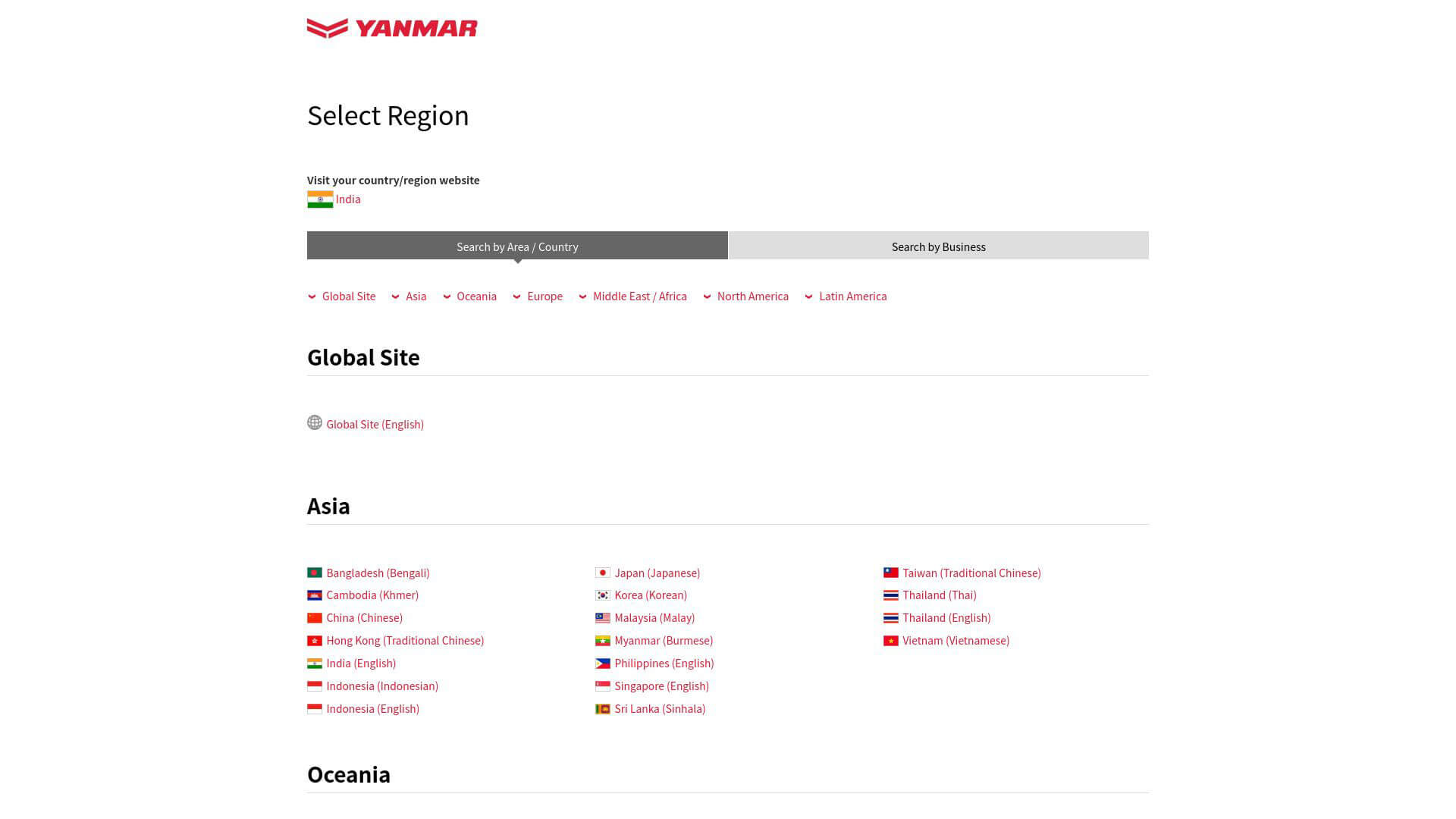
Yanmar’s website design is modern and minimalistic, with a red and white color scheme that resonates with the brand's identity. The homepage features full-screen images of Yanmar machinery in action, giving users a sense of the brand’s engineering excellence. The navigation is streamlined and easy to use, guiding users through various product categories, services, and support options. Each product page includes high-resolution images, videos, and detailed specifications, making it easy for users to explore and compare machinery. The responsive design ensures that the site works seamlessly on both desktop and mobile devices, while the clean typography enhances readability. Yanmar’s website successfully merges aesthetic appeal with practical functionality.
20. Tadano Global - https://www.tadano.com
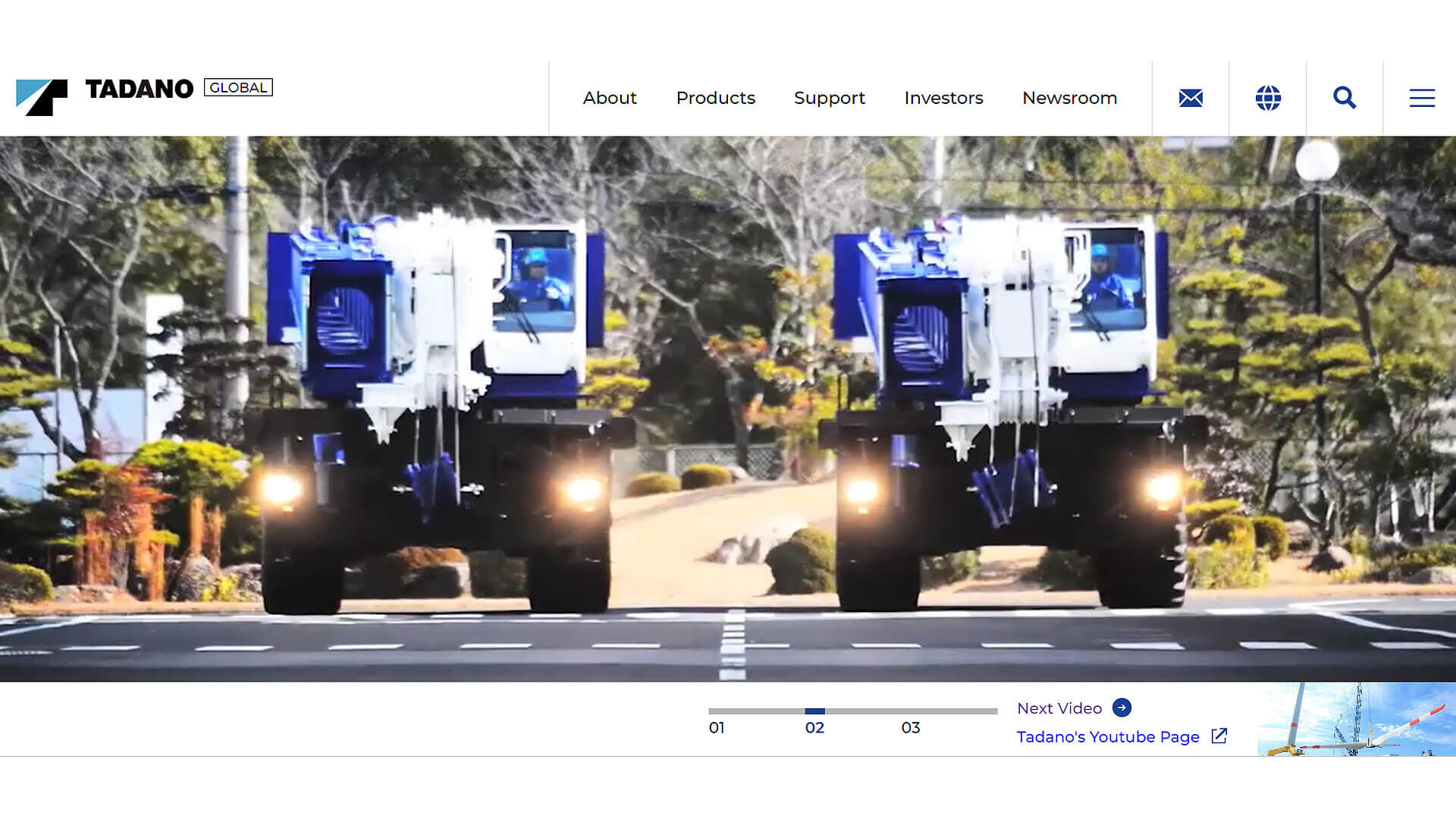
Tadano’s website presents a polished and modern design, with a blue and white color palette that creates a professional and reliable feel. The homepage is visually appealing, featuring full-screen images of Tadano cranes in action, complemented by bold typography and well-placed CTAs. The navigation is straightforward, allowing users to easily find product categories, services, and company news. Each product page includes comprehensive technical specifications, images, and videos, providing a detailed understanding of the machinery. The website is also optimized for mobile, ensuring a smooth experience across devices. Tadano’s website successfully blends visual sophistication with user-friendly functionality, catering to a wide range of customers.
21. Fendt Construction - https://www.fendt.com
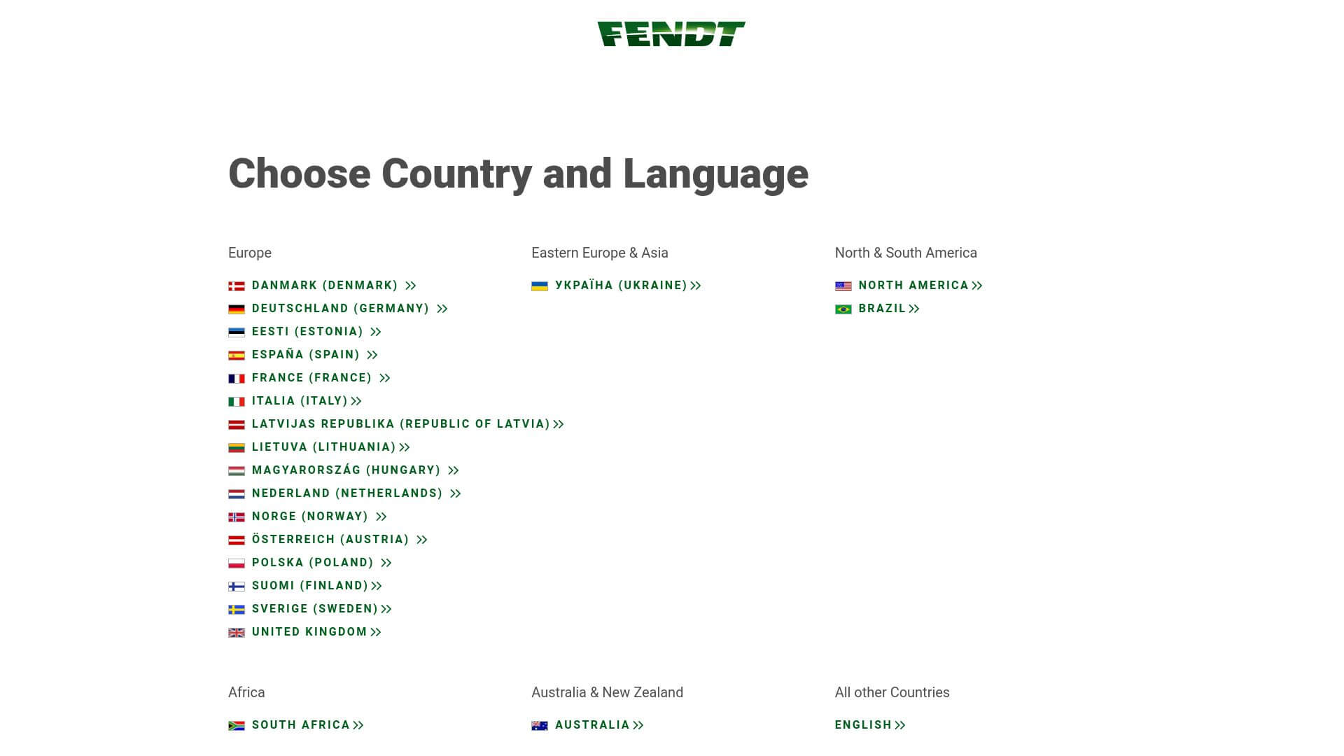
Fendt’s website stands out for its clean and elegant design, utilizing a green and white color scheme that aligns with the brand’s heritage. The homepage features high-resolution imagery of their machinery, creating a strong visual impact. The navigation is intuitive, with easy-to-find product categories and support options. Each product page provides detailed information, including technical specifications and multimedia content, such as videos and 360-degree views. The responsive design ensures optimal performance across all devices. Fendt’s website focuses on delivering a visually appealing and functional experience, ensuring that users can easily explore and understand their offerings.
22. Kobelco Construction Machinery - https://www.kobelco-usa.com
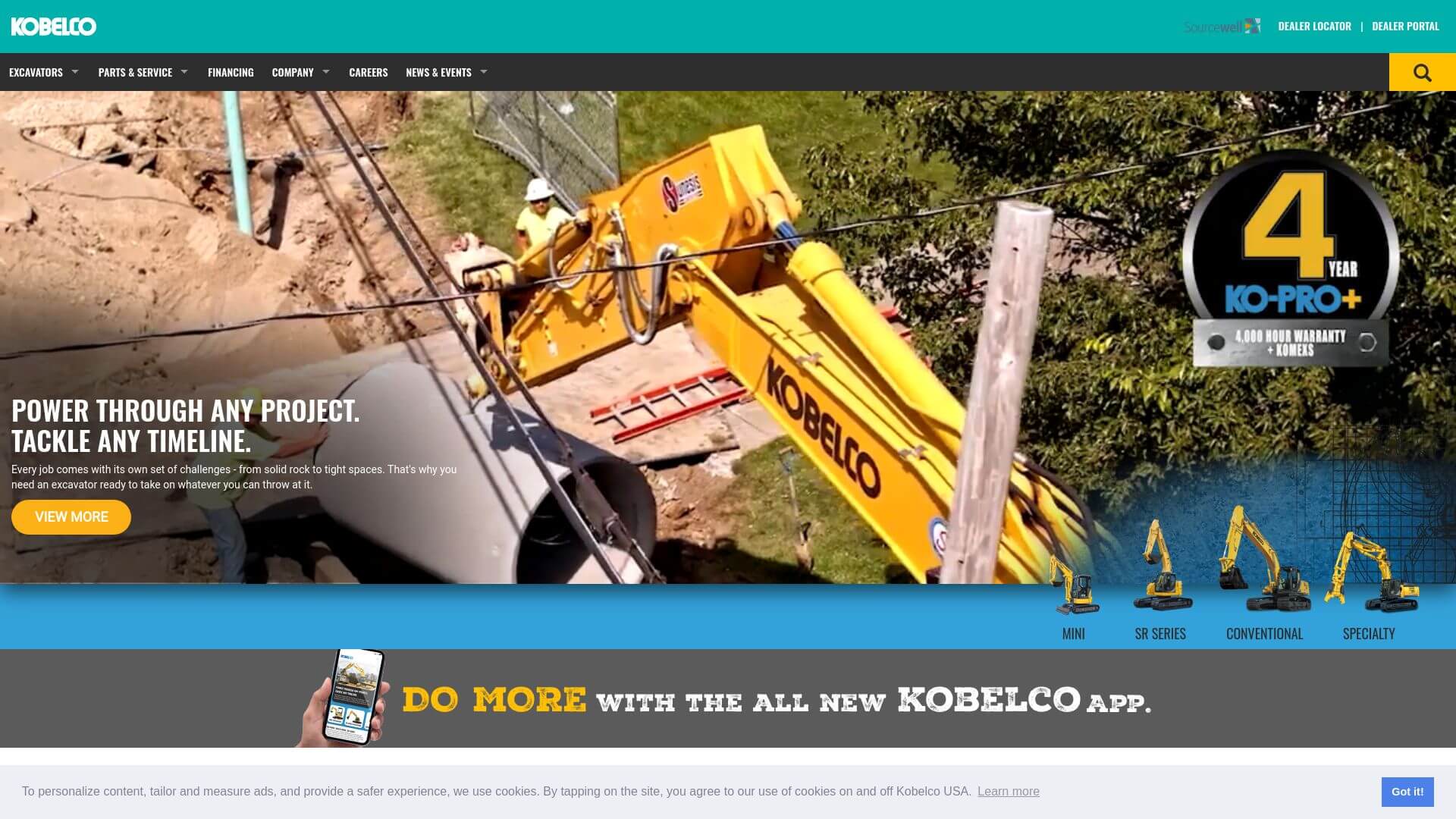
Kobelco’s website exudes professionalism and simplicity, with a dark blue and white color scheme that reflects its industrial roots. The homepage is clean and features high-quality visuals of machinery, creating an immersive experience for visitors. The navigation is straightforward, with dropdown menus that guide users to explore product categories, parts, and services. Each product page is filled with detailed specifications, images, and videos, allowing users to thoroughly explore the equipment. The responsive design ensures that the website works seamlessly across various devices. Kobelco’s site emphasizes clarity and ease of use, making it a standout in the heavy machinery sector.
23. Takeuchi - https://www.takeuchi-us.com
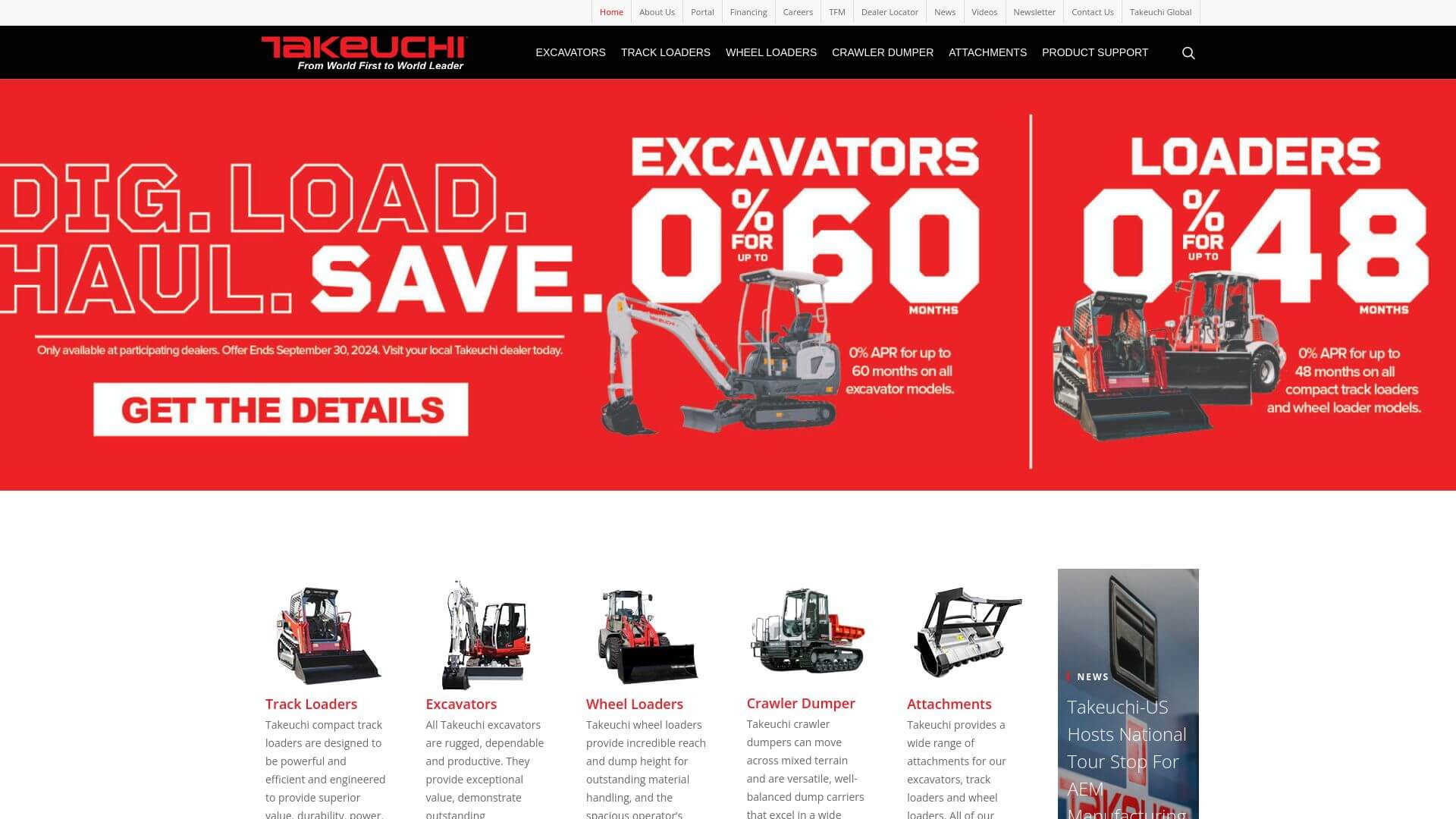
Takeuchi’s website has a modern, clean aesthetic, utilizing a red, white, and grey color palette that aligns with the brand's identity. The homepage is visually engaging, with full-screen images of their machinery in action. The layout is simple, with intuitive navigation that allows users to easily explore different machinery categories, parts, and services. Each product page includes comprehensive technical specifications, high-resolution images, and customer reviews. The Responsive Design ensures that the website provides an optimal user experience across all devices. Takeuchi’s site combines visual impact with functionality, ensuring that users can find what they need quickly and efficiently.
24. CNH Industrial - https://www.cnhindustrial.com
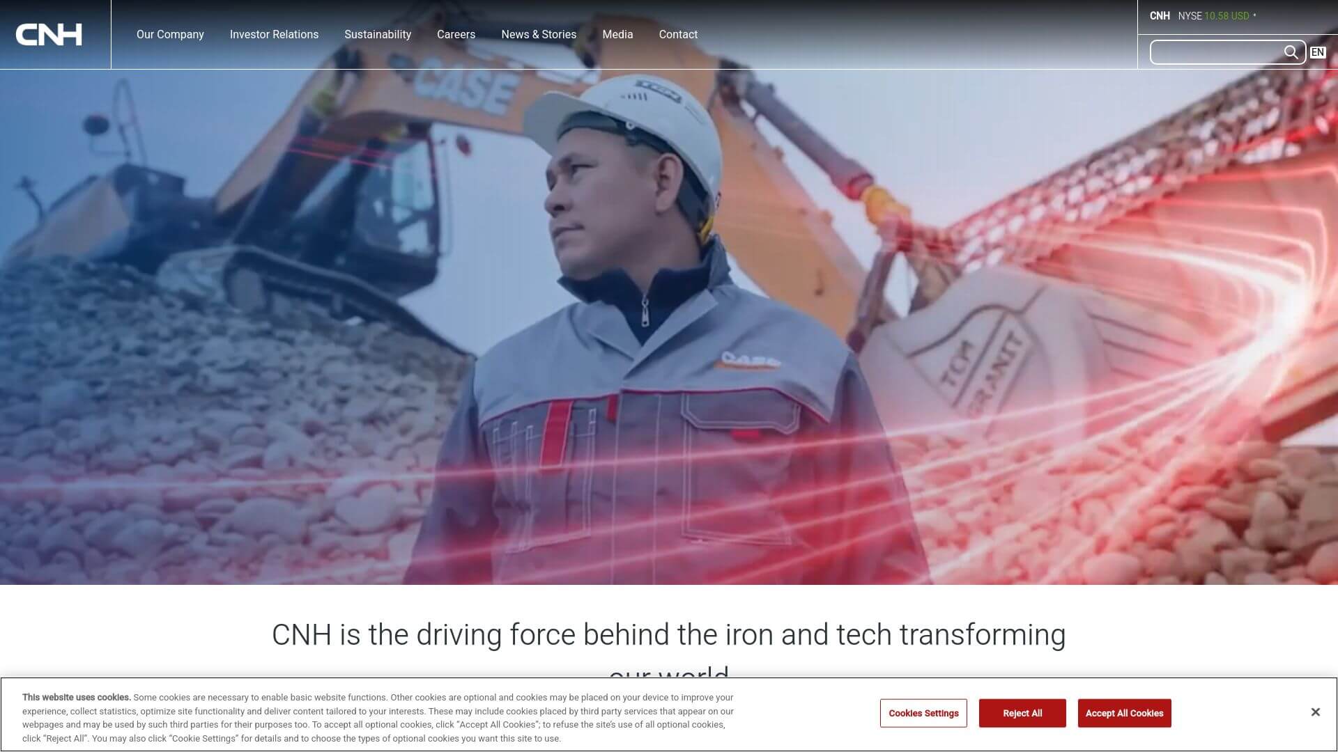
CNH Industrial’s website features a modern, minimalistic design, with a white and blue color scheme that conveys a sense of professionalism and trust. The homepage is clean, with large banners showcasing machinery and clear CTAs that guide users to different sections. The navigation is simple, with dropdown menus that allow users to explore product categories, services, and company news. Each product page includes detailed specifications, images, and videos, making it easy for users to understand the machinery. The website is designed to be responsive, ensuring a seamless experience on both desktop and mobile devices. CNH Industrial’s site effectively blends visual appeal with ease of use, creating a compelling online presence.
25. LiuGong Machinery - https://www.liugong.com
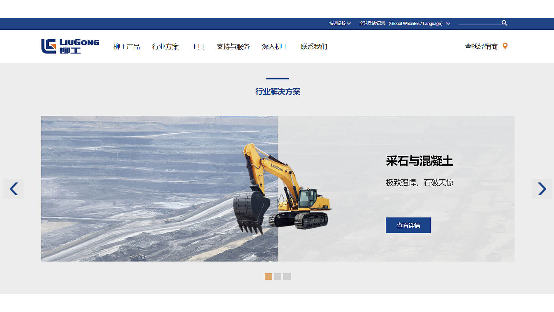
LiuGong’s website is a blend of bold visuals and user-centric design, with a blue and white color palette that reinforces the brand's identity. The homepage features high-resolution images of machinery in action, creating an immediate connection with users. The navigation is user-friendly, with dropdown menus that guide visitors to product categories, services, and dealer locations. Each product page includes detailed specifications, images, and videos, allowing users to fully explore the machinery. The website is optimized for mobile devices, ensuring a smooth experience across all platforms. LiuGong successfully combines visual impact with practical functionality, making it a strong contender in the heavy machinery space.
26. Palfinger - https://www.palfinger.com
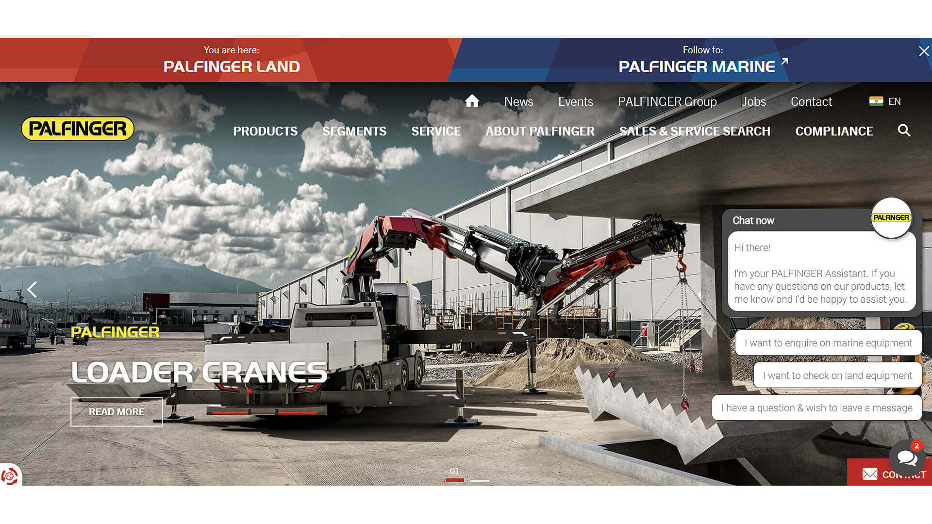
Palfinger’s website showcases a bold and modern design, with a red and white color scheme that reflects the brand’s energetic identity. The homepage features large, captivating images of their equipment, along with prominent CTAs directing users to explore products and services. The navigation is straightforward, with clear categories for different machinery types. Each product page includes comprehensive specifications, images, and multimedia content, providing users with all the information they need to make informed decisions. The site’s responsive design ensures a seamless experience across devices. Palfinger’s website effectively balances visual appeal and functionality, creating a user-friendly experience for both professionals and casual visitors.
27. Volvo Penta - https://www.volvopenta.com
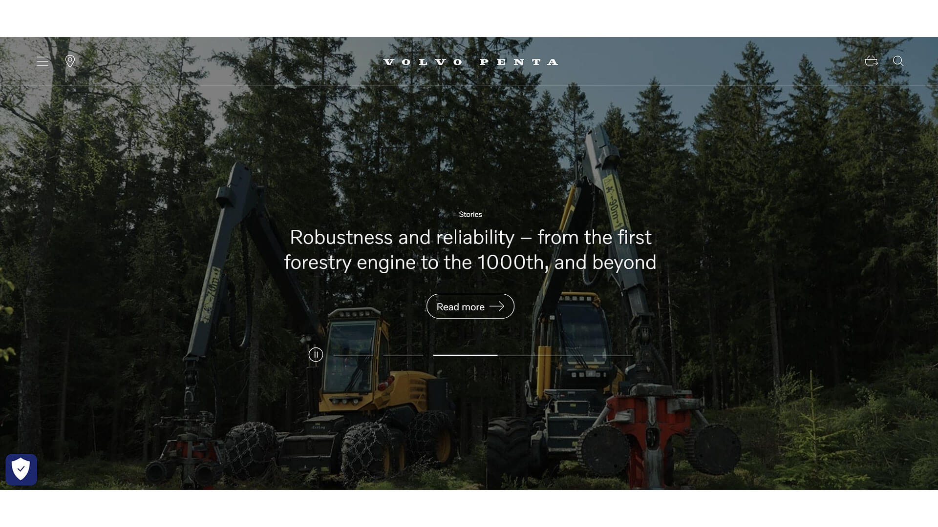
Volvo Penta’s website exemplifies clean, sophisticated design, with a blue and white color palette that conveys professionalism and reliability. The homepage is visually appealing, with large images and videos of their machinery in action. The navigation is user-friendly, allowing visitors to quickly access product categories, services, and dealer information. Each product page includes detailed specifications, images, and videos, making it easy for users to explore and compare equipment. The website is designed to be responsive, ensuring a smooth experience on both desktop and mobile devices. Volvo Penta’s site successfully combines visual sophistication with practical functionality, creating a strong online presence.
28. Sennebogen - https://www.sennebogen.com
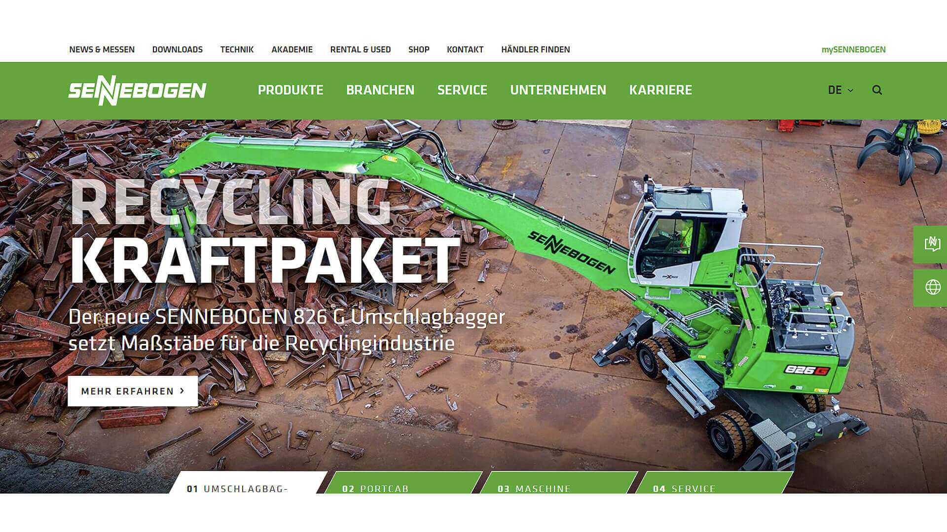
Sennebogen’s website design is modern and engaging, with a green and white color scheme that reflects the brand’s environmental consciousness. The homepage is visually impactful, featuring high-resolution images of their equipment at work. The navigation is simple, with clear categories for different machinery types and services. Each product page includes detailed specifications, images, and videos, allowing users to fully explore the equipment. The site is optimized for mobile devices, ensuring a seamless experience across platforms. Sennebogen’s website effectively combines visual appeal with ease of use, providing a user-friendly experience for both professionals and casual visitors.
29. Genie - https://www.genielift.com
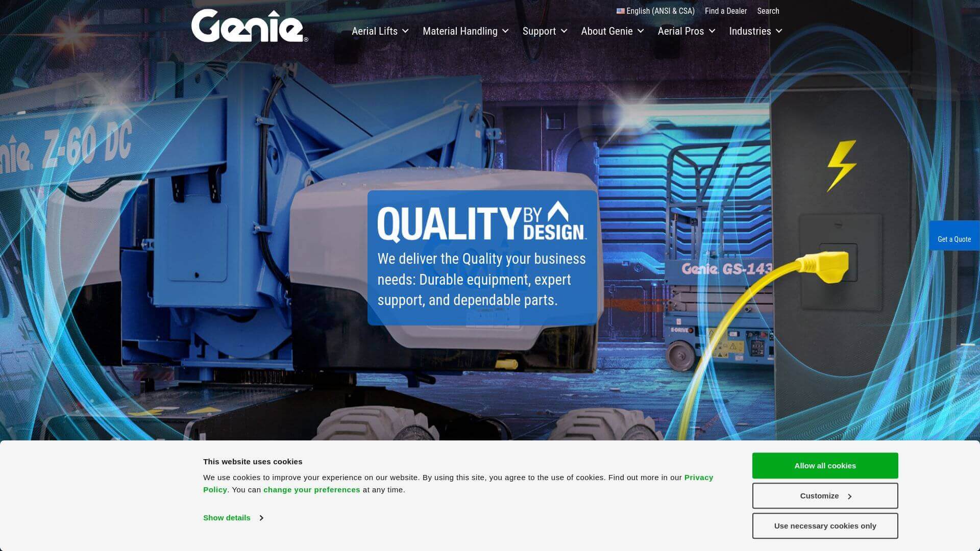
Genie’s website features a bold and energetic design, with a blue and white color scheme that reflects the brand’s innovative identity. The homepage is visually striking, with large images of their equipment and clear CTAs that guide users to explore products
and services. The navigation is intuitive, with easy access to product categories, services, and dealer information. Each product page includes detailed specifications, images, and multimedia content, providing users with all the information they need to make informed decisions. The site’s responsive design ensures a seamless experience across devices. Genie’s website effectively balances visual impact and functionality, creating a strong online presence.
30. Skyjack - https://www.skyjack.com
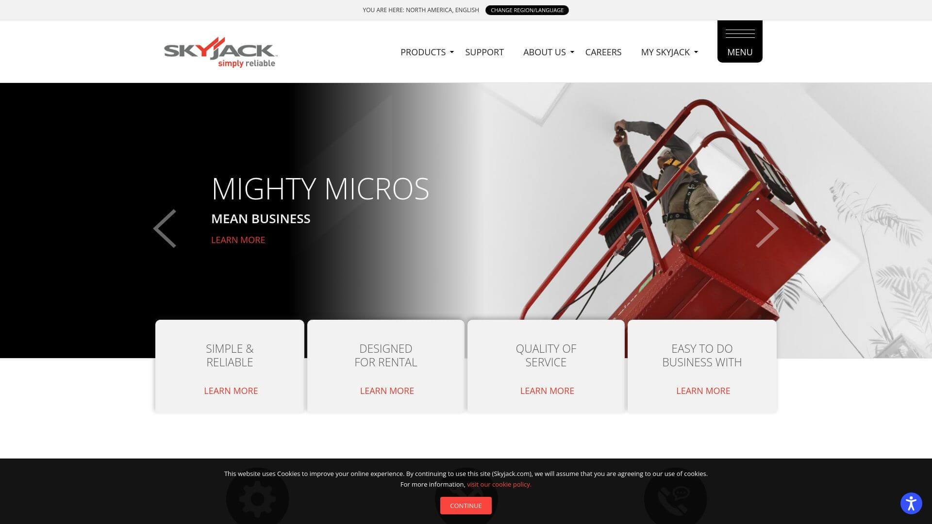
Skyjack’s website is a great example of industrial elegance, with a red and white color scheme that reflects the brand’s identity. The homepage is clean and organized, featuring high-quality images of their machinery. The navigation is simple, allowing users to easily explore product categories, services, and dealer locations. Each product page includes comprehensive technical details, images, and videos, allowing users to fully understand the equipment. The responsive design ensures that the website works seamlessly across devices. Skyjack’s site focuses on functionality and user experience, making it a valuable resource for potential buyers and industry professionals.
About Prateeksha Web Design
Prateeksha Web Design Company is a renowned firm that specializes in providing creative design solutions for heavy-machinery websites. They offer services ranging from site layout design to the integration of interactive features. Their experts transform conventional heavy-machinery websites into user-friendly platforms, enhancing visuals, and improving navigation. Their creative designs not only make the websites aesthetically pleasing but also increase engagement and customer satisfaction.
Interested in learning more? Contact us today.
