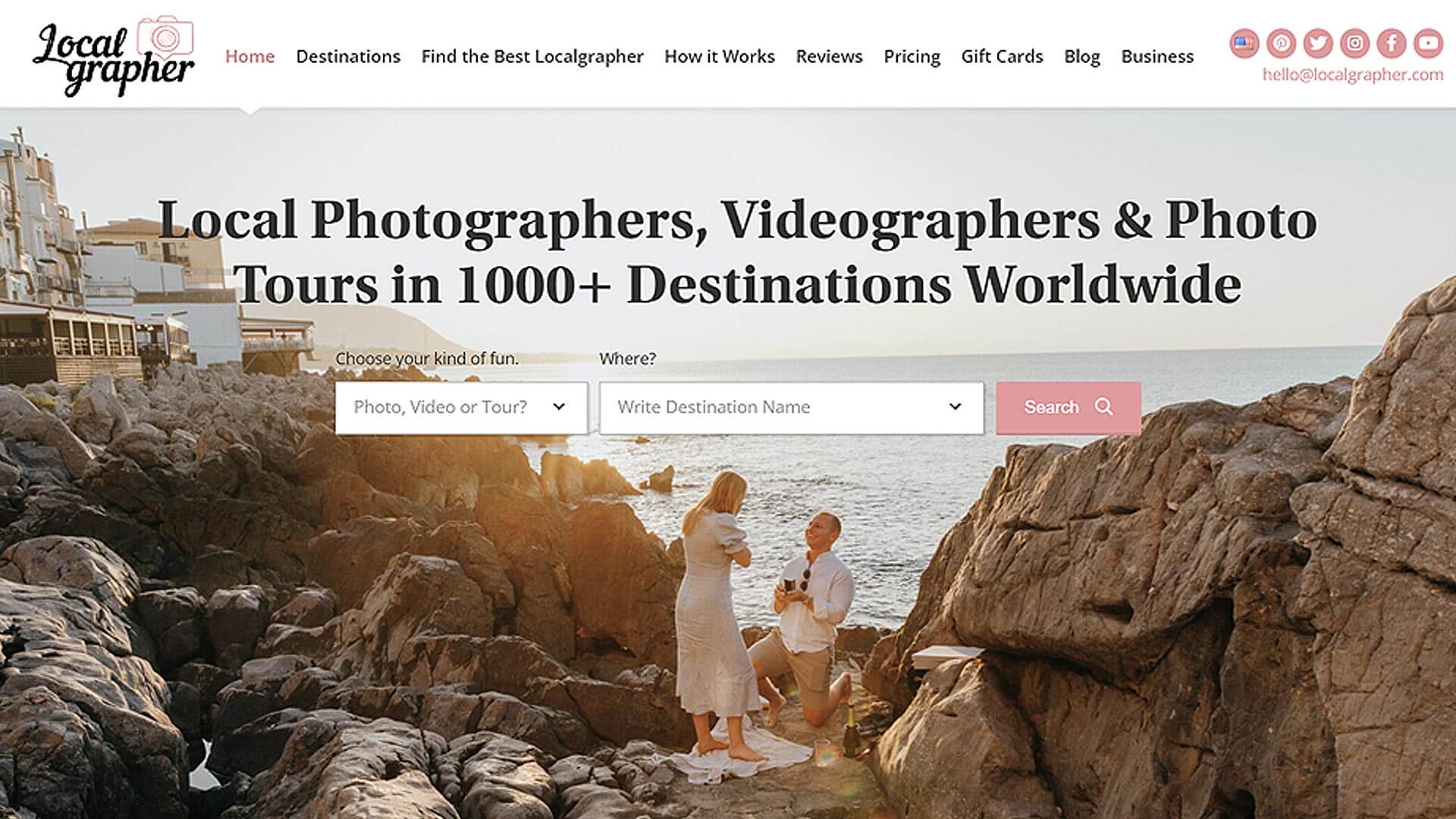
1. Local Photographer
The look of Localgrapher's site is both fresh and professional. On the homepage's image slider, there are pictures of happy customers and quotes from them about how the company helped them. There is also a short description of what the company has to offer.
The services, customer reviews, and contact information for Localgrapher are shown in three different sections below the slider. In the page's footer, there is a map that customers can click on to find a photography studio near them.
Overall, Localgrapher has done a great job making a website that looks good and works well. This makes it easy for potential customers to learn more about the company and what it has to offer and get in touch with them.
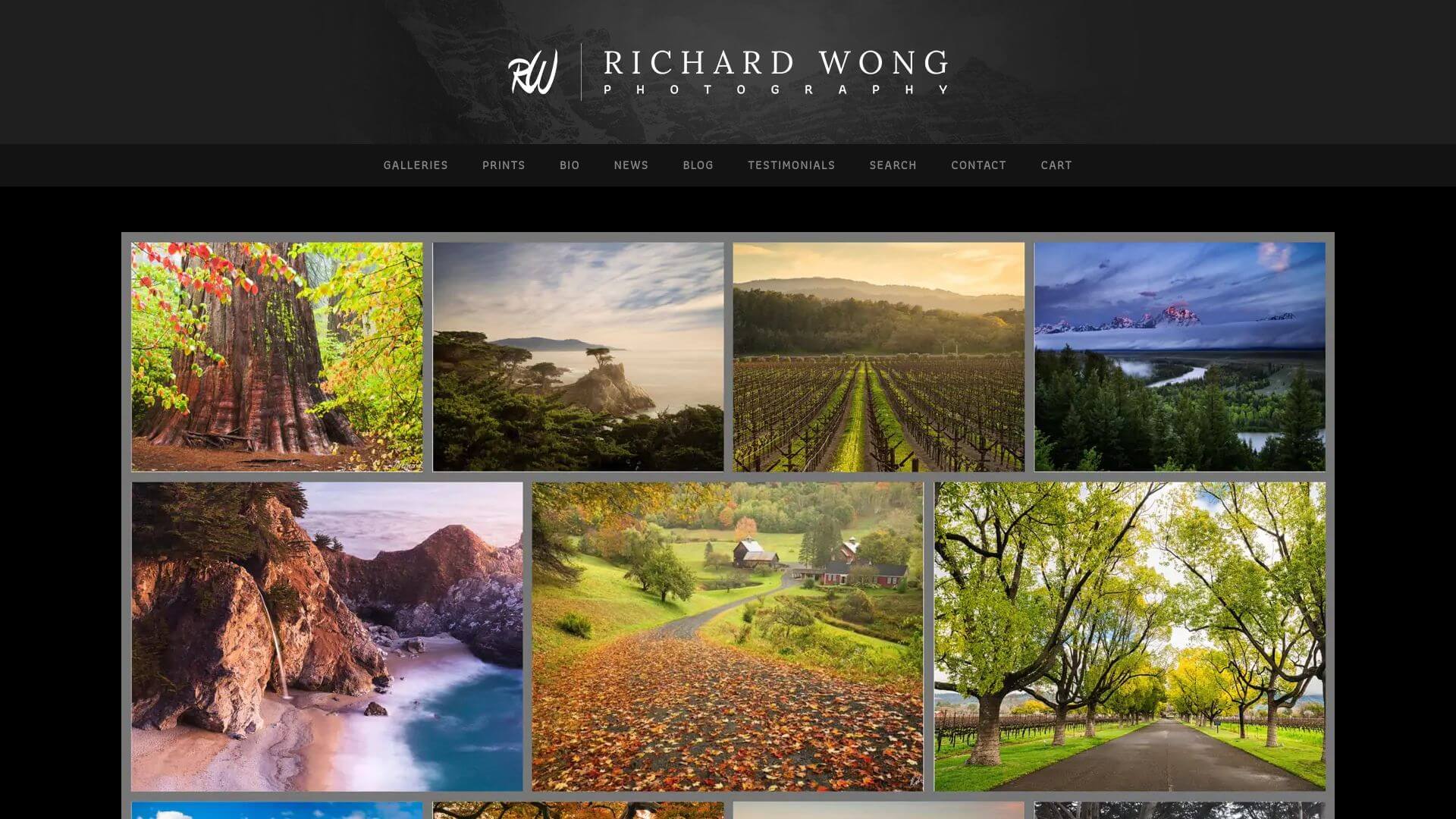
2. Richard Wong Photography
RWongPhoto.com is a great example of a modern, beautiful website that other web designers can learn from and be inspired by. At the top of the page is a menu bar with links to the many parts of the site (Home, About, Portfolio, Blog, and Contact). On the homepage, their best work is shown in a big slider carousel. In the footer, there are links to Facebook, Instagram, and Twitter, as well as other ways to get in touch with the site.
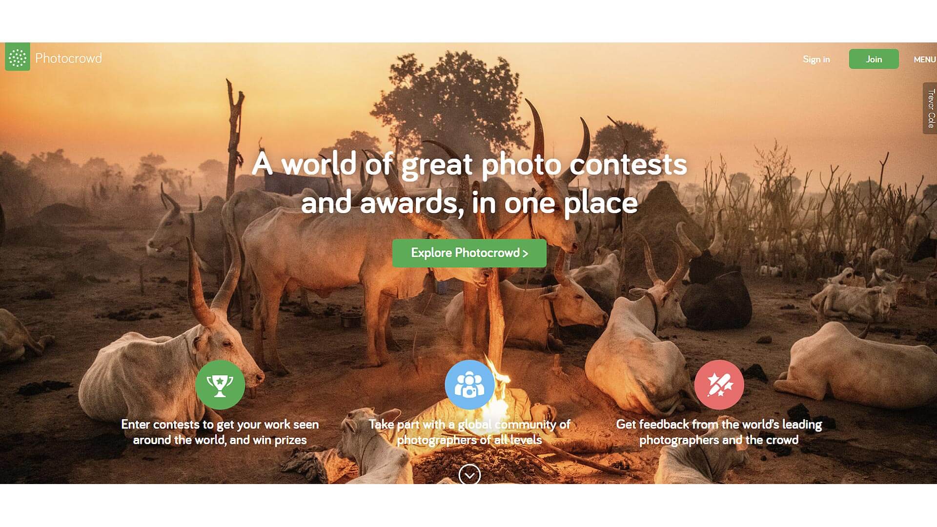
3. Photocrowd
The people who made https://www.photocrowd.com/ spent a lot of time making it easy to find your way around and fun to use. The homepage is simple and focuses on big, easy-to-read graphics and text that show off the best parts of the site.
The menu at the top of the page lets you quickly get to many parts of the site and the user's profile. In the middle of the page is a useful interactive search bar that lets visitors quickly find the photos or products that most interest them.
The design of the site is clean and simple, and there is enough white space to help people focus on the site's main goal, which is to have fun while getting photography tips and services from real photographers all over the world.
Focusing on photography as a way to inspire and bring together people from all walks of life, the site makes good use of original graphics to improve its look and stay true to its mission.
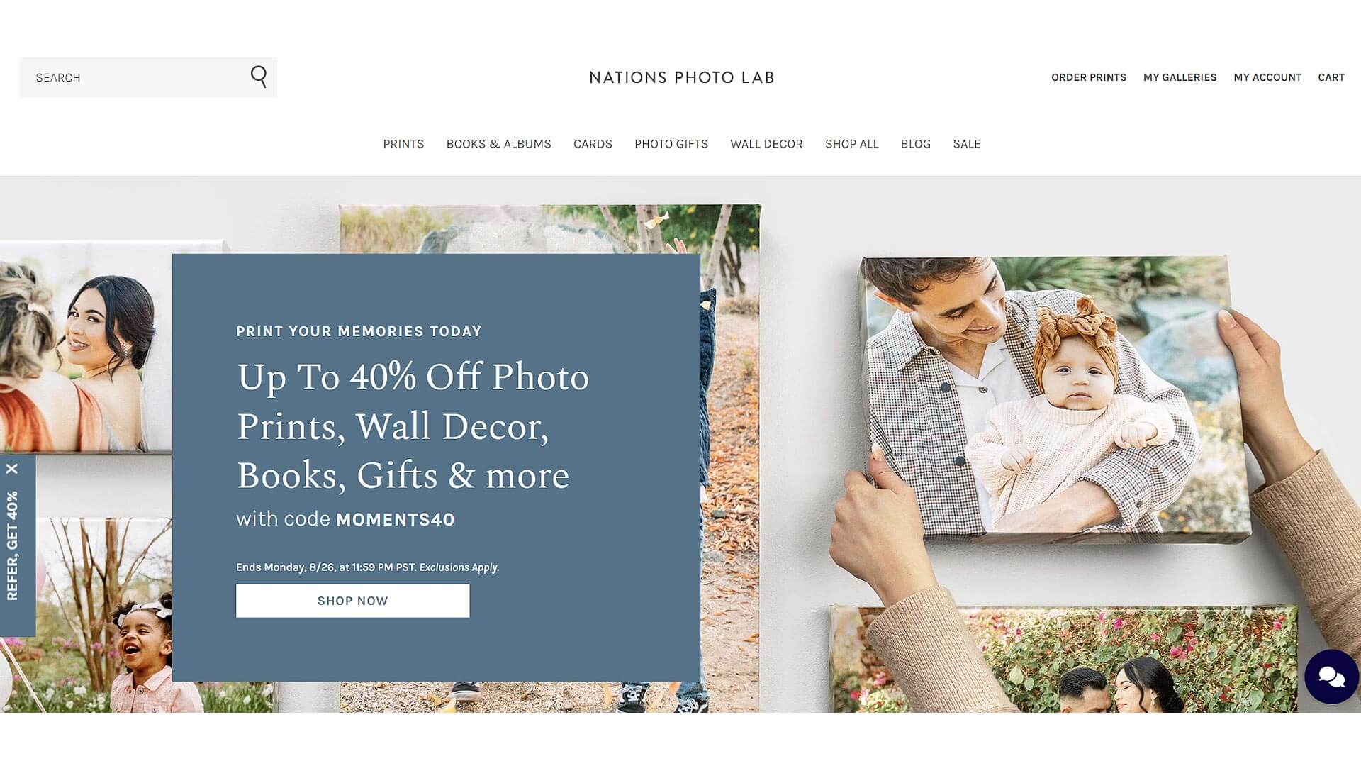
4. Nations photo lab
The design of Nations Picture Lab's website is creative and unique. Its minimalist colour scheme is mostly black, grey, and white, which gives it a modern look. The website has a simple layout that puts the company's services front and centre on the first page. Many pull-down menus have been put in the header area to make it easy to move around the site quickly.
The content in the body area is neatly divided into sections and columns, ensuring easy navigation and helping users quickly find what they need. Photos and graphics are prominently featured to catch the user's attention and guide them to key areas, such as the Web Design Inspirations page, which showcases examples of their work. Additionally, an interactive map at the bottom of the page allows customers to locate the most convenient Nations Photo Lab location.
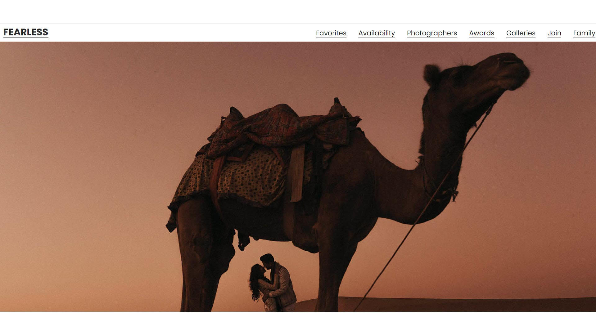
5. Fearless photographers
The website for Fearless Photographers is both stylish and up-to-date. Its main colours are black and white, with blue and yellow accents that draw attention to important parts. The idea of Fearless Photographers is introduced by an eye-catching banner at the top of the homepage. This is followed by prominent lists of photographers who have earned their seal of approval.
Below is a deck of cards with information about the different kinds of photo shoots Fearless Photographers can do, from weddings to family portraits. On these cards, you can find the photographer's contact information as well as tips on how to choose the right photographer for your needs.
If people visit your site and have questions or concerns, they can get in touch with you quickly and easily using the information in the footer, which includes links to your social media profiles and your contact information. The layout of the website is simple and clear, so it's easy to get around and find out everything you need to know about the services.
Visit fearlessphotographers.com
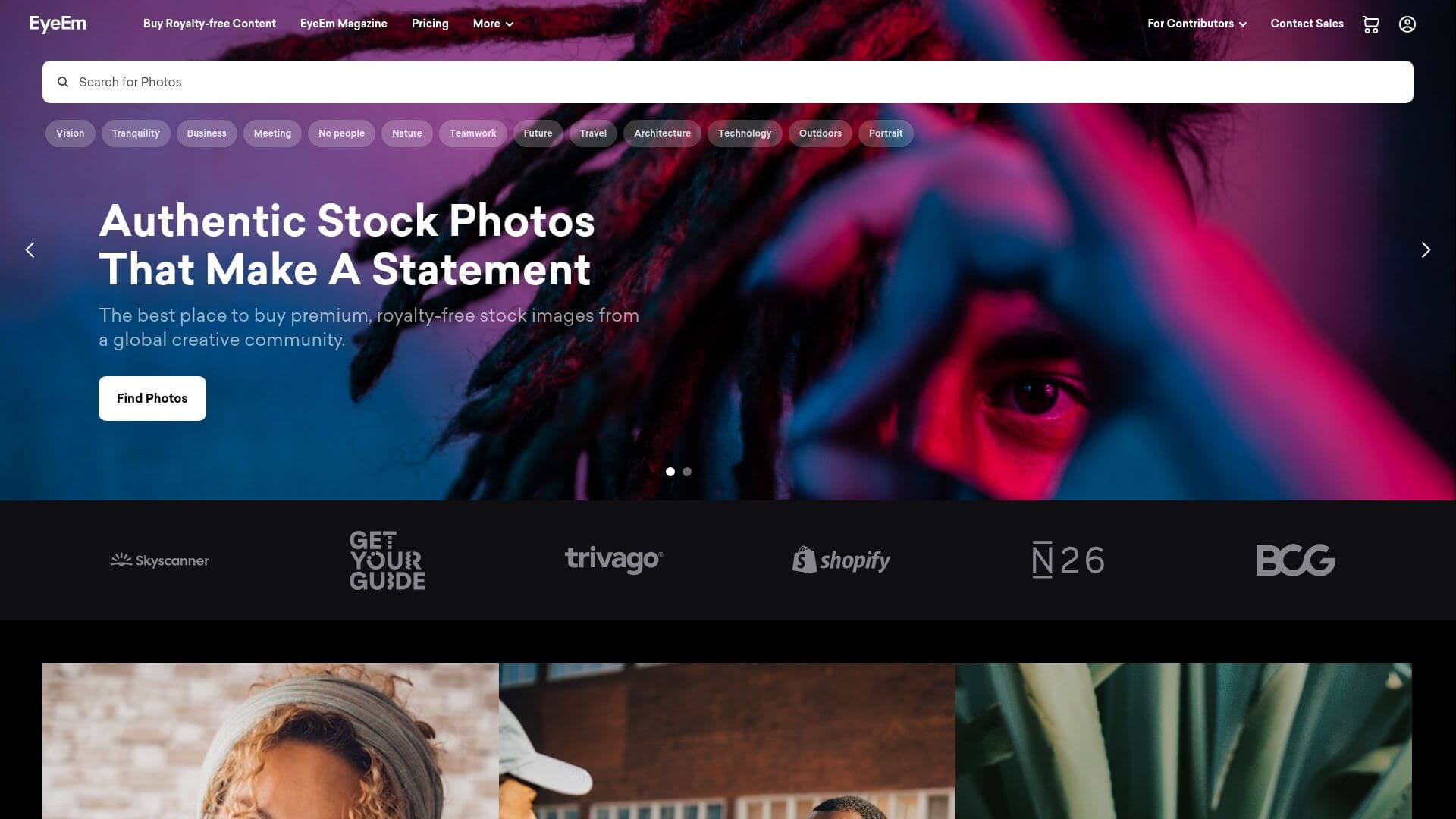
6. EyeEm | Authentic Stock Photography and Royalty-Free Images
EyeEm's website is simple, clean, and easy to use. The page is dominated by a big graphic with the company's name and slogan, followed by a few lines of text that describe the services. Under this, you'll find galleries of images on different topics, like nature and travel, as well as the most recent works by featured photographers.
In the top navigation bar, visitors can choose from a number of options, such as Discover (for ideas), Explore (for image searches), and Buy & Sell (for money transactions) (for buying or selling photos). On every page, you can find links to EyeEm's blog, magazine, store, and social media profiles.
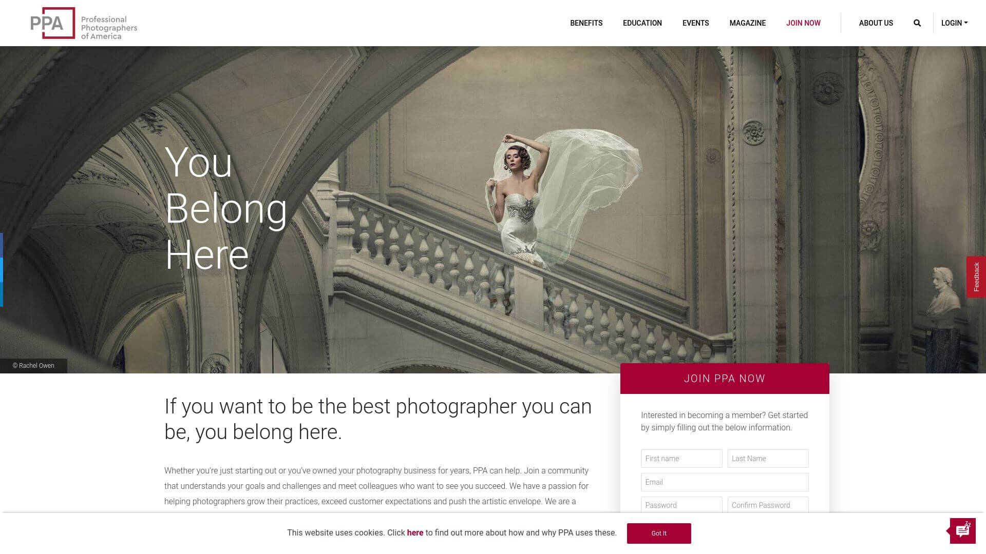
7. PPA | Professional Photographers of America
The website for the PPA looks clean and is easy to use. On the homepage, a full-width banner image and some text explain that PPA wants to "Raise Professional Photography." In the sections that follow, you'll learn about the PPA's image software and other web design resources. You'll also learn about the benefits of being a member, educational opportunities, news and events in the industry, and more.
Overall, the PPA website is designed with cutting-edge features like full-width photos and bright colours. It also gives photographers important information about the organisation and how it can help them get ahead in their careers. It not only gives you access to their services, but it also gives you ideas for how to design your own website by using eye-catching images that fit with what their brand stands for.
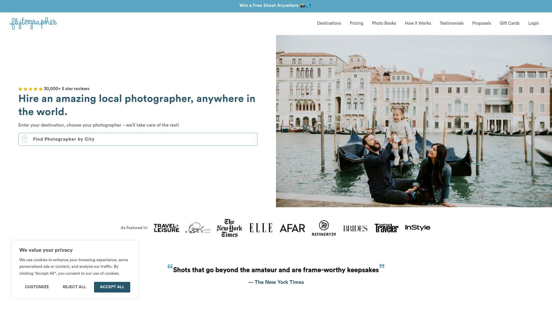
8. Professional Vacation Photographers | Flytographer
Check out https://www.flytographer.com/ for a great example of how Web Design is changing right now. Its simple layout and use of bright colours draw attention to the writing. Large, eye-catching photos on the homepage draw people in, and the menu bar at the top of the page makes it easy for them to find what they want.
The layout of the site is simple and effective, with each piece carefully placed to give users a rich and interesting experience that makes them want to look around and learn more about what the company has to offer. This site's font is both modern and aesthetically pleasing. Strong text is used where it makes sense, but it never looks like it was written by a beginner.
9. Open Homes Photography
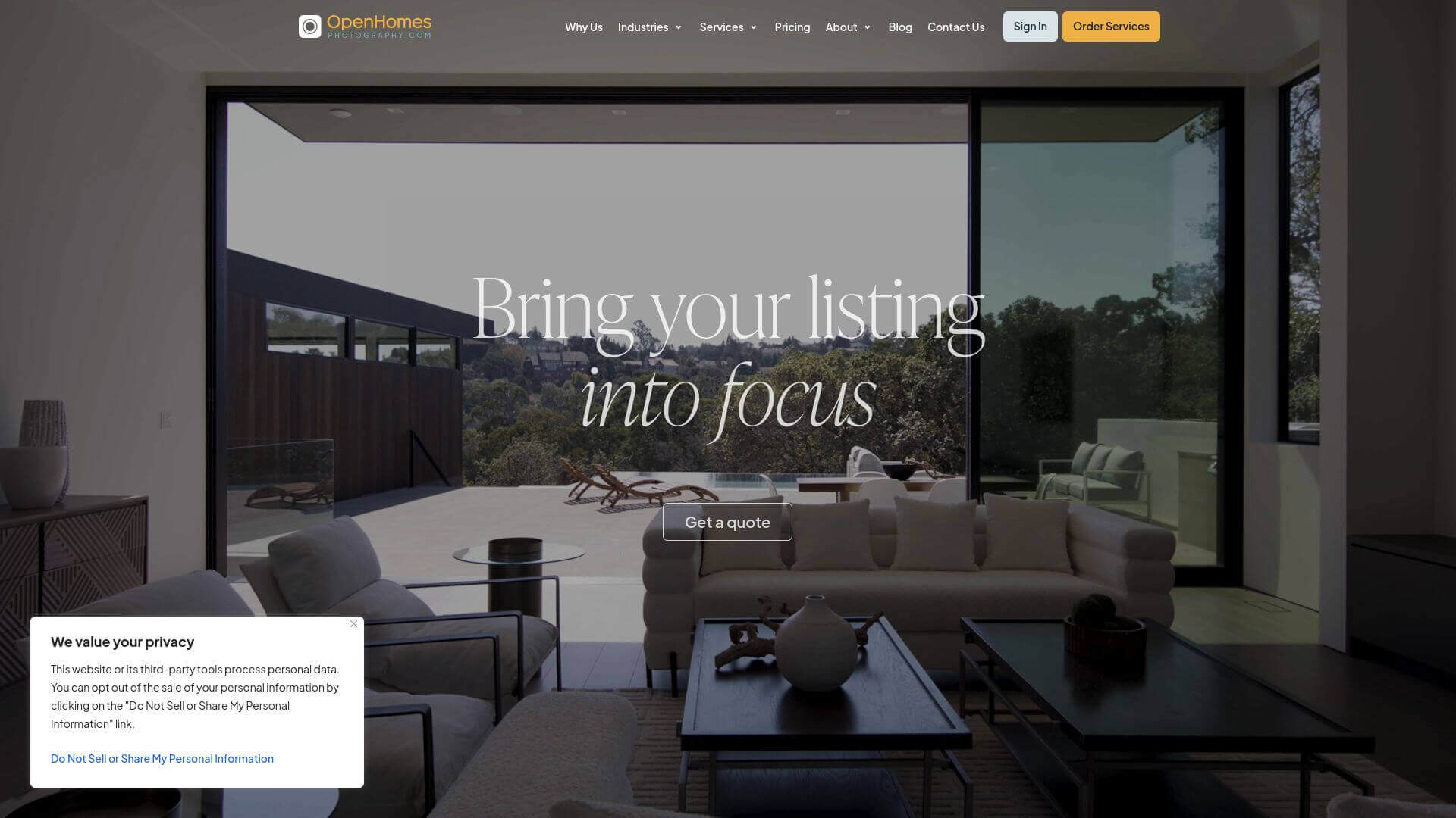
The website for Open Houses Photography is well-designed and looks great. On the homepage, a full-screen slider with beautiful pictures of homes gives visitors an instant idea of what the company has to offer. After the slider, the main content of the website is broken up into "Services," "Portfolio," and "About" tabs that are easy to use.
The beautiful pictures on the site are the focus of the design, which is simple and has muted colours. The headings and body text are both bold and easy to read, which makes it easy to move from one page to the next.
The website also has some great web development features, like a search bar, a Google Maps widget, a contact form, and links to other social media platforms. Open Houses Photography's website has many "book now" and "contact us" links that make it easy for people to get in touch.
Visit openhomesphotography.com
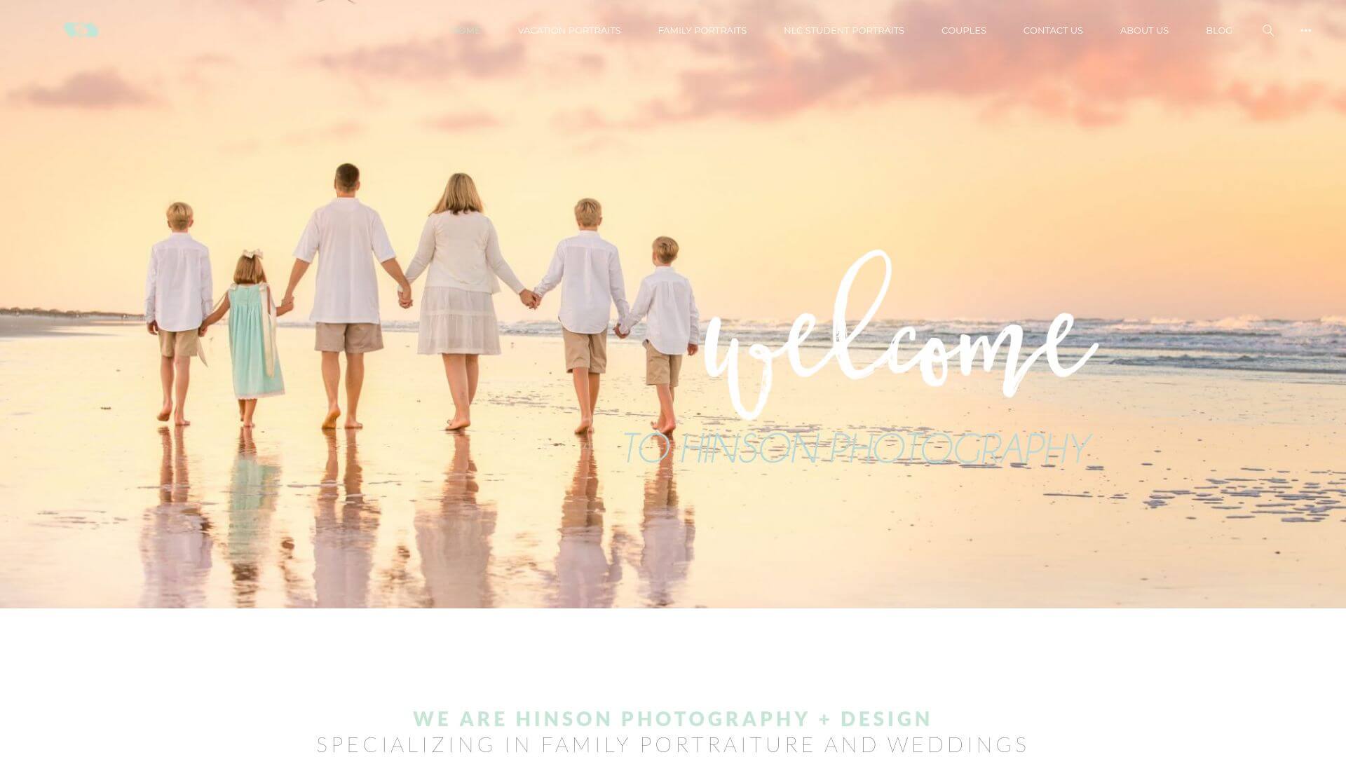
10. Hinson Photography
Hinson is a professional photographer who lives in New Jersey. His work can be seen on his website. The website has a clean, simple design that puts all the attention on the beautiful pictures. On the site, a stylish full-width slider shows off the photographer's best work. Below that, there are two sections that describe the different kinds of photography services Hinson Photography offers and link to online examples of their work.
The simple menu at the top, which has links to the About, Portfolio, Services, Prices, and Contact Us sections, makes it easy to move around the site. Each page has a nice layout and pictures that go with it that match the information in that section.
Because the design as a whole is clean and elegant, each image is shown in all its glory without any other elements on the page getting in the way. Small animations can be found all over the site. These add a touch of interest and make it fun to look through their portfolio.
This website was made with Web Design in mind so that visitors can find out useful information about the Website Design Services that Hinson Photography offers in an attractive way.
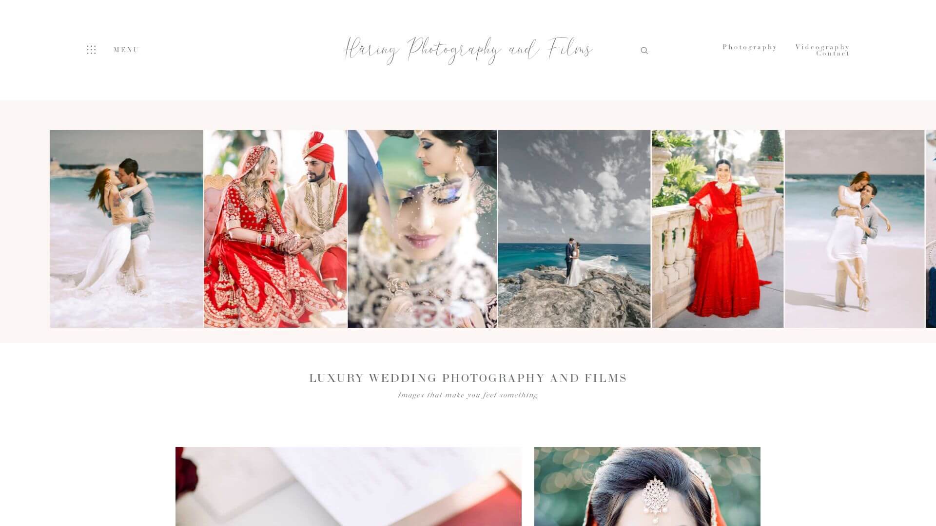
11. Haring photography
The sleek, professional design of https://www.haringphotography.com/ makes it easy for people to use. The pictures on the site are the main attraction because the design is simple and the background is white. You can click through different photos taken by Haring Photography in a slide show at the top of the page. Just below that, you'll find a list of the services they offer and a selection of their past work, as well as a way to get in touch with them if you have any questions or want to book them.
The design of the website, which uses striking images and bright colours against a black background, puts the focus on each photo in its own way. Text is kept to a minimum so that site visitors can quickly find the information they need without having to wade through a lot of useless fluff. However, important information like pricing, contact information, etc. is still included.
12. Classic Photographers
https://classicphotographers.com/ is a creative website with both web design ideas and web design services from professionals. On the homepage, samples of the company's photography are shown in a slider that takes up the whole screen. Below the slider, you'll find four buttons that will take you to separate pages for weddings, portraits, corporate/commercial photography, and events.
If they scroll down to the "Testimonials" section, they can read what other people have said about their experiences with Vintage Photographers. Classic Photographers' website has a clean, modern look that draws people in with its beautiful writing and pictures.
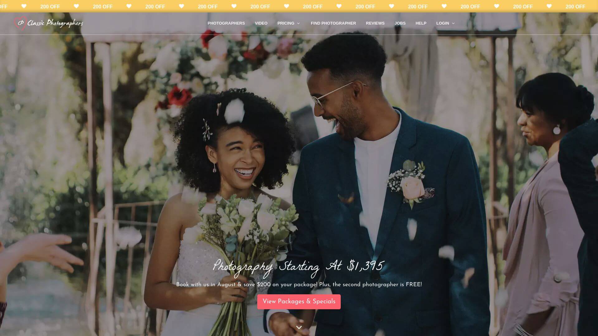
Visit classicphotographers.com
13. Michael Anthony photography
The website for Michael Anthony Photography is sleek and up-to-date. The site is mostly black and white, which gives it an air of sophistication and authority. At the top of the site, there is a big banner that shows some of the photographer's work. Below that, there are several sections, such as "About Us," "Galleries," and "Contact Us."
In the top right corner of the page, visitors can access the main navigation bar and links to Michael Anthony Photography's social media pages. In the portfolio section, located at the bottom center of the Web Design Inspiration page, you can view some of the photographer's most recent work.
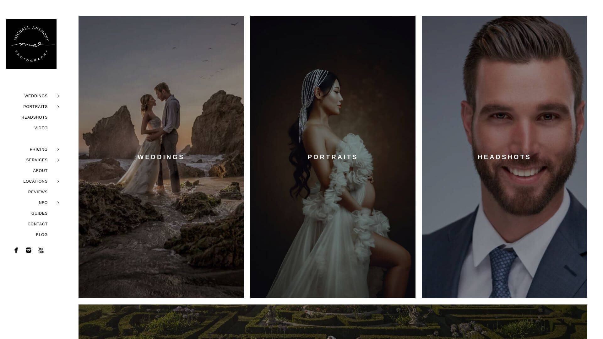
Visit michaelanthonyphotography.com
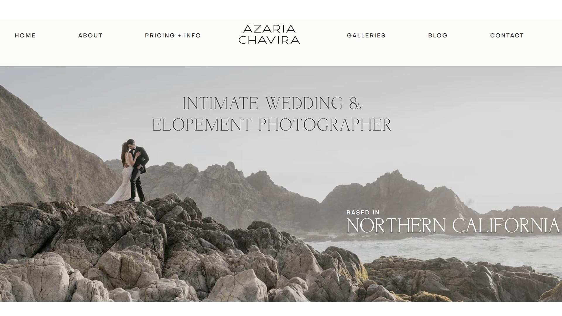
14. Azaria Chavira Photography
On Azariachavira.com, you can find web design services and examples of user experience and User Interface Design. The homepage is really well made, with a banner that shows off the company's work and gets the user's attention right away.
After that, you'll learn about Azaria Chavira, what she has to offer, and how to get in touch with her. In addition to their portfolio and case studies, they also have a blog where they regularly post useful tips and information about web design for their readers.
The website's design is modern and simple, with clean lines and simple fonts that make the photos and information stand out. Also, the site uses a number of interactive features, such as "hover effects," to make it easier for readers to look through the site's content and click on links to related resources.