
When building a website for a yoga studio or professional, the essence of yoga, the demands of the target audience, and the company's goals should all be considered. The following are important design aspects for a yoga website:
1. Clean and Calming Aesthetics
Using pastels, blues, greens, and whites, you may create a quiet and calm setting that is in line with the yoga ideal.
2. High-Quality Imagery
To convey the essence of yoga and pull in viewers, display high-resolution photos of yoga poses, serene landscapes, and soothing studio settings.
3. Intuitive and Easy Navigation
Make sure the site's navigation is simple and easy to use so that students can quickly find information such as course options, hours, and professors.
4. Mobile Responsiveness
Optimise the design to be fully responsive on different devices (desktop, tablet, and smartphone) in order to provide a consistent user experience across all platforms.
5. Engaging Typography
Use fonts that are easy on the eyes while still reflecting the peaceful, calm mood of yoga.
6. Class Schedules and Booking System
Display a clear class schedule and include a booking mechanism so that students can simply verify availability and sign up for sessions online.
7. Instructor Profiles
Provide detailed biographies of yoga instructors that emphasise their credentials, experience, teaching style, and areas of specialty.
By integrating these design aspects, you can create a platform that is in line with the essence of yoga and valuable to its practitioners and fans.
Om-azing Websites Tailored for Yogis
To express your enthusiasm, use a humorous and friendly tone. Contact us right now if you need assistance establishing a beautiful website for the yoga community.
Get StartedYou might find several promising Yoga instruction websites here.
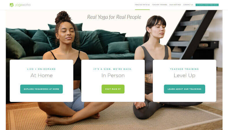
1. Yogaworks
The website https://www.yogaworks.com/ has yoga lessons and teacher training programmes that are easy to use and look good. Here are some important parts of the layout: The main colours of the site are white, grey, and blue, and there are orange accents all over. The white background is soothing and clean, and the blue and orange details stand out. Text on the site is set in a modern sans-serif typeface that looks great and is easy on the eyes.
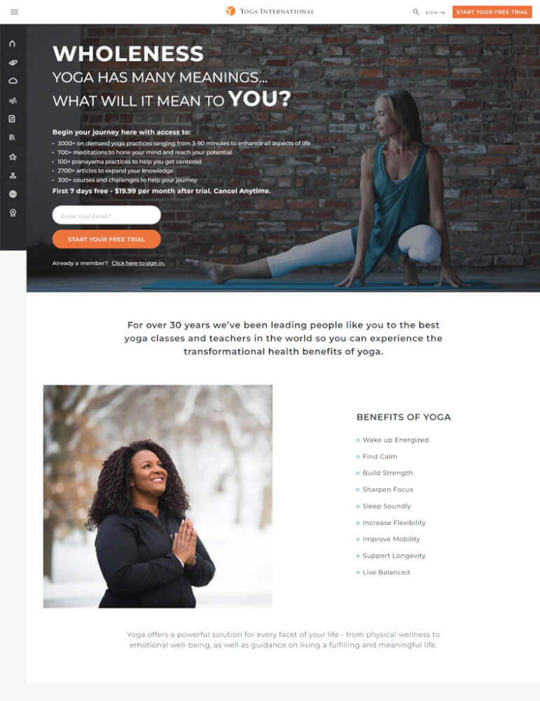
2. Yogainternational
The design of Yogainternational.com is modern and simple, with an easy-to-use interface and inspiring pictures. On the homepage, a big graphic banner with a commanding caption welcomes visitors. Just below this, there are links that customers can click on to find out more about the company, sign up for classes, look around the store, and do other things.
So, people who visit the site can find the information they need quickly and easily. There is a lot of white space between the different parts of the site, which makes it look clean and modern. There are also spots of colour that draw attention to different parts of the page. The site also has a number of high-quality photos that show all kinds of yoga practises and the people who do them. These photos give visitors visual ideas.
Breathe Life into Your Yoga Website
Use our website designing services to showcase your creative skills while serving the yoga community. Your site will be both functional and visually beautiful.
Get Started3. Royalyogacare
The design of Royalyogacare.com is based on the ideas of modern minimalism, which emphasise blank space and straight lines. The cool white and blue colours are used most of the time, which makes the whole site feel calm and peaceful.
On the homepage, a banner picture of a woman in a yoga pose catches the eye and makes people want to learn more. The top navigation bar makes it easy for users to get to different parts of the site, such as "About Us," "Services," "Contact Us," and "Store."
The main parts of the content area on Royalyogacare.com are Classes & Events, Goods & Courses, Yoga Coaching & Support Services, and Resources & Blogs. In each section, visitors can find out more about the company and the services they offer. They can also find other helpful resources, such as articles about health and wellness issues related to yoga.
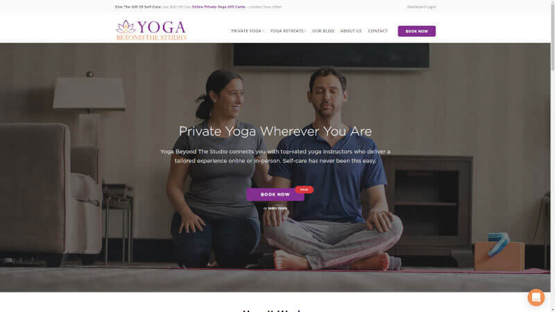
4. Yogabeyondthestudio
The Yoga Beyond the Studio website has a clean, simple, and brightly coloured look. The design of the homepage is simple and meant to put people in a comfortable and creative mood by using a light blue background. The main menu bar is at the top of the page, and it stands out against the sky blue background because the black lettering stands out against the lighter colours. This menu has links to "Course," "About Me," "Blog," and other pages.
Some of the things that make the site so inspiring are the beautiful yoga photos, quotes from yogis and teachers, class recordings, galleries of positions, and more. Even if they're not in the classroom or at home, viewers might still feel like they're a part of the practise.
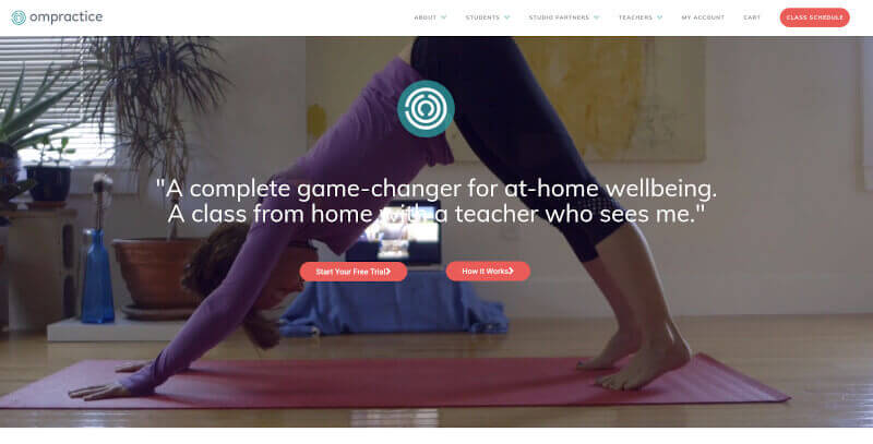
5. Ompractice
The design of https://www.ompractice.com/ is based on sleek minimalism and modernism, with a focus on visuals and easy reading. On a neutral grey background, the homepage's large hero image highlights the company's two main services: website design services and brand identity creation.
The menu is simple, with only links to the Services page, About page, and Contact page, and a big "Get A Quote" button that stands out against the site's light grey background. The rest of the page is taken up by a portfolio of their past work that scrolls and looks great when you move your mouse over it.
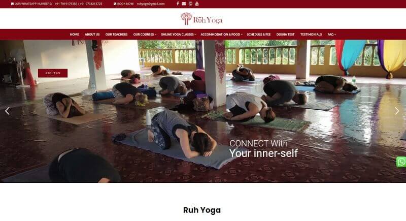
6. Ruhyoga
The design of RuhYoga's site is modern and easy to understand. The main colours are blue and green, with a few yellow accents that stand out. Each type of yoga class has its own large area, which helps keep the site clean and organised overall.
The top of the homepage has a navigation bar with links to all of the site's sections. Here is a big banner ad for whatever deals or free stuff RuhYoga is currently offering. Below are some comments from past participants and the schedules for upcoming workshops or other events. At the bottom of the page, there are links to resources like a Frequently Asked Questions page and a list of their instructors and studios.
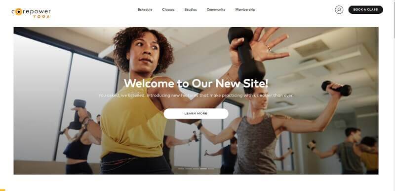
7. Corepoweryoga
https://www.corepoweryoga.com/ was made with the style of modern design in mind. White is the main colour of the background, and yellow, green, blue, and pink are used as accent colours to make the site look lively. All of the text on the site is set in a clean, modern sans-serif font that is easy to read and looks good.
Large, eye-catching featured photos serve as visual focal points and draw attention to important information on each page, like class descriptions and studio locations.
Overall, CorePowerYoga's website is easy to use and gives users a pleasant experience because of how it looks now.
8. Sampoornayoga
The website https://www.sampoornayoga.com/ is simple and modern, with a colour scheme based on white and soft shades of green and brown. The design is based around a large header image, which is followed by a navigation bar that lets you get to different parts of the site, such as "About," "Classes," and "Blog."
Under this, you'll find hero photos for the different services that Sampoorna Yoga offers, like Website Design Services, Web Development, and Design Inspirations. The good reviews left by happy customers in the footer also show that the site can be trusted. Each service comes with a detailed explanation of what it is and some kind of visual aid to show what it can do. The site stays visually appealing without getting in the way of how easy it is to use, and all of the information users need is easy to find.

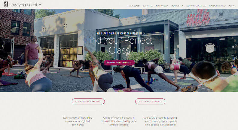
9. Flowyogacenter
At Flow Yoga Center, you can take classes and courses in yoga. The design of the site is meant to give users a calm and friendly time online.
On the home page, there is a picture of a woman in lotus position. Her skin is a warm shade of orange that is meant to make you feel calm. The online courses, workshops, teacher trainings, and private sessions offered by Flow Yoga Center, as well as other services and events, are all listed below.
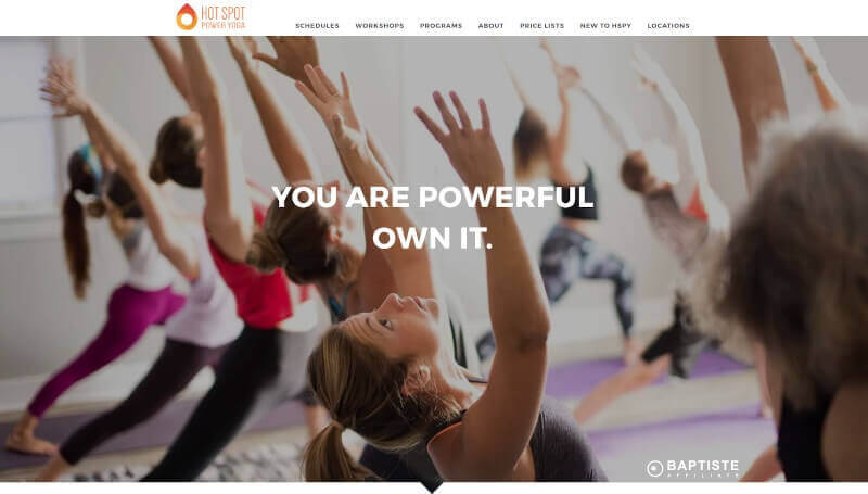
10. Hotspotpoweryoga
https://hotspotpoweryoga.com/ was made so that it could be used in many ways and was easy to use. The design of the site is clean and simple, making it easy to get around. When yellow, white, and grey are used together, the room feels upbeat and professional at the same time.
Visitors to the homepage see a banner that says the company exists and a few photos that show what it has to offer. This gives them a quick idea of what Hotspot Power Yoga is all about. People who are interested in the company can find out more about it by reading testimonials, looking at the events calendar, and following the company on social media.
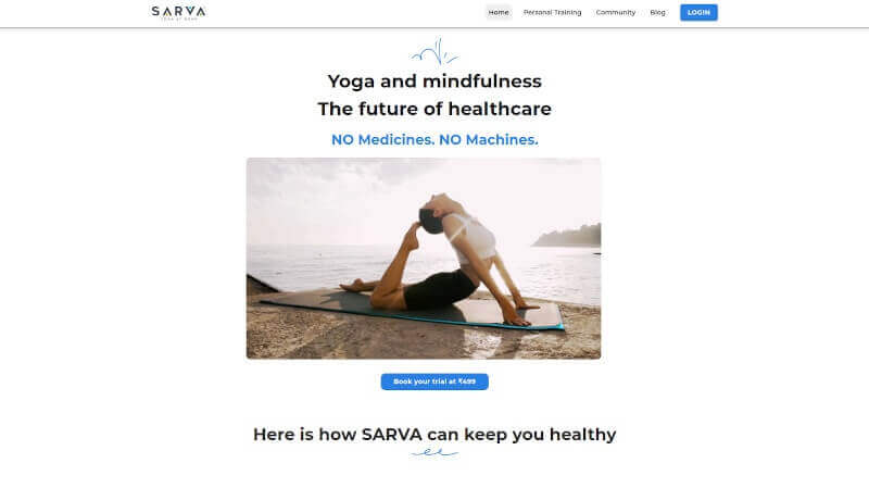
11. Sarva
The design of Sarva.com is based on the ideas of minimalism and simplicity. In the striking header of the site, a white logo stands out against a navy blue background. Also, there is a simple menu at the top that lets you get to sections like "Our Work" and "About Us" quickly. Here are many pictures of Sarva's work and services that will catch your eye. Visitors can find out more about what they have to offer in sections like "Design Inspirations," "Website Design Services," "Social Media Solutions," and others by scrolling down. The website looks and feels modern, and the use of white space helps make the content more pleasing to the eye.
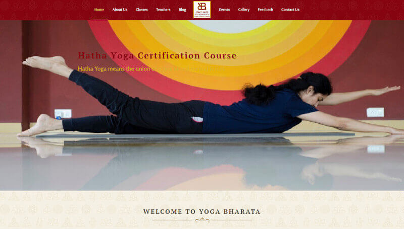
12. Yogabharata
The design of the Yogabharata website is based on an old Indian style that uses bold, flat, and simple fonts along with traditional Indian symbols like mandalas. The result is a unique visual style that is both beautiful and useful for people in India or anywhere else in the world who want to use Yogabharata's services.
Overall, the design of Yogabharata's website gives visitors a simple but beautiful interface that makes it easy for them to find what they're looking for. It also creates an atmosphere that makes it easy to relax and be aware, which are both great qualities for practising yoga. Yogabharata is the best website design service because it combines ancient Indian art with the latest online technology in a way that looks natural.
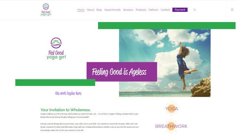
13. Feelgoodyogagirl
The layout of Feel Good Yoga Girl's website is simple and inspiring, making it easy for visitors to find what they need. The layout as a whole uses bright colours, with white as the main background colour and pastel blues, pinks, and oranges as accents.
The design of the site makes heavy use of bold typeface, which helps draw attention to important information and makes it easy to quickly skim through the site. Also, Feel Good Yoga Girl has strategically placed a number of high-quality photographs on its pages. These pictures serve two purposes: they break up large blocks of text, making the content easier to read, and they add aesthetic value, which is sure to please its audience.
14. Doyou
The design of www.doyou.com is modern, simple, and easy on the eyes. Above the fold on the homepage is a rotating image carousel that shows examples of the company's design work and links to its many Website Design Services. Next is a section for doyou client testimonials, which help show that the company's services are reliable.
There are also features on client projects and portfolios. Here, you can find information for customers, like how to reach you and what your services and prices are. At the bottom of the page, there is a footer navigation bar. This bar has links to doyou's social media profiles and important company information, like the company's mission statement and core values. Overall, the layout of the site is very user-friendly, making it easy for people to find what they want with few clicks.

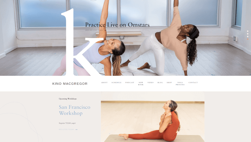
15. Kinoyoga
Kinoyoga.com looks clean and simple, with a soothing colour scheme of blue and white. The main thing you see on the homepage is a big picture of a hero with a motivational quote next to it. You can use the menu at the top of the website to find out about their yoga classes, instructors, events, and more.
The design of the site is simple and easy to use, and it makes good use of white space to draw attention to important parts of each page. Also, the design of the site has a number of big buttons, links, and icons that encourage site visitors to do things like sign up for a newsletter.
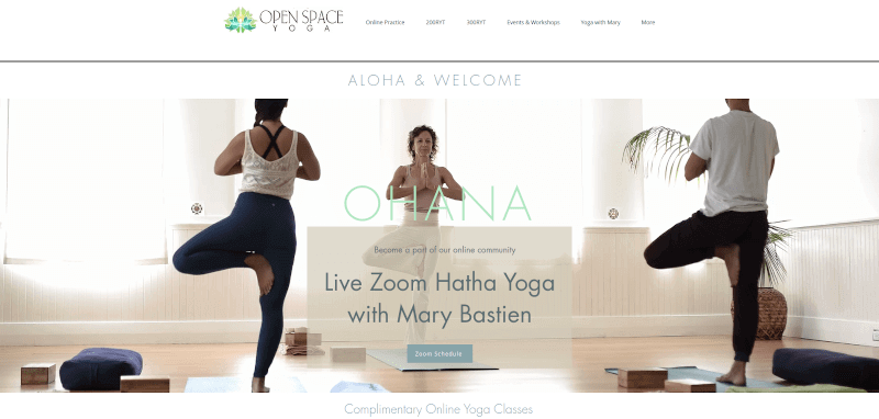
16. Yogaopenspace
The website for Yoga Open Space is clean and easy to use. The Design Inspirations on the homepage are big, colourful photos. Other than that, the homepage has a simple design. Most of the site is made up of white, black, and blue. By using both plain and fancy typefaces, the page feels friendly and easy to read.
The prominent navigation bar at the top of the page makes it easy to find the information you need. Under headings like "Our Services" and "About Us," the company's website design services are explained in more depth. With the social media buttons at the bottom of the page, people can find out about the organization's new posts and events.
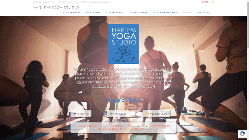
17. Harlemyogastudio
The website, at https://harlemyogastudio.com/, was made to show what the studio stands for and what yoga is all about. The main colours are cool blues, greens, and whites, with splashes of brighter colours used to draw attention to important parts. On the home page, a full-width image slider shows different aspects of yoga, and a simple menu bar at the top lets you quickly get to other parts of the site. Each page has headings and text that help readers find their way through the information.
Customers who want Website Design Services from Harlem Yoga Studio can easily get in touch with the company through the site's contact form. The design of this site is in line with its goals and gives visitors a good experience.
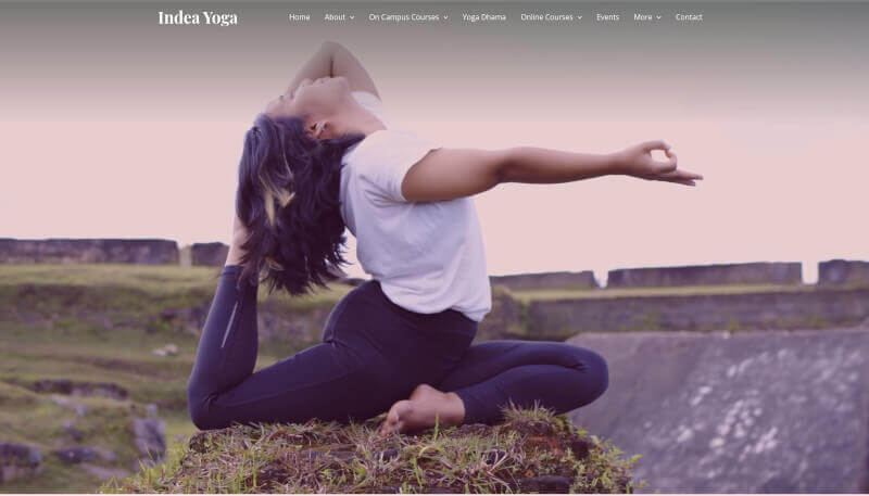
18. Indeayoga
The yoga studio's website, indeayoga.com, looks nice and works well on mobile devices, which makes potential students want to find out more about what they have to offer. The site is simple and clean, with soft colours and lots of white space to draw attention to the information. There is a flashing banner on the homepage with a big button that says "Learn More" to entice website visitors to find out more about the company's offerings. Class schedules, pricing options, and contact details are all easily accessible via a drop-down menu at the top of the page, which is also interactive.
The general design makes use of soft motions that catch the eye without being too distracting. The soothing colour scheme and legible font make indeayoga's site a pleasure to peruse at your leisure.
19. Hotyogachicago
The design of https://www.hotyogachicago.com/ gets you excited and makes you think. The colour scheme, which is made up of blues, pinks, purples, and oranges, gives off a friendly vibe and invites the user in. The content is written in a typeface that is easy to read and stands out on every page.
The navigation bar is clear, clean, and well-organized, with direct links to the different parts of the site. The images used on the site are bright, clear, and interesting, which adds to the overall effect of the design.
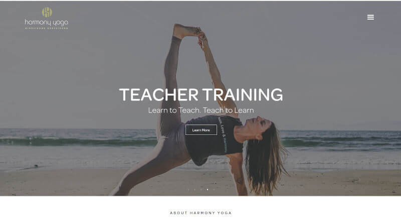
20. Harmonyyoga
The look of the Harmony Yoga website is based on both old yoga ideas and the latest in web design. The combination of blues, greens, and sunny yellows is meant to make you feel calm and at ease. All of the fonts are classic sans-serifs with clean lines, which gives the site a professional look. The way colours and fonts are put together on the site makes it look both sophisticated and easy to use. Harmony Yoga has a number of online classes, as well as private in-person or Zoom-based lessons. On their homepage, you can find information about retreats, workshops, and even trainings for teachers. Also, their online store is easy to use and has all the yoga gear and meditation supplies a customer could need.
Yoga instructor and studio websites must be visually appealing and feature-rich, all while portraying the peaceful essence of yoga.
Do you need a Yoga Website?
This includes developing responsive designs that adapt to the screen size of the user's device, implementing user-friendly class scheduling and booking systems, showcasing in-depth instructor profiles, encouraging community engagement through forums, compiling a list of useful yoga-related websites, enabling e-commerce for digital product sales, integrating social media and email marketing, including testimonials for credibility, optimising SEO for visibility, and facilitating online payments.
Contact us now to get your Yoga Website within a week
Get Started