Travel Websites - Incredible Design Inspirations You Must See
Table of Contents
- Lonely Planet
- Airbnb
- Travel + Leisure
- Expedia
- National Geographic Travel
- Booking.com
- Kayak
- Culture Trip
- Luxury Escapes
- Skyscanner
- Glamping Hub
- Mr & Mrs Smith
- Secret Escapes
- Trafalgar
- Contiki
- Tripadvisor
- Intrepid Travel
- Globetrotter
- Visit Scotland
- Earth Trekkers
- G Adventures
- Viator
- Roadtrippers
- The Outbound Collective
- Travelocity
- Nomadic Matt
- Pack Up + Go
- GetYourGuide
- Hostelworld
- The Blonde Abroad
Lonely Planet
URL: www.lonelyplanet.com
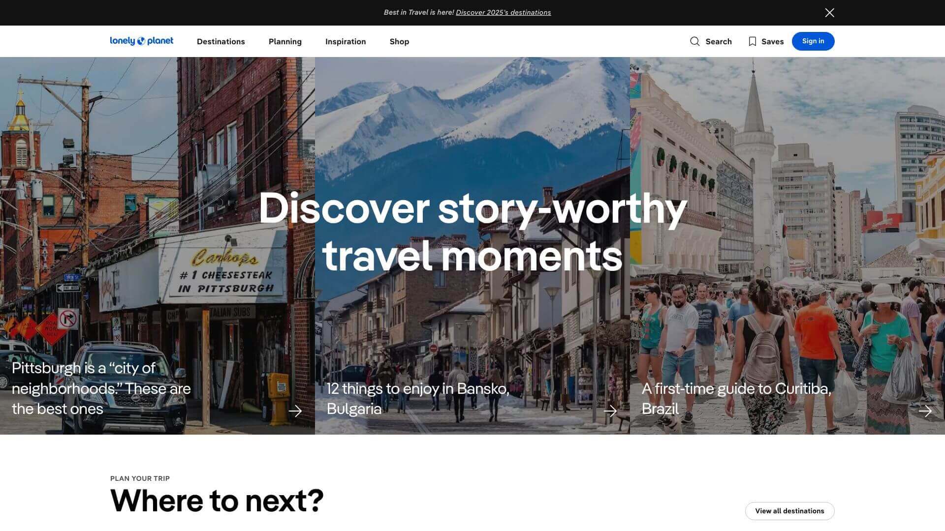
Lonely Planet’s travel website design reflects its adventurous spirit. The site features full-width imagery that immerses users in breathtaking landscapes. The color palette blends calming blues and earth tones, invoking both trust and the excitement of travel. The layout is clean and intuitive, using grids and well-placed typography to guide users effortlessly through a world of travel guides, booking options, and tips. There's a perfect balance between visual content and white space, which keeps users engaged without overwhelming them. Overall, the design strategy allows users to focus on the site’s rich travel content while enjoying a seamless browsing experience.
Airbnb
URL: www.airbnb.com
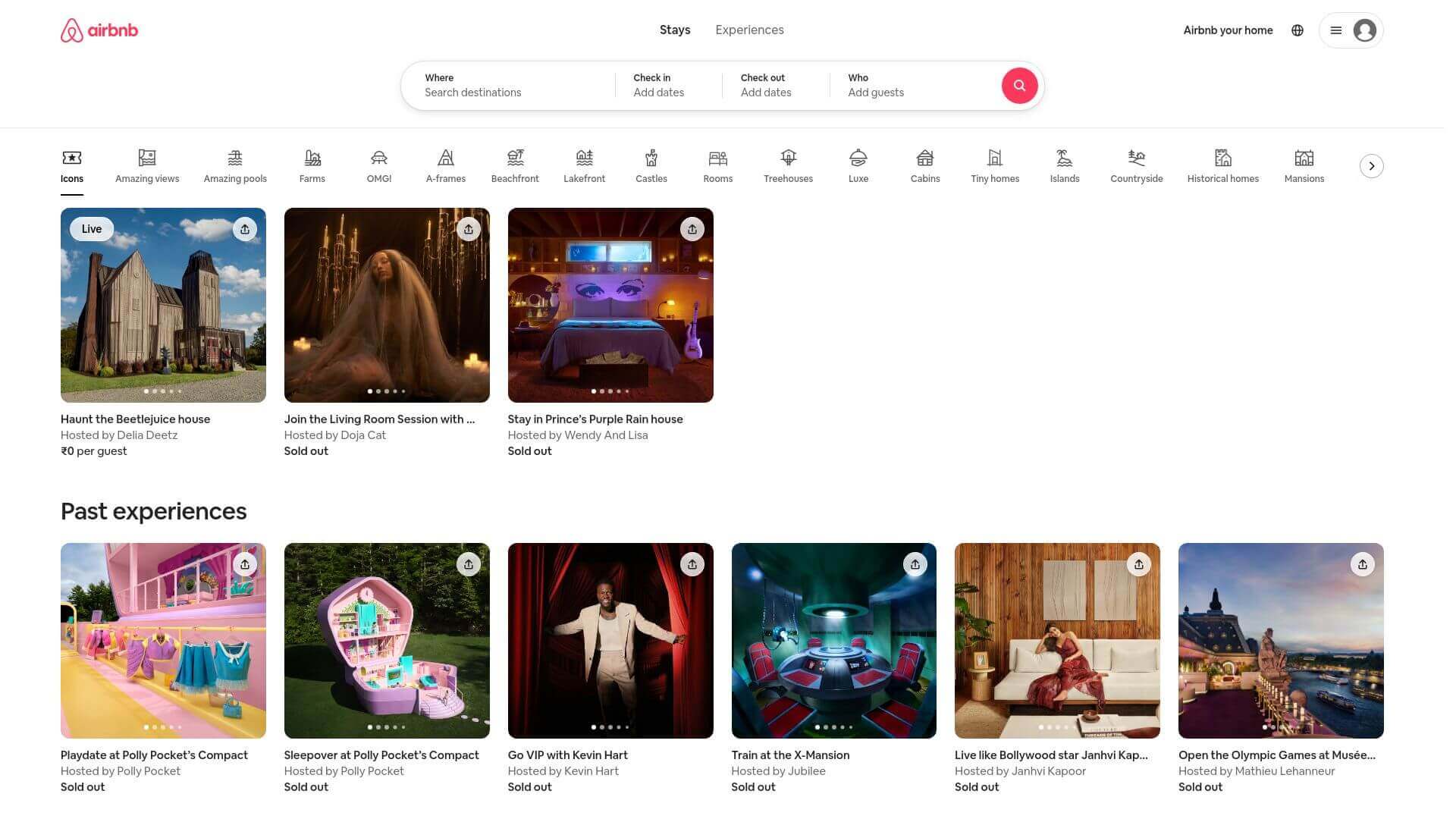
Airbnb's travel design focuses on minimalism and user experience. From the homepage, users are greeted with stunning high-resolution images of homes and experiences from around the world. The site’s earthy tones of beige and brown create a cozy and inviting atmosphere, while the search bar at the center encourages immediate interaction. Each listing is presented in a card-based layout, making it easy to browse through options. The website is filled with smooth transitions and clean typography, all designed to make navigation effortless. The intuitive design ensures users can quickly find a place to stay or an experience to enjoy, blending style with functionality.
Travel + Leisure
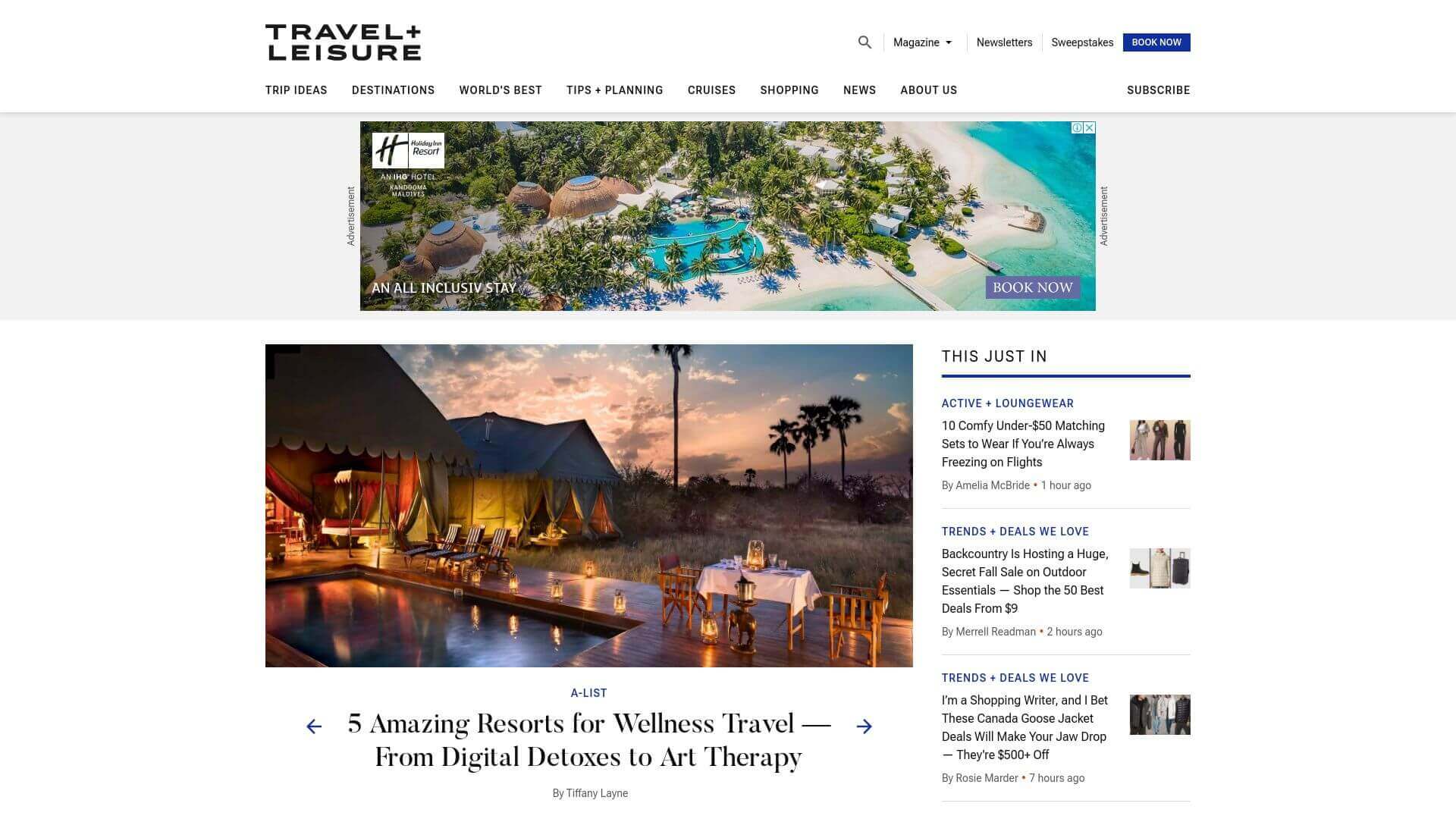
Travel + Leisure’s travel website stands out with its editorial look and feel, echoing the design of a glossy travel magazine. The black-and-white color palette exudes sophistication, while the layout uses plenty of white space to let high-quality images and articles shine. The content is organized in a grid format, making it easy to find the latest travel news and guides. Subtle hover animations add a dynamic feel without overwhelming users. The typography is elegant, and the whole site feels like a luxurious escape, designed to inspire wanderlust and deliver high-end content.
Expedia
URL: www.expedia.com
Expedia focuses on user convenience while maintaining a polished and professional look. The blue and white color scheme makes users feel secure and ready to book their next trip. The homepage is laid out clearly, offering distinct sections for flights, hotels, car rentals, and vacation packages. The search bar is the focal point, with CTAs that guide users to their travel needs quickly. Minimal distractions ensure the website remains fast and functional, with large images used sparingly to highlight specific offers. This travel web design merges practicality with a subtle but attractive visual appeal.
National Geographic Travel
URL: www.nationalgeographic.com/travel
The travel design of National Geographic is as breathtaking as you’d expect from the brand. High-resolution images dominate the homepage, giving you a sense of adventure right away. The iconic yellow accents add a splash of brand identity, which stands out against the otherwise simple layout. Each section is organized by destination, making it easy for users to find content relevant to their interests. There’s a balance between visual storytelling and textual content, with magazine-like layouts and grids showcasing both photos and articles. This site is a prime example of how visual content can drive engagement in travel websites.
Booking.com
URL: www.booking.com
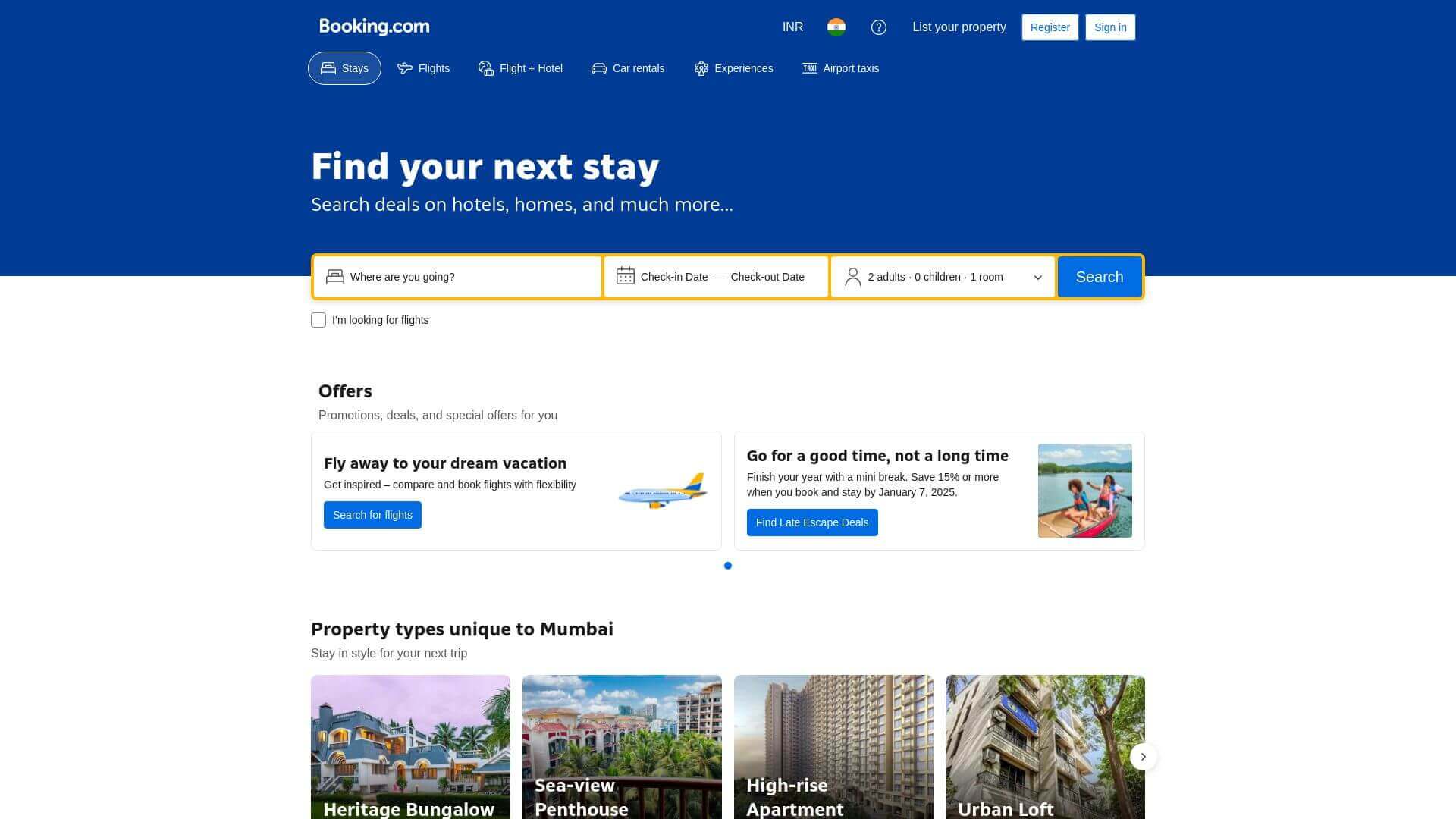
Booking.com’s travel website design is highly functional and streamlined for users looking to quickly find and book travel options. The design isn’t overly flashy, but that’s by choice—simplicity is key here. The color scheme focuses on blue, white, and yellow to emphasize clarity and trust. The search functionality is front and center, making it easy for users to search for hotels, flights, or car rentals. Clear typography and large CTAs make navigating this site effortless. While the design may not be the most visually creative, its usability makes it one of the best travel websites for booking travel efficiently.
Kayak
URL: www.kayak.com
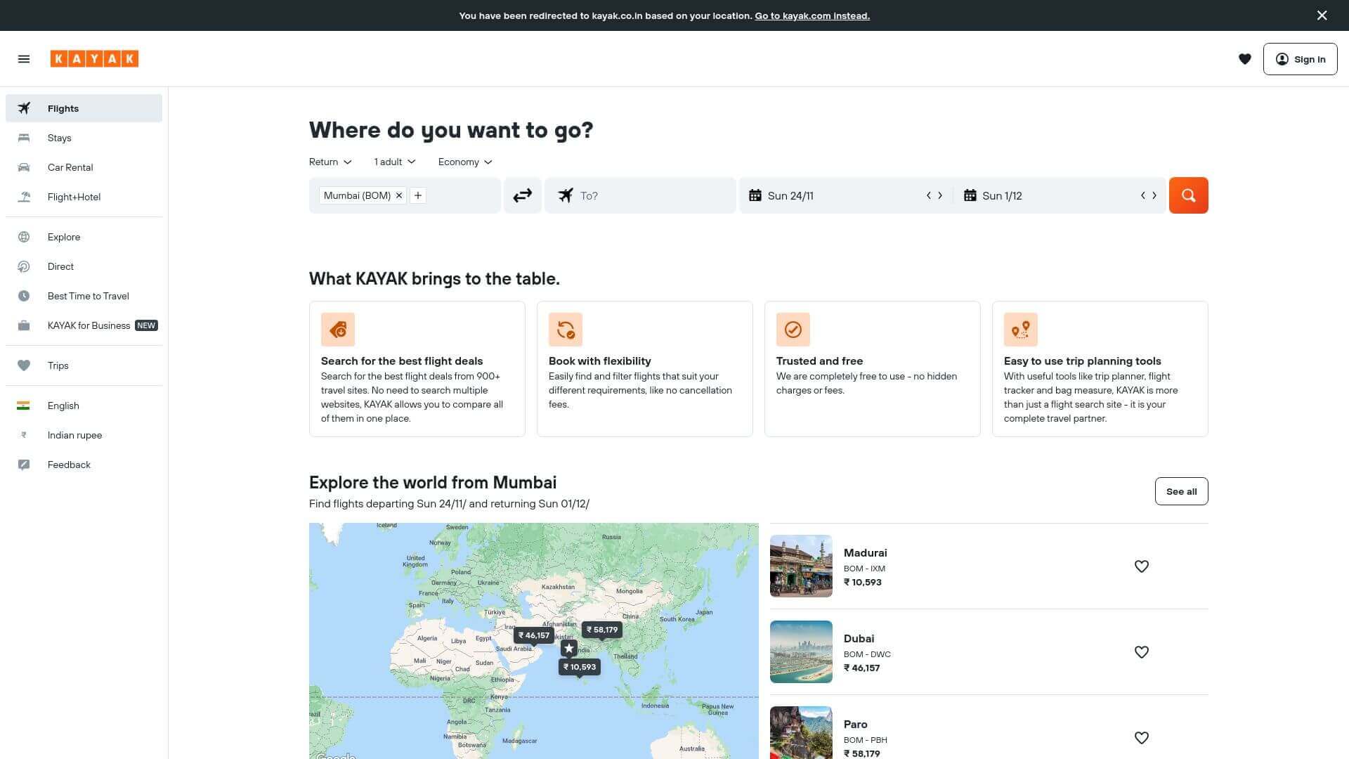
Kayak is known for its sleek, modern travel web design. The homepage utilizes a dark-themed color palette accented with bright oranges for CTAs, creating a sense of urgency. The layout is clean and straightforward, focusing on getting users to search and book quickly. The design employs large imagery at the top, but the site primarily emphasizes functionality over aesthetic flourishes. The combination of powerful search tools, intuitive navigation, and minimalist design elements ensures Kayak remains one of the most efficient travel websites available.
Culture Trip
URL: www.culturetrip.com
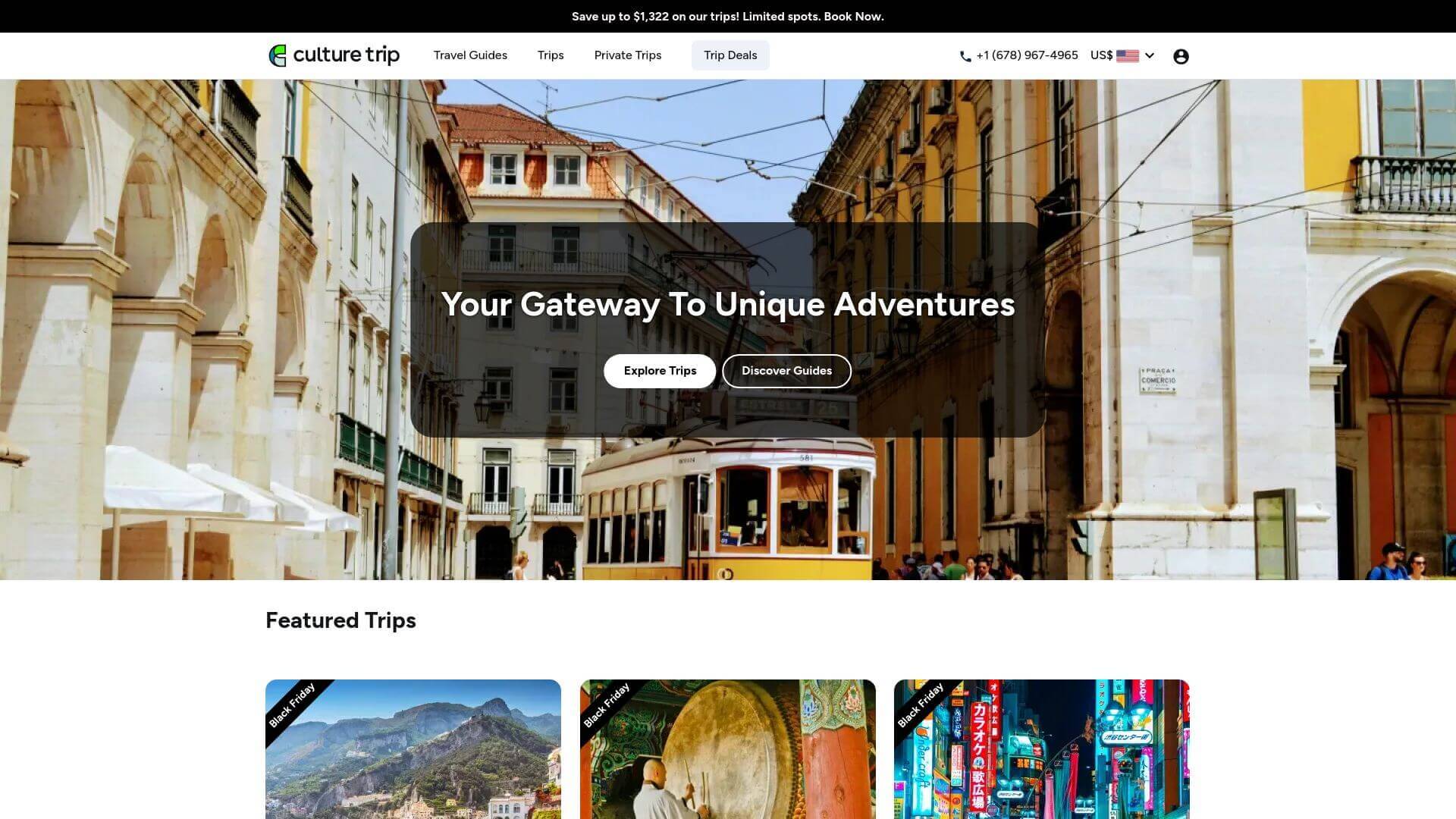
Culture Trip’s travel website stands out for its unique focus on immersive cultural content. The design leans heavily on visual storytelling, with images and videos taking up much of the homepage real estate. A bold, vibrant color palette adds energy and makes the content pop, while the layout is built around large, bold blocks that present travel articles, guides, and videos. There’s an emphasis on lifestyle and cultural experiences rather than purely booking-based content, which sets it apart. Scrolling animations and subtle transitions give the website a dynamic feel, enhancing the user experience.
Luxury Escapes
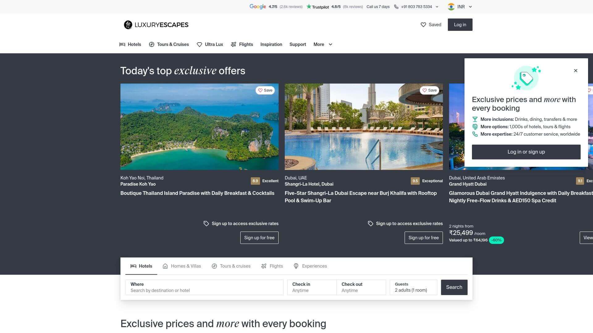
Luxury Escapes' travel web design exudes high-end elegance. The homepage is dominated by large, luxurious images of breathtaking destinations, perfectly setting the tone for a brand that specializes in premium travel experiences. The dark-themed palette paired with gold and white accents adds a sense of exclusivity. The layout is clean and minimalist, with prominent search bars and easy-to-navigate sections like “Deals” and “Destinations.” The typography is classy, while the use of space ensures that images take center stage. For those seeking upscale travel experiences, Luxury Escapes delivers both visually and functionally.
Skyscanner
URL: www.skyscanner.net
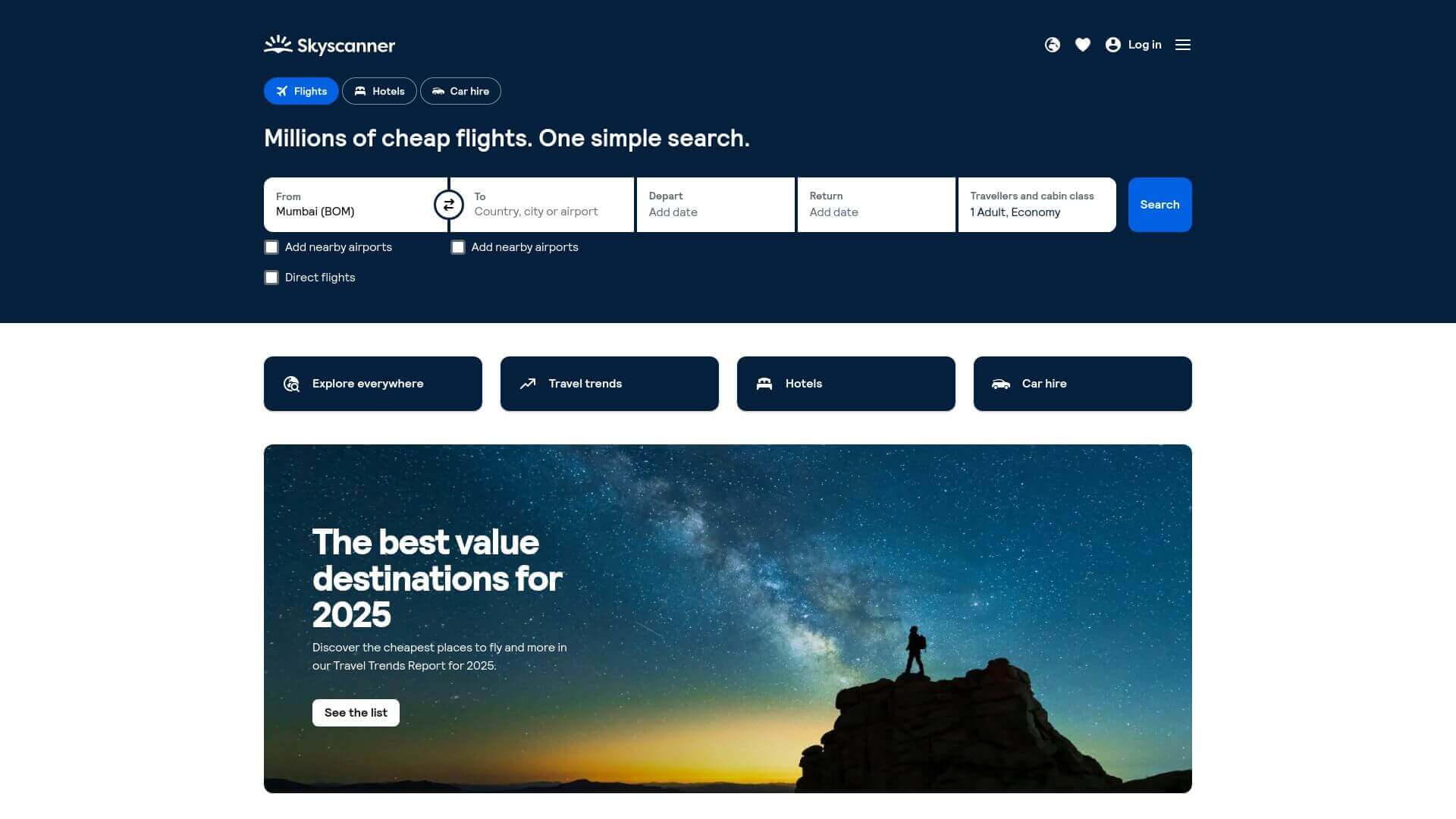
Skyscanner’s travel website design is all about simplicity and efficiency. The homepage is clean, with a blue and white color scheme that feels professional and inviting. The main focus is on the search bar, with minimal distractions elsewhere on the page. Images and icons are used sparingly but effectively, ensuring fast loading times and easy navigation. The layout emphasizes user-friendliness, with clear CTAs and filters that make searching for flights, hotels, or car rentals a breeze. The minimalist approach works well here, making Skyscanner one of the most user-focused travel websites out there.
Glamping Hub
URL: www.glampinghub.com
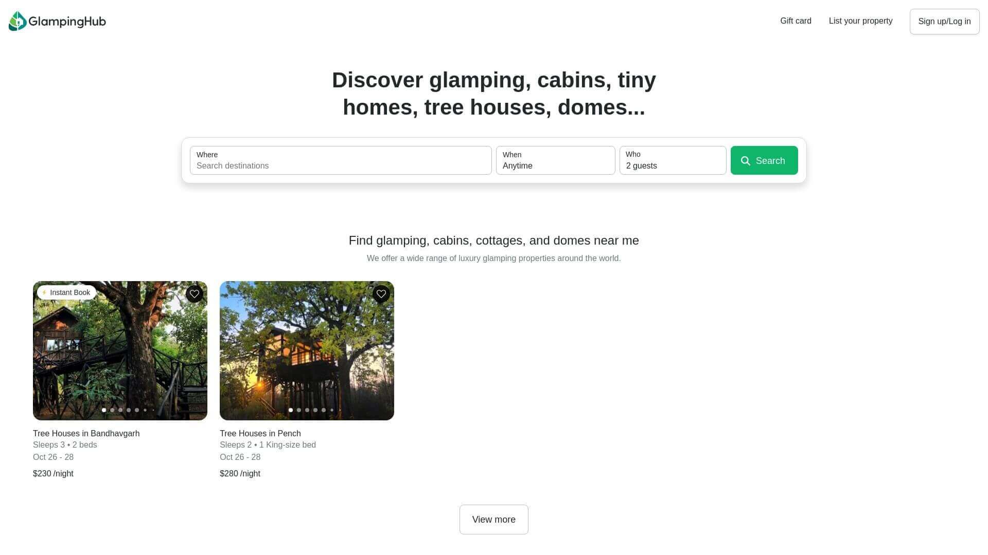
Glamping Hub’s travel web design brings a sense of adventure with a touch of luxury. The homepage features full-screen images of glamping sites, immediately drawing users into nature. The color palette is a blend of earthy tones like green, brown, and soft whites, which reflect the outdoor theme of the site while maintaining a clean, professional feel. The typography is simple and elegant, allowing the site’s content and images to take the spotlight. A well-organized grid layout highlights various glamping categories, making it easy for users to explore and find accommodations. The balance between visual richness and user-friendliness makes Glamping Hub a standout among travel websites, especially for nature enthusiasts looking for a luxury experience.
Mr & Mrs Smith
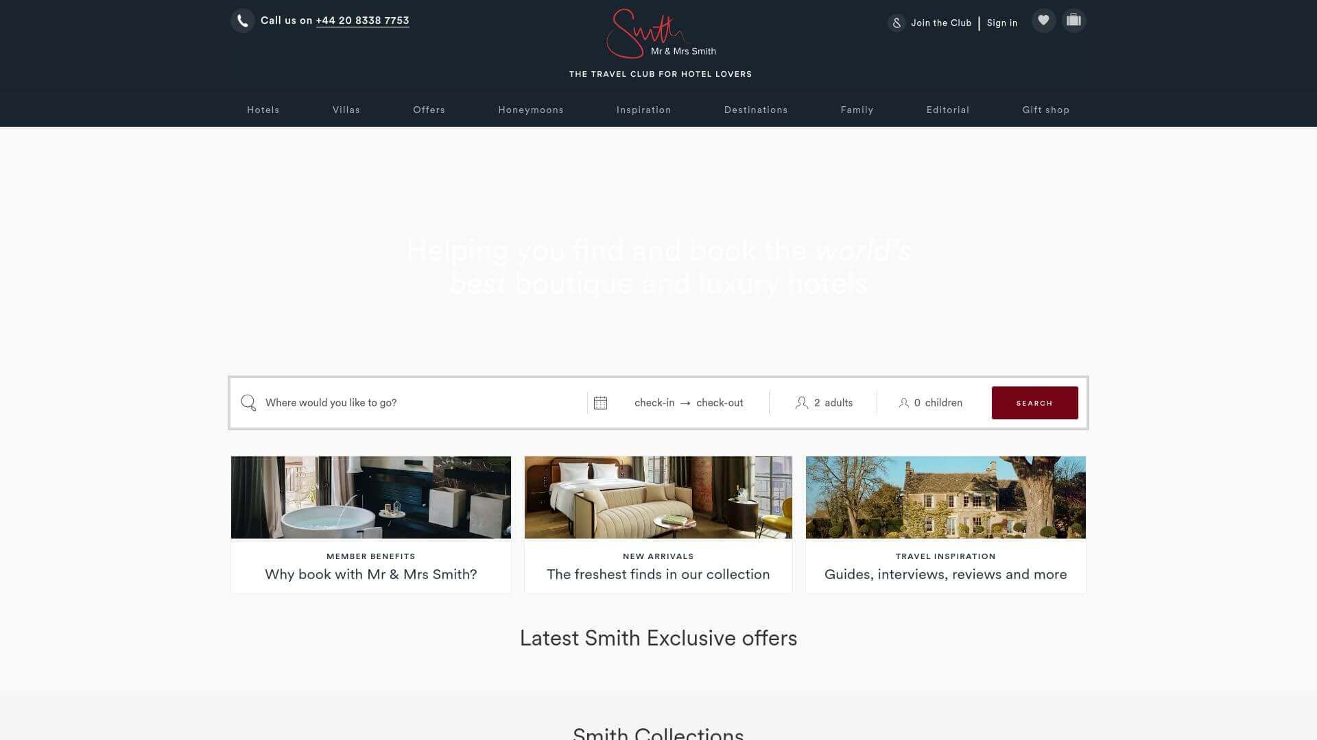
The travel website design for Mr & Mrs Smith is all about luxury and romance. It uses a dark, moody color scheme with gold and white accents, giving the site a refined and high-end feel. The homepage greets users with beautiful, full-width images of boutique hotels and exclusive escapes, setting the tone for the luxurious experiences offered. The navigation is sleek and intuitive, with a sticky header that keeps important options like destinations and offers always accessible. Typography is classy and minimal, letting the visuals shine. This website is a masterclass in designing for affluent travelers seeking premium and stylish getaways.
Secret Escapes
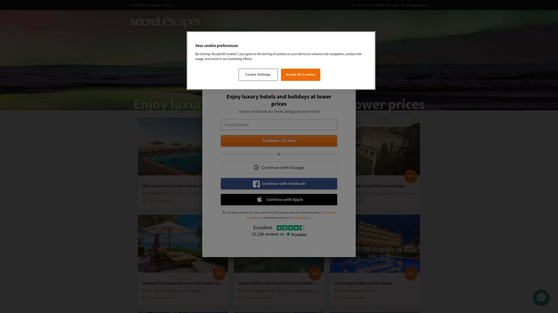
Secret Escapes delivers a travel website design that is clean, functional, and visually inviting. With a dark background and vibrant white text, the site feels sophisticated but still accessible. The homepage highlights exclusive deals with large, eye-catching banners and sliders. The color scheme is primarily black and white with pops of orange for the CTAs, making it easy for users to identify key actions and deals. The site uses a card layout to organize travel options, and the grid system keeps everything neat and easy to browse. It’s a straightforward yet elegant design, perfectly suited for those looking for luxury travel at discounted rates.
Trafalgar
URL: www.trafalgar.com
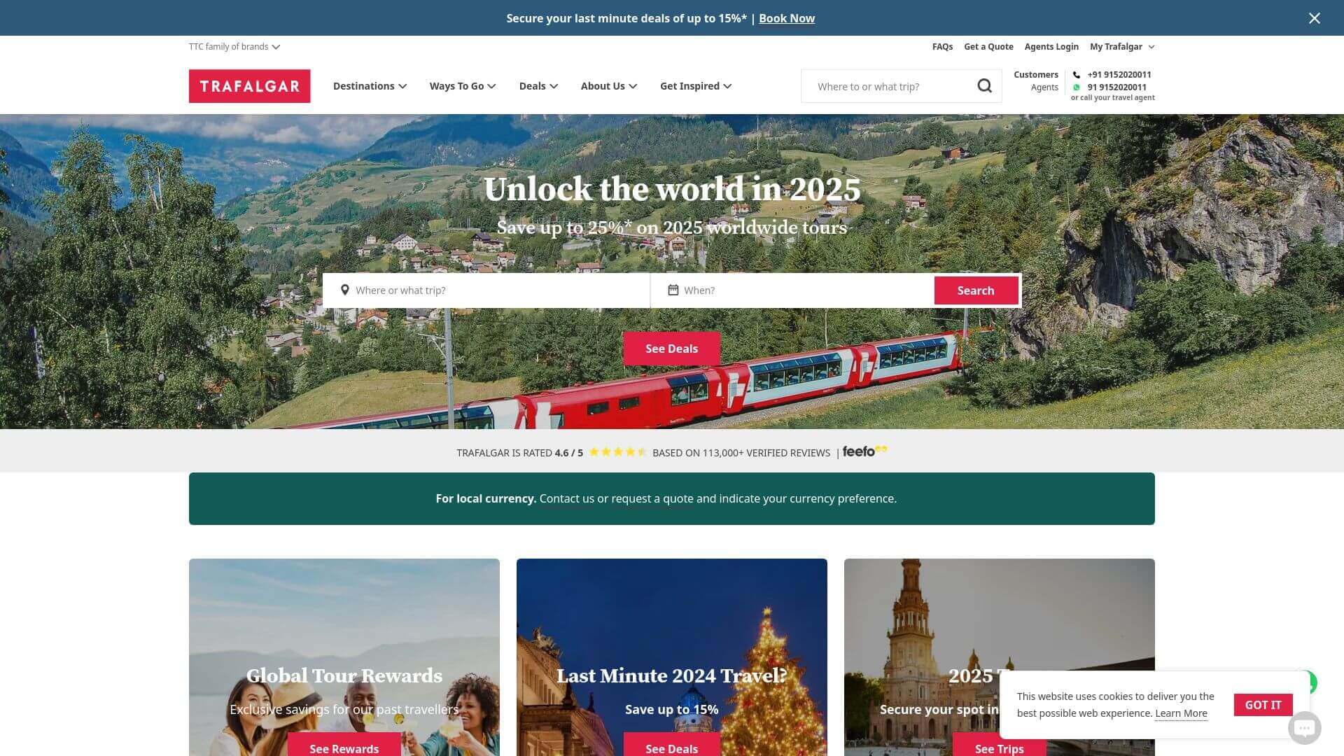
Trafalgar’s travel design is bold and vibrant, perfect for showcasing its wide array of tours. The homepage uses high-definition images that highlight the beauty of various destinations around the world. The color palette consists of red accents, complementing the white and black base, which makes the website both visually exciting and easy to navigate. The layout is structured around grids that showcase different tour options, ensuring that users can easily browse through their choices. The typography is clean and professional, making all the important information stand out. Trafalgar’s website is designed to inspire wanderlust while making the booking process straightforward and enjoyable.
Contiki
URL: www.contiki.com
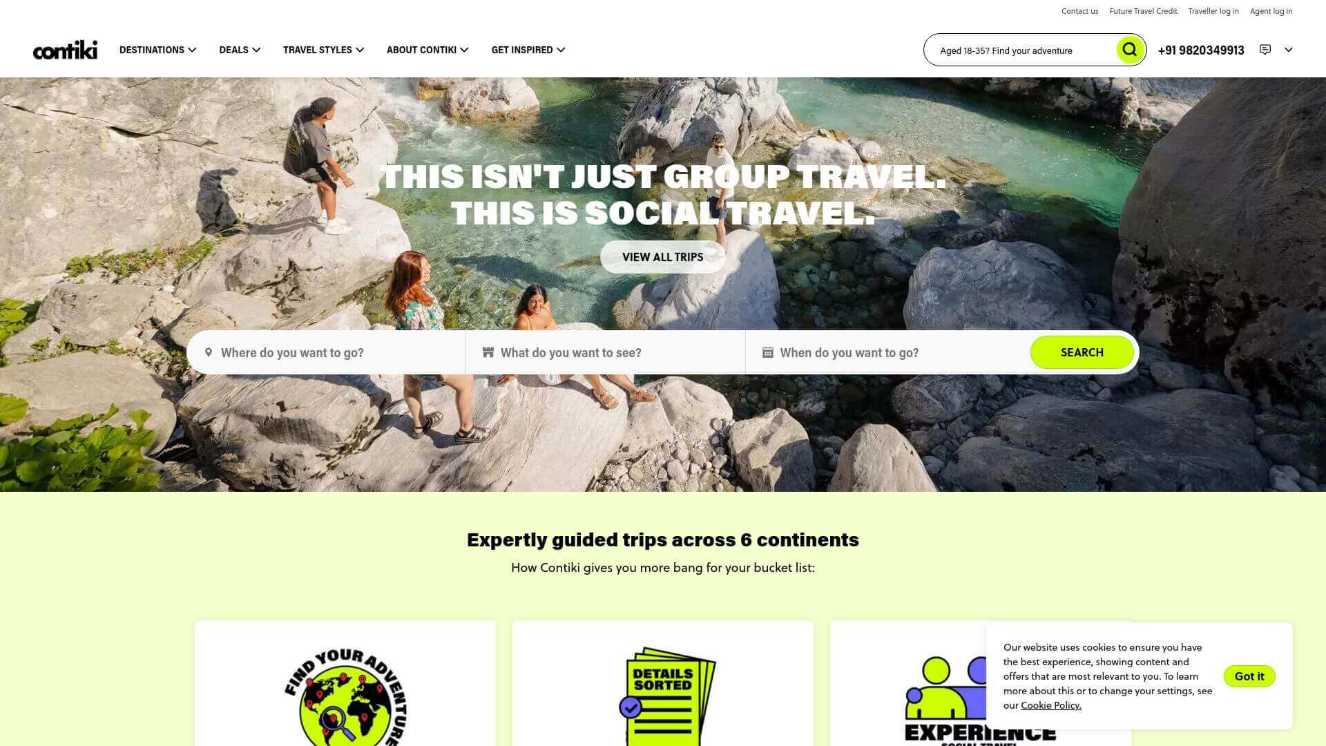
Contiki’s travel website design appeals to a younger audience with its fun, vibrant color scheme and energetic layout. Bright greens and oranges are used strategically to draw attention to CTAs, making the site feel dynamic and exciting. The homepage features large full-width images of youthful travelers exploring destinations, immediately pulling the user into the action. The layout is easy to navigate, with sections for tours, experiences, and deals prominently displayed. The typography is bold and modern, adding to the youthful vibe of the site. This travel web design is perfect for millennials and Gen Z travelers looking for adventure-packed experiences.
Tripadvisor
URL: www.tripadvisor.com
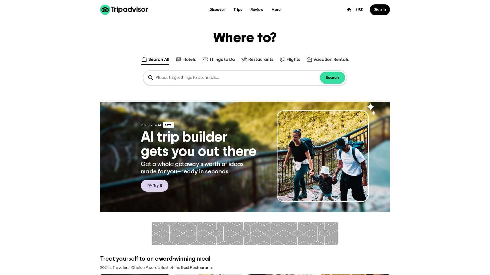
Tripadvisor is a prime example of functional travel web design. While the design isn’t flashy, it’s built with user experience at the forefront. The green, white, and black color palette is easy on the eyes, creating a sense of reliability and trust. The homepage features a search bar prominently at the top, making it easy for users to dive into planning their trips. Reviews, ratings, and user-generated content are clearly displayed in an easy-to-read format, with well-placed icons and simple typography. The grid-based layout ensures that all the content is easy to browse and accessible, whether users are looking for hotels, restaurants, or attractions.
Intrepid Travel
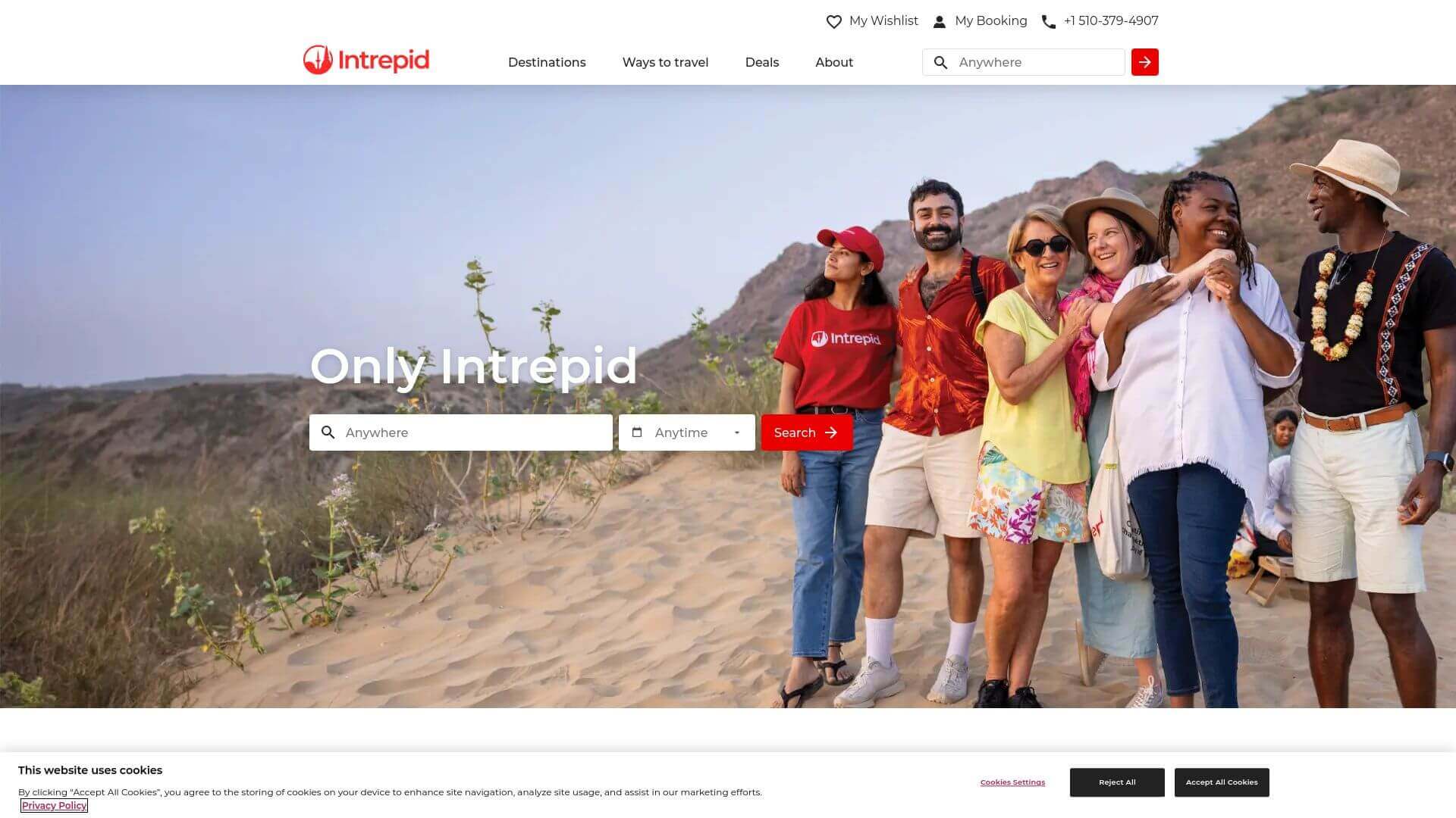
Intrepid Travel’s travel web design focuses on sustainable and responsible tourism, reflected in its color palette of earthy greens and whites. The homepage is filled with inspiring images of far-off destinations, with bold text overlays that encourage users to “travel differently.” The layout is clean and modern, featuring large, easy-to-read text and spacious sections that guide users through various travel packages. Interactive elements like hover effects and smooth scrolling make the site feel dynamic without overwhelming the user. Intrepid Travel’s design strikes the right balance between inspiration and functionality, making it a top choice for eco-conscious travelers.
Globetrotter
URL: www.globetrotter.com
Globetrotter’s travel website design is sleek and modern, with a strong focus on adventure travel. The homepage is packed with full-screen imagery that showcases stunning locations and outdoor experiences. The color palette is dominated by bold blues and deep greens, which give the site a fresh and energetic feel. The layout is well-organized, with large, clickable sections that guide users to different travel categories like hiking, skiing, or water sports. The site also features a well-integrated blog section that offers travel tips and destination guides. Globetrotter is a prime example of how minimalism and bold visuals can create an immersive travel experience.
Visit Scotland
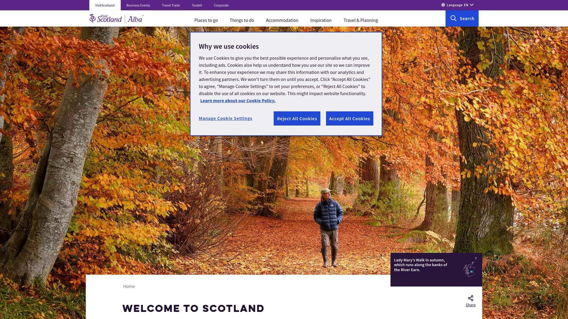
Visit Scotland’s travel web design perfectly captures the rugged beauty of Scotland. The homepage is dominated by stunning, full-width images of Scottish landscapes, creating an immersive experience right from the start. The color scheme consists of deep greens and blues, representing Scotland’s natural beauty, while the typography is clean and modern, ensuring all the important information is easy to read. The layout is designed to be intuitive, with large sections for accommodation, attractions, and travel tips, making it easy for users to plan their trip. The website does a great job of balancing visual appeal and usability, making it both inspiring and functional.
Earth Trekkers
Earth Trekkers is a blog-style travel website that focuses on offering detailed travel guides and itineraries. The design is clean and content-driven, with large images used to enhance the storytelling aspect. The color palette is neutral, with whites and grays allowing the photography and content to take center stage. The layout is structured in a blog format, with articles organized by destination and travel type, making it easy for users to find what they’re looking for. The typography is simple and easy to read, ensuring that the wealth of content on the site is accessible. Earth Trekkers strikes the perfect balance between informative content and visual appeal, making it a go-to for travel planning.
G Adventures
URL: www.gadventures.com
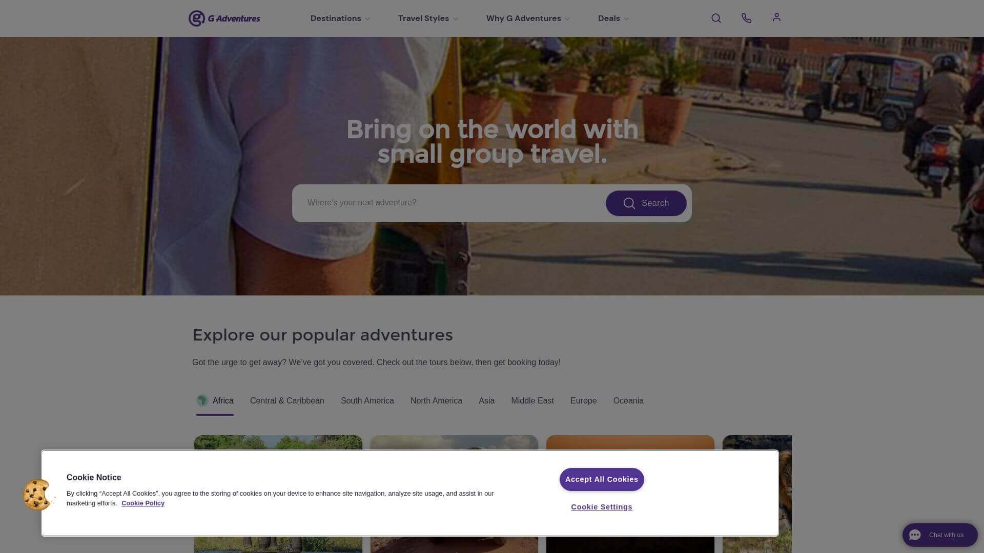
G Adventures combines vibrant colors and bold typography to create an engaging, adventure-focused travel website design. The homepage is packed with high-energy images of group tours and exotic destinations, instantly drawing users in. The color palette uses a mix of purples, greens, and whites, which gives it a fresh, youthful vibe. The layout is well-organized, featuring large buttons and CTAs that guide users to specific tours, making it easy to navigate. This site also leverages hover effects and subtle animations, which enhance the browsing experience without making the site feel overwhelming. Overall, G Adventures balances a sense of adventure and professionalism, appealing to both solo travelers and groups.
Viator
URL: www.viator.com

Viator’s travel website design emphasizes simplicity and efficiency. The homepage is sleek, with minimalistic white and blue tones that create a calming, user-friendly atmosphere. The design features a search bar front and center, allowing users to quickly look up tours and activities based on their destination. The layout is divided into clear sections, making it easy to find top destinations, trending tours, and deals. The use of icons and well-placed images ensures that the design remains uncluttered while still visually engaging. The design’s focus on usability and clean aesthetics makes Viator one of the best travel websites for booking tours efficiently.
Roadtrippers
URL: www.roadtrippers.com
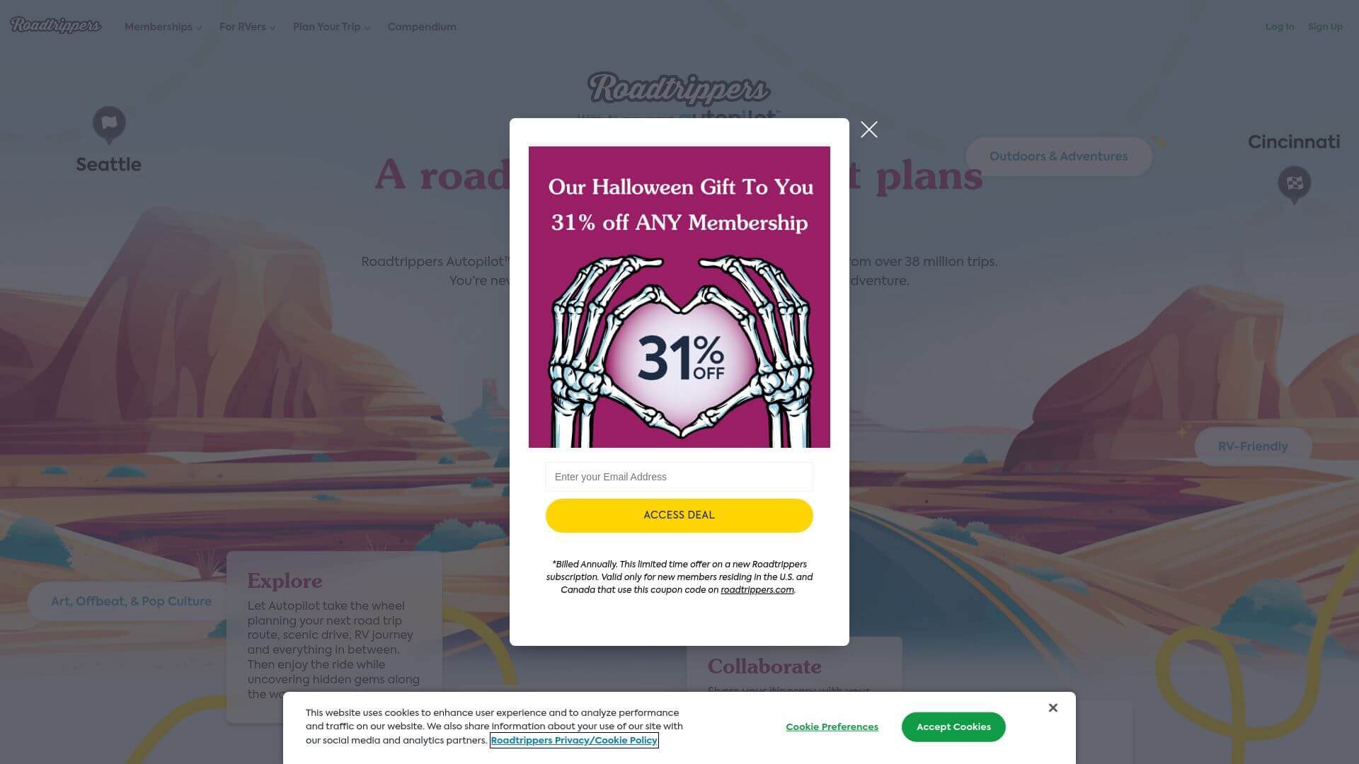
Roadtrippers’ travel web design is all about exploration and discovery. The homepage features full-width background images of scenic roads and travel destinations, inviting users to plan their next road trip. The color scheme is earthy and vibrant, with green and orange accents that provide a sense of adventure. The layout is highly intuitive, featuring a trip planner tool prominently at the top, making it easy for users to start their journey. The typography is clear and simple, with large, easy-to-read headings and buttons. Interactive maps and user-generated trip guides add a dynamic element, making Roadtrippers not only visually appealing but also highly functional for road trip enthusiasts.
The Outbound Collective
URL: www.theoutbound.com
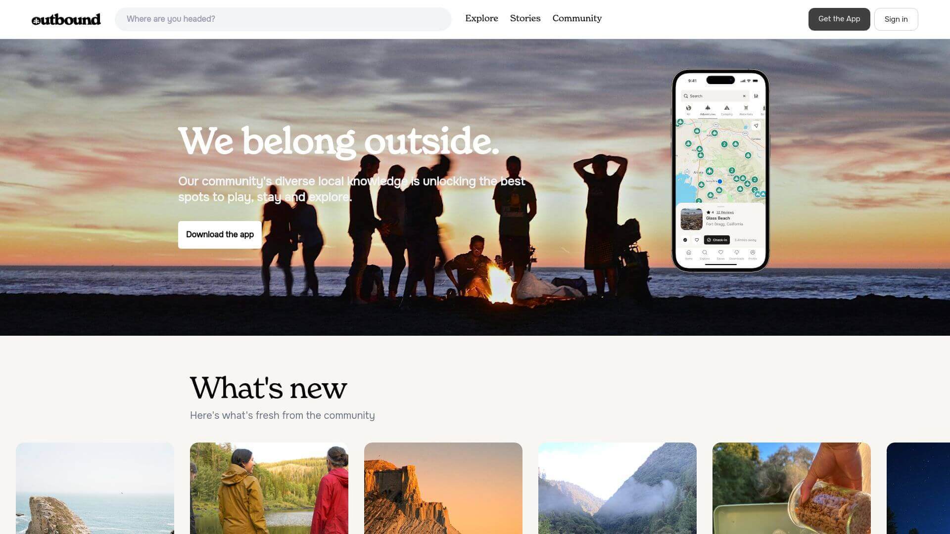
The Outbound Collective is designed for those seeking outdoor adventures. The homepage uses large, high-resolution images of outdoor activities such as hiking and camping, immediately engaging the user. The color palette features soft blues and greens, reinforcing the nature-focused theme. The layout is simple yet effective, with a grid system that displays various articles, guides, and travel tips. The typography is bold but minimal, allowing the imagery and content to shine. The site also incorporates interactive elements like maps and user-submitted reviews, making it both visually stunning and functional for outdoor enthusiasts planning their next adventure.
Travelocity
URL: www.travelocity.com
Travelocity’s travel website design is focused on efficiency while maintaining a welcoming, user-friendly aesthetic. The blue and white color scheme is inviting and gives the site a sense of trust and security. The homepage is simple but effective, featuring a large search bar for flights, hotels, and car rentals. CTAs like "Search" or "Book Now" are highlighted in orange, which contrasts nicely against the blue background, making them stand out. The layout is easy to navigate, with different travel categories clearly organized. Overall, Travelocity’s minimalistic design is perfect for users who want to quickly find and book their next trip without any visual clutter.
Nomadic Matt
URL: www.nomadicmatt.com
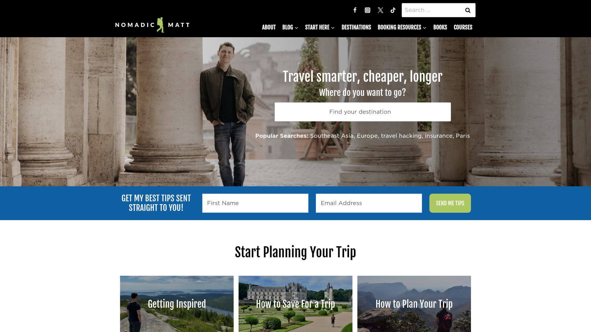
Nomadic Matt’s travel website offers a blog-style design that’s content-driven, with a focus on budget travel. The homepage features large hero images of travel destinations, and the color palette sticks to calming whites and soft blues. The layout is clean and organized, with sections for blog posts, travel guides, and resources for budget travelers. The typography is simple yet effective, ensuring that the focus remains on the travel content. With large buttons and CTAs, the site encourages users to explore travel tips, budgeting guides, and travel deals. Nomadic Matt’s design is perfect for travelers seeking informative content presented in a user-friendly, attractive way.
Pack Up + Go
URL: www.packupgo.com
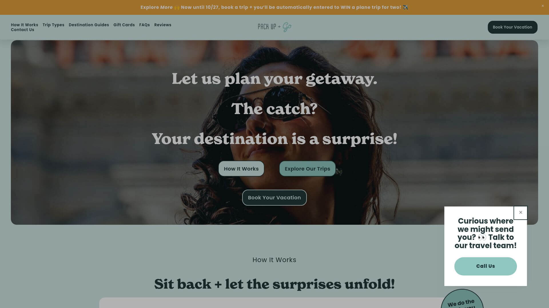
Pack Up + Go uses an adventurous, modern design to reflect the surprise-travel experiences they offer. The homepage immediately grabs attention with its bold use of color, mainly featuring turquoise and white, which creates a fresh and inviting feel. The layout is clean, with prominent CTAs that guide users to book their surprise vacation. The minimalist typography paired with large, high-quality images of travel experiences offers a sense of excitement and anticipation. Pack Up + Go’s modern, streamlined travel design is perfect for adventurous travelers who want a fun and easy way to book a surprise getaway.
GetYourGuide
URL: www.getyourguide.com
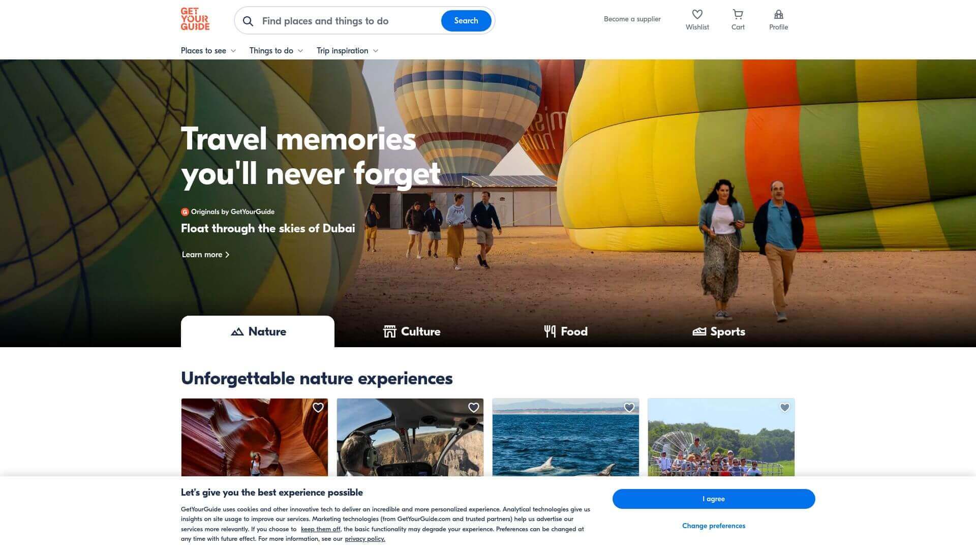
GetYourGuide’s travel web design is built around functionality with a polished, professional aesthetic. The homepage is clean, with a minimalistic layout that puts a strong emphasis on the search function. The color palette consists of whites and grays with subtle pops of red, making it easy for users to focus on the content. The layout uses a grid-based system, showcasing the top tours and attractions while keeping everything organized. The use of large images and clean typography makes the website visually appealing without feeling cluttered. It’s an excellent example of how usability and modern design can coexist seamlessly in a travel website.
Hostelworld
URL: www.hostelworld.com
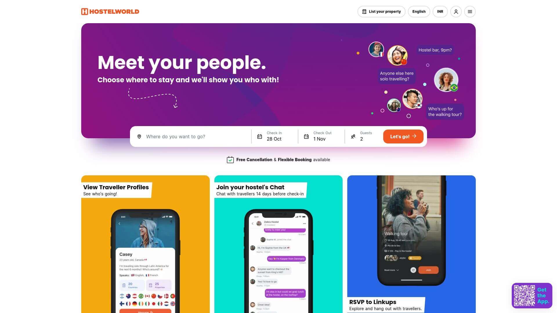
Hostelworld’s travel website is designed with a younger, budget-conscious audience in mind. The homepage uses bright colors like orange and blue, which give the site a lively, energetic feel. Large hero images showcase different hostels, immediately drawing users in. The layout is clean and simple, with a prominent search bar that encourages users to start their booking right away. The typography is playful yet readable, with large headings and buttons guiding the user to different sections. Hostelworld's design makes it easy for users to find budget accommodations while enjoying a visually stimulating experience that appeals to young travelers.
The Blonde Abroad
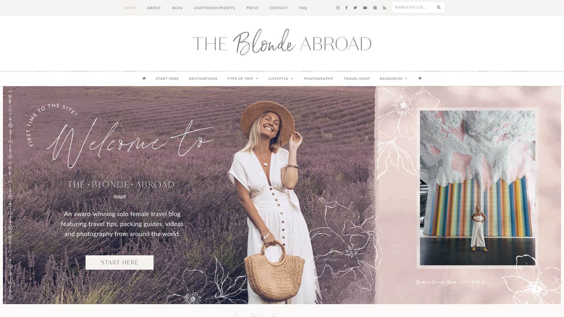
The Blonde Abroad is a beautifully designed travel blog that focuses on solo female travel. The website has a feminine and chic design, with a soft color palette of pinks, whites, and golds. The homepage features large images of destinations, which give the site a personal and welcoming feel. The layout is content-driven, with blog posts organized by destination, travel style, and tips for female travelers. The typography is stylish yet easy to read, adding to the elegant and approachable feel of the site. Subtle animations and hover effects add a dynamic element without overwhelming the user. The Blonde Abroad’s modern, travel blog design is perfect for those seeking travel inspiration and advice, especially for solo female travelers.
About Prateeksha Web Design
Prateeksha Web Design Company specializes in creating innovative and inspirational travel websites. They focus on delivering aesthetically pleasing designs that capture the essence of travel, providing gorgeous visuals and user-friendly interfaces. Their services range from web development, SEO to digital marketing, all tailored to effectively reach the target audience and enhance their online experience.
Interested in learning more? Contact us today.
