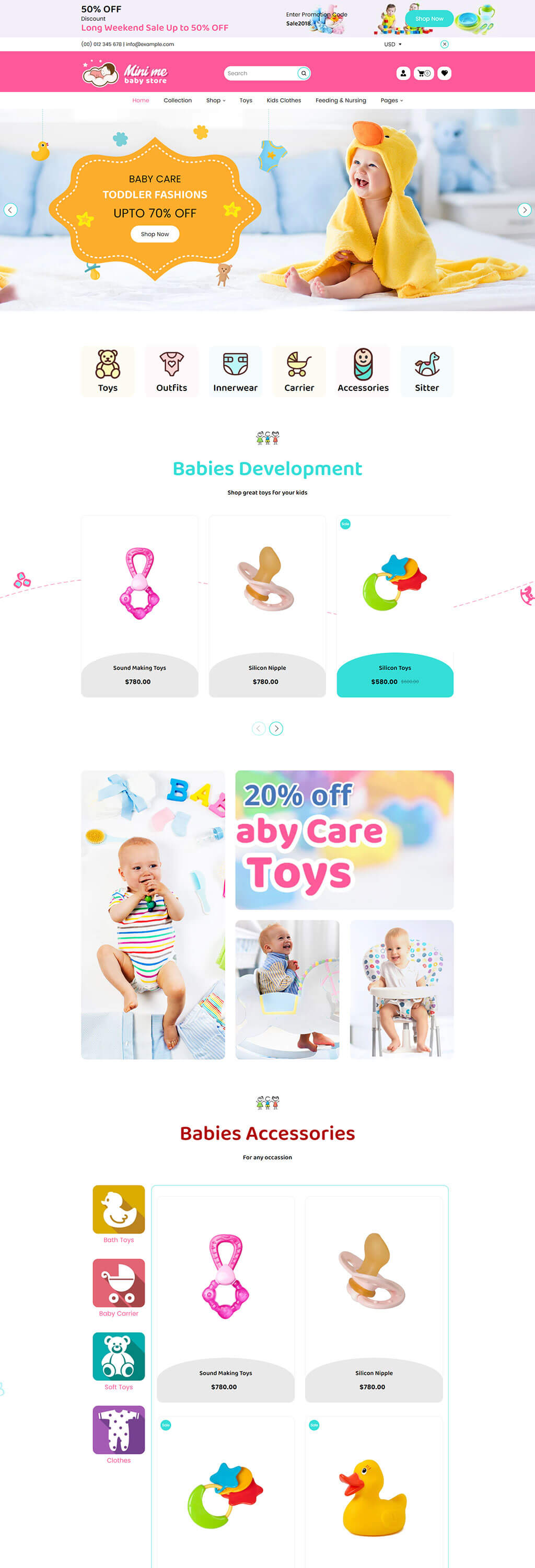
1. Mini Me | Baby Store
It employs a bright and playful color palette with a focus on soft pastel yellows and whites, creating an inviting and child-friendly atmosphere. The layout is clean and uses large, bold fonts for readability, and the imagery is high-quality and joyful, featuring a baby in a duck-themed towel, which aligns with the baby care theme.
The product showcase area uses a minimalist design with a white background to ensure the colorful products stand out. The pricing is prominent, and the visual hierarchy is maintained by sizeable, clear photos and legible text. The rounded corners of the product cards add a soft, approachable feel suitable for a baby-oriented site.
Icons are utilized for quick navigation, employing a consistent, rounded design language and a playful color scheme that matches the overall theme. The repeated product cards from the middle section create a sense of continuity, while the layout remains uncluttered, prioritizing user experience and ease of browsing.
Transform Your Baby Products Store Now!
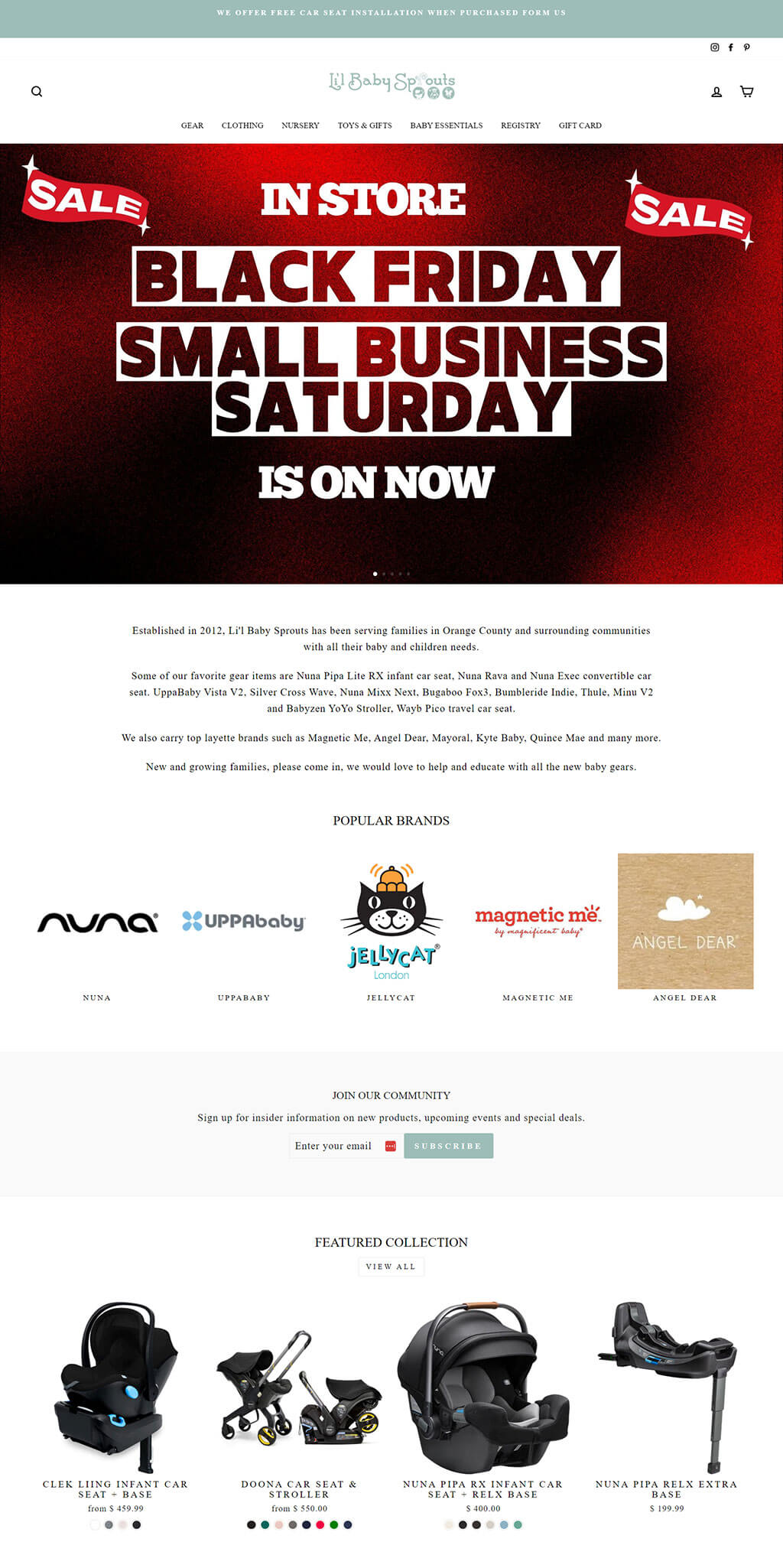
2. Li'l Baby Sprouts
This section has a bold and dramatic appeal, with a deep red textured background that draws attention to the Black Friday and Small Business Saturday sale announcements. The use of stark white and black text creates a strong contrast, ensuring the message is clear and impactful.
The middle portion offers a clean, simple typography on a white background for easy reading. The text is well-spaced and organized in a way that guides the reader through the narrative of the store's history and product offerings, with brand logos presented in a neat grid to establish familiarity and trust.
The featured collection showcases high-contrast images of baby gear against a dark background, emphasizing the products while maintaining a sophisticated and premium look. The pricing and product names are neatly aligned for quick scanning, and the overall layout is sleek and modern.
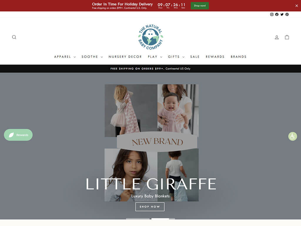
3. The Natural Baby Company
The header features a muted color scheme with a clean, easy-to-navigate layout that emphasizes functionality. A countdown timer for holiday deliveries adds urgency, while the minimalistic navigation menu promotes a clutter-free environment.
This area uses large, high-quality images of children with a soft, neutral color palette, conveying warmth and comfort. The images are overlaid with minimal text to highlight the 'New Brand' announcement, ensuring the focus remains on the visuals.
The product feature section for 'Little Giraffe' uses a simple, elegant typeface on a clean background to maintain a high-end feel. The design is spacious and modern, with images serving as the focal point to showcase the luxury baby blankets, reinforcing the brand's premium positioning.
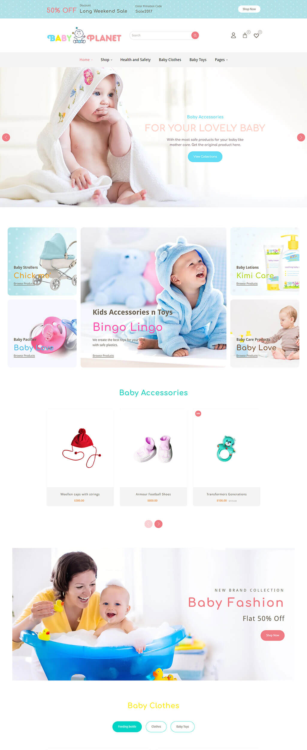
4. Baby Planet
The header is clean and airy with a light color scheme that gives the site a gentle, nurturing feel, appropriate for a baby products store. The promotional banner is cheerful with a prominent discount offer, enticing visitors to explore the sales.
The middle section uses soft, rounded graphics with a pastel color palette to feature various baby products, creating a welcoming and child-friendly vibe. The product categories are highlighted with playful fonts and imagery that clearly indicate the fun and loving nature of the items.
Product images against a white background with clear, colorful call-to-action buttons provide a clean and inviting shopping experience. The layout is spacious and organized, making it easy for visitors to browse through the selections and the promotional offer is prominently displayed, creating an incentive to purchase.
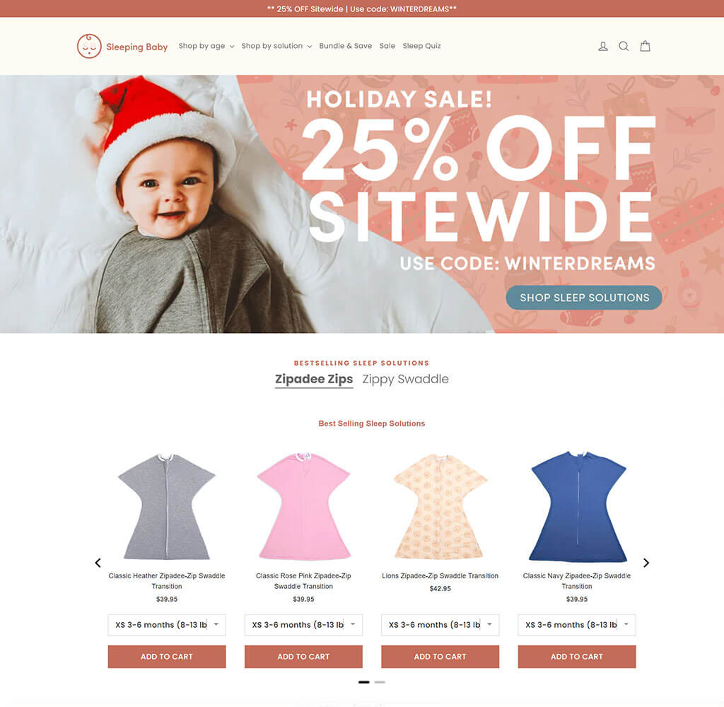
5. Sleeping Baby | Clothes Online: Swaddle Transition Zipadee-Zip
The top section combines a cheerful holiday theme with a smiling baby in a Santa hat to create an instant emotional connection. The warm color scheme and festive graphics set a joyful tone for the holiday sale, complemented by a clear, bold discount offer.
The navigation bar and promotional headers are crisp and modern, with a soft color backdrop that contrasts well with the white text. It maintains a clean aesthetic while also conveying the seasonal sale message effectively.
The product section showcases the sleep solutions with a straightforward layout, using soft colors and clean lines. The product images are front and center, with concise descriptions and clear pricing, making for an intuitive and pleasant shopping experience.
"Start Your Design Journey Today!
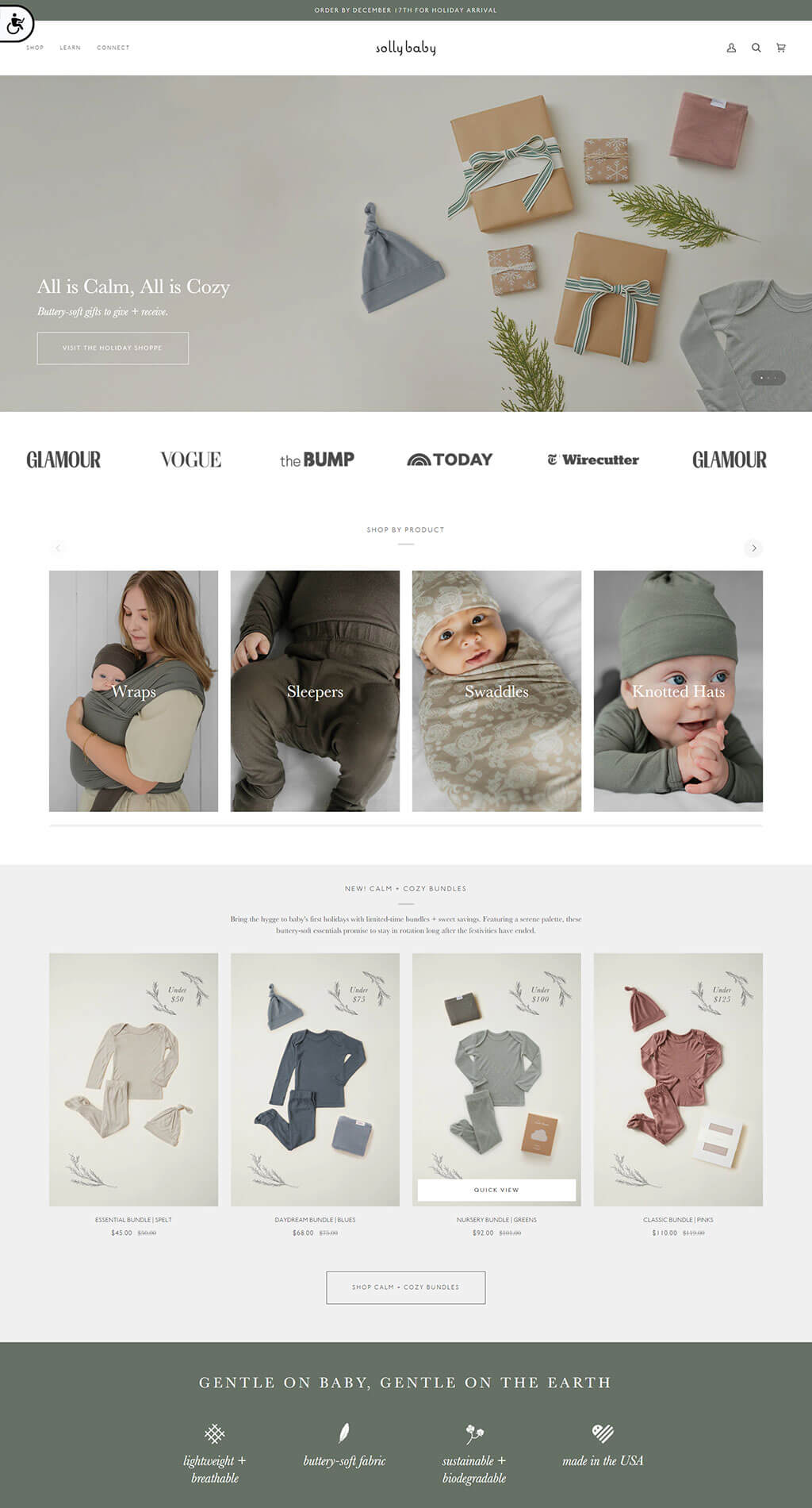
6. Baby Wraps | Solly Baby | The Wrap
The top section sets a serene and upscale tone with a muted color palette and a clean, minimalist layout. The holiday theme is subtly introduced with elegantly wrapped gift images, reinforcing the message of calmness and coziness.
The inclusion of media endorsements from well-known publications is displayed in a simple, understated manner, which lends credibility and a sense of prestige to the brand without overwhelming the design.
The product images are showcased with a focus on natural and soft hues, creating a cohesive visual story that aligns with the brand's gentle and earthy aesthetic. The layout is spacious and modern, with an emphasis on the products’ texture and quality, inviting potential customers to explore more.
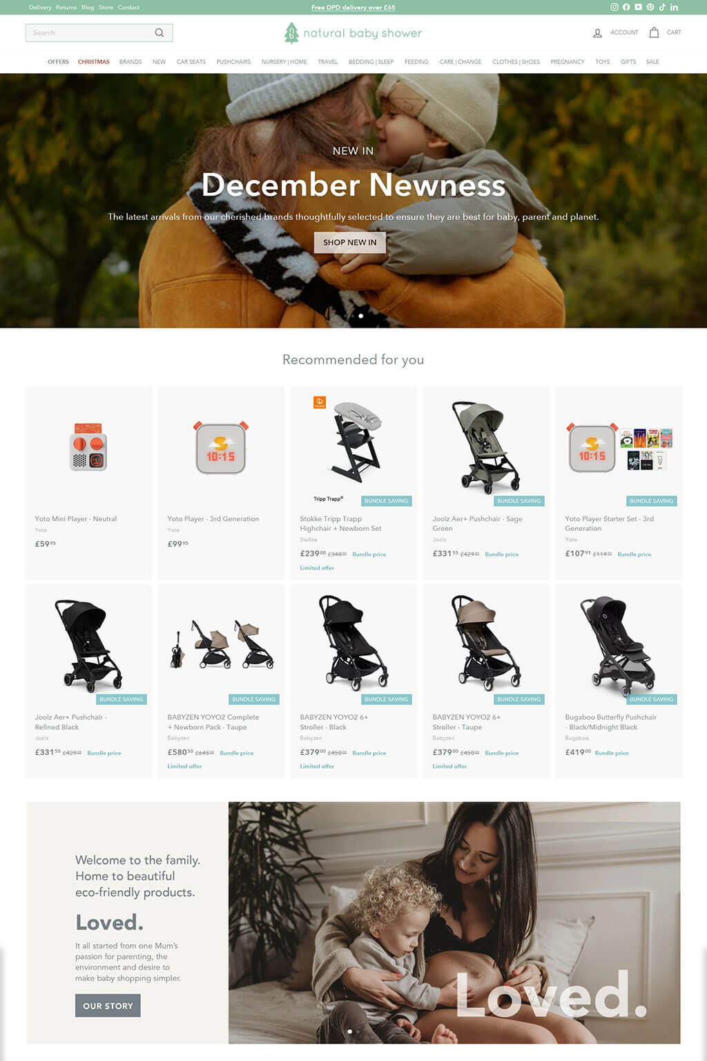
7. Natural Baby Shower | Quality natural baby products and gifts
The header conveys a warm, inviting atmosphere with a seasonal image that encapsulates a sense of closeness and natural warmth. The use of earth tones and a clear, legible font for the "December Newness" announcement adds a contemporary touch.
Below, the layout is clean and grid-like, presenting recommended products in a structured, easy-to-navigate manner. Each product is highlighted with a clear image and price, set against a white background to maintain focus on the items.
The 'Welcome to the family' section is personal and heartfelt, with a large, emotive image of a mother and child that aligns with the eco-friendly brand message. The text is concise and prominently placed, inviting users to connect with the brand's story and values.
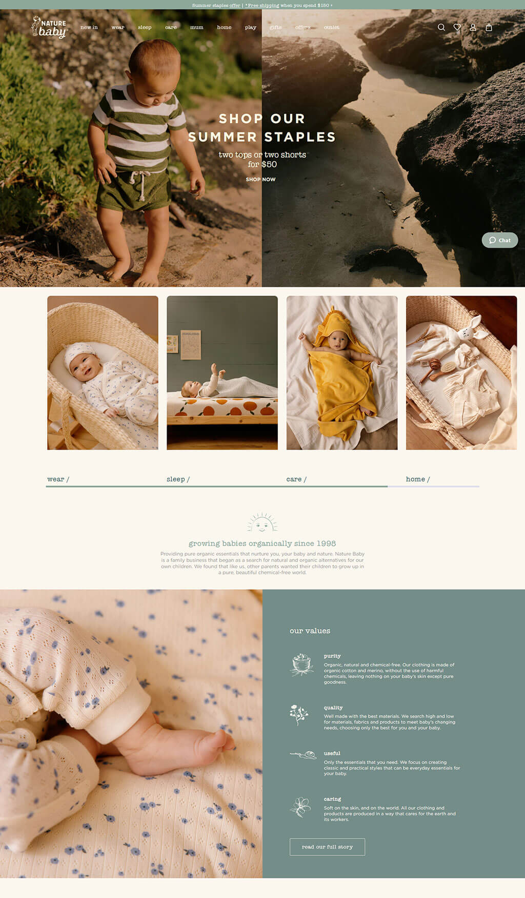
8. Nature Baby: Organic Baby Clothes & Natural Baby Products
The top part of the page features a large, engaging image of a child in a natural setting, invoking a connection to the outdoors and reinforcing the brand's commitment to nature. The "Shop Our Summer Staples" promotion is presented with an overlay that blends seamlessly with the image, offering a clear call to action without detracting from the visual appeal.
Directly below, a series of smaller, high-quality images showcase the product categories in a clean and organized manner, with a warm, earth-toned color palette that reinforces the organic and natural ethos of the brand.
The bottom section describes the brand's philosophy and values through a combination of thoughtful text and a complementary image, all set against a neutral background. The design uses icons and concise headlines to convey the core values of purity, quality, usefulness, and caring, facilitating quick comprehension and emotional resonance with the brand's mission.
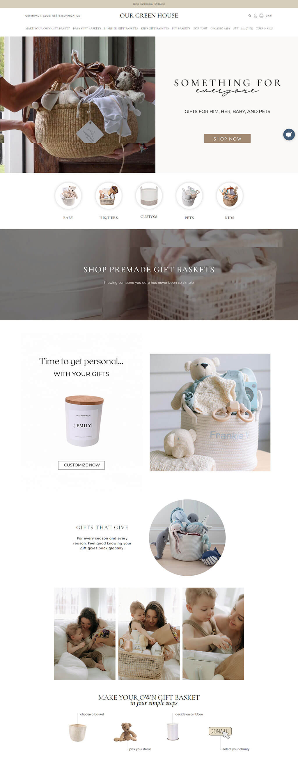
9. Baby Gift Baskets | Luxury Gifts | Make Your Own Custom | Our Green House
The header conveys a warm, inviting feel with an image of a gift basket being handed over, suggesting personal touch and care. The neutral color palette and simple, elegant typography communicate a high-quality, organic ethos.
The middle section is clean and organized, with round icons representing different categories, offering a user-friendly experience. The soft pastel color scheme and the high-quality images of the products showcase the brand's focus on natural and thoughtful gifting.
This area emphasizes the brand's personalization service with a clear 'Customize Now' call-to-action, alongside images of curated gift baskets, enhancing the bespoke nature of the brand. The section also highlights the brand's commitment to giving back, enhancing its appeal to socially conscious consumers.
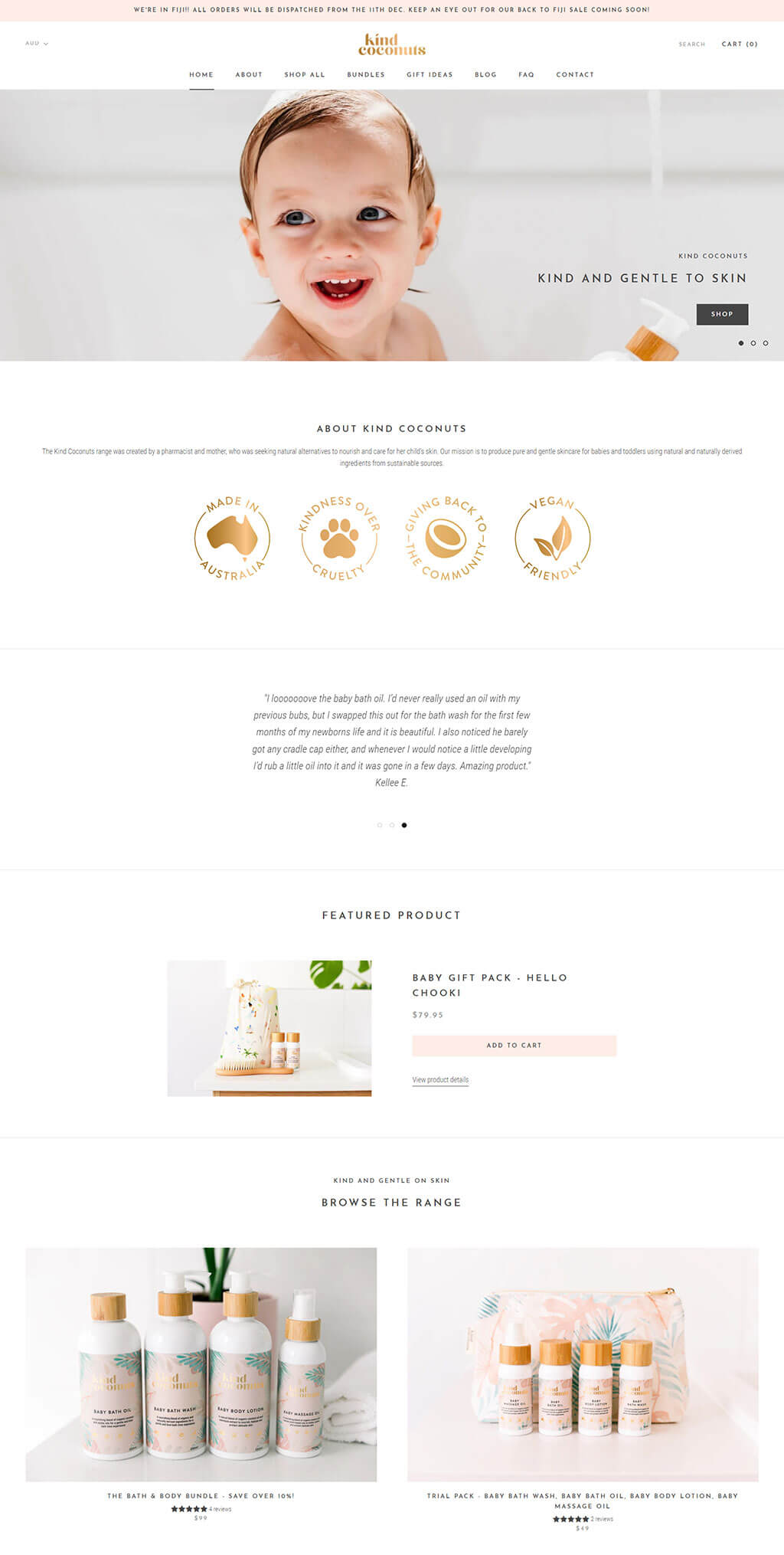
10. Kind Coconuts | Natural Baby Skincare Online Australia
The header showcases a joyful baby image, conveying purity and happiness, which is central to the brand's image. The clean, white background and minimalistic design reflect the natural and gentle approach of the products.
Below the fold, the site uses elegant golden icons and a brief, heartfelt origin story to communicate its core values like Australian-made, kindness, community giving, and vegan-friendly products, fostering trust and a strong brand identity.
The product section is presented with a simple and elegant design, featuring high-quality images of the products with a neutral color palette that emphasizes the natural ingredients and promotes a sense of calm and cleanliness. The customer testimonial adds a personal touch, enhancing credibility.
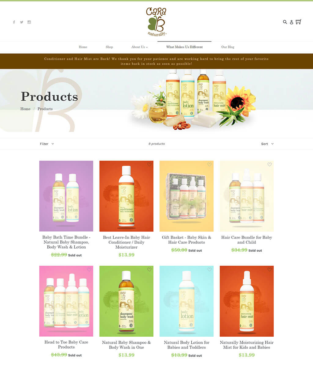
11. Products – CARA B Naturally
The top section of the website features a clean and inviting layout with a warm color scheme that reflects the natural essence of the brand. The banner announces the return of popular products, creating a sense of excitement and anticipation.
Products are presented against a backdrop of vibrant, pastel-colored blocks that add a playful yet soft touch to the overall design. The layout is grid-like, offering a structured browsing experience with clear images and prices.
The site's navigation is straightforward, with a sans-serif font that’s easy to read against a white background. The brand logo is prominently placed at the top, reinforcing brand identity throughout the customer's shopping experience.