15 Designs of the Best Restaurant Websites
Website design is a challenging art form to perfect. It is difficult to achieve a harmonious balance between form and function. However, these ten websites have achieved that elusive balance, creating the ideal tool for promoting their restaurant brand.
1. The Fat Duck
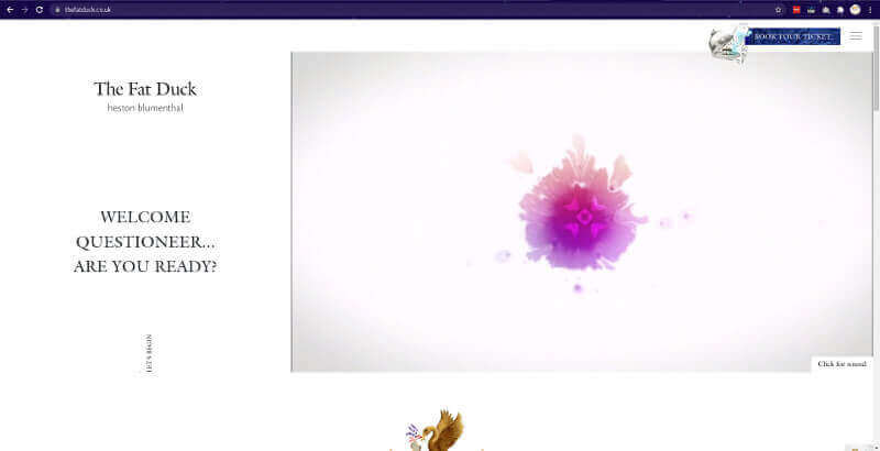
Heston Blumenthal, the Fat Duck's head chef, is renowned for his inventive cuisine; his dishes frequently conceal wonderful surprises, such as a chicken liver and foie gras parfait that resembles a mandarin orange. The website for The Fat Duck has been expertly built to live up to this expectation.
Fat Duck's home page image
At first glance, this website appears to be a little too simple - just a map with an Alice in Wonderland theme - however upon closer investigation (with the large magnifying glass), you'll discover a plethora of minor nuances concealed throughout the map on the home page. It's easy to lose track of time watching the map later via the magnifying glass, which contributes to the restaurant's reputation for surprising diners.
The takeaway: including an interactive element onto your website is an excellent approach to increase its remembered quality.
2. Le Mugs
3. Risotteria Melotti
4. Blackhouse
5. Gourmet Natural
6. Bresca
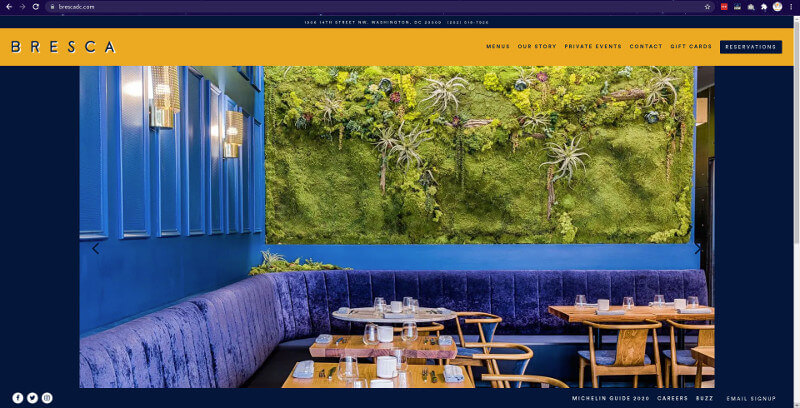
If you're looking for an example of a conventional restaurant website design, consider this one. Bresca prominently displays their address and phone number. Following that is a well-organized menu bar from which you may access all of the main pages such as location, menu, and dining selections. As you scroll down, you'll discover stunning pictures and well-organized information. You can make a reservation for a table by clicking the Reservation button in the top right corner, which is a very helpful tool for prospective customers.
7. El Burro
8. Quay
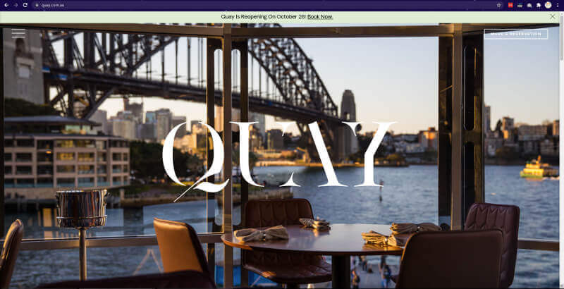
Quay is one of Australia's most award-winning restaurants, and its website lives up to their reputation. This site has an attractive appearance due to the combination of excellent photographs and liberal use of whitespace. There is an integrated reservation system located in the top right corner. On the left, the hamburger menu is well-organized. Quay's website is entirely responsive on mobile devices, including smartphones and tablets.
9. Ilili restaurants
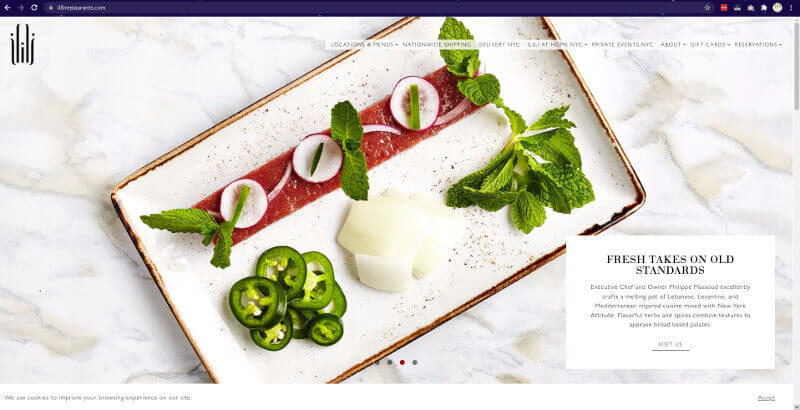
This is another excellent illustration of a typical restaurant website design. Ilili's homepage features enticing photographs that highlight both their food and interior design. The navigation bar provides quick access to their location, menu, catering options, and other pertinent information. Additionally, you can order online or book seats directly from the website.
10. Au Cheval
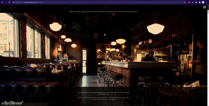
Au Cheval's website is all visual. The website features breathtaking full-screen photographs. Scrolling through these photographs will undoubtedly urge you to visit their eatery. The site's design makes it simple to obtain critical information via the top-right menu icon. If you want to develop a website for your restaurant solely around photographs, Au Cheval is a fantastic example of how to do so.
10. La Barraca
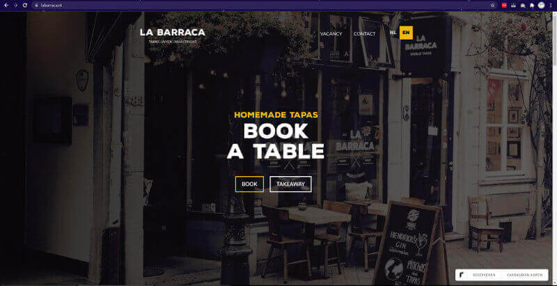
La Barraca, a tapas restaurant in the Netherlands, uses stunning images on their website – you can practically hear the subdued talk of visiting friends, the clinking of full wine glasses, and the intoxicating aroma of ocean salt drifting from seafood dishes. Any website's photographs should be of good quality, but this is particularly true for a restaurant's website. La Barraca employs photos to convey their convivial atmosphere and delectable tapas. These stunning photographs offer us an excellent sense of what to expect if we decide to visit.
11. Da Francesco
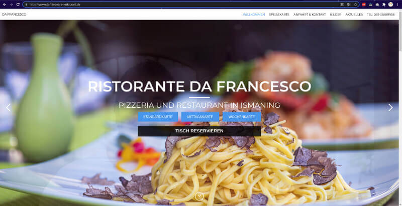
The homepage of Da Francesco greets us with a rotating carousel of cuisine and warm faces. This personal connection fosters trust in a positive consumer experience. The menu, the location, the phone number, and the instructions for making a reservation are all clearly presented in a neat row of grey buttons, making it simple to find what we're looking for when we get there.
12. Dédé licieux
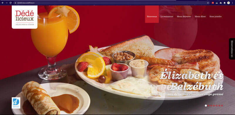
If you're not from Quebec, chances are you've never heard of Dédé Fortin, the flamboyant frontman of Les Colocs in the 1990s. Dédé lisieux is a restaurant named for him. "Like Dédé Fortin, our meals and evenings are animated by an infectious frenzy!" says Google's translation. I'm not sure how accurate this translation is, but the idea of a "contagious frenzy" sounds like something I'd find quite pleasurable.
I'm not aware of any restaurants devoted just to artists. Dédé licieux masterfully executed this concept without letting it take over. On the homepage, there are photos of Dédé, and musical note icons, which may be clicked to hear songs performed by Les Colocs, can be found throughout the website.This is an oddly interactive menu, but it works nicely in honour of this renowned Quebec musician.
