20 Successful Small Business Websites Design That Will Impress You

When people see new startup websites on the internet, they are more likely to visit them. However, having said that, one of the most important factors in the success of your project is developing a successful startup website.
The old adage that "first impressions are everything" holds true in the case of new businesses, and this is especially true in the case of startups. In order to reflect your company's values and identity as a business owner, it is critical that you design and host a website for your company's launch. Here are 20 examples of well-designed startup websites to serve as examples.
1. Stripe
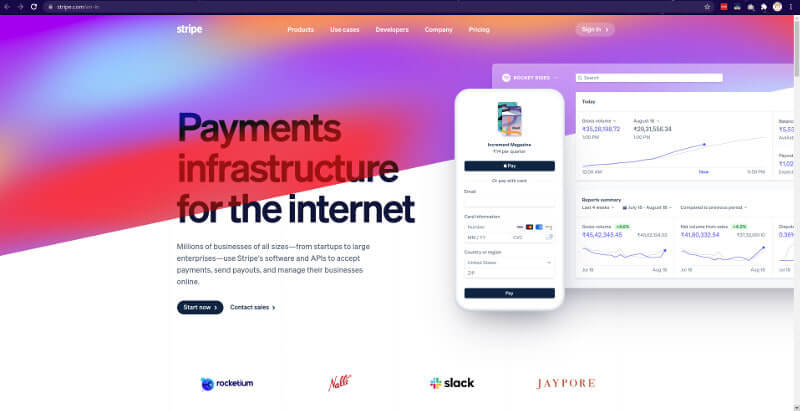
Stripe is a technology company that focuses on the development of internet-based economic infrastructure. Their software is used by businesses of all sizes, ranging from new startups and small businesses to large public corporations, to accept payments and manage their operations online.
2. Limepay
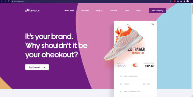
Thanks to clever behind-the-scenes technology, Limepay empowers you to take control of the payment process, providing you with a secure checkout that is state-of-the-art and seamlessly integrates into your existing website. There will be no redirects. There are no additional logins. There is no friction. With Limepay, your customers remain on your site until they have completed their purchase, reducing the likelihood of dropoff or Cart abandonment. Despite the fact that we handle all of the payment logistics, we never get in the way of a smooth and quick customer experience.
3. Objectivity
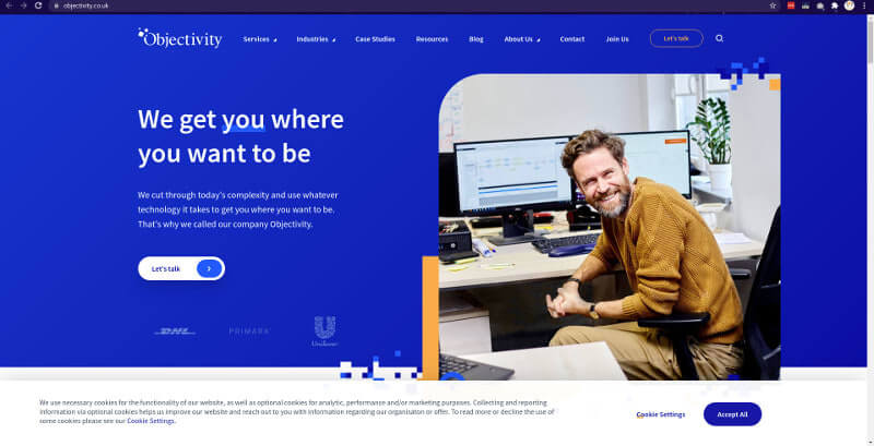
Objectivity is a company that does much more than just develop software. They assist our clients in overcoming their business challenges by implementing digital transformation. A wide range of digital transformation solutions, including web and desktop applications, are provided by them. Internet of Things, Big Data, Machine Learning, proactive maintenance and support are all topics covered. They work in close collaboration with our clients to develop solutions. Dedicated teams and tribes are formed in order to meet their requirements and expectations. They have a strong connection to the Client's operations.
4. Vectornator
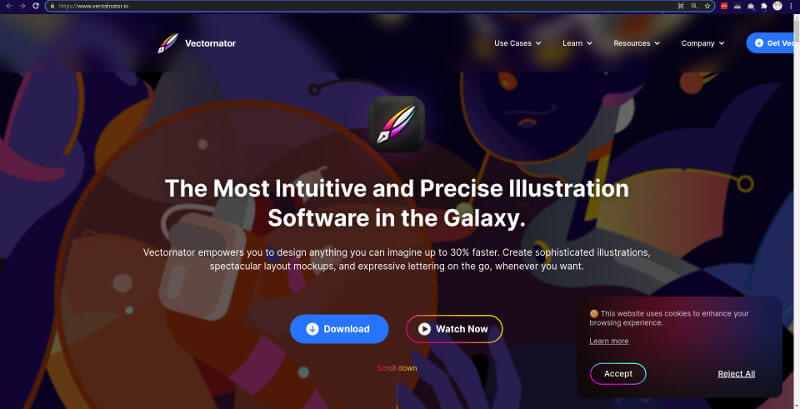
Vectornator is an easy-to-use vector graphic design software that allows you to create anything you can think of using vector graphics. Create sophisticated illustrations, beautiful designs, and amazing layouts — all with a single, incredibly powerful software package.
5. Ghost
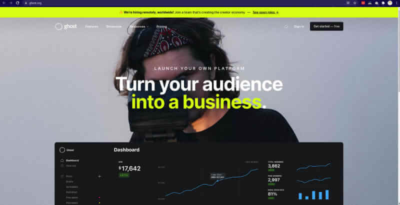
Ghost is a new content management system that makes the complicated world of blogging more understandable. Their landing page design is effective due to the use of large images and a large amount of information on the page.
6. Squarespace
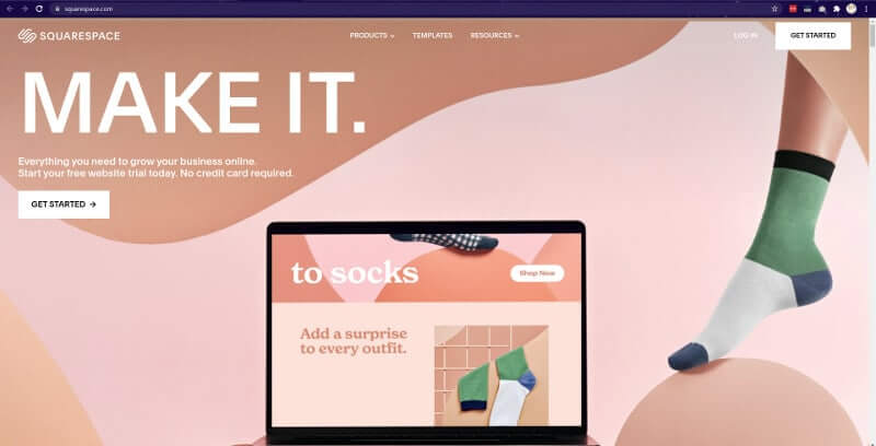
Squarespace is a drag-and-drop website builder that makes the process of creating websites more convenient. The landing page is simple yet sophisticated, and it includes a background image that changes when the page is completely filled. As a result of these effects, the platform has risen to become one of the most popular startup websites.
7. Kano
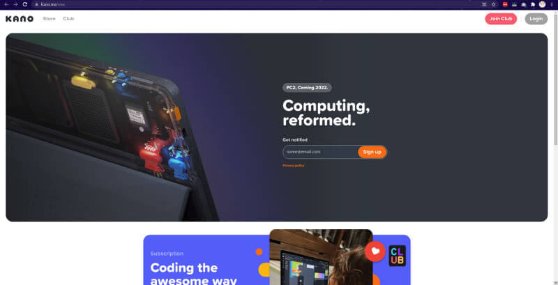
Kano is a computer system structure kit that was created to teach children how to design and programme computer systems. It is available for purchase online. As you scroll down the website, you can see how the computer is constructed through the use of beautiful animations and graphics.
8. BuildZoom
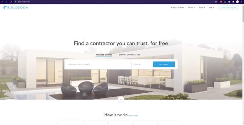
BuildZoom is a service that is similar to Angie's List, but it looks and performs significantly better. From the moment you land on their homepage, you'll understand what they're all about and how to get involved. The contractor search is the centrepiece of the site, and it is as simple as typing in a type of service and your zip code to receive relevant search results. BuildZoom has a lot of content on their homepage, but they've done a good job of organising everything.
9. WeFunder
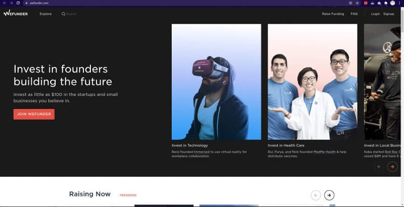
WeFunder is a strange-looking but endearing offspring of the Kickstarter and Prosper concepts. In essence, it allows regular people to make investments in startup companies. It is recommended that people refrain from investing in startups unless they are well-versed in the field, as startups are extremely risky investments. The WeFunder website has a very professional and clean appearance. The layout is tile-based, similar to that of KickStarter. The content is well-organized, as well.
10. Traackr
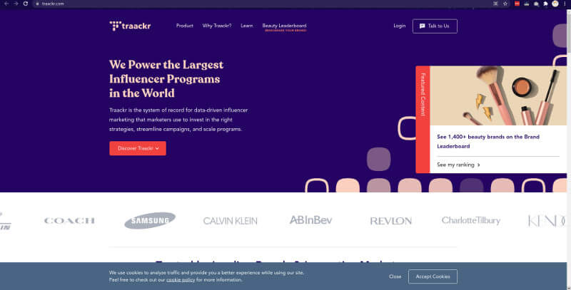
When it comes to Influencer marketing, it's easy to make fun of it — after all, we've all seen the Fyre Festival documentaries, haven't we? However, the superficial aspects of social media should not be used to dismiss the potential impact that influencer marketing can have. Influencers who are genuine in their endorsements of brands and their products are in abundance. Traackr verifies influencers and assists brands in harnessing their marketing power in the most effective manner. This small business website design is visually appealing due to the use of vibrant colours, blocks of staggered images, and scroll-triggered animations throughout. Although it is a beautiful website, this is more than just a showcase of the company's capabilities; case studies, testimonials, and other data demonstrate how their services produce tangible results for their clients.
11. Soundstripe
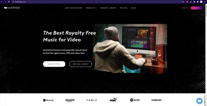
The search for suitable music to licence for a video project can be time-consuming and frustrating. In this world, there is plenty of lifeless, repetitive nu-muzak to be found. Soundstripe provides professionally produced high-quality songs and sound effects at an affordable price. They entice us to check out their sonic offerings by providing us with three free royalty-free tracks at the top of their homepage. SoundStripe's design is outstanding in the way that it keeps everything in its proper place. Everything from modern orchestral music to chill hop can be found on the playlists that have been assembled. Whatever jams or sounds you're looking for can be found with a quick scroll and a few clicks on your computer's web browser window.
12. Alley
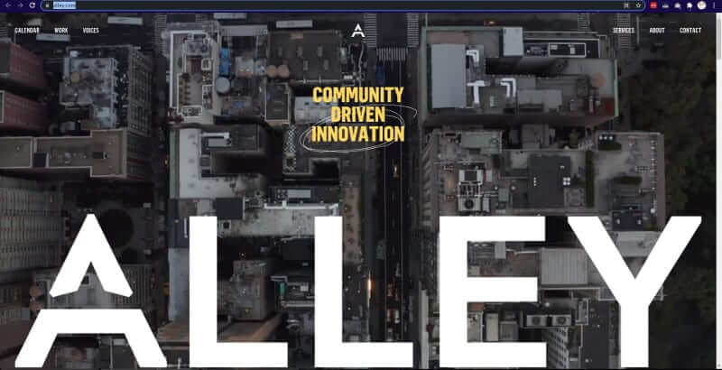
Coworking spaces are springing up all over the place as a viable alternative for those who do not require a traditional office space. Many businesses are rushing in, hoping to gain a foothold in this emerging market. However, many of these businesses are unaware that a coworking space must be more than just a room filled with tables, desks, and chairs to be effective. Alley appears to understand this, as they host events and opportunities for collaboration that bring people together in a positive environment. The layout of their website is based on grids and blocks, with plenty of photos of the community. A coworking space that is bursting with the energy of the people who use it is reflected in their design.
13. Mighty
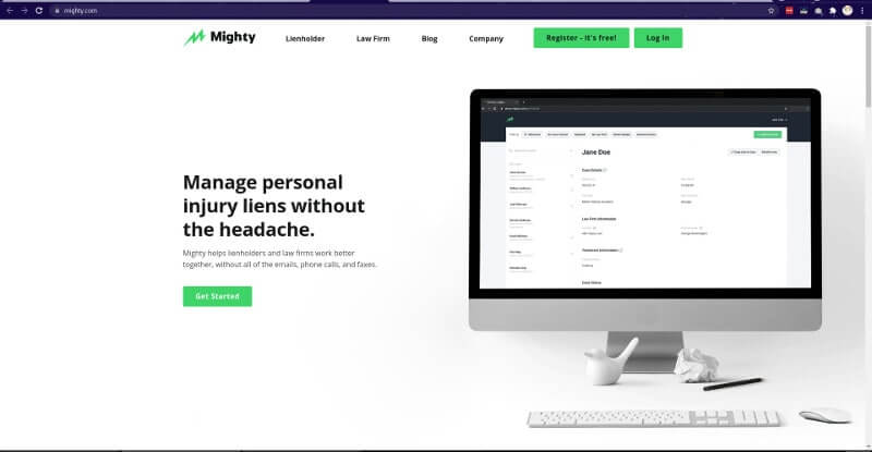
The task of finding a niche in the overcrowded world of business software solutions can be challenging. In addition to providing a software platform that tracks personal injury liens, Mighty also provides valuable data for billers, attorneys, and other professionals working in the medical industry. Mighty promotes an aesthetic for their small business website that is free of bloated terminology and drab design, focusing instead on the importance of taking action. It is possible to interact with this layout through the use of bold headlines, animated icons, and other small interactions. They also have a blog where they post articles that are technically sound but also conversational and understandable to non-experts.
14. Confluera
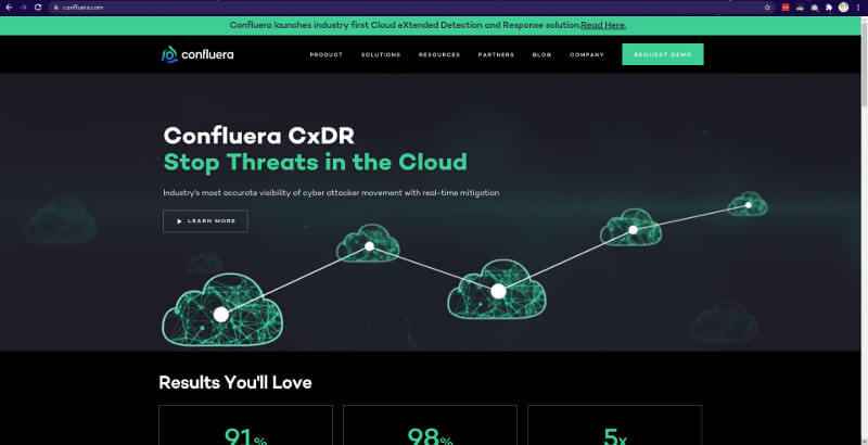
When explaining how their anti-hacker software works, Confluera uses a commanding tone to convey their message. Data breaches are a serious threat, and their no-nonsense demeanour demonstrates that they are not taking any chances. From the swirl of the ocular-like graphic on the landing page to the blunt messaging of the large headlines, the site has the feel of the instruction page of a video game, with the goal of neutralising intruders as the goal. However, the dead-pan, blunt tone of their approach is a good match for their cybercrime-fighting software. This approach could have easily crossed the line into parodying itself.
15. Fortnight Studio
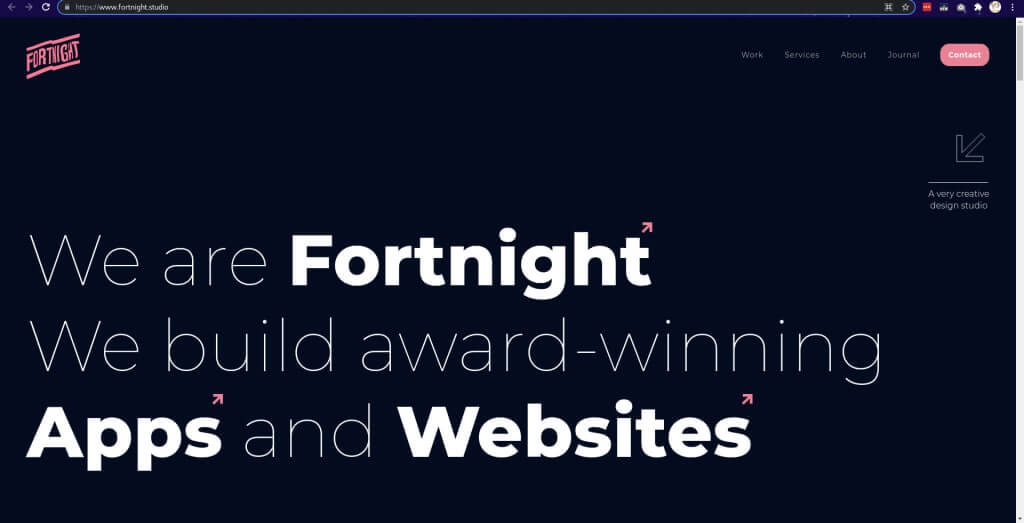
Fortnight Studio distinguishes themselves from other advertising agencies by concentrating on startups. They describe themselves as "a design and development studio that is intentionally small." To differentiate yourself in an agency landscape where everyone is trying to do everything, it is beneficial to specialise in a particular field. If you arrive at this agency's website expecting to see an extensive Portfolio, you will be disappointed.When they say "purposefully small design," they are referring to exactly what they are describing in their statement. They provide us with a small glimpse into their work through a horizontal scrolling gallery of projects and the logos of the major players with whom they have collaborated.
16. The Balloon Queen
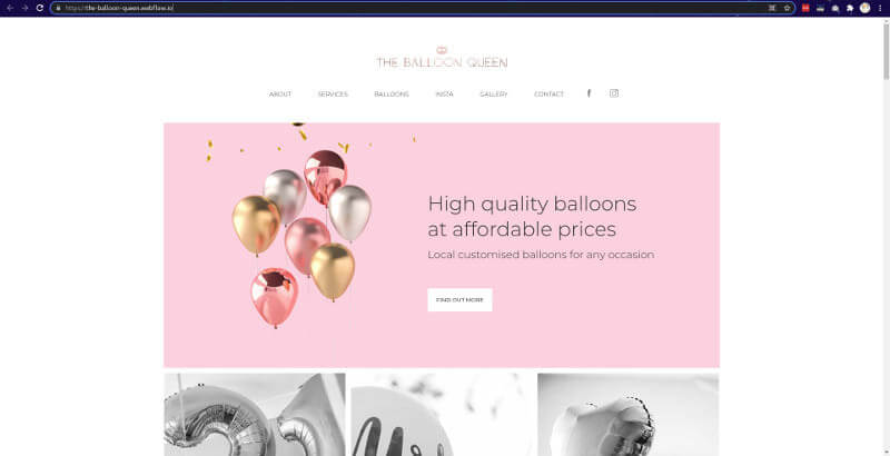
The Balloon Queen represents everything that is helium-filled and entertaining. Movement abounds in this design, which includes microinteractions and hover effects throughout the page. While it is not overly silly, it captures the excitement of balloons. This design, which strikes the perfect balance between professionalism and whimsy, demonstrates everything that makes The Balloon Queen deserving of her title. Take a look at the Prateeksha Web Design to see how it all came together.
17. Bulb
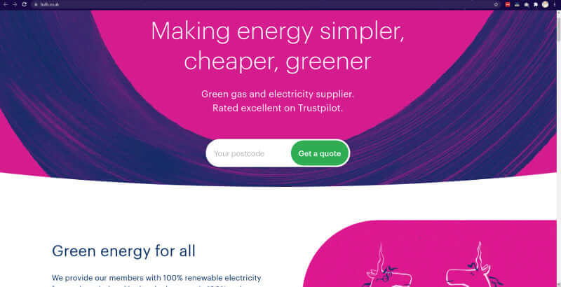
Bulb is a technology-driven energy supplier that uses 100 percent renewable electricity and 10 percent green gas to generate its energy. The company now provides energy to more than 300,000 homes in the United Kingdom, establishing it as one of the most successful startups in recent years. As for their website, the startup has chosen to introduce its initiative and philosophy on the home page, while also providing new visitors with useful pieces of information to keep them coming back. This approach enables forward-thinking businesses to create websites that capture visitors' attention right away and, as a result, increase their sales. One of the best startup websites for 2019 is one that showcases both the company's presentation as well as the benefits that their users will receive from using their services. Bright colours evoke the feeling of a modern brand that is willing to take risks and embark on new adventures. The website emphasises the individual impact that a user can have solely as a result of switching to Bulb, and it clearly demonstrates the benefits of using the service. As a result, it is understandable why so many people have placed their trust in the company.
18. Trint
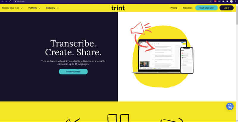
Trint is the first automated transcription service to combine a text editor and an audio/video player into a single tool, recognising how dreadful transcribing can be in the publishing and broadcasting industries. The service provided by the startup can transcribe recorded content in 13 different languages, making it one of the industry's leaders in automated transcription. Their home page provides an overview of the service as well as instructional videos on how to use it. Their website provides additional information on pricing as well as news for the user to consider. Furthermore, the instantly recognisable brand colour helps to make Trint's identity memorable for their visitors.
19. Dutchie
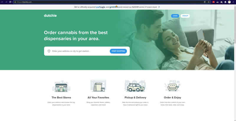
This is the epitome of elegance in simplicity. Inform them of what you do, how to obtain it, and how it operates. A three-step procedure that doesn't get any simpler, and the best part is that it actually works. Dutchie is a cannabis e-commerce and online ordering platform that specialises in medical marijuana. You should make it as simple as possible for people who visit your site to purchase your product or service if you know they are doing so.
20. Carbon Health
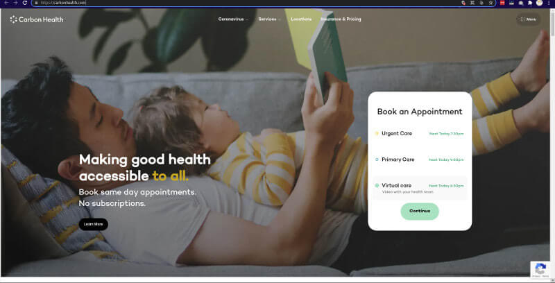
A network of technology-enabled medical clinics that provides both virtual and in-person care, Carbon Health is a pioneer in the field. If you have two to four core offerings, this is a great landing page to model your business after. The header and subheader on the left are changed when you select one of the three appointment options to the right. As a result, you can find what you're looking for without having to scroll down or navigate their website. In addition, scheduling an appointment is simple and straightforward.
