
07.24.26
Heatmaps and User Behaviour Analysis: How to Find Out Why Your Website Visitors Don't Convert
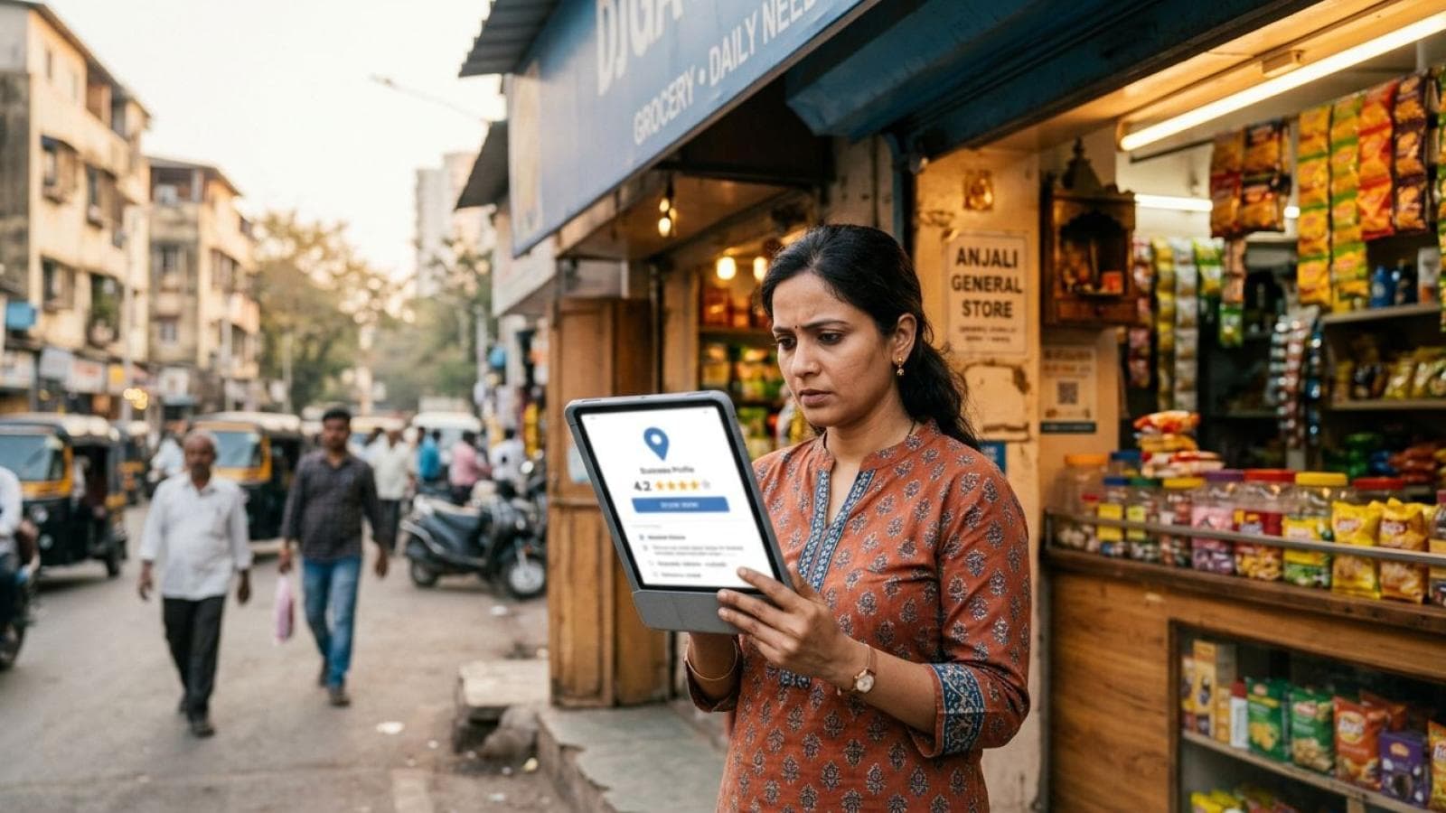
How heatmaps reveal exactly why your India website visitors leave without converting — patterns, tools, and fixes.
Read articleJuly 24, 2026
Deep-dive articles on Shopify, Laravel, Next.js, AI automation, and conversion-focused web design—crafted to help you ship smarter, faster, and more profitable websites.
Stay ahead
No fluff—just practical breakdowns, examples, and playbooks from real client work.
Subscribe to the newsletterHow heatmaps reveal exactly why your India website visitors leave without converting — patterns, tools, and fixes.

The 5 patterns behind failed web design projects in India, the red flags to spot before you sign, and the deliverables checklist to hold any Mumbai agency to in 2026.

Schema markup for business websites in India explained: what it looks like in search results, the 5 types you need, and how to add it without a developer.
Thane businesses compete in a market with its own buyer behaviour and search patterns. Here's what web design and local SEO actually need to look like to win there.

The 7 elements every high-converting Indian landing page needs, from mobile-first layout to trust signals and speed fixes.

Complete guide to Shopify SEO in India 2026 — foundations, category pages, blog strategy, and the best SEO apps to grow organic store traffic.

What a real website maintenance plan costs in India, what it should include, and how to evaluate a quote before you sign.

Answer Engine Optimisation explains why ChatGPT and Google AI Overviews cite some businesses and ignore others — and how to fix that.
Most Mumbai businesses ignore Google Business Profile posts. Learn the 4 post types, a 20-min/week posting calendar, and a copywriting formula that gets calls.

A 90-day case study: how a Mumbai contractor's website rebuild turned zero leads into 12 qualified enquiries a month.

The honest SEO timeline for a new website in India, the first-30-days checklist, and mistakes that slow new sites down.

OTAs take 15-25% commission per booking. See the real cost comparison and how a direct-booking website, WhatsApp flow, and GBP setup win back margin.

Ecommerce SEO services for Mumbai stores: product page SEO, category fixes, and Shopify vs custom store technical SEO that ranks.

What makes Mumbai parents trust a school website enough to enquire — admissions clarity, fee transparency, faculty proof, and mobile usability.

How Indian B2B companies combine conversion websites with WhatsApp automation to slash response time and win more deals.

How Mumbai security agencies use PSARA credentials, coverage maps, and WhatsApp enquiry flows to win more corporate contracts.

What Mumbai architecture clients actually check before enquiring: portfolios, credentials, mobile speed, and easy contact paths.

The 8-point website maintenance checklist Mumbai businesses use to stop hacks, downtime, and lost enquiries before they happen.

How Mumbai businesses can get cited by ChatGPT, Perplexity & AI Overviews using FAQ schema, direct answers, and entity clarity.
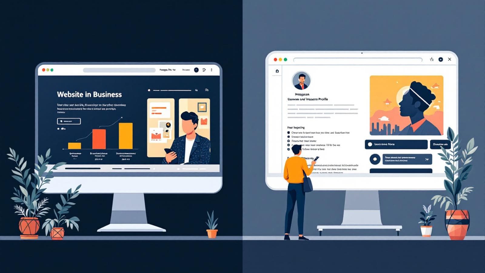
Instagram is not enough for Indian businesses in 2026. Discover the 5 commercial gaps Instagram can't fill and why a website still wins.
Mumbai website getting visitors but no enquiries? Discover the 6 CRO fixes — WhatsApp CTAs, GA4 tracking, and landing page formulas — that triple enquiry rates.
Most Mumbai businesses lose local customers due to avoidable Google Business Profile mistakes. Learn the 10 most common GBP errors and how to fix them.

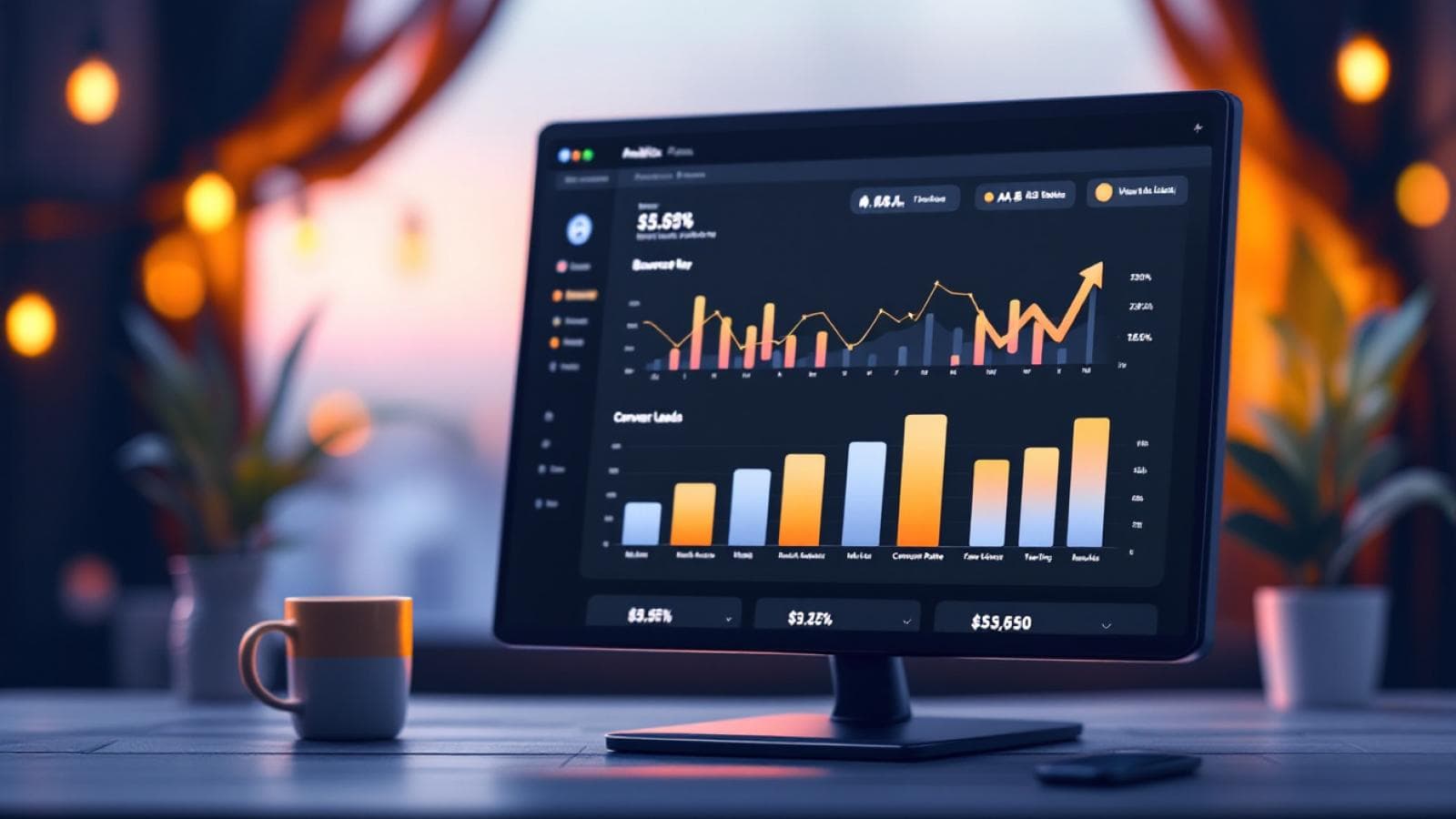
Your GA4 data hides your real buyers inside averages. These 5 audience segments separate Mumbai traffic, brand searches, and service-page visitors from the noise.

Interior designers in Mumbai need more than a pretty portfolio. Learn how strategic web design converts browsers into high-value enquiries.