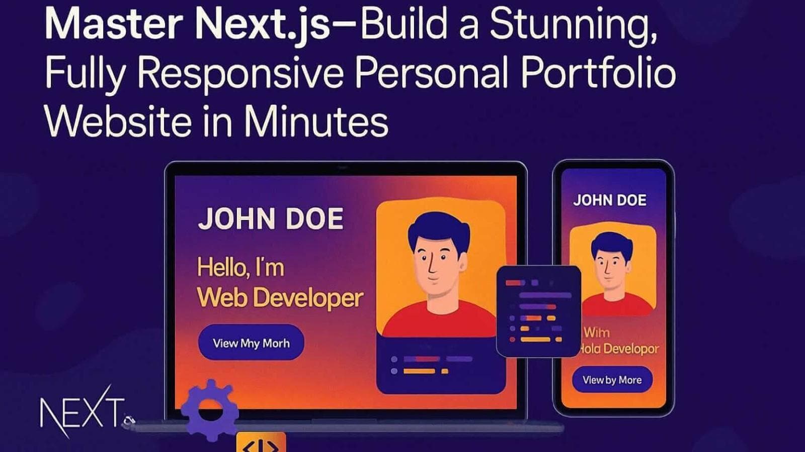
Master Next.js- Build a Stunning, Fully Responsive Personal Portfolio Website in Minutes
In today’s digital-first world, a strong online presence is non-negotiable—especially for developers. A well-designed personal portfolio website doesn’t just showcase your projects; it acts as a dynamic resume, a personal brand, and a growth engine for your career. Whether you're hunting for your next big opportunity or building a freelance business, mastering the art of creating a powerful portfolio is essential.
Enter Next.js, one of the most powerful JavaScript frameworks for modern web development. Thanks to its incredible flexibility, server-side rendering capabilities, and developer-friendly structure, you can now build a stunning, fully responsive personal portfolio website in minutes. In this article, we'll walk you through how to achieve this quickly and efficiently, referencing an excellent web development tutorial that outlines every step—from ideation to deployment.
Get ready to create stunning websites, increase your web presence, and master frontend development principles along the way!
Why Choose Next.js for Your Developer Portfolio?
Before we dive into the step-by-step, let’s talk about why Next.js is a game-changer for building personal portfolios:
- SEO Optimization: With server-side rendering (SSR) and static site generation (SSG), Next.js dramatically boosts your site's visibility.
- Performance: Lightning-fast loading times keep users engaged and improve SEO rankings.
- Flexibility: Build everything from minimalist portfolios to complex, animated masterpieces.
- Developer Experience: Seamless integration with modern libraries like Tailwind CSS and Framer Motion speeds up your workflow without sacrificing quality.
In short, Next.js empowers you to build professional portfolios faster and better, aligning with modern web design best practices and user experience design principles.
An Overview of the Tutorial: Build and Deploy a Modern Next.js Developer Portfolio
The YouTube video tutorial we’re highlighting does a phenomenal job at breaking down the process of building an engaging, responsive developer portfolio using Next.js. The creator doesn’t just skim the surface—they deep-dive into important elements like dynamic hero sections, animated Bento grid layouts, and SEO for portfolios.
Some standout features showcased:
- Seamless Animations: Crafted using Framer Motion for beautiful page transitions.
- Responsive Design: Perfectly tuned layouts for mobile, tablet, and desktop views.
- Dynamic Content: Personalized sections like project showcases, work experiences, and client testimonials.
- Bento Grids: A fresh design layout for showcasing skills and work creatively.
The tutorial even includes a free open-source codebase and custom Figma design files to help customize your site effortlessly. You’ll walk away knowing how to build a portfolio in minutes—and with resources to keep iterating.
What You'll Learn: Features & Implementation Walkthrough
Here’s what you can expect to master:
1. Personal Introductions and Hero Sections
Learn how to build an eye-catching hero section that immediately grabs attention using minimalistic design and fluid animations. You’ll weave in a personal touch, branding your portfolio as uniquely yours.
2. Project Showcases
Highlight your Next.js projects with beautifully designed cards, grids, or carousels. Display tech stacks, project timelines, and case study links for deeper exploration.
3. Incorporating Testimonials and Work Experience
Adding real-world testimonials increases credibility. The tutorial teaches you to create stylish, animated testimonial components using Tailwind CSS and Framer Motion.
4. Performance Optimization and SEO
Get hands-on experience optimizing performance with server-side rendering, code-splitting, and SEO-focused meta tags—key factors in increasing your web presence.
5. Error Monitoring with Sentry
Learn to integrate Sentry, a world-class error tracking tool, to monitor user interactions, spot issues early, and continuously improve your site.
Branding and Hosting: Make Your Mark
A beautiful portfolio deserves a branded home. The tutorial walks through hosting options—like Hostinger—which offers affordable plans tailored for developers. You'll also learn how to:
- Set up custom domains (e.g., yourname.dev).
- Deploy seamlessly through Vercel or Hostinger.
- Configure SSL for security and credibility.
Strong branding and consistent hosting ensure your developer portfolio tips turn into tangible results, making you stand out in the sea of talent.
Step-by-Step Guide: Building Your Next.js Portfolio
Here’s the meticulous process outlined:
Setting Up the Environment
- Install Visual Studio Code.
- Initialize a Next.js app with:
npx create-next-app@latest your-portfolio - Install Tailwind CSS and Framer Motion libraries.
Designing and Developing Components
Of course! Here’s a detailed version for the section "Designing and Developing Components" you requested — with a clean, technical-but-accessible tone:
Designing and Developing Components
One of the most powerful aspects of building a personal portfolio website with Next.js is its modular architecture. Rather than creating one giant file, you'll break your website into reusable, maintainable components, each serving a specific purpose. This modular approach follows frontend development best practices and ensures that your portfolio remains scalable, easy to update, and visually coherent.
Let's walk through each core section you'll design and develop:
1. Hero Section
The hero section is your website’s first impression—make it unforgettable. It should immediately convey who you are, what you do, and invite visitors to explore further.
Key Elements to include:
- A headline introducing yourself (e.g., "Hi, I’m Alex — Frontend Developer & Designer").
- A short, compelling tagline describing your expertise.
- A call-to-action button (e.g., "View Projects" or "Contact Me").
- A stylish profile image or a creative illustration.
- Optional: Dynamic background effects or micro-animations to catch the eye.
Enhancements with Framer Motion: Use Framer Motion to add subtle fade-ins or slide-in animations as the page loads. Example:
<motion.div
  initial={{ opacity: 0, y: -50 }}
  animate={{ opacity: 1, y: 0 }}
  transition={{ duration: 0.6 }}
>
  <h1>Hello, I'm Alex</h1>
</motion.div>
This simple animation gives your hero section a polished, lively feel without overwhelming the user.
2. About Section
The About section gives visitors a deeper look at your background, philosophy, and journey as a developer.
Key Elements to include:
- A short bio written in a personal yet professional tone.
- A summary of skills and technical proficiencies (e.g., JavaScript, Next.js, React, Tailwind CSS).
- Personal hobbies or passions (optional, but great for humanizing your profile).
Enhancements with Framer Motion: Use staggered animations for different text blocks or skill lists to guide the reader’s eyes naturally down the page. You can animate each list item or paragraph sequentially for a flowing experience.
3. Projects Section
Your Projects section is arguably the most critical part of your portfolio. It showcases your ability to solve real-world problems with code and design.
Key Elements to include:
- Project title and thumbnail image.
- Brief project description (problem + solution).
- Tech stack used.
- Live demo link and GitHub repository link.
Best Practices:
- Use cards or Bento grid layouts to organize projects neatly.
- Prioritize responsiveness: make sure your project cards resize gracefully across mobile, tablet, and desktop.
- Highlight your role clearly if you collaborated with a team.
Enhancements with Framer Motion: Add hover effects and animated entrances:
<motion.div whileHover={{ scale: 1.05 }}>
  <ProjectCard />
</motion.div>
This creates an engaging, interactive experience that feels modern and intuitive.
4. Testimonials Section
Incorporating client testimonials or peer endorsements builds instant credibility and trust.
Key Elements to include:
- A short quote praising your work ethic, communication, or technical skills.
- Name and designation of the person giving the testimonial (with their permission).
- Optional: small profile picture or logo of their company.
Design Tips:
- Keep the design light and airy, so testimonials don’t overpower the portfolio.
- Use a carousel slider or animated card flip if you have multiple testimonials.
Enhancements with Framer Motion: Use a gentle fade-in or scroll-triggered animations to reveal testimonials as the user navigates. This approach ensures that testimonials feel integrated into the journey rather than intrusive.
5. Footer Section
The footer is the final touch of your personal brand. It's your chance to leave a lasting impression.
Key Elements to include:
- Your name and a short inspirational quote or tagline.
- Important links (Home, Projects, Contact, Resume).
- Social media icons (LinkedIn, GitHub, Twitter, etc.).
- Copyright notice.
Enhancements with Framer Motion: Add a subtle upward entrance animation or a delayed fade-in to the footer elements for a polished closing effect.
Component Structure Example
In your Next.js project, the structure might look something like this:
/components
  ├── HeroSection.jsx
  ├── AboutSection.jsx
  ├── ProjectsSection.jsx
  ├── TestimonialsSection.jsx
  └── FooterSection.jsx
Each component will:
- Be fully responsive (using Tailwind CSS utilities).
- Be animated smoothly with Framer Motion.
- Import cleanly into your Next.js page templates (
index.js,about.js, etc.).
Why Modular Design and Animation Matter
- Maintainability: Updating a single component doesn’t break your whole site.
- Performance: Smaller, focused components load faster, improving Core Web Vitals.
- User Experience Design: Animations, when used sparingly and tastefully, enhance user flow, guide attention, and boost engagement.
By combining thoughtful modular design with elegant motion effects, you’ll build a developer portfolio that feels alive, professional, and genuinely impressive to visitors.
Styling the Layout
Of course! Here's the detailed version for your "Styling the Layout" section, keeping it aligned with the technical-but-accessible tone:
Styling the Layout
Once your portfolio components are designed and developed, the next crucial step is styling the layout.
Great design isn’t just about aesthetics—it’s about user experience, clarity, and accessibility across every device your visitors might use.
In this section, we’ll focus on how to apply responsive design principles using Tailwind CSS and craft layouts that feel natural, inviting, and professional no matter where they’re viewed—from smartphones to ultra-wide monitors.
Apply Responsive Design Principles Using Tailwind CSS
Responsive design ensures that your website adapts gracefully to different screen sizes and device orientations without losing its structure, functionality, or appeal.
Thanks to Tailwind CSS, implementing responsiveness becomes not just easier—but almost second nature.
Here’s how you should approach it:
1. Mobile-First Approach
Tailwind is mobile-first by default.
This means your base styles are automatically optimized for smaller screens, and you can progressively layer enhancements for larger devices.
✅ Example:
<h1 className="text-3xl md:text-5xl lg:text-6xl font-bold">
  Hello, I'm Alex
</h1>
text-3xl: default size (mobile)md:text-5xl: medium screens (tablets)lg:text-6xl: large screens (laptops/desktops)
Tip: Always start with mobile sizing first, then scale up with responsive prefixes (sm:, md:, lg:, xl:, 2xl:).
2. Use Tailwind’s Grid and Flex Utilities
Tailwind provides powerful grid and flexbox utilities that let you quickly set up adaptive layouts.
✅ Example for a Projects Section:
<div className="grid grid-cols-1 sm:grid-cols-2 lg:grid-cols-3 gap-8">
  {/* Project Cards */}
</div>
grid-cols-1: single column on mobilesm:grid-cols-2: two columns on tabletslg:grid-cols-3: three columns on larger desktops
This approach ensures that no matter the device size, your project cards adjust elegantly without the need for custom media queries.
3. Responsive Spacing
Proper spacing between elements is critical for readability and visual balance. Tailwind makes it easy to adjust margins (m-), padding (p-), and gaps (gap-) responsively.
✅ Example for Section Padding:
<section className="px-4 md:px-12 lg:px-24 py-10">
  {/* Content */}
</section>
px-4: padding on mobilemd:px-12: larger padding for tabletslg:px-24: even more generous spacing for desktops
Good spacing ensures that your layout breathes and feels welcoming, not cramped.
4. Typography That Scales
Readable, well-scaled text is a cornerstone of good design. Tailwind’s responsive typography utilities help you adjust font sizes for different devices easily.
✅ Example for Paragraph Text:
<p className="text-base md:text-lg lg:text-xl text-gray-700">
  I'm a frontend developer passionate about creating beautiful web experiences.
</p>
This technique ensures that body text remains readable on a phone while looking polished on a desktop.
5. Visibility Controls
Sometimes you may want to show or hide certain elements depending on the device.
✅ Example:
<div className="hidden md:block">
  {/* This element is hidden on mobile, visible on tablet/desktop */}
</div>
hidden: hides by defaultmd:block: displays as a block on medium screens and larger
This is especially useful for things like large images, complex animations, or extra sidebar information that could clutter a small screen.
Craft Layouts That Feel Natural and Inviting Across All Devices
Now that you know how to apply Tailwind’s responsive tools, let's talk about design strategy.
You want users to feel comfortable exploring your portfolio no matter the device. Here’s how you achieve that:
1. Hierarchical Visual Flow
Use size, weight, and spacing to naturally guide the user’s eyes through the page:
- Big, bold headlines draw attention first.
- Short paragraphs help keep content digestible.
- Clear calls-to-action (buttons) make navigation intuitive.
✅ Structure each page like an engaging story: Hero ➔ About ➔ Projects ➔ Testimonials ➔ Contact/Footer
2. Consistency Across Pages
Maintain consistent:
- Padding and margins
- Color palette
- Button styles
- Card layouts
Consistency builds trust, enhances memorability, and avoids jarring visual experiences.
✅ Pro Tip: Create shared Tailwind utility classes or use Tailwind’s @apply directive inside a CSS file if you find yourself repeating the same styles across components.
3. Touch-Friendly Interactions
On smaller screens, users interact by tapping, not clicking.
Make sure:
- Buttons have enough padding (
px-6 py-3feels good). - Interactive elements like carousels or links aren’t too small.
- Links and buttons are spaced far enough apart for “fat finger” usability.
4. Optimize for Performance
Fast sites = happy users.
- Optimize your images (Next.js makes it easy with its
<Image />component). - Avoid excessive animations on mobile.
- Keep page sizes light by lazy-loading non-critical assets.
Tailwind’s utility-first approach, combined with Next.js optimizations like image optimization and static generation, ensures top-tier performance without extra complexity.
Styling your personal portfolio website with Tailwind CSS and responsive design principles means:
- Building layouts that scale beautifully from phone to desktop.
- Designing experiences that feel intuitive and inviting.
- Keeping your visual identity consistent, clean, and professional.
By embracing these practices, you'll create stunning websites that not only impress visitors but also showcase your attention to detail—a crucial skill every employer and client values highly in today's competitive frontend development landscape.
Adding Interactivity
- Use dynamic routing in Next.js to make your projects clickable.
- Integrate hover animations and scroll effects to make the experience lively.
Enhancing User Experience
- Optimize page load speeds through lazy loading.
- Structure content thoughtfully, ensuring readability and intuitive navigation.
Personalization: Making It Truly Yours
Don't settle for cookie-cutter templates! The tutorial emphasizes customizing:
- Typography: Select fonts that match your brand voice.
- Color Palette: Set yourself apart with a memorable color scheme.
- Animations: Tailor motion speeds and effects to fit your style.
- Testimonials: Include personalized quotes from past collaborators or clients.
Remember, personalization amplifies your individuality, making your portfolio a true reflection of your journey.
Deployment: Go Live with Confidence
The final section covers deploying your masterpiece:
- Push the codebase to GitHub.
- Connect the repository to Vercel (for automatic deployments) or manually configure through Hostinger for customized hosting solutions.
- Test on various devices ensuring a consistent user experience design.
- Monitor using Sentry and gather real-time feedback to iterate quickly.
A mobile-friendly, fast-loading site is critical to solidify positive associations with visitors—and Next.js makes this almost effortless.
Conclusion: Mastering Next.js for Portfolio Excellence
Building a fully responsive personal portfolio website no longer has to be overwhelming. With tools like Next.js, Tailwind CSS, Framer Motion, and resources like detailed web development tutorials, creating stunning websites becomes not just possible—but exciting.
You’ve seen how you can:
- Build beautiful Next.js projects from scratch.
- Follow web design best practices for a better user experience.
- Integrate SEO strategies and error monitoring tools.
- Customize open-source portfolio website templates effortlessly.
It’s time to leverage these incredible tools and start crafting a portfolio that increases your web presence, impresses employers and clients, and showcases your true potential in the dynamic world of frontend development.
Take your first step today. Your dream opportunities are just a stunning portfolio away.
If you'd like, I can also create a shorter LinkedIn version or SEO meta description for this blog post!
Would you like that too? 🚀