How To Build A High-converting Checkout Process For Startups
How to Build a High-Converting Checkout Process for Startups: A Step-by-Step Guide
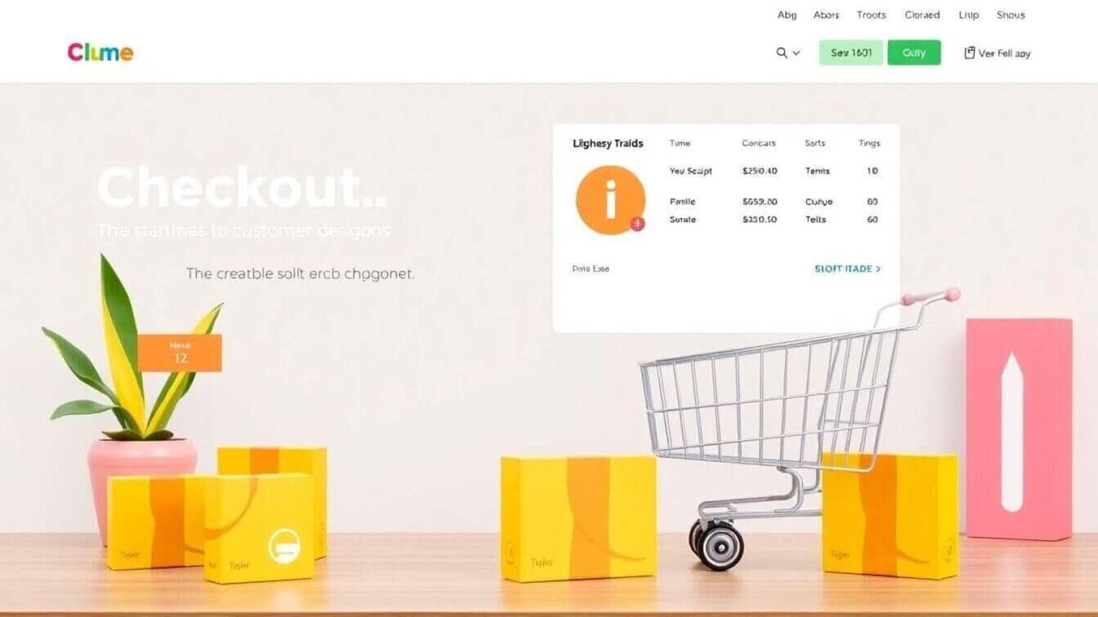
When it comes to running a successful eCommerce startup, nailing your checkout process is like finding the perfect playlist for a party—it sets the vibe and keeps everyone engaged. A high-converting checkout isn’t just a nice-to-have; it’s your golden ticket to turning casual browsers into loyal customers. Let’s dive into how you can create an optimized, seamless checkout experience that makes your customers say, "Take my money!"
1. The First Impression Matters: Keep It Simple, Silly!
Imagine walking into a beautifully curated store where every item is neatly displayed, and you instantly know where to find what you’re looking for. That’s the vibe your checkout process should give—a clean, intuitive experience that sparks joy and builds trust.
Why Keeping It Simple Works
A cluttered checkout page can overwhelm and confuse your customers, leading to cart abandonment. Simplicity isn’t just about aesthetics—it’s about functionality and user experience. Customers want to complete their purchase quickly and without fuss. If the process is too complicated or visually chaotic, they’re more likely to abandon the cart, leaving you with lost sales.
Key Takeaways
-
Single-Column Layout for Clarity:
A single-column layout helps guide your customers through the checkout process step by step. It eliminates the confusion of multiple options competing for attention and ensures users focus on the task at hand—completing their purchase.- Why it works: It mimics natural reading patterns, making it easier for users to follow.
- Pro Tip: Arrange the checkout steps in logical order—Shipping Info → Billing Info → Payment → Review & Submit.
-
Consistent Design with Website Theme:
Your checkout page should feel like an extension of your website, not a completely different platform. Consistency in colors, fonts, and design elements reassures customers they’re still on your site, building trust.- Example: If your website uses a minimalistic white-and-gray palette, don’t surprise users with a neon-colored checkout page.
- How to achieve this: Use the same header, footer, and branding as your main website.
-
Limit Distractions:
Distractions are the enemy of conversion. Avoid banners, pop-ups, or unrelated links during checkout. These can sidetrack your customer or even make them second-guess their decision to buy.- What to remove: Social media links, promotional banners, or unrelated CTAs like "Sign up for our newsletter."
- What to keep: Clear navigation to cart and checkout support options, like live chat or FAQs.
An Example to Follow: Apple’s Checkout Process
Apple’s checkout design is often hailed as the gold standard for simplicity and effectiveness.
- Why it works:
- Clean and minimal design.
- Easy navigation with clear progress indicators.
- No unnecessary distractions or clutter.
When customers shop with Apple, they know exactly where they are in the checkout process and what’s expected of them. This reduces decision fatigue and makes the process feel effortless.
How Prateeksha Web Design Can Help
At Prateeksha Web Design, we excel in crafting intuitive eCommerce checkout designs tailored to your business needs. We take the time to understand your brand and audience, ensuring the checkout experience is seamless, visually appealing, and user-friendly.
- Our Approach:
- Evaluate your current checkout process for pain points.
- Redesign with simplicity and clarity in mind.
- Test and refine the design for maximum conversions.
If your checkout feels more like a maze than a smooth pathway, let us simplify it for you!
2. Don’t Make Me Sign Up (Right Away)
Imagine this: You’re standing at a coffee shop counter, cash in hand, ready to pay. Suddenly, the barista says, “Before I serve you, sign up for our loyalty program.” Annoying, right? That’s exactly how customers feel when they’re forced to create an account before checking out.
Why It’s a Buzzkill
Forcing account creation at checkout creates an extra barrier between the customer and completing their purchase. This added friction often leads to cart abandonment, especially for first-time buyers who aren’t ready to commit to your brand.
The Guest Checkout Advantage
Allowing customers to checkout as a guest is a win-win:
- Reduces Friction: Customers can complete their purchase without extra steps.
- Increases Conversions: The fewer hurdles, the more likely they are to finish the process.
Pro Tip: Use their email address during checkout to capture their information for future marketing, even if they check out as a guest.
After Purchase: Incentivize Account Creation
Once the purchase is complete, politely invite the customer to create an account with a little incentive.
- Example Incentives:
- “Sign up now to track your orders and enjoy faster checkout next time!”
- “Create an account and get 10% off your next purchase!”
This approach gives them a reason to stick around without pressuring them.
3. Autofill Is Your Best Friend
Let’s be honest—no one enjoys typing their address or credit card details every time they shop online. It’s tedious and feels like homework. That’s where autofill comes to the rescue, turning a potentially frustrating process into a breeze.
Why Autofill Features Matter
Autofill eliminates unnecessary friction, saving your customers time and reducing the chances of cart abandonment. A smooth checkout process makes it easier for users to hit that “Place Order” button without second-guessing.
Key Features to Include
-
Address Auto-Completion:
Use tools like Google Places API to auto-complete addresses as customers type. This not only saves time but also reduces errors in shipping information.- Why It’s Great: Customers can quickly select their address from a dropdown instead of typing it all out.
-
Card Detail Autofill for Returning Customers:
For loyal customers, store encrypted card details securely and enable them to checkout with a single click.- Example: Many Shopify stores integrate this feature through platforms like Stripe or PayPal, ensuring fast, repeat purchases.
-
Real-Time Error Validation:
Flag errors immediately if a user misses a required field or inputs invalid data. For example:- If someone forgets to enter the zip code, highlight the field with a helpful message like, “Please enter a valid zip code.”
How Prateeksha Web Design Can Help
We’re experts at integrating advanced autofill features that speed up checkout times while ensuring data security. Whether it’s implementing Google Pay, Apple Pay, or custom solutions, we make sure your checkout process is as fast and frictionless as possible.
4. Optimize for Mobile: Your Customers Are Shopping on the Go
Picture this: A customer is on their phone during a lunch break, browsing your store, and decides to buy something. They get to the checkout page, and—uh-oh—it’s a desktop-first disaster. Pinch-zooming, slow loading, and tiny buttons drive them away. Don’t let this happen to your store.
Why Mobile Optimization Is Critical
Mobile users now dominate eCommerce, with over 70% of traffic coming from smartphones. If your checkout isn’t optimized for mobile, you’re alienating a massive chunk of your audience.
Must-Haves for Mobile Checkout
-
Large, Tappable Buttons:
Tiny buttons on mobile screens are a no-go. Make sure your buttons are big enough to tap easily, even for people with large fingers.- Pro Tip: Use a contrasting color for the “Place Order” button to make it stand out.
-
Responsive Design:
A responsive layout ensures your checkout adapts to any screen size, whether it’s a phone, tablet, or desktop.- Why It’s Important: Customers shouldn’t have to zoom in or scroll sideways to fill out a form.
-
Minimal Scrolling Required:
Design your checkout flow so everything fits neatly on the screen. Break long forms into steps, using a progress bar (see the next section!) to guide users.
Example: Shopify Mobile Checkout
Shopify’s mobile-first design philosophy ensures its stores are fast, responsive, and easy to navigate on any device. From large buttons to simplified forms, Shopify nails mobile optimization, and we can help you do the same.
How Prateeksha Web Design Can Help
At Prateeksha Web Design, we create mobile-optimized checkout experiences that are fast, user-friendly, and visually appealing. Whether your customers are shopping on the couch or on the go, we ensure their experience is seamless and satisfying.
5. The Power of Progress Indicators
Ever waited in line at a theme park with no idea how much longer it’ll take to get on the ride? Frustrating, right? That’s exactly how customers feel during a checkout process without progress indicators.
Why Progress Indicators Matter
Progress indicators reassure users by showing them where they are in the checkout process and what’s left to do. This sense of direction reduces anxiety and motivates them to complete the process.
How to Use Progress Indicators Effectively
-
Break the Checkout into Steps:
Divide your checkout into clear, manageable steps, such as:- Step 1: Cart Review
- Step 2: Shipping Details
- Step 3: Payment
- Step 4: Order Confirmation
-
Visual Representation:
Use a progress bar at the top of the page with clear labels for each step. Highlight the current step, so users know exactly where they are. -
Keep It Short:
A lengthy checkout process can deter users. Aim for a 3-4 step process, focusing only on essential information.
Example: Amazon’s Checkout Flow
Amazon uses a simple yet effective progress indicator to show the steps:
- Shipping Address
- Payment Information
- Place Your Order
This clear structure builds confidence and keeps users engaged.
6. Multiple Payment Options = More Sales
Imagine walking into a store, ready to buy your favorite gadget, only to find out they only accept cash. Frustrating, right? That’s how online customers feel when they don’t see their preferred payment method at checkout. Offering multiple payment options is no longer a luxury—it’s a necessity.
Why It Matters
People have different preferences when it comes to payments, influenced by convenience, security, or even geography. By providing a range of payment methods, you can:
- Increase Conversion Rates: Customers are more likely to complete their purchase if their favorite payment method is available.
- Expand Your Customer Base: Catering to international customers or those using newer payment methods can open new markets.
- Build Trust: Offering trusted payment gateways reassures customers that their transactions are secure.
Must-Have Payment Methods
-
Credit/Debit Cards:
The backbone of online transactions, these are a must-have for any eCommerce store. Make sure your gateway supports all major card providers (Visa, MasterCard, American Express). -
PayPal:
PayPal remains one of the most trusted and widely used payment platforms, especially for international shoppers. It offers an added layer of security, which many customers appreciate. -
Apple Pay and Google Pay:
Digital wallets like these are gaining popularity for their speed and convenience. They allow users to pay with a single tap, making them perfect for mobile-first shoppers. -
Buy Now, Pay Later (BNPL):
Services like Afterpay, Klarna, and Affirm have revolutionized online shopping by letting customers pay in installments. These options are especially appealing to younger audiences and those purchasing higher-ticket items.
Seamless Integration
Ensure all payment methods are integrated smoothly into your checkout process.
- Pro Tip: Clearly display the available options on the product page and at checkout to avoid surprises.
- Example: Shopify makes it easy to integrate multiple payment gateways like Stripe, PayPal, and BNPL options directly into your store.
How Prateeksha Web Design Can Help
We specialize in integrating multiple payment gateways to create a seamless payment experience. Whether you want to implement the latest digital wallets or cater to international customers with alternative methods, we’ve got the expertise to make it happen.
7. Secure Your Customers’ Trust
Would you hand over your wallet to a stranger on the street? Probably not. Similarly, online shoppers are wary of entering their payment details unless they trust your site. Building trust through visible security measures is essential for a high-converting checkout process.
Why Trust Matters in Checkout
Cybersecurity concerns are at an all-time high, and customers want assurance that their sensitive information is safe. By showcasing security features, you can:
- Boost Confidence: Customers are more likely to complete purchases when they see signs of security.
- Reduce Abandonment: Trust badges and clear policies address common fears about fraud or scams.
What to Showcase
-
SSL Certificates:
An SSL certificate encrypts data exchanged between your website and your customers, ensuring it’s safe from prying eyes.- Visible Cue: A padlock icon in the browser address bar signals a secure connection.
-
Trust Seals:
Add badges from reputable security providers like Norton, McAfee, or TRUSTe.- Pro Tip: Place these badges near the payment form or “Place Order” button for maximum visibility.
-
Transparent Policies:
Display clear refund, return, and privacy policies. Transparency builds credibility and reassures customers that they can shop with confidence.
8. Speed Up the Checkout Process
In the world of eCommerce, speed isn’t just a nice-to-have; it’s a must-have. A slow checkout process is the ultimate buzzkill, turning eager buyers into frustrated abandoners. Think of your checkout process as the express lane at a supermarket—fast, efficient, and frustration-free.
Why Speed Matters
Studies show that a delay of just one second in page load time can reduce conversions by 7%. Online shoppers are impatient, and if your checkout takes too long, they’re likely to bail.
Quick Fixes to Speed Things Up
-
Enable One-Click Checkout for Returning Customers:
For loyal customers, make reordering as easy as clicking a single button.- Why It Works: Amazon’s "Buy Now" button is a prime example of how one-click checkout boosts conversions.
-
Compress Images and Optimize Loading Time:
Large, uncompressed images can slow down your site. Use tools like TinyPNG to compress images without compromising quality.- Pro Tip: Implement lazy loading to ensure only the visible elements load first, speeding up the checkout process.
-
Reduce the Number of Fields in Your Checkout Form:
Each additional field increases the time it takes for customers to complete their purchase.- Streamline Your Form:
- Combine "First Name" and "Last Name" into a single field.
- Use dropdown menus for predictable inputs like country or state.
- Streamline Your Form:
At Prateeksha Web Design, we know how to balance speed and functionality. We’ll help you create a lightning-fast checkout process that keeps customers coming back for more.
9. Offer Clear Shipping Information
Imagine finding the perfect product, adding it to your cart, and then discovering exorbitant shipping costs at the last minute. Instant deal-breaker! Clear, upfront shipping information can prevent this and boost conversions.
Why Transparency Is Key
Hidden shipping costs are one of the leading causes of cart abandonment. By providing clear and detailed shipping information upfront, you:
- Build trust with your customers.
- Set accurate expectations for delivery times and costs.
Best Practices for Clear Shipping Information
-
Real-Time Shipping Calculators:
Let customers see shipping costs based on their location before they even reach the checkout page.- Example: Shopify integrates with real-time shipping APIs to calculate accurate costs.
-
Delivery Estimates:
Provide a clear timeline for delivery (e.g., "3-5 business days"). Customers love knowing when they’ll receive their order. -
Free Shipping Thresholds:
Encourage larger orders by offering free shipping on purchases over a certain amount.- Example: “Free shipping on orders over ₹500!”
How Prateeksha Web Design Can Help
We can integrate real-time shipping calculators, set up transparent delivery timelines, and highlight free shipping offers to keep your customers informed and happy.
10. Test, Analyze, and Improve
Your checkout process isn’t a static feature—it’s a dynamic element that should evolve with customer preferences and technology. Testing and analyzing performance is how you stay ahead of the competition and keep your checkout process optimized.
Why Continuous Testing Is Essential
What works today might not work tomorrow. By regularly testing your checkout process, you can:
- Identify bottlenecks or areas where users drop off.
- Experiment with design elements to boost conversions.
- Stay responsive to customer feedback and behavior changes.
What to Test
-
Button Placements and Colors:
Placement and color can significantly impact conversions. Test whether customers respond better to “Place Order” in a prominent position or a different color scheme. -
Form Field Labels and Instructions:
Clear labels and instructions reduce confusion and errors. Test different wordings to see what works best. -
Call-to-Action Text:
Experiment with CTAs like “Place Order,” “Buy Now,” or “Complete Purchase” to see which drives more completions.
Tools for Testing and Analysis
- Google Analytics: Track user flow and identify where drop-offs happen.
- Hotjar: Visualize user behavior with heatmaps and session recordings.
- A/B Testing Platforms: Tools like Optimizely let you test variations of your checkout process to see which performs better.
Bonus Tips for High-Converting Checkout Processes
- Add a Personal Touch: A post-purchase "Thank You" message or a follow-up email goes a long way in building loyalty.
- Allow Easy Edits: Let customers modify their cart items directly from the checkout page.
- Showcase Social Proof: Highlight reviews or testimonials to boost confidence.
The Prateeksha Advantage
At Prateeksha Web Design, we’ve helped countless startups transform their checkout processes from clunky to high-converting. Whether it’s crafting a seamless mobile experience, integrating multiple payment options, or optimizing for speed, we’ve got you covered.
Your eCommerce checkout design isn’t just a technical necessity; it’s a strategic advantage. Let us help you turn it into your startup’s secret weapon.
Let’s Wrap It Up
Building a high-converting checkout process might sound like a Herculean task, but with the right strategies and a sprinkle of expertise, you’ll be cashing in on more sales in no time. Remember, the goal is to make it as easy as possible for your customers to say "yes."
What’s Next?
Ready to level up your checkout game? Reach out to Prateeksha Web Design today and let’s create a checkout experience that your customers (and your wallet) will love.
About Prateeksha Web Design
Prateeksha Web Design specializes in crafting tailored checkout processes that enhance user experience for startups. Our services include intuitive UI/UX design, streamlined payment integration, and responsive mobile optimization to reduce cart abandonment. We employ data-driven strategies to optimize conversion rates, ensuring that every step is designed for maximum engagement. Additionally, we provide A/B testing and analytics support to continuously refine the checkout process. Partner with us to turn your checkout into a powerful sales tool.
Interested in learning more? Contact us today.