How Minimalist Design Can Boost Your Ecommerce Startup's Success
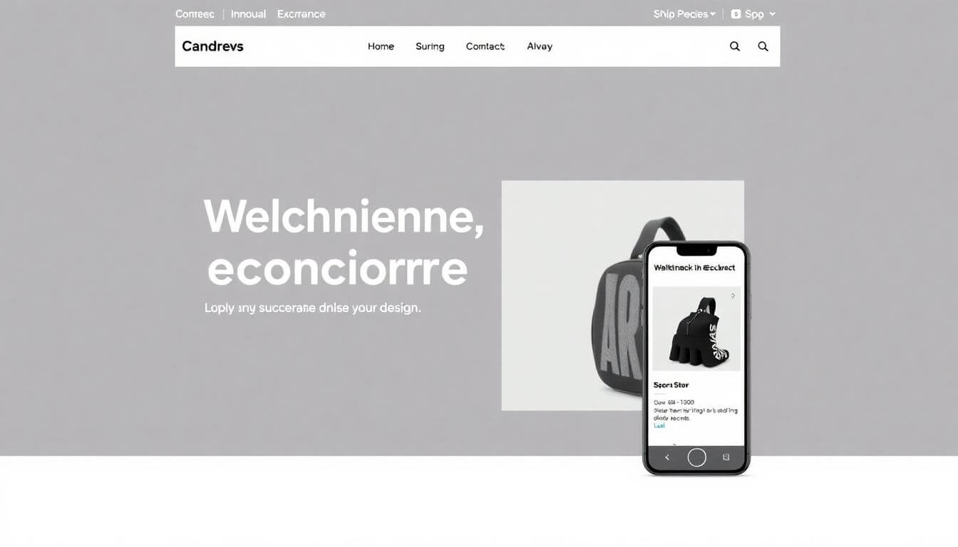
Starting an eCommerce business is like diving into a bustling market. Everyone is shouting about their products, waving their flashy signs, and vying for attention. So how do you stand out without screaming louder than everyone else? Enter minimalist eCommerce design—your secret weapon for cutting through the noise and delivering a sleek, unforgettable shopping experience.
But before we dive in, let’s clarify one thing: Minimalism isn’t about doing less; it’s about doing what matters most. It’s like Marie Kondo for your website—if it doesn’t spark joy (or conversions), it’s out!
Let’s explore how minimalist design can transform your eCommerce startup into a sleek, conversion-driven powerhouse.
1. First Impressions Matter—Make Yours Count
Let’s expand on why first impressions are crucial for your eCommerce startup and how minimalist design ensures you leave a lasting one.
The Psychology of First Impressions
Humans are visual creatures. Studies show that it takes just 50 milliseconds for users to form an opinion about your website. That’s less time than a blink! If your site is visually overwhelming or confusing, visitors are likely to bounce and never return.
Think of your website as a virtual storefront. If it’s cluttered or disorganized, people assume the same about your brand. On the other hand, a clean and well-structured site signals professionalism, trustworthiness, and a high-quality shopping experience.
Why Clutter Kills Conversions
When a website bombards visitors with too many options, it leads to decision fatigue. Imagine landing on a homepage with 10 pop-ups, flashing banners, and conflicting CTAs (Call-to-Actions). Instead of taking action, visitors freeze or leave.
Minimalist design tackles this problem by:
-
Focusing on One Goal per Page: Each page should guide visitors toward a single desired action. For instance, your homepage could highlight a limited-time sale, while product pages focus on "Add to Cart."
-
Creating Visual Hierarchy: Use clean layouts to draw attention to what matters most, such as product images, pricing, or CTAs. By eliminating unnecessary distractions, users naturally focus on the elements that drive conversions.
Highlighting What Matters
In minimalist eCommerce design, less is more. This approach allows you to highlight key elements effectively, such as:
- Hero Images: A stunning, full-width banner showcasing your star product or latest collection can immediately capture attention.
- Prominent CTAs: Whether it’s “Shop Now” or “Sign Up,” a clear, bold CTA placed strategically ensures visitors know their next step.
For example, Apple’s website often uses a minimalist design to emphasize its newest product. The homepage typically features a single product image with minimal text and a clear CTA like “Learn More” or “Buy Now.”
Building Trust Through Simplicity
A clutter-free design also builds credibility. A messy website can feel untrustworthy or outdated, making visitors hesitant to share personal information or complete a purchase.
Minimalist design instills confidence by:
- Showcasing Professionalism: Clean, modern designs give the impression that your business is serious and established.
- Improving Usability: Simplified layouts make it easier for users to navigate your site and find what they need.
Prateeksha Web Design: Your Partner in First Impressions
At Prateeksha Web Design, we specialize in crafting minimalist eCommerce designs that grab attention and convert visitors into customers. By focusing on clarity and purpose, we ensure your website serves as a warm welcome mat rather than a chaotic entrance.
Example in Action
Imagine you’re a startup selling eco-friendly skincare products. A minimalist homepage could feature:
- A hero image of your best-selling product with a soft green background.
- A tagline like “Glow Naturally. Sustainably.”
- A single, bold CTA: “Shop Our Collection.”
No clutter, no distractions—just a clear message and an easy path to take action.
2. Speed Is King—And Minimalism Is Fast
In the digital age, patience is a rare commodity. If your website takes more than a few seconds to load, you’re essentially handing customers over to your competitors. Minimalist design isn’t just about aesthetics—it’s also a performance powerhouse that keeps your website running like a well-oiled machine.
Why Website Speed Matters
Statistics don’t lie:
- 53% of users abandon a website that takes over 3 seconds to load.
- A 1-second delay in load time can reduce conversions by 7%.
Think about it: You wouldn’t wait at the door of a physical store if the clerk took ages to unlock it, right? The same applies to online shoppers. Every extra second of delay makes them more likely to leave, increasing your bounce rate and hurting your bottom line.
How Minimalist Design Boosts Speed
By design, minimalist websites are faster. Why? Because they’re built with fewer elements, smaller files, and a streamlined approach. Let’s break it down:
-
Reduced Visual Load: Minimalist websites avoid heavy, unnecessary graphics. Instead of multiple images or videos, they rely on one or two high-quality visuals that load quickly.
-
Efficient Code: Clean web design prioritizes optimized code with minimal scripts and styles. For example, using lightweight CSS frameworks like Tailwind can enhance your site’s performance.
-
Fewer Plugins and Features: Each plugin you add to your site is like adding weight to a backpack—it slows you down. Minimalist design sticks to the essentials, ensuring your site stays lightweight.
The Role of Image Optimization
Images are often the biggest culprits for slow load times. But with a minimalist approach, you can showcase stunning visuals without sacrificing speed.
Tips for Optimizing Images:
- Compress images using tools like TinyPNG or ImageOptim.
- Use modern formats like WebP, which provide high-quality visuals at smaller file sizes.
- Implement lazy loading, so images load only when they come into view.
At Prateeksha Web Design, we incorporate these techniques to ensure your site loads quickly, without compromising on visual appeal.
Lightweight Themes: A Minimalist’s Best Friend
Your website’s theme sets the foundation for performance. Heavy themes with bloated code can drastically slow your site down. A minimalist eCommerce design opts for lightweight themes that prioritize speed and functionality.
Examples of Lightweight Shopify Themes:
- Debut: Ideal for startups, with a clean and straightforward layout.
- Minimal: True to its name, this theme focuses on simplicity and speed.
How Speed Impacts SEO
It’s not just about keeping visitors happy—Google cares about speed too. Page load time is a critical factor in search engine rankings. A slow website can push you down in search results, making it harder for potential customers to find you.
Minimalist design ensures your website meets Core Web Vitals, Google’s benchmarks for user experience, which include:
- Largest Contentful Paint (LCP): Measures loading performance.
- First Input Delay (FID): Tracks interactivity.
- Cumulative Layout Shift (CLS): Ensures visual stability.
By achieving high scores in these areas, your site not only loads faster but also ranks higher.
Real-Life Example: Why Speed Matters
Imagine you’re running a startup that sells limited-edition sneakers. You’ve announced a flash sale on Instagram, and hundreds of users click the link to your site. If your website takes too long to load, those eager customers might leave before they even see your products.
Now, let’s say you have a minimalist website. It loads in under two seconds, guiding visitors seamlessly to the sale page. They add products to their cart without delay, and you see a spike in sales.
Prateeksha Web Design: Speed Meets Style
At Prateeksha Web Design, we blend clean web design trends with performance optimization to ensure your eCommerce website isn’t just stylish—it’s also lightning-fast. From optimizing image files to building custom lightweight themes, we ensure your site performs as beautifully as it looks.
3. Navigation: Simple and Intuitive
Navigating a website should feel as effortless as walking through an open door. If visitors can’t find what they’re looking for within seconds, they’ll leave—and likely won’t come back. This is where minimalist navigation saves the day by ensuring a seamless, frustration-free experience.
Why Minimalist Navigation Matters
Navigation is like the GPS for your website—it directs visitors to their destination. Overcomplicated menus and confusing layouts create roadblocks, leaving potential customers feeling lost.
Minimalist navigation simplifies the journey, helping visitors focus on what’s important. It’s particularly crucial for startups that need to build trust and keep users engaged from the moment they land on the site.
Key Features of Minimalist Navigation
-
Fewer Menu Options
The rule of thumb? Less is more. Instead of cramming ten categories into your menu, group related items into broader sections. For instance, an eCommerce fashion store could condense “T-shirts,” “Jeans,” and “Jackets” into a single “Clothing” category.
Why it works: It reduces decision fatigue and makes your site look organized. -
Sticky Menus
A sticky (or fixed) navigation bar stays visible as users scroll. This keeps essential links—like your product categories or shopping cart—within easy reach at all times.
Why it works: It’s like handing your visitors a map that they can reference anytime, ensuring they never feel lost. -
Search Bar Front and Center
For startups with a growing inventory, a prominent search bar is essential. Think of it as a shortcut that empowers users to find exactly what they need without hunting through multiple pages.
Why it works: Visitors save time, which translates into a better user experience—and higher conversions.
Examples of Minimalist Navigation in Action
- Apple: A few top-level categories like "Mac," "iPhone," and "Accessories," along with a prominent search icon, make navigating effortless.
- Warby Parker: Their site uses a sticky menu and simple dropdowns to help users explore their glasses collection without feeling overwhelmed.
How Prateeksha Web Design Simplifies Navigation
At Prateeksha Web Design, we focus on user behavior to create intuitive navigation systems. Whether it’s designing collapsible menus for mobile users or ensuring your search bar delivers fast, relevant results, we tailor the experience to your audience’s needs.
4. White Space Is Your Friend
White space isn’t just “empty space”—it’s a powerful design tool that elevates your website’s visual appeal and usability. Also known as negative space, it’s the area between elements like text, images, and buttons. When used effectively, white space can transform a cluttered layout into a clean, elegant design.
Why White Space Works
-
Enhances Readability
Large blocks of text are intimidating and hard to read. White space breaks content into digestible chunks, making it easier for visitors to skim and absorb key points. -
Draws Attention to Key Elements
Surrounding important elements—like a CTA or product image—with white space makes them stand out. It’s like putting a spotlight on what matters most. -
Creates a Sense of Elegance
Think of luxury brands like Chanel or Prada. Their websites use ample white space to convey sophistication and exclusivity. It’s proof that simplicity can exude class.
How to Use White Space Effectively
- Balance Text and Images: For every block of text, ensure there’s enough space around it to avoid visual clutter.
- Spacing Between Sections: Add padding between different sections to guide the user’s eye naturally down the page.
- Don’t Be Afraid of “Empty” Areas: Negative space doesn’t mean wasted space—it means breathing room for your design.
The Analogy: White Space as Silence Between Notes
Imagine listening to music with no pauses or rhythm—just continuous noise. Overwhelming, right? White space in design is like those silent moments between notes in music. It brings balance and harmony to the entire experience.
How Prateeksha Web Design Masters White Space
At Prateeksha Web Design, we believe that every pixel counts. Our design philosophy incorporates white space strategically, ensuring your website feels airy, inviting, and professional. From text alignment to image placement, we create layouts that prioritize clarity and elegance.
5. Colors and Fonts: Keep It Cohesive
Minimalist design doesn’t mean boring—it’s about balance. Use colors and fonts sparingly but strategically to evoke emotion and build your brand identity.
Tips for Choosing Colors:
- Stick to a neutral palette (think whites, greys, and soft pastels) with one or two accent colors for pop.
- Use color psychology to your advantage. For instance, blue conveys trust, while green signifies growth and eco-friendliness.
Font Matters Too:
- Go for clean, sans-serif fonts like Lato or Roboto.
- Maintain consistency across headings, subheadings, and body text.
Prateeksha Web Design can guide you in choosing a palette and typography that reflect your brand’s personality while staying on-trend with startup website design trends.
6. Mobile-First Design—It’s a Must
With over 55% of online shopping done on mobile devices, your website must be as stunning on a smartphone as it is on a desktop. Minimalist design lends itself beautifully to mobile-first principles:
- Responsive Layouts: Ensure your design adjusts seamlessly across all screen sizes.
- Touch-Friendly Elements: Buttons should be big enough to tap easily, and forms should be simple to fill.
At Prateeksha Web Design, we prioritize mobile optimization in every project, so your startup’s website isn’t just functional—it’s fabulous on any device.
7. Build Trust with Visual Hierarchy
Minimalism isn’t just about aesthetics; it’s a psychological game. By leveraging visual hierarchy, you can subtly guide visitors toward desired actions.
How to Nail Visual Hierarchy:
- Use large, bold headlines to grab attention.
- Place CTAs above the fold (the top part of your webpage visible without scrolling).
- Make important elements stand out with contrasting colors or sizes.
By building trust through intentional design, you not only attract visitors but also convert them into loyal customers.
8. Let Your Products Shine
In minimalist eCommerce design, your products are the stars of the show. Use high-quality images, clean layouts, and concise descriptions to let them take center stage.
Quick Tips:
- Opt for zoomable images so customers can inspect every detail.
- Keep descriptions short, engaging, and benefit-focused.
At Prateeksha Web Design, we create product pages that strike the perfect balance between simplicity and impact, ensuring your customers are hooked at first glance.
9. Keep Testing and Improving
Minimalist design is never “one and done.” Regularly test your site’s performance and tweak elements for maximum impact.
What to Test:
- CTA Placement: Does a button work better on the top right or bottom center?
- Product Images: Are lifestyle shots more engaging than plain backgrounds?
- Page Load Times: Speed matters—always.
We’re big fans of A/B testing at Prateeksha Web Design because it helps our clients uncover what truly resonates with their audience.
10. The Future Is Clean—Stay Ahead of Trends
Startup website design trends are moving toward simplicity, sustainability, and user-centric layouts. By adopting a minimalist approach, you future-proof your brand while appealing to a generation that values authenticity over flash.
At Prateeksha Web Design, we stay on top of these trends, ensuring your eCommerce startup isn’t just keeping up—it’s leading the pack.
Final Thoughts: Minimalism Equals Maximum Results
Minimalist eCommerce design isn’t just a trend; it’s a proven strategy for boosting user engagement, improving conversions, and building trust. By simplifying your website, you make it easier for customers to navigate, connect with your brand, and ultimately make a purchase.
So, what are you waiting for? Declutter your digital storefront, embrace clean web design, and watch your startup soar.
Need help getting started? Prateeksha Web Design is here to bring your minimalist vision to life. Contact us today, and let’s create a sleek, stunning website that sets your eCommerce startup apart.
About Prateeksha Web Design
Prateeksha Web Design specializes in creating sleek, user-friendly interfaces that enhance the shopping experience for ecommerce startups. By utilizing minimalist design principles, they ensure that key products and calls to action stand out, reducing clutter and improving navigation. Their tailored solutions focus on fast load times and mobile responsiveness, crucial for retaining customers. Additionally, they emphasize strategic use of white space, which highlights offerings and fosters an inviting atmosphere. Ultimately, Prateeksha aims to boost your online sales through intuitive and aesthetically pleasing design.
Interested in learning more? Contact us today.