
07.13.26
Ecommerce SEO Services in Mumbai: Getting Shopify & Custom Stores to Rank
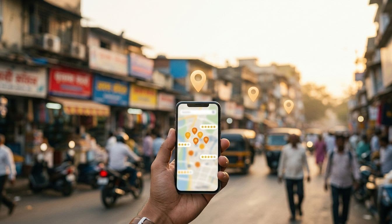
Ecommerce SEO services for Mumbai stores: product page SEO, category fixes, and Shopify vs custom store technical SEO that ranks.
Read articleJuly 13, 2026
Deep-dive articles on Shopify, Laravel, Next.js, AI automation, and conversion-focused web design—crafted to help you ship smarter, faster, and more profitable websites.
Stay ahead
No fluff—just practical breakdowns, examples, and playbooks from real client work.
Subscribe to the newsletterEcommerce SEO services for Mumbai stores: product page SEO, category fixes, and Shopify vs custom store technical SEO that ranks.

What makes Mumbai parents trust a school website enough to enquire — admissions clarity, fee transparency, faculty proof, and mobile usability.

How Indian B2B companies combine conversion websites with WhatsApp automation to slash response time and win more deals.

How Mumbai security agencies use PSARA credentials, coverage maps, and WhatsApp enquiry flows to win more corporate contracts.

What Mumbai architecture clients actually check before enquiring: portfolios, credentials, mobile speed, and easy contact paths.

The 8-point website maintenance checklist Mumbai businesses use to stop hacks, downtime, and lost enquiries before they happen.

How Mumbai businesses can get cited by ChatGPT, Perplexity & AI Overviews using FAQ schema, direct answers, and entity clarity.
Instagram is not enough for Indian businesses in 2026. Discover the 5 commercial gaps Instagram can't fill and why a website still wins.
Mumbai website getting visitors but no enquiries? Discover the 6 CRO fixes — WhatsApp CTAs, GA4 tracking, and landing page formulas — that triple enquiry rates.
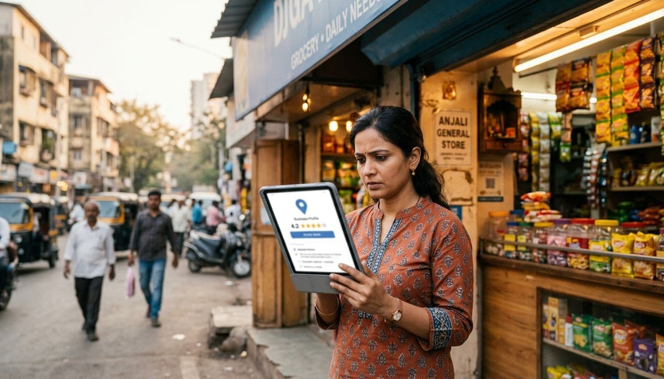
Most Mumbai businesses lose local customers due to avoidable Google Business Profile mistakes. Learn the 10 most common GBP errors and how to fix them.

Your GA4 data hides your real buyers inside averages. These 5 audience segments separate Mumbai traffic, brand searches, and service-page visitors from the noise.

Interior designers in Mumbai need more than a pretty portfolio. Learn how strategic web design converts browsers into high-value enquiries.

Core Web Vitals are Google speed signals that affect your ranking. Learn what LCP, INP, CLS mean, how to check scores, and what fixes cost in India.

Learn how the Website Growth Engine combines 6 components — landing pages, WhatsApp funnels, reviews, SEO, and GA4 — to triple leads for Mumbai businesses.
Five ready-to-use WhatsApp automation flows — lead qualification, follow-up, nurture, re-engagement, and review collection — built for Indian service businesses.
Local SEO helps Mumbai businesses appear when nearby customers search on Google. Learn the 3 pillars, realistic timelines, and how to get started in 2026.

Most Indian business websites have GA4 installed but track zero conversions. This step-by-step guide fixes that — form fills, WhatsApp clicks, and calls all tracked.

The free WhatsApp Business App handles basic enquiries. The API automates sequences and scales. Here is how to decide which your Indian business actually needs.

Honest INR breakdown of ecommerce website costs in India for 2026 — Shopify, WooCommerce, and custom builds compared with hidden costs revealed.

Your website may be losing customers in 3 seconds flat. Here are 9 hidden reasons why Indian business websites run slow — and exactly how to fix each one.

Most Mumbai websites are digital brochures — they look good but don't generate enquiries. Here's how to tell which one you have.

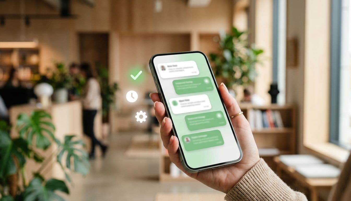
Indian mobile buyers abandon contact forms and go straight to WhatsApp. Here is the data — and how to use both channels to capture every enquiry.

GA4 reports feel like a foreign language until you know which 5 matter. This guide cuts through the jargon for Mumbai business owners who want results, not dashboards.

A WhatsApp funnel turns casual visitors into qualified leads automatically. Here is how Indian businesses use it to get 3x more enquiries.