Error Pages That Convert- Creative Ideas For Your Ecommerce Store
In the world of e-commerce, creating a seamless and enjoyable shopping experience for your customers is crucial to driving sales and building brand loyalty. However, no matter how well-designed your website is, you’ll occasionally encounter errors—most commonly the infamous 404 error page. Instead of letting this inevitable roadblock become a negative experience for your customers, why not turn it into an opportunity to enhance your store’s engagement? With a bit of creativity, your error pages can become a key element in improving your customer experience, building your brand identity, and even increasing conversions.
In this blog, we’ll delve into why it’s essential to focus on error pages for your e-commerce store and explore creative ideas that can help you design pages that not only inform but also convert. We’ll cover the latest best practices for 404 pages, strategies for what to say instead of 404, and the technology behind crafting error pages that support your store’s goals. At the end, we’ll highlight how Prateeksha Web Design can help small businesses implement these creative and effective strategies.
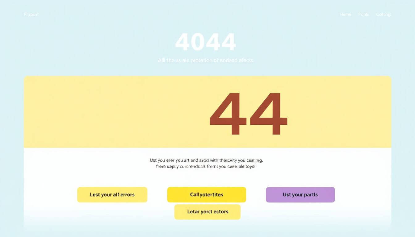
What is a 404 Page and Why Does it Matter?
To begin, let’s break down what a 404 error page is and why it matters for your e-commerce store. The 404 error occurs when a user tries to visit a page that doesn’t exist or has been removed. It’s a standard HTTP response code that indicates the server was unable to find the requested page.
While it’s easy to dismiss the 404 page as just a technical detail, it plays a much more significant role in your customers' journey. A poor 404 page can lead to frustration, increasing the likelihood that users will abandon your site. On the other hand, an effective and engaging 404 page can guide users back to the content they were looking for, helping them continue their shopping experience. Moreover, this page offers an opportunity to build brand personality and reinforce customer trust.
Key Reasons to Focus on Your 404 Page:
- First Impressions Matter: The 404 page might be the first interaction a visitor has with your brand after encountering an error. Make it count.
- Customer Retention: A well-designed 404 page can keep potential customers on your site and encourage them to explore other areas of your store.
- Brand Personality: Use the 404 page to reinforce your brand’s voice and identity. A lighthearted or witty tone can turn a negative experience into a positive one.
- Conversion Opportunity: Rather than simply informing the user that the page doesn't exist, you can guide them toward other products, offers, or even a site search, keeping the conversion funnel intact.
What to Say Instead of 404 for E-commerce Stores
Instead of simply displaying the generic "404 – Page Not Found" message, consider offering something more tailored to your brand and customer base. This is an opportunity to align your 404 page with your store's voice and customer expectations.
Ideas for What to Say Instead of 404:
- "Oops, something went wrong!": A casual and friendly approach that invites users to explore your site further.
- "We couldn’t find the page you were looking for. How about checking out our latest products?": This encourages users to browse other areas of your site, possibly leading them to make a purchase.
- "This page has gone on vacation. Check out what’s trending!": Adding humor can ease the frustration of encountering an error and keep the experience light-hearted.
- "Page not found, but we have plenty more to explore. Here’s what’s hot right now!": Directly guide customers to popular or recommended products, thus keeping them engaged.
Remember, the goal is to reduce user frustration and help them continue their shopping journey. Think about your target audience and speak to them in a way that resonates with their expectations and preferences.
Best Practices for Designing 404 Pages That Convert
Now that we’ve covered what to say instead of 404, let’s dive into the best practices for designing 404 pages that will not only inform users but also convert them into customers.
1. Provide a Clear Path Back to Shopping
One of the main goals of a 404 page is to ensure the user doesn’t leave your website frustrated. To achieve this, it’s important to direct them back to your store’s main content. Here are a few ideas for guiding your visitors:
- Add Navigation Links: Including a search bar, category links, or clear links to popular products will help users quickly find what they’re looking for.
- Featured Products: Displaying a selection of your best-selling or recently viewed products can remind visitors of the items they are most likely to be interested in.
- CTA Buttons: A call-to-action such as “Shop Now” or “Check Out Our Deals” can nudge users toward making a purchase.
2. Personalize the Experience
Your 404 page shouldn’t feel like a generic, robotic response. Personalizing it with content tailored to the visitor’s journey or browsing history can go a long way in improving the user experience.
- Recent Searches or Browsing History: If possible, show users the products they have recently viewed or searched for, making it easier for them to continue where they left off.
- Localization: If your store operates in multiple regions, customize the 404 page based on the user’s location. For example, offer localized product recommendations or currency options.
3. Keep It Simple and Visually Engaging
While you want to be creative with your 404 page, don’t overcomplicate it. A clean, simple design with clear messaging works best. Avoid cluttering the page with unnecessary elements or distractions. Focus on the essentials:
- Branding: Your 404 page should reflect your brand identity with consistent colors, fonts, and logo placement.
- Imagery: Including fun or eye-catching visuals that fit your brand can make the page feel more engaging. For instance, if your store is a pet supply store, a cute image of a dog could add a playful touch.
4. Add Humor or Lightheartedness
Injecting some humor or a lighthearted message can help turn an unexpected error into a positive experience. Think about your audience and what might appeal to them. For example, if your store sells outdoor equipment, you could use a message like “Looks like we took a wrong turn in the woods. Let’s get you back on track!”
Humor can be an effective tool to enhance user experience, but make sure it aligns with your brand’s voice and values. Overdoing it or being too quirky can alienate some customers, so find the right balance.
5. Offer Contact Information or Live Chat
Sometimes, users might still feel lost or frustrated after encountering a 404 page. Adding contact information or a live chat option can be a helpful touch. Offering real-time assistance can reassure users that they won’t be left hanging and can guide them through any issues they might be facing.
Leveraging Technology for 404 Page Customization
Behind every great 404 page lies the technology that enables you to easily customize and manage it. Here are some ways you can use technology to enhance your error page design:
1. Shopify Apps and Themes for Customizing 404 Pages
If your store is on Shopify, you’ll be happy to know that there are apps and themes specifically designed for 404 page customization. These apps allow you to easily design and update your error page without requiring coding knowledge. For example, some apps let you add custom images, buttons, and even personalized recommendations based on the customer’s browsing behavior.
2. A/B Testing for Optimizing Your 404 Page
Just like any other page on your website, your 404 page can benefit from A/B testing. Test different headlines, layouts, and calls to action to see what works best for your audience. By analyzing which version leads to higher engagement or conversions, you can continuously improve the page’s performance.
3. Advanced Analytics and Tracking
By integrating Google Analytics or other tracking tools, you can monitor how users interact with your 404 page. Insights such as bounce rates, time spent on the page, and which links users click can help you refine your design over time.
How Prateeksha Web Design Can Help
At Prateeksha Web Design, we understand the importance of a well-designed 404 page in the context of your e-commerce business. As experts in Shopify website design, we can help small businesses like yours create custom error pages that not only engage users but also keep them within your sales funnel.
Whether you're looking to create a visually stunning 404 page or need guidance on optimizing it for conversions, our team has the experience to help you achieve your goals. We focus on custom designs that align with your brand and customer needs, while also integrating SEO best practices and user-friendly navigation.
Conclusion
Incorporating a creative and functional 404 page into your e-commerce store is an often-overlooked opportunity to enhance the customer experience, reinforce your brand identity, and improve conversions. By following best practices and applying the right strategies, you can turn error pages into valuable assets. Whether it's through personalized recommendations, a lighthearted tone, or simply guiding users back to the main content, the goal is to keep your customers engaged, even when things go wrong.
If you need help implementing these ideas, Prateeksha Web Design is here to assist you in building a website that not only looks great but also delivers a smooth, seamless experience from start to finish. Contact us today to learn more about how we can help you design and optimize your e-commerce store for success.
About Prateeksha Web Design
Prateeksha Web Design offers innovative solutions for designing error pages that convert for your e-commerce store. They create engaging, user-friendly error pages that retain visitors, guide them back to your site, and encourage them to continue their shopping experience. This service includes creative and strategic designs, effective error messages, and relevant CTAs, turning missed opportunities into potential sales.
Interested in learning more? Contact us today.