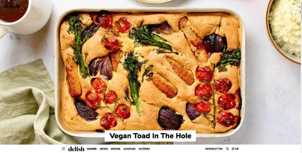
1. Delish UK - recipes, food news and cocktails
The bright, happy colours of https://www.delish.com/uk/ come from the world of food and cooking. These colours can be found all over the site. In the middle of the homepage is a recipe that is highlighted. Around it are colourful graphics from other sections, such as "Recipes," "Food News," "Celebrity Recipes," and so on. In many of the articles in each section, there are nice pictures. At the bottom of the page, links to Delish UK's social media profiles, like Instagram and Facebook, make it easy for people to follow the brand and share posts with their own audiences. The look is clean and inviting, which makes people want to look through the recipes and makes them feel like they are in good hands.
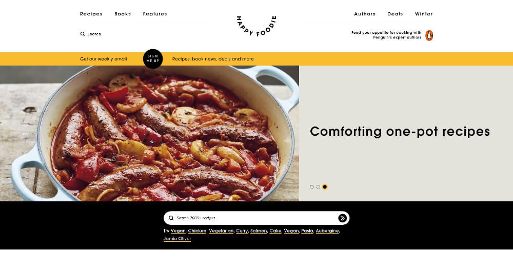
2. The Happy Foodie
The layout and design of https://thehappyfoodie.co.uk/ are modern and nice to look at. On the homepage, there is a slideshow of different food-themed photos that visitors can use to get ideas for their own designs. The menu bar at the top of the page makes it easy for users to get to other parts of the site, such as recipes, articles, contests, and more. The user interface is easy to use because it is clean and doesn't have too much going on. The user experience is better because everything on each page is clearly marked and easy to get to. The website also has a number of settings that can be changed to help people find the information they want quickly and easily.
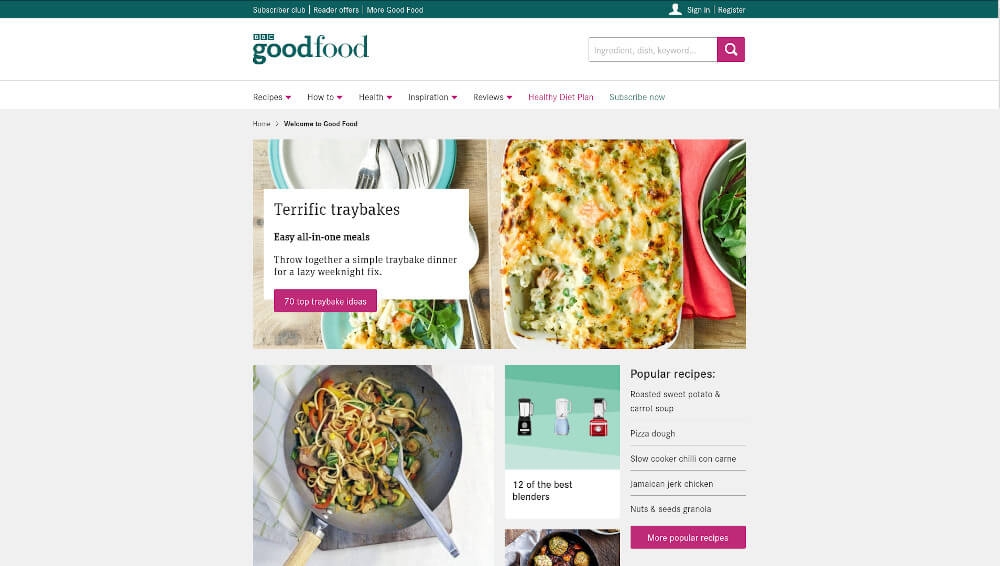
3. BBC Good Food
The design of https://www.bbcgoodfood.com is very modern and well-organized. The use of a white background with light grey accents makes the room feel open and airy. The menu bar is in the top left corner of the page, making it easy for users to get around without getting lost in a sea of content.
The main colours of the site, blue and yellow, give it a warm feel while also putting across the BBC Good Food brand. These colours also draw attention to things that users need to pay attention to, like buttons or sections.
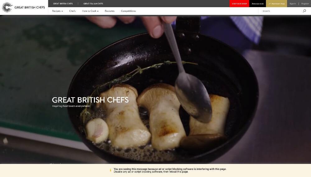
4. Great British Chefs
The website https://www.greatbritishchefs.com/ is made in a modern, simple style with the goal of giving its users a positive experience. On the home page, a full-screen image slider shows a variety of foods and recipes to help visitors get ideas for their own cooking. The main navigation bar at the top of the page makes it easy to find Recipes, Chefs & Restaurants, Videos & Articles, Reviews & Competitions, and other tabs.
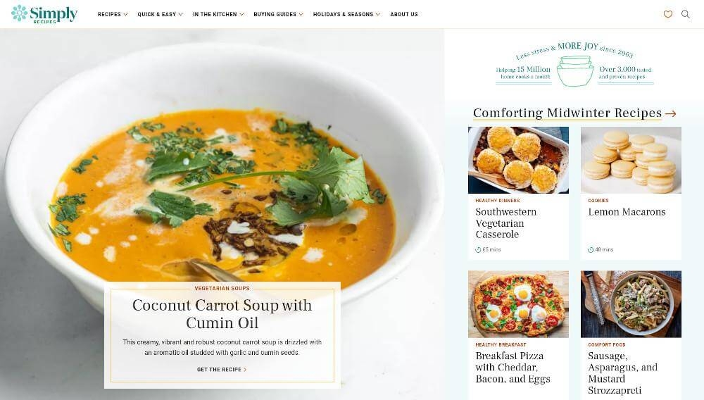
5. Simply Recipes
The website https://www.simplyrecipes.com/ was made with the user experience in mind, taking design cues from modern, minimalistic aesthetics. The homepage has a full-screen image slider at the top that can be used to show off featured recipes and sections. Many subheadings, like "seasonal recipes" and "top-rated meals," give a more detailed look at the available information. Each subheading also has links to other subheadings that are related to it. A menu bar at the top of the screen lets you get to all of the site's pages and sections.
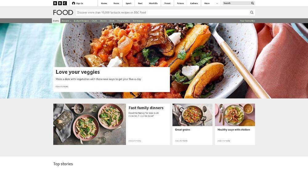
6. BBC Food - Recipes and inspiration
The layout of BBC Food's website is a beautiful mix of new technology and tried-and-true design ideas. The layout is simple and clean, and the white background makes the text stand out. The main navigation bar at the top of the page has five different options that make it easy for people to find what they need.
On the site, there is a big banner with photos of mouthwatering dishes, and right below it are quick links to different types of food. To put it another way, this makes it easier for people to find recipes that meet their dietary needs or taste preferences. If you don't want to scroll through all of the recipes on the site, you can use the search bar that appears a little further down the page.
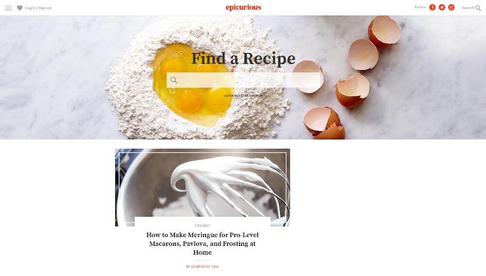
7. Epicurious – Recipes, Menu Ideas, Videos & Cooking Tips
Epicurious is a very popular site for food lovers. There is a lot of useful information in the book, like recipes, cooking tips, reviews of restaurants, and itineraries for trips. The website has a clean, simple design that puts the focus on the pictures. On the home page, a large image slider shows featured dishes, restaurants, and articles that change over time. A search bar at the top of the page makes it easy to find exactly what you need. Then, there are separate places for dishes, restaurants, and posts that have been picked out.
The design of Epicurious is carefully made to be friendly and easy to use for first-time visitors while keeping a polished look that makes experienced foodies feel confident. Color schemes use warm, muted tones that catch the eye without being too much or taking away from the site's main goal, which is to help people find and try out new, tasty restaurants in their area.
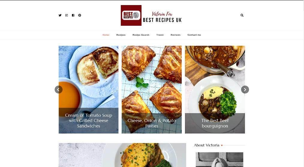
8. Best Recipes UK
The style of https://bestrecipesuk.com/ is clean, simple, and friendly. At the top of the page is a big banner with a colourful picture and the words "Welcome to Best Recipes UK" in bold font. There are many different kinds of recipes under the banner.
Behind the banner, you'll find a bunch of recipe cards for different kinds of food. Each card has a picture on the front and information about the dish on the back.
The website has a simple colour scheme with a white background and a variety of photos with colourful designs to help people get ideas for their own work. It's easy on the eyes and has a lot of white space, which helps people focus on the text instead of the design.
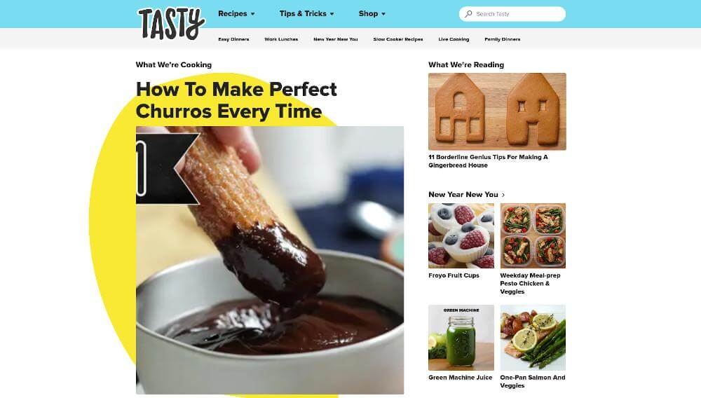
9. Tasty - Food videos and recipes
The design of the website at https://tasty.co/ is modern and eye-catching, with lots of bright colours, big, bold fonts, and pictures that relate to the content. The recipes themselves are in the main content area, and links to often-visited sections like "Breakfast Recipes" and "Gluten-Free Recipes" are in the sidebar. The website also has a simple navigation bar that makes it easy to find the recipes you want.
On the homepage, the Design Inspirations section has recipes from all over the world that use seasonal foods. Tasty also has Website Design Services for people who want to change the way their recipe pages look or make a unique menu for their restaurant.
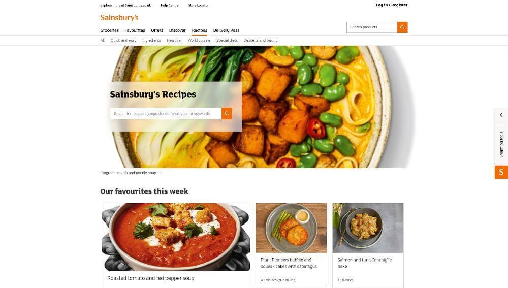
10. Sainsburys Recipes
The designers of https://www.sainsburys.co.uk/gol-ui/recipes used ideas from a number of places to make the site friendly and easy to use. On a white background, blues, greens, and oranges make things look nice and draw attention to important parts. The large, clear pictures and modern, easy-to-read font make it fun and easy to look through the recipes. Several interactive features, like drop-down menus and search bars, make it easy for users to find the dish they want.
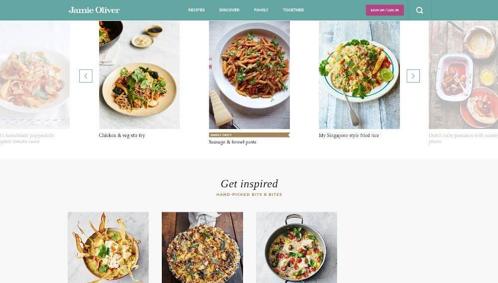
11. Jamie Oliver | Official website for recipes
The look of Jamie Oliver's website comes from his well-known TV show. The bright colours, fun typefaces, and cutting-edge images on his site give it the same upbeat feel as the celebrity chef himself. The homepage is dominated by a banner of Jamie holding a plate of food. Below the banner is a grid of colourful graphics that link to different parts of the site, like recipes, videos, and articles.
Users can find what they need quickly if the site is easy to use and has well-organized content sections. There are tabs on the top navigation bar that make it easy to jump to certain sections, such as those about Jamie Oliver's books, TV shows, and restaurants.
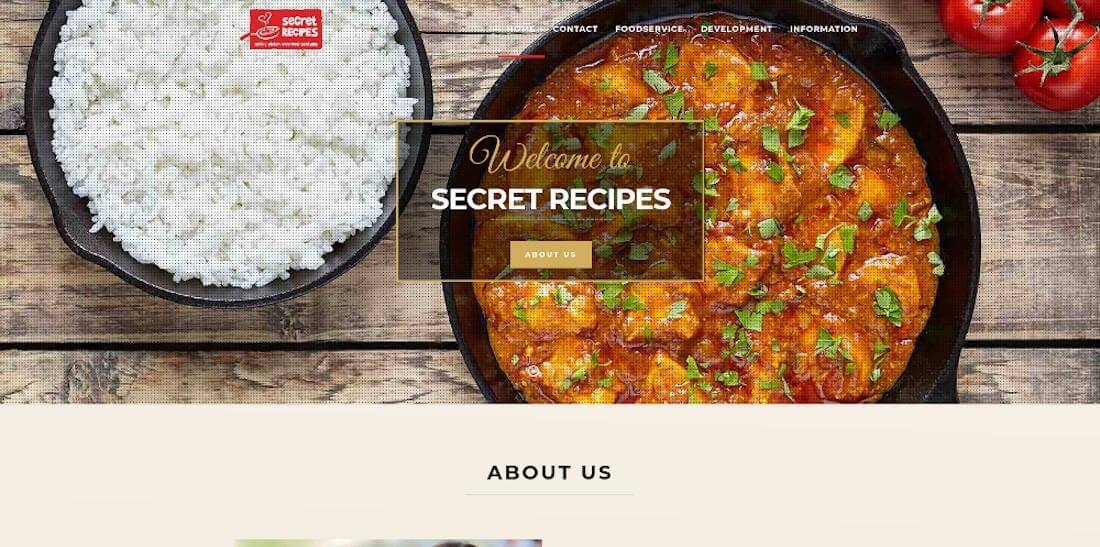
12. Secret Recipes
The layout of the SecretRecipes.ie website is cutting-edge and easy to use. The homepage is clean and simple, with clear options and a font that is easy to read. This makes it easier to use right away. The search box is right in the middle, so it's easy to find recipes by looking for specific ingredients or keywords. In addition to the many featured recipes on the main page, there are also category tabs for different kinds of food (e.g., vegetarian, vegan, etc.).
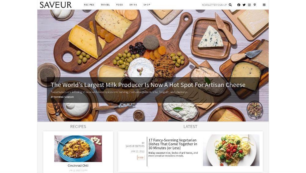
13. Saveur: Authentic Recipes
The design as a whole looks very professional, with special attention paid to the font, the photos, and the way the material is put together. As a bonus, the site uses a standard set of icons to help users find their way around its many sections. The left-hand navigation panel puts content into even more groups, such as Cooking, How-Tos, Shopping & Services, and more.
Overall, the design of Saveur's website is professional, visually appealing, and easy to use. This is mostly because the site uses a clean layout and icons that are easy to recognise.